7.4 Building custom annotations
Labelling individual points with text is an important kind of annotation, but it is not the only useful technique. The ggplot2 package provides several other tools to annotate plots using the same geoms you would use to display data. For example you can use:
geom_text()andgeom_label()to add text, as illustrated earlier.geom_rect()to highlight interesting rectangular regions of the plot.geom_rect()has aestheticsxmin,xmax,yminandymax.geom_line(),geom_path()andgeom_segment()to add lines. All these geoms have anarrowparameter, which allows you to place an arrowhead on the line. Create arrowheads witharrow(), which has argumentsangle,length,endsandtype.geom_vline(),geom_hline()andgeom_abline()allow you to add reference lines (sometimes called rules), that span the full range of the plot.
Typically, you can either put annotations in the foreground (using alpha if needed so you can still see the data), or in the background. With the default background, a thick white line makes a useful reference: it’s easy to see but it doesn’t jump out at you. To illustrate how ggplot2 tools can be used to annotate plots we’ll start with a time series plotting US unemployment over time:
ggplot(economics, aes(date, unemploy)) +
  geom_line()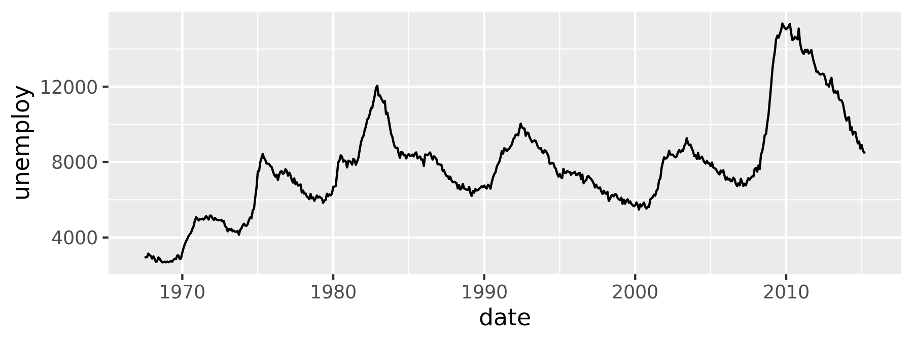
One useful way to annotate this plot is to use shading to indicate which president was in power at the time. To do this, we use geom_rect() to introduce shading, geom_vline() to introduce separators, geom_text() to add labels, and then use geom_point() to overlay the data on top of these background elements:
presidential <- subset(presidential, start > economics$date[1])

ggplot(economics) +
  geom_rect(
    aes(xmin = start, xmax = end, fill = party),
    ymin = -Inf, ymax = Inf, alpha = 0.2,
    data = presidential
  ) +
  geom_vline(
    aes(xintercept = as.numeric(start)),
    data = presidential,
    colour = "grey50", alpha = 0.5
  ) +
  geom_text(
    aes(x = start, y = 2500, label = name),
    data = presidential,
    size = 3, vjust = 0, hjust = 0, nudge_x = 50
  ) +
  geom_line(aes(date, unemploy)) +
  scale_fill_manual(values = c("blue", "red")) +
  xlab("date") +
  ylab("unemployment")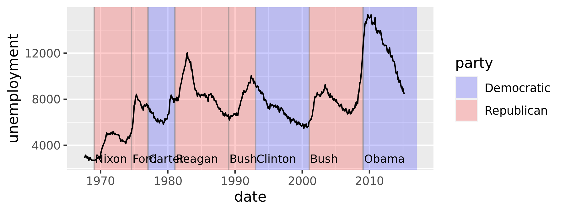
Notice that there is little new here: for the most part, annotating plots in ggplot2 is a straightforward manipulation of existing geoms. That said, there is one special thing to note in this code: the use of -Inf and Inf as positions. These refer to the top and bottom (or left and right) limits of the plot.
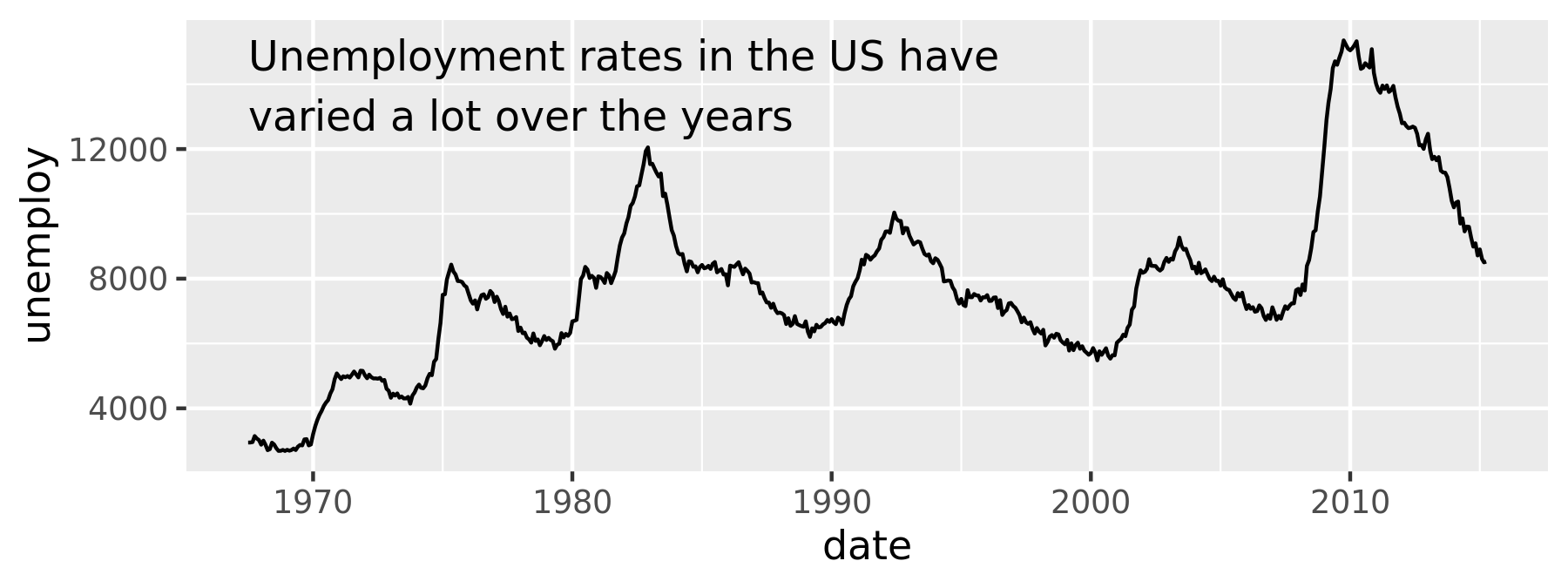
This technique can be applied in other ways too. For instance, you can use it to add a single annotation to a plot, but it’s a bit fiddly because you have to create a one row data frame:
yrng <- range(economics$unemploy)
xrng <- range(economics$date)
caption <- paste(strwrap("Unemployment rates in the US have
  varied a lot over the years", 40), collapse = "\n")

ggplot(economics, aes(date, unemploy)) +
  geom_line() +
  geom_text(
    aes(x, y, label = caption),
    data = data.frame(x = xrng[1], y = yrng[2], caption = caption),
    hjust = 0, vjust = 1, size = 4
  )
This code works, and generates the desired plot, but it is very cumbersome. It would be annoying to have to do this every time you want to add a single annotation, so ggplot2 includes the annotate() helper function which creates the data frame for you:
ggplot(economics, aes(date, unemploy)) +
  geom_line() +
  annotate(
    geom = "text", x = xrng[1], y = yrng[2],
    label = caption, hjust = 0, vjust = 1, size = 4
  )
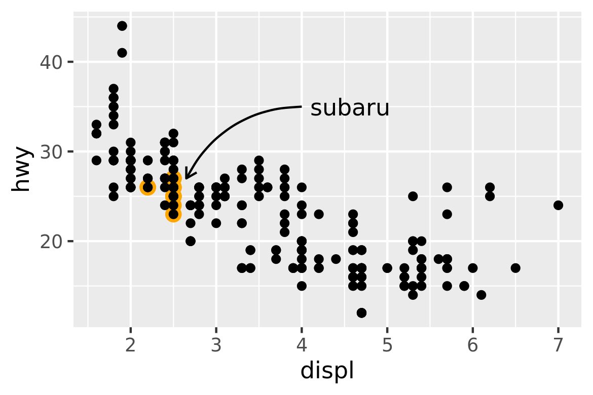
The convenience of the annotate() function comes in handy in other situations. For example, a common form of annotation is to highlight a subset of points by drawing larger points in a different colour underneath the main data set. To highlight vehicles manufactured by Subaru you could use this to create the basic plot:
p <- ggplot(mpg, aes(displ, hwy)) +
  geom_point(
    data = filter(mpg, manufacturer == "subaru"),
    colour = "orange",
    size = 3
  ) +
  geom_point()
The problem with this is that the highlighted category would not be labelled. This is easily rectified using annotate()
p +
  annotate(geom = "point", x = 5.5, y = 40, colour = "orange", size = 3) +
  annotate(geom = "point", x = 5.5, y = 40) +
  annotate(geom = "text", x = 5.6, y = 40, label = "subaru", hjust = "left")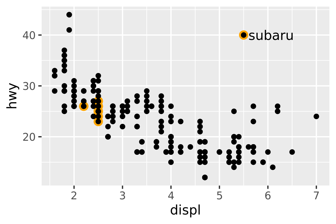
This approach has the advantage of creating a label inside the plot region, but the drawback is that the label is distant from the points it picks out (otherwise the orange and black dot adjacent to the label might be confused for real data). An alternative approach is to use a different geom to do the work. geom_curve() and geom_segment() can be used to draw curves and lines connecting points with labels, and can be used in conjunction with annotate() as illustrated below:
p +
  annotate(
    geom = "curve", x = 4, y = 35, xend = 2.65, yend = 27,
    curvature = .3, arrow = arrow(length = unit(2, "mm"))
  ) +
  annotate(geom = "text", x = 4.1, y = 35, label = "subaru", hjust = "left")