9.1 Numeric
The most common continuous position scales are the default scale_x_continuous() and scale_y_continuous() functions. In the simplest case they map linearly from the data value to a location on the plot. There are several other position scales for continuous variables—scale_x_log10(), scale_x_reverse(), etc—most of which are convenience functions used to provide easy access to common transformations:
base <- ggplot(mpg, aes(displ, hwy)) + geom_point()
base
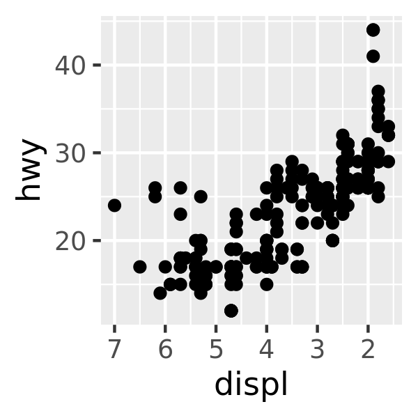
base + scale_x_reverse()
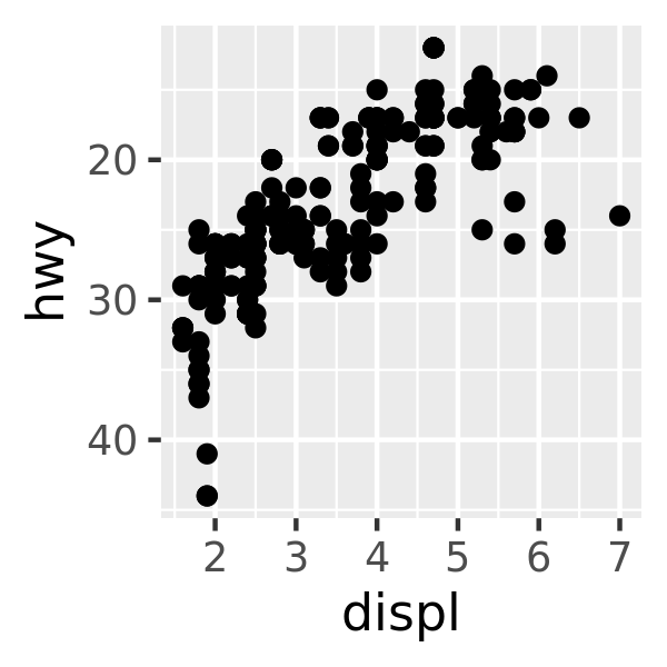
base + scale_y_reverse()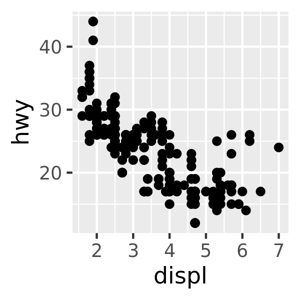
For more information on scale transformations see Section 14.2.
9.1.1 Limits
9.1.2 Out of bounds values
By default, ggplot2 converts data outside the scale limits to NA. This means that changing the limits of a scale is not precisely the same as visually zooming in to a region of the plot. If your goal is to zoom in part of the plot, it is better to use the xlim and ylim arguments of coord_cartesian():
base <- ggplot(mpg, aes(drv, hwy)) +
  geom_hline(yintercept = 28, colour = "red") +
  geom_boxplot()

base
base + coord_cartesian(ylim = c(10, 35)) # zoom only
base + ylim(10, 35) # alters the boxplot
#> Warning: Removed 6 rows containing non-finite values (stat_boxplot).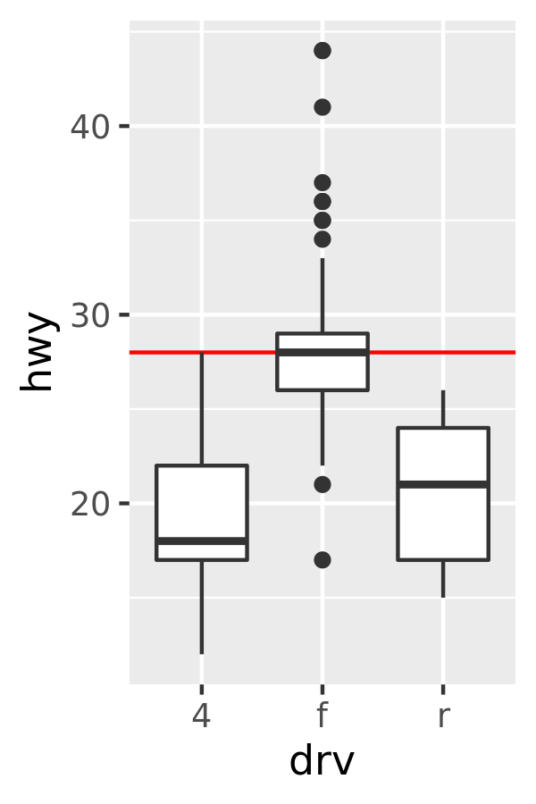
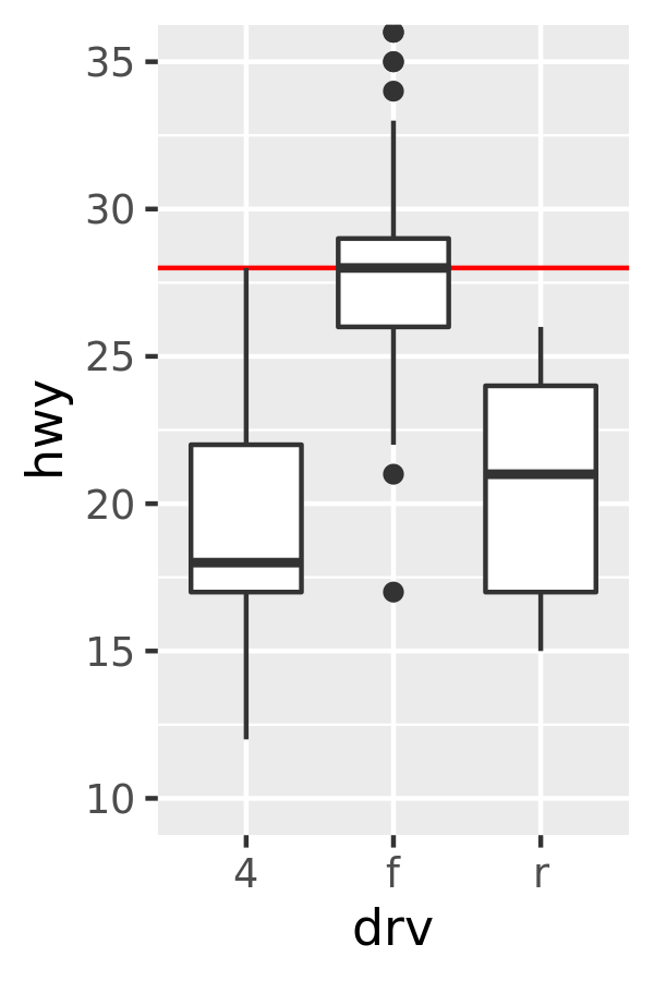
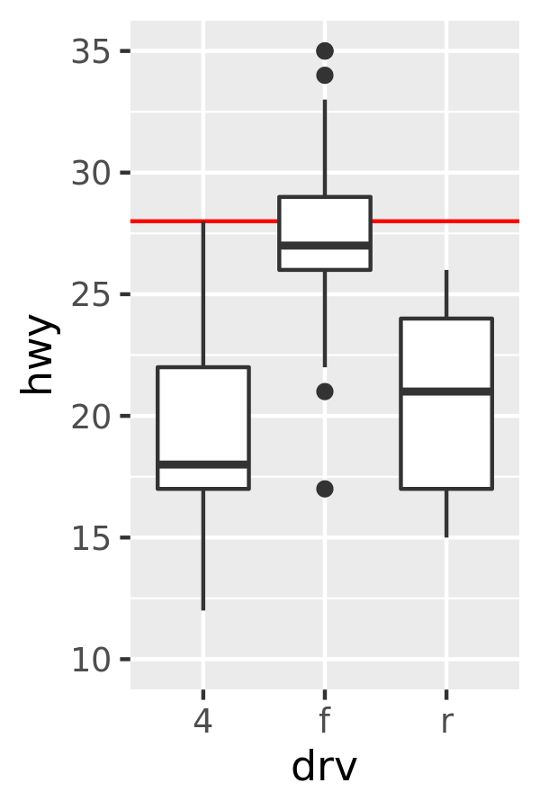
The only difference between the left and middle plots is that that the latter is zoomed in. Some of the outlier points are not shown due to the restriction of the range, but the boxplots themselves remain identical. In contrast, in the plot on the right one of the boxplots has changed. When ylim() is used to set the scale limits, all observations with highway mileage greater than 35 are converted to NA before the stat (in this case the boxplot) is computed. This has the effect of shifting the sample median downward. You can learn more about coordinate systems in Section 15.1.
Although the default behaviour is to convert the out of bounds values to NA, you can override this by setting oob argument of the scale, a function that is applied to all observations outside the scale limits. The default scales::censor() which replaces any value outside the limits with NA. Another option is scales::squish() which squishes all values into the range. An example using a fill scale is shown below:
df <- data.frame(x = 1:6, y = 8:13)
base <- ggplot(df, aes(x, y)) +
  geom_col(aes(fill = x)) +                    # bar chart
  geom_vline(xintercept = 3.5, colour = "red") # for visual clarity only

base
base + scale_fill_gradient(limits = c(1, 3))
base + scale_fill_gradient(limits = c(1, 3), oob = scales::squish)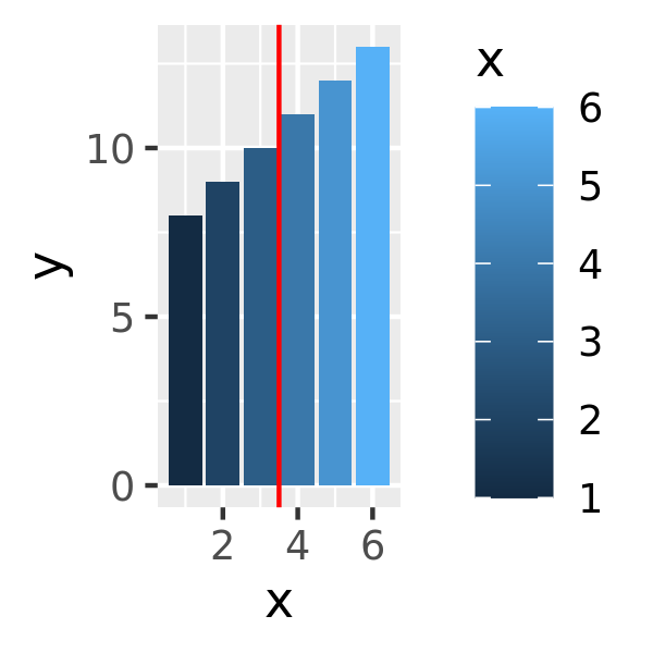
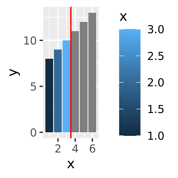
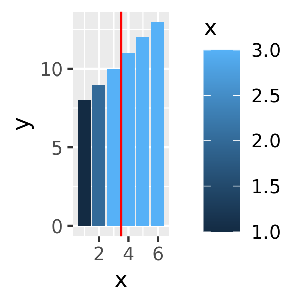
On the left the default fill colours are shown, ranging from dark blue to light blue. In the middle panel the scale limits for the fill aesthetic are reduced so that the values for the three rightmost bars are replace with NA and are mapped to a grey shade. In some cases this is desired behaviour but often it is not: the right panel addresses this by modifying the oob function appropriately.
9.1.3 Visual range expansion
If you have eagle eyes, you’ll have noticed that the visual range of the axes actually extends a little bit past the numeric limits that I have specified in the various examples. This ensures that the data does not overlap the axes, which is usually (but not always) desirable.
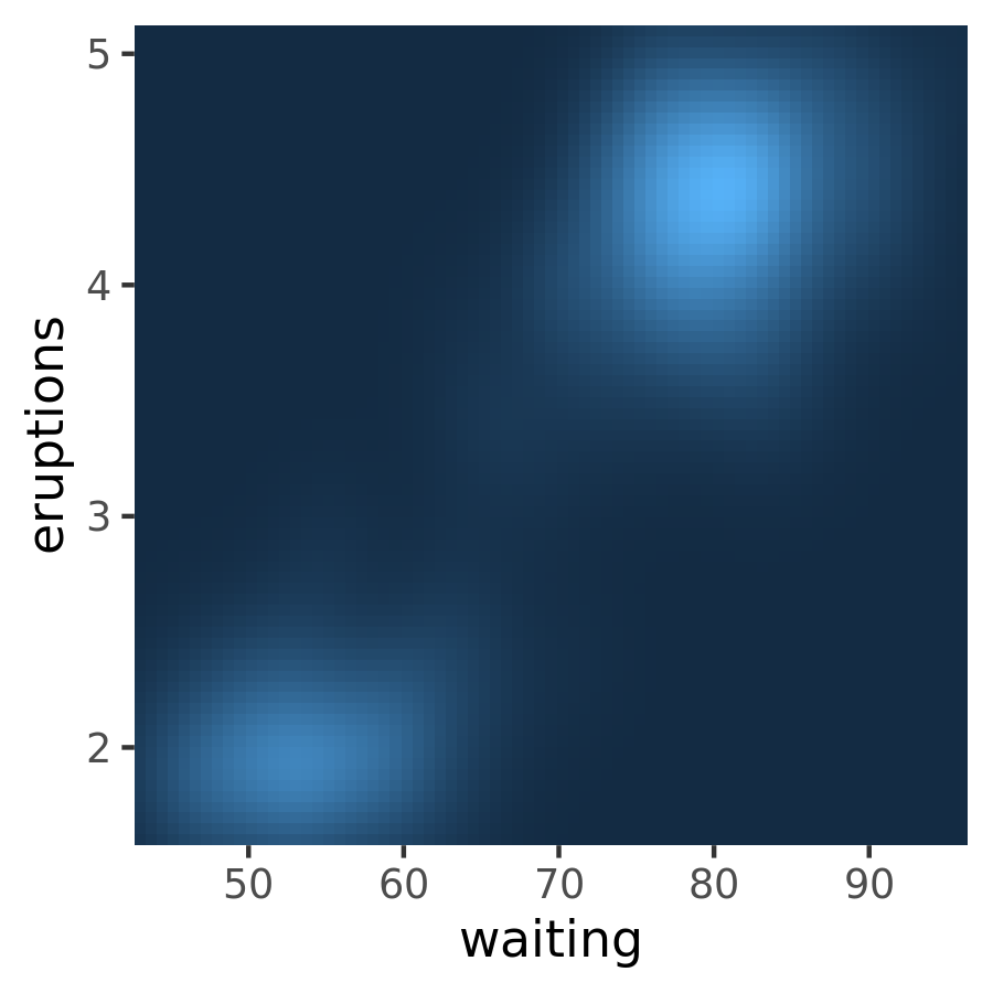
You can eliminate this this space with expand = c(0, 0). One scenario where it is usually preferable to remove this space is when using geom_raster():
ggplot(faithfuld, aes(waiting, eruptions)) +
  geom_raster(aes(fill = density)) +
  theme(legend.position = "none")

ggplot(faithfuld, aes(waiting, eruptions)) +
  geom_raster(aes(fill = density)) +
  scale_x_continuous(expand = c(0,0)) +
  scale_y_continuous(expand = c(0,0)) +
  theme(legend.position = "none")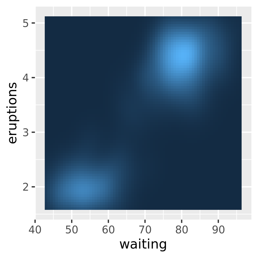
9.1.4 Exercises
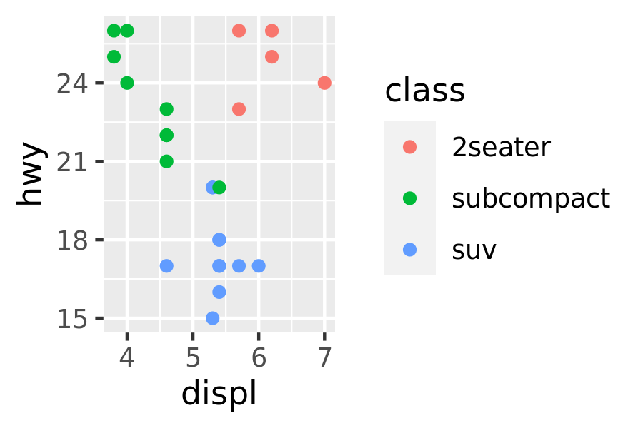
The following code creates two plots of the mpg dataset. Modify the code so that the legend and axes match, without using faceting!
fwd <- subset(mpg, drv == "f")
rwd <- subset(mpg, drv == "r")

ggplot(fwd, aes(displ, hwy, colour = class)) + geom_point()
ggplot(rwd, aes(displ, hwy, colour = class)) + geom_point()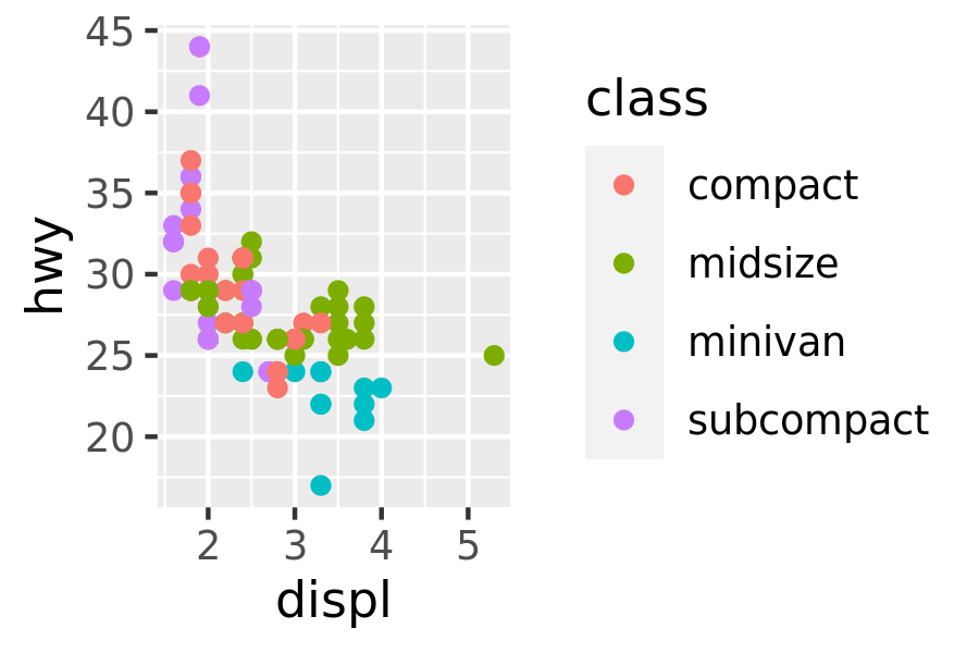
What happens if you add two
xlim()calls to the same plot? Why?What does
scale_x_continuous(limits = c(NA, NA))do?What does
expand_limits()do and how does it work? Read the source code.
9.1.5 Breaks
In the examples above, I specified breaks manually, but ggplot2 also allows you to pass a function to breaks. This function should have one argument that specifies the limits of the scale (a numeric vector of length two), and it should return a numeric vector of breaks. You can write your own break function, but in many cases there is no need, thanks to the scales package.31 It provides several tools that are useful for this purpose:
scales::breaks_extended()creates automatic breaks for numeric axes.scales::breaks_log()creates breaks appropriate for log axes.scales::breaks_pretty()creates “pretty” breaks for date/times.scales::breaks_width()creates equally spaced breaks.
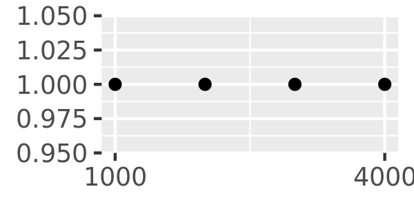
The breaks_extended() function is the standard method used in ggplot2, and accordingly the first two plots below are the same. I can alter the desired number of breaks by setting n = 2, as illustrated in the third plot. Note that breaks_extended() treats n as a suggestion rather than a strict constraint. If you need to specify exact breaks it is better to do so manually.
toy <- data.frame(
const = 1,
up = 1:4,
txt = letters[1:4],
big = (1:4)*1000,
log = c(2, 5, 10, 2000)
)
toy
#> const up txt big log
#> 1 1 1 a 1000 2
#> 2 1 2 b 2000 5
#> 3 1 3 c 3000 10
#> 4 1 4 d 4000 2000
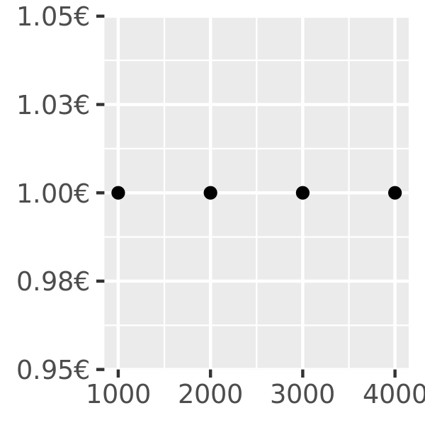
axs <- ggplot(toy, aes(big, const)) +
geom_point() +
labs(x = NULL, y = NULL)
axs
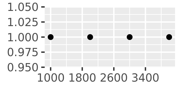
axs + scale_x_continuous(breaks = scales::breaks_extended())
axs + scale_x_continuous(breaks = scales::breaks_extended(n = 2))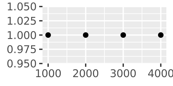

Another approach that is sometimes useful is specifying a fixed width that defines the spacing between breaks. The breaks_width() function is used for this. The first example below shows how to fix the width at a specific value; the second example illustrates the use of the offset argument that shifts all the breaks by a specified amount:
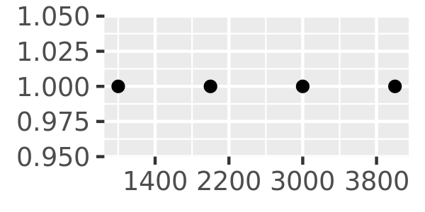
axs + scale_x_continuous(breaks = scales::breaks_width(800))
axs + scale_x_continuous(breaks = scales::breaks_width(800, offset = 200))
axs + scale_x_continuous(breaks = scales::breaks_width(800, offset = -200))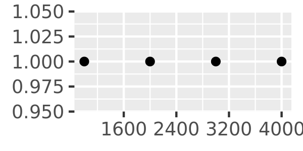
Notice the difference between setting an offset of 200 and -200.
You can suppress the breaks entirely by setting them to NULL:
axs + scale_x_continuous(breaks = NULL)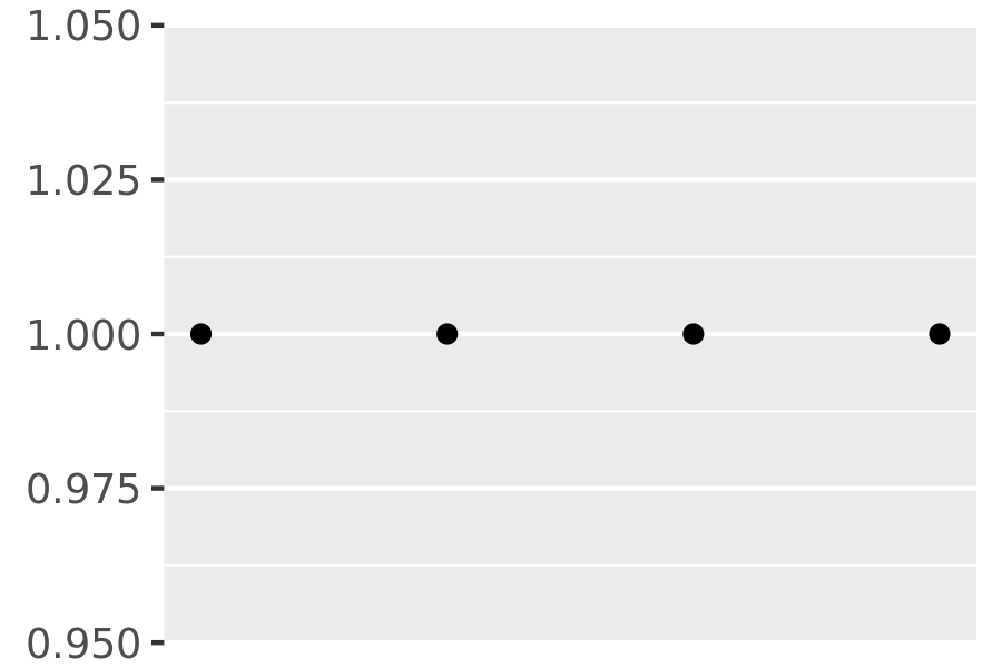
9.1.6 Minor breaks
You can adjust the minor breaks (the unlabelled faint grid lines that appear between the major grid lines) by supplying a numeric vector of positions to the minor_breaks argument.
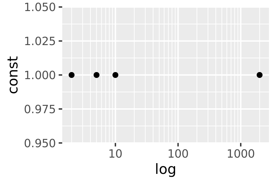
Minor breaks are particularly useful for log scales because they give a clear visual indicator that the scale is non-linear. To show them off, I’ll first create a vector of minor break values (on the transformed scale), using %o% to quickly generate a multiplication table and as.numeric() to flatten the table to a vector.
mb <- unique(as.numeric(1:10 %o% 10 ^ (0:3)))
mb
#>  [1]     1     2     3     4     5     6     7     8     9    10    20    30
#> [13]    40    50    60    70    80    90   100   200   300   400   500   600
#> [25]   700   800   900  1000  2000  3000  4000  5000  6000  7000  8000  9000
#> [37] 10000
The following plots illustrate the effect of setting the minor breaks:
log_base <- ggplot(toy, aes(log, const)) + geom_point()

log_base + scale_x_log10()
log_base + scale_x_log10(minor_breaks = mb)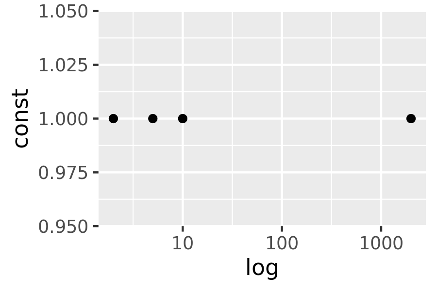
As with breaks, you can also supply a function to minor_breaks, such as scales::minor_breaks_n() or scales::minor_breaks_width() functions that can be helpful in controlling the minor breaks.
9.1.7 Labels
Every break is associated with a label and these can be changed by setting the labels argument to the scale function:
axs + scale_x_continuous(breaks = c(2000, 4000), labels = c("2k", "4k"))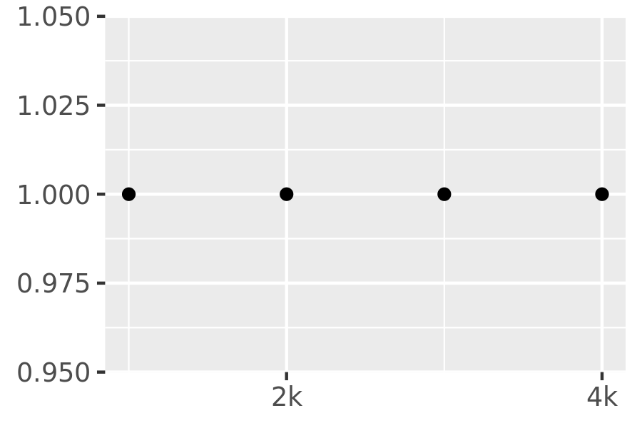
In the examples above I specified the vector of labels manually, but ggplot2 also allows you to pass a labelling function. A function passed to labels should accept a numeric vector of breaks as input and return a character vector of labels (the same length as the input). The scales package provides a number of tools that will automatically construct label functions for you. Some of the more useful examples for numeric data include:
scales::label_bytes()formats numbers as kilobytes, megabytes etc.scales::label_comma()formats numbers as decimals with commas added.scales::label_dollar()formats numbers as currency.scales::label_ordinal()formats numbers in rank order: 1st, 2nd, 3rd etc.scales::label_percent()formats numbers as percentages.scales::label_pvalue()formats numbers as p-values: <.05, <.01, .34, etc.
A few examples are shown below to illustrate how these functions are used:
axs + scale_y_continuous(labels = scales::label_percent())
axs + scale_y_continuous(labels = scales::label_dollar(prefix = "", suffix = "€"))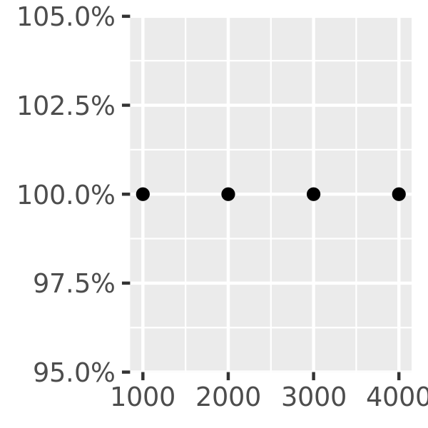
You can suppress labels with labels = NULL. This will remove the labels from the axis or legend while leaving its other properties unchanged:
axs + scale_x_continuous(labels = NULL)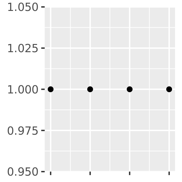
9.1.8 Exercises
Recreate the following graphic:
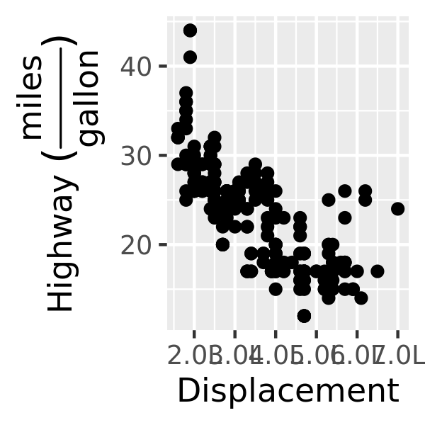
Adjust the y axis label so that the parentheses are the right size.
List the three different types of object you can supply to the
breaksargument. How dobreaksandlabelsdiffer?What label function allows you to create mathematical expressions? What label function converts 1 to 1st, 2 to 2nd, and so on?
Hadley Wickham and Dana Seidel, Scales: Scale Functions for Visualization, 2020, https://CRAN.R-project.org/package=scales.↩︎