5.1 Revealing uncertainty
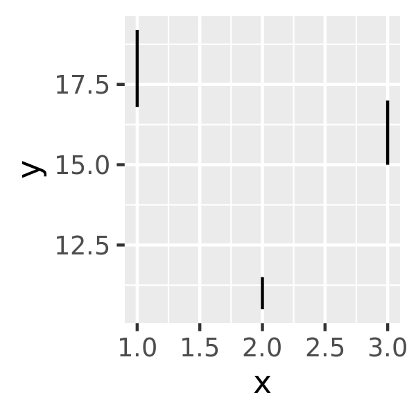
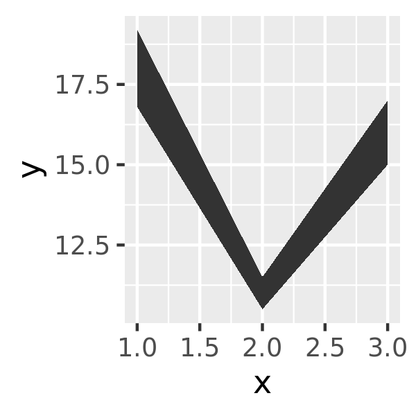
If you have information about the uncertainty present in your data, whether it be from a model or from distributional assumptions, it’s a good idea to display it. There are four basic families of geoms that can be used for this job, depending on whether the x values are discrete or continuous, and whether or not you want to display the middle of the interval, or just the extent:
- Discrete x, range:
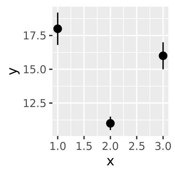
geom_errorbar(),geom_linerange() - Discrete x, range & center:
geom_crossbar(),geom_pointrange() - Continuous x, range:
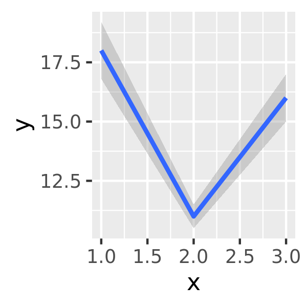
geom_ribbon() - Continuous x, range & center:
geom_smooth(stat = "identity")
These geoms assume that you are interested in the distribution of y conditional on x and use the aesthetics ymin and ymax to determine the range of the y values. If you want the opposite, see Section 15.1.2.
y <- c(18, 11, 16)
df <- data.frame(x = 1:3, y = y, se = c(1.2, 0.5, 1.0))

base <- ggplot(df, aes(x, y, ymin = y - se, ymax = y + se))
base + geom_crossbar()
base + geom_pointrange()
base + geom_smooth(stat = "identity")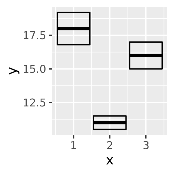
base + geom_errorbar()
base + geom_linerange()
base + geom_ribbon()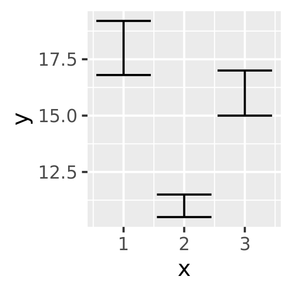
Because there are so many different ways to calculate standard errors, the calculation is up to you. For very simple cases, ggplot2 provides some tools in the form of summary functions described below, otherwise you will have to do it yourself. R for Data Science (https://r4ds.had.co.nz) contains more advice on working with more sophisticated models.