5 plot with R
5.1 ggplot2
library(ggplot2)labs(x = NULL)can suppress x axis labelcalculated aesthetics via
stat()
ggplot(mpg, aes(displ)) +
  geom_histogram(aes(y = stat(count)))
#> `stat_bin()` using `bins = 30`. Pick better value with `binwidth`.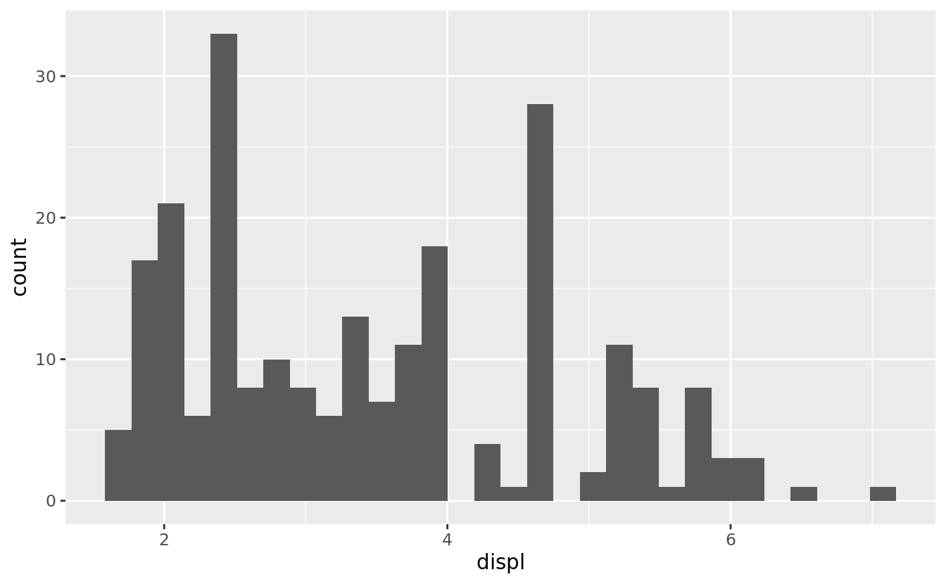
- color
scales::show_col(scales::hue_pal()(4))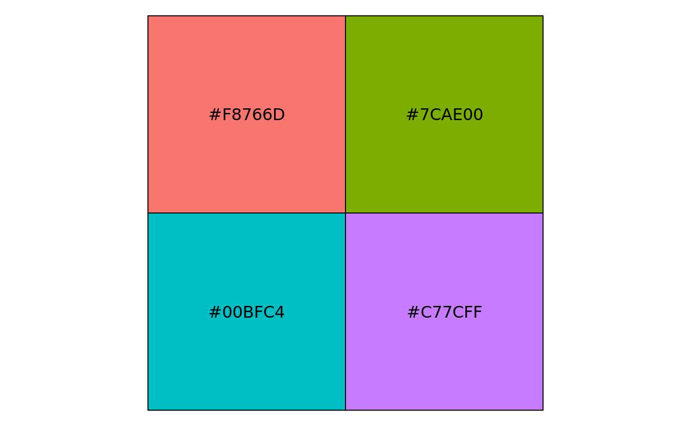
- legend
ggplot(mtcars, aes(wt, mpg)) +
    geom_point(aes(colour = factor(cyl), shape = factor(vs))) +
    labs(x = "Weight (1000 lbs)", y = "Fuel economy (mpg)", colour = "Cylinders", shape = "Transmission") +
    theme(legend.background = element_rect(colour = 'purple', fill = 'pink', size = 3, linetype='dashed'),
          legend.margin = margin(20,15,10,5),
          legend.box.background = element_rect(colour = 'blue', fill = 'yellow', size = 5, linetype='solid'),
          legend.box.margin = margin(10,20,30,40))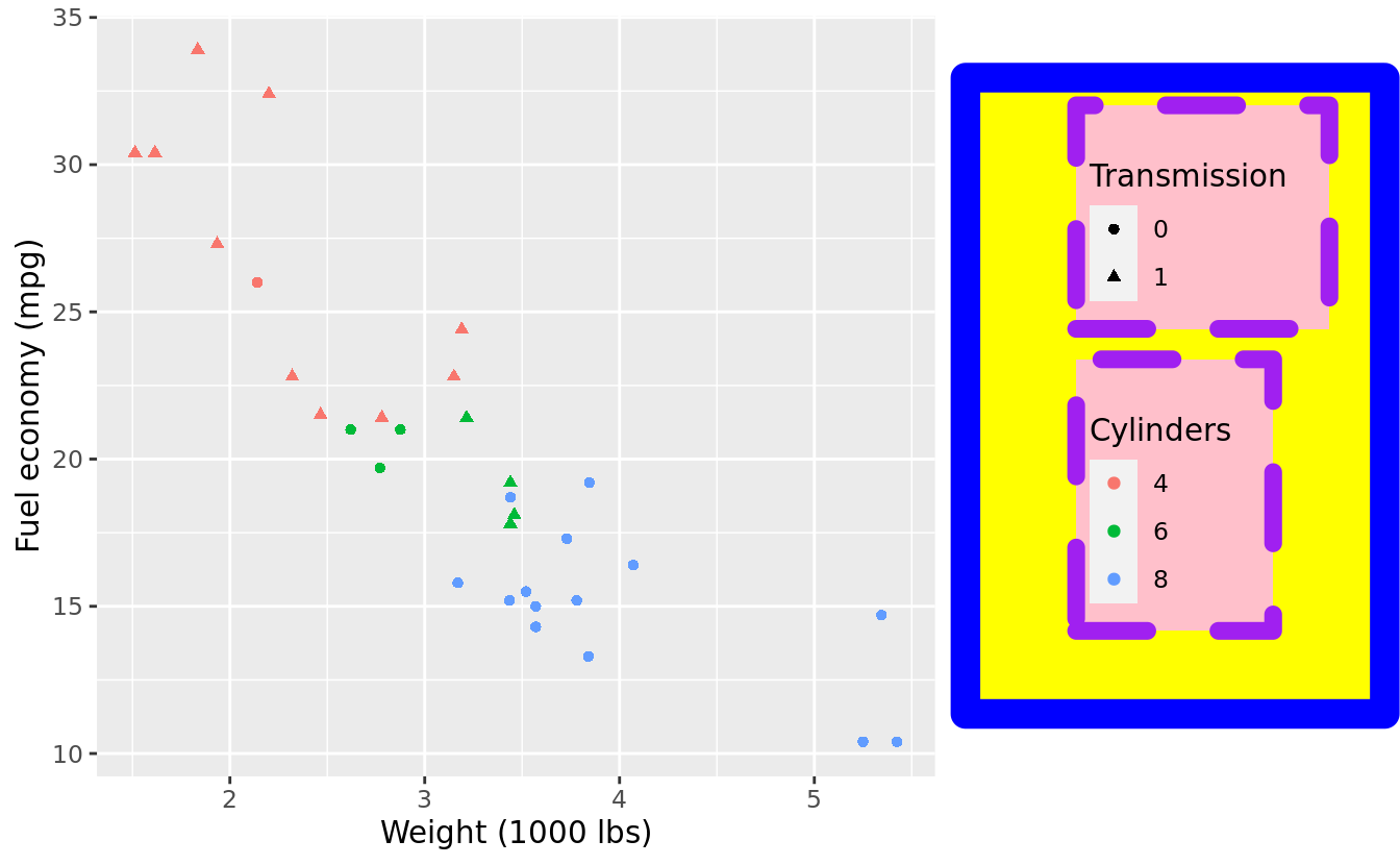
5.2 multi-plot
- 排列 plot,唯 patchwork 不破
we use cowplot::plot_grid() as reference
for gtable,
rbind()&cbind()just align plots, and you have to useggplotGrob()to convert ggplot object, examplefor egg,
ggarrange()doesn’t provide more feature, but some figure explains how to align panels: one & another 13for gridExtra,
grid.arrange()can’t add label, and syntax for layout is more complex. But can add title, contain hole, nest and multi-page vignettepatchwork provides a nice
+syntax, but it remains to see whether I have tolibrary()it, homemultipanelfigure ’s syntax is very different, but also very versatile, the author even use it to produce a supp figure of a biomedical paper guide
Thanks to this vignette, which contains many other useful tips:
- Plot insets
- share legend
- convert table to plot
following are R code I write when reproducing that vignette
gl <- lapply(1:4, function(ii)
    grid::grobTree(grid::rectGrob(gp=grid::gpar(fill=ii, alpha=0.5)), grid::textGrob(paste0('plot', ii))))

grid.arrange(
    grobs = gl,
    widths = c(2, 1, 1),
    layout_matrix = rbind(c(1, 2, NA),
                          c(3, 3, 4))
)

p1 <- qplot(mpg, wt, data = mtcars, colour = cyl)
p2 <- qplot(mpg, data = mtcars) + ggtitle("title")
p3 <- qplot(mpg, data = mtcars, geom = "dotplot")
p4 <-
    p1 + facet_wrap( ~ carb, nrow = 1) + theme(legend.position = "none") +
    ggtitle("facetted plot")
grid.arrange(
    p1, p2, p3, p4,
    widths = c(1, 1, 1),
    layout_matrix = rbind(c(1, 2, 3),
                          c(4, 4, 4))
)


g <- ggplotGrob(qplot(1, 1) +
                    theme(plot.background = element_rect(colour = "black")))
qplot(1:10, 1:10) +
    annotation_custom(
        grob = g,
        xmin = 1,
        xmax = 5,
        ymin = 5,
        ymax = 10
    ) +
    annotation_custom(
        grob = grid::rectGrob(gp = grid::gpar(fill = "white")),
        xmin = 7.5,
        xmax = Inf,
        ymin = -Inf,
        ymax = 5
    )
5.3 graphics: prepare
# not avaliable in CRAN
if(!("nutshell.bbdb" %in% .packages(T))) remotes::install_github("cran/nutshell.bbdb")
if(!("nutshell.audioscrobbler" %in% .packages(T))) remotes::install_github("cran/nutshell.audioscrobbler")
if(!("nutshell" %in% .packages(T))) remotes::install_github("cran/nutshell")
if(!("learningr" %in% .packages(T))) remotes::install_github("cran/learningr")library(nutshell)
#> Loading required package: nutshell.bbdb
#> Loading required package: nutshell.audioscrobbler
library(learningr)
as_ggplot_list <- function(...) {
rlang::enexprs(...) %>% purrr::map(as.expression) %>% purrr::map(ggplotify::as.ggplot)
}
data(doctorates, batting.2008, turkey.price.ts, toxins.and.cancer, yosemite)
bat = plyr::mutate(
batting.2008,
PA = AB + BB + HBP + SF + SH,
OBP = (H + BB + HBP)/(AB + BB + HBP + SF)
)
bat.w.names <- plyr::mutate(
bat,
throws = as.factor(throws),
bats = as.factor(bats),
AVG = H/AB
)
toc = toxins.and.cancer
data(obama_vs_mccain, crab_tag)
obama_vs_mccain = obama_vs_mccain[!is.na(obama_vs_mccain$Turnout), ]
ovm = within(obama_vs_mccain, Region <- reorder(Region, Obama, median))5.4 graphics: univariate plot
5.4.1 pie chart
c(
    "Fresh and forzen" = 7752,
    "Reduced to meal, etc." = 1166,
    "Canned" = 463,
    "Cured" = 108
) %>% pie(main = "domestic catch 2006")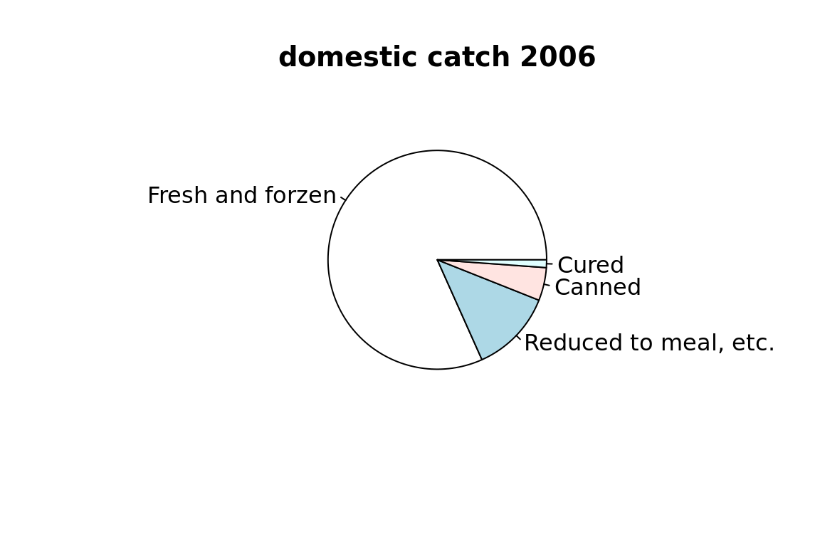
5.4.2 bar chart
transform data.frame into a matrix for barplot
doctorates.m <- as.matrix(doctorates[,-1])
rownames(doctorates.m) <- doctorates[,1]
doctorates.m
#>      engineering science education health humanities other
#> 2001        5323   20643      6436   1591       5213  2159
#> 2002        5511   20017      6349   1541       5178  2141
#> 2003        5079   19529      6503   1654       5051  2209
#> 2004        5280   20001      6643   1633       5020  2180
#> 2005        5777   20498      6635   1720       5013  2480
#> 2006        6425   21564      6226   1785       4949  2436
If the vector or matrix isn’t named, you need to use names.arg to specify the labels.
barplot(doctorates.m[1,])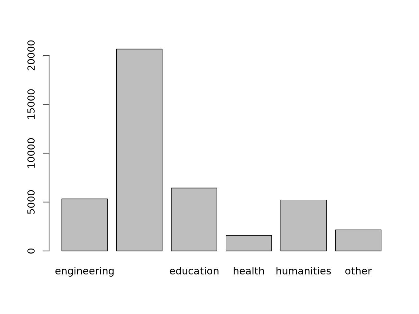
barplot(doctorates.m, beside = T, horiz = T, legend = T)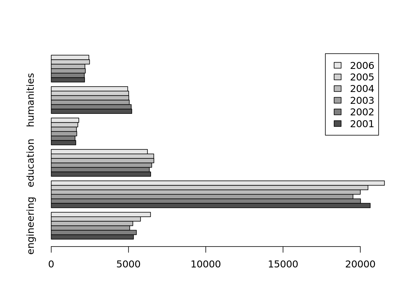
## we set `ylim` to make room for the legend
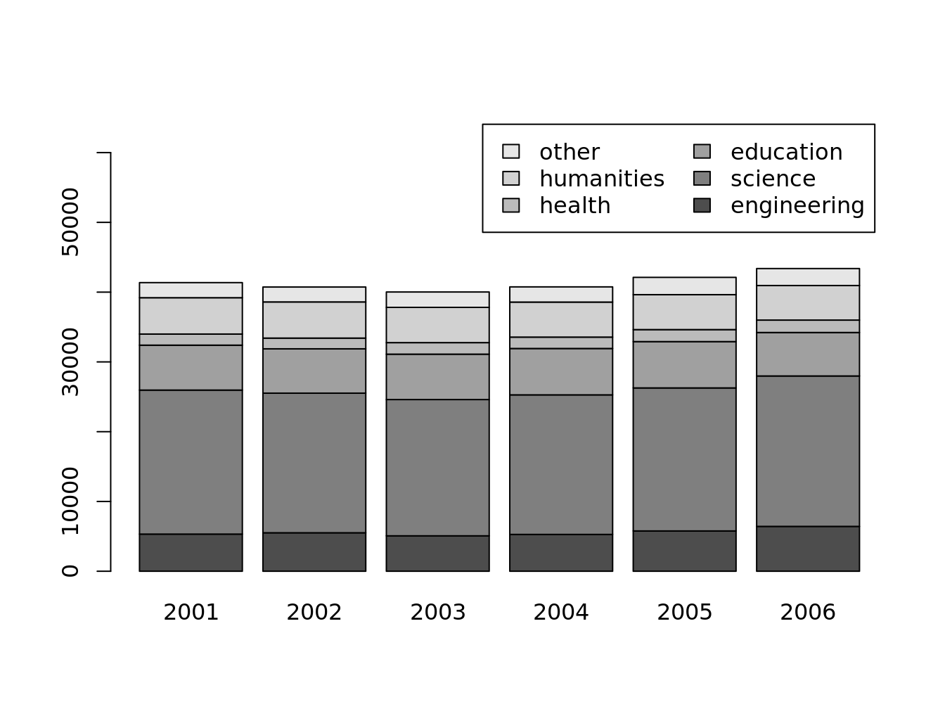
barplot(
t(doctorates.m), legend = T, ylim = c(0,66000),
args.legend = list(ncol = 2)
)
5.4.3 histogram
as_ggplot_list(
    hist(obama_vs_mccain$Obama, main = 'number'),
    hist(obama_vs_mccain$Obama, freq = F, main = 'frequency')
) %>% gridExtra::grid.arrange(grobs = ., nrow = 1)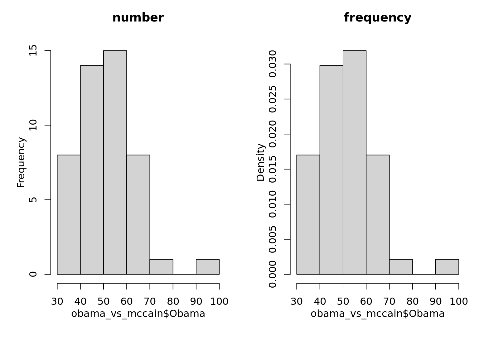
how to specify binwidth (breaks parameter)
hist(obama_vs_mccain$Obama, 4, main = "An exact number of bins")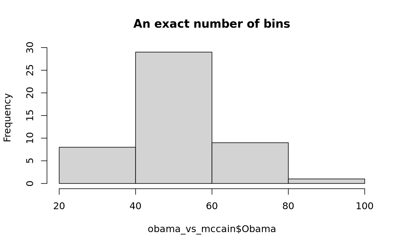
hist(obama_vs_mccain$Obama, seq.int(0, 100, 5), main = "A vector of bin edges")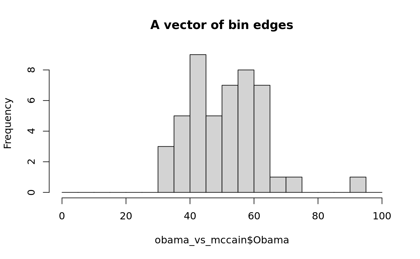
hist(obama_vs_mccain$Obama, nclass.scott, main = "A function for the number of bins")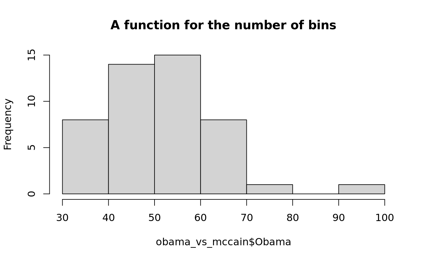
# you can also use the name of a method, such as `"FD"`
hist(obama_vs_mccain$Obama, function(x) {seq(min(x), max(x), length.out = 50)}, main = "A function for the bin edges")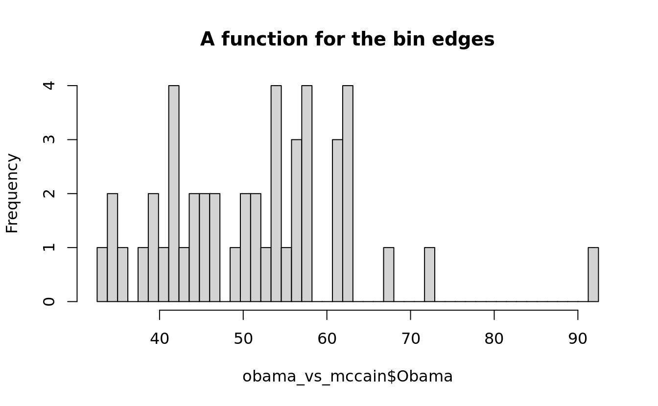
5.4.4 denstity plot
plot(density(bat[bat$PA > 25,"PA"]))
rug(bat[bat$PA > 25,"PA"])  #added to the above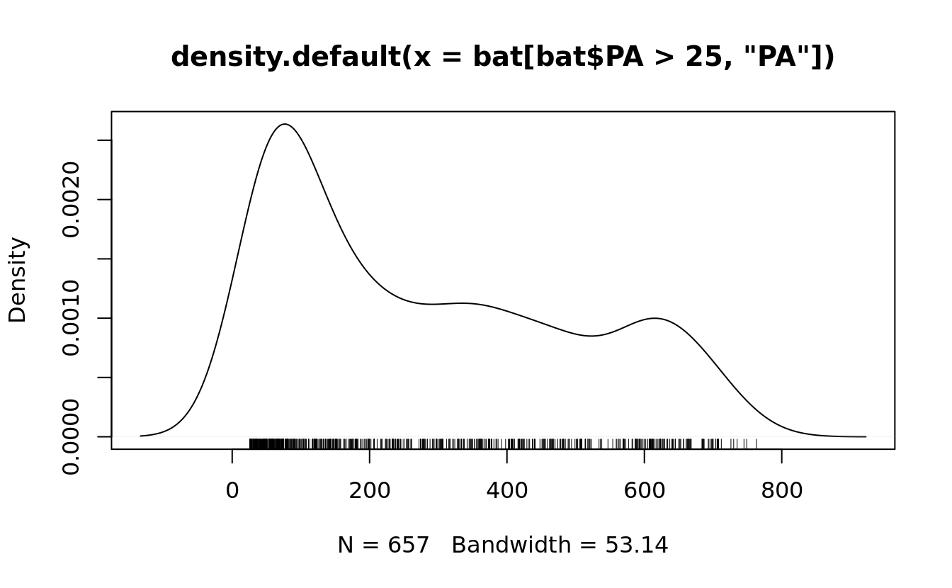
5.4.5 quantile plot
qqnorm(bat$AB)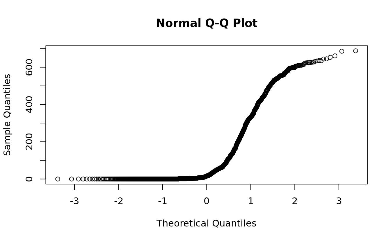
5.4.6 time series plot
acf() computes and plots the autocorrelation function for a time series:
as_ggplot_list(
    plot(turkey.price.ts),
    acf(turkey.price.ts)
) %>% gridExtra::grid.arrange(grobs = ., nrow = 1)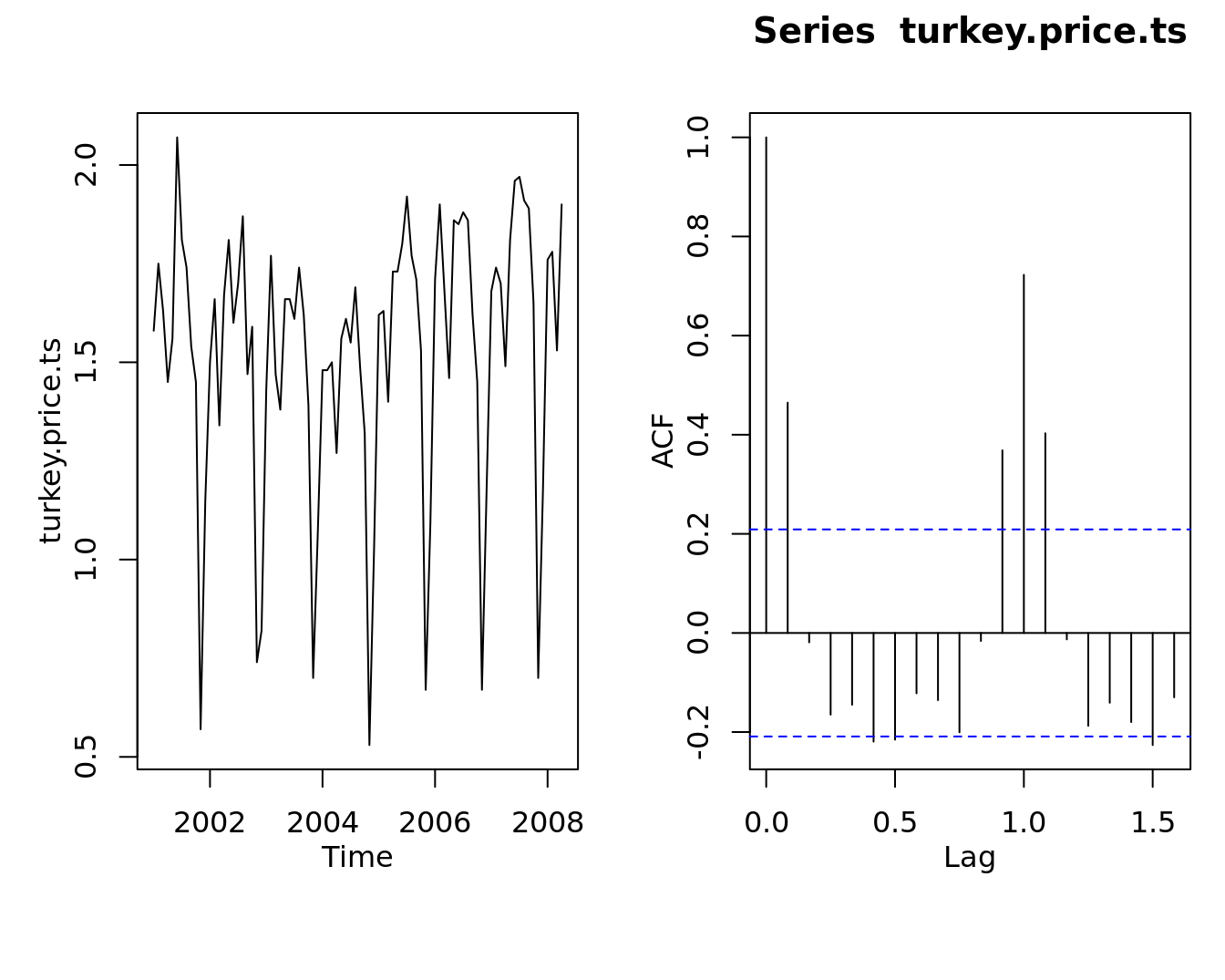
5.5 graphics: bivariate plot
5.5.1 scatter plot
as_ggplot_list(
    plot(obama_vs_mccain$Income, obama_vs_mccain$Turnout, col = "violet", pch = 20),
    plot(obama_vs_mccain$Income, obama_vs_mccain$Turnout, log = "xy")
) %>% gridExtra::grid.arrange(grobs = ., nrow = 1)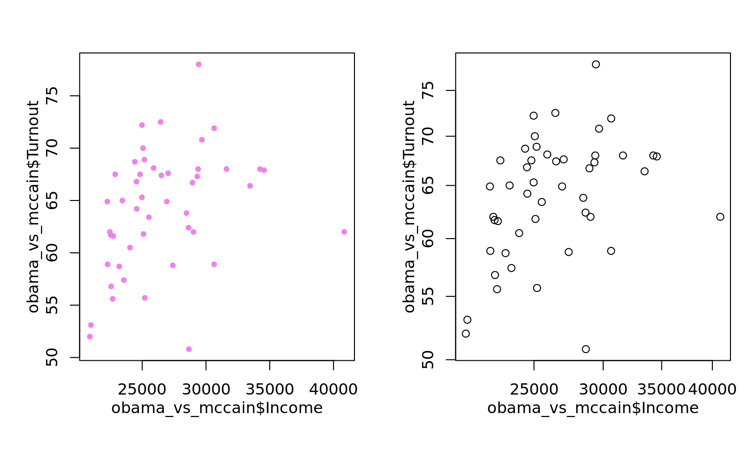
pairs of correlation
plot(bat[,c("H","R","SO","BB","HR")], main = '')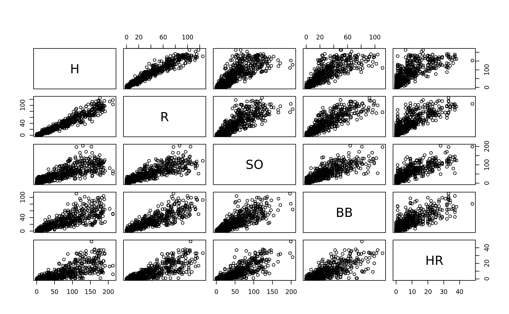
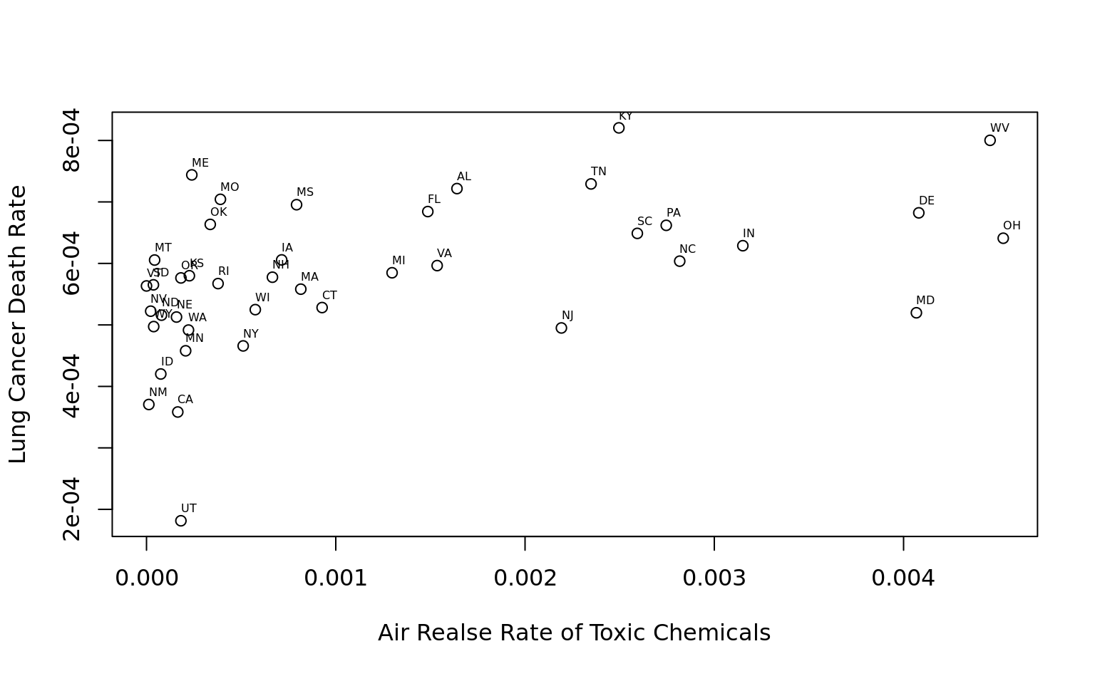
add text labels
plot(
    toc$air_on_site/toc$Surface_Area, toc$deaths_lung/toc$Population,
    xlab = "Air Realse Rate of Toxic Chemicals", ylab = "Lung Cancer Death Rate"
)
text(
    toc$air_on_site/toc$Surface_Area, toc$deaths_lung/toc$Population,
    cex = 0.5, labels = toc$State_Abbrev, adj = c(0, -1)
)
point shape is specified by pch (plotting character)
plot(1:25, pch = 1:25, bg = "blue")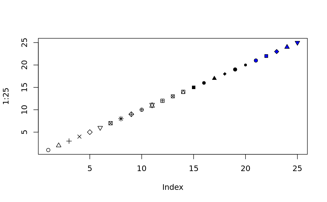
5.5.2 line plot
line plots are created in the same way as scatterplots, except that they take the argument type = “l”
plot(crab_tag$daylog$Date, -crab_tag$daylog$Max.Depth, type = "l", ylim = c(-max(crab_tag$daylog$Max.Depth), 0))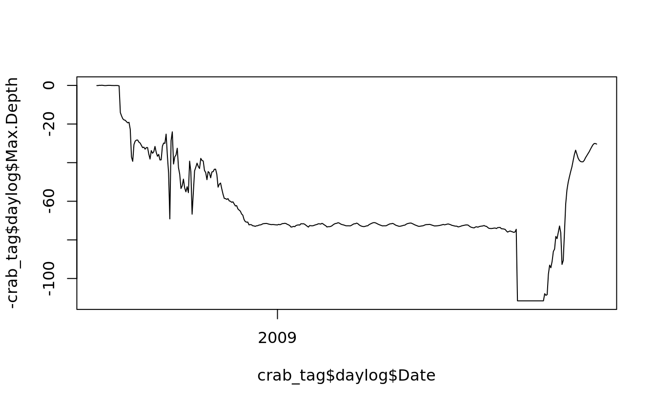
## use `lines()` to draw additional lines on an existing plot
lines(crab_tag$daylog$Date, -crab_tag$daylog$Min.Depth, col = "blue")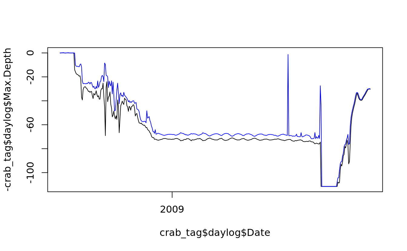
5.5.3 box plot
- The box shows the interquartile range, which contains values between the 25th and 75th percentile;
- The line inside the box shows the median;
- The two whiskers on either side of the box show the adjacent values, which are intended to show extreme values;
- When there are values far outside the range we would expect for normally distributed data, those outlying values are plotted separately.
- Specifically, here is how the adjacent values are calculated:
- the upper adjacent value is the value of the largest observation that is less than or equal to the upper quartile plus 1.5 times the length of the interquartile range;
- the lower adjacent value is the value of the smallest observation that is greater than or equal to the lower quartile less 1.5 times the length of the interquartile range.
as_ggplot_list(
    boxplot(Obama ~ Region, data = obama_vs_mccain),
    boxplot(Obama ~ Region, within(obama_vs_mccain, Region <- reorder(Region, Obama, median)))
) %>% gridExtra::grid.arrange(grobs = ., nrow = 1)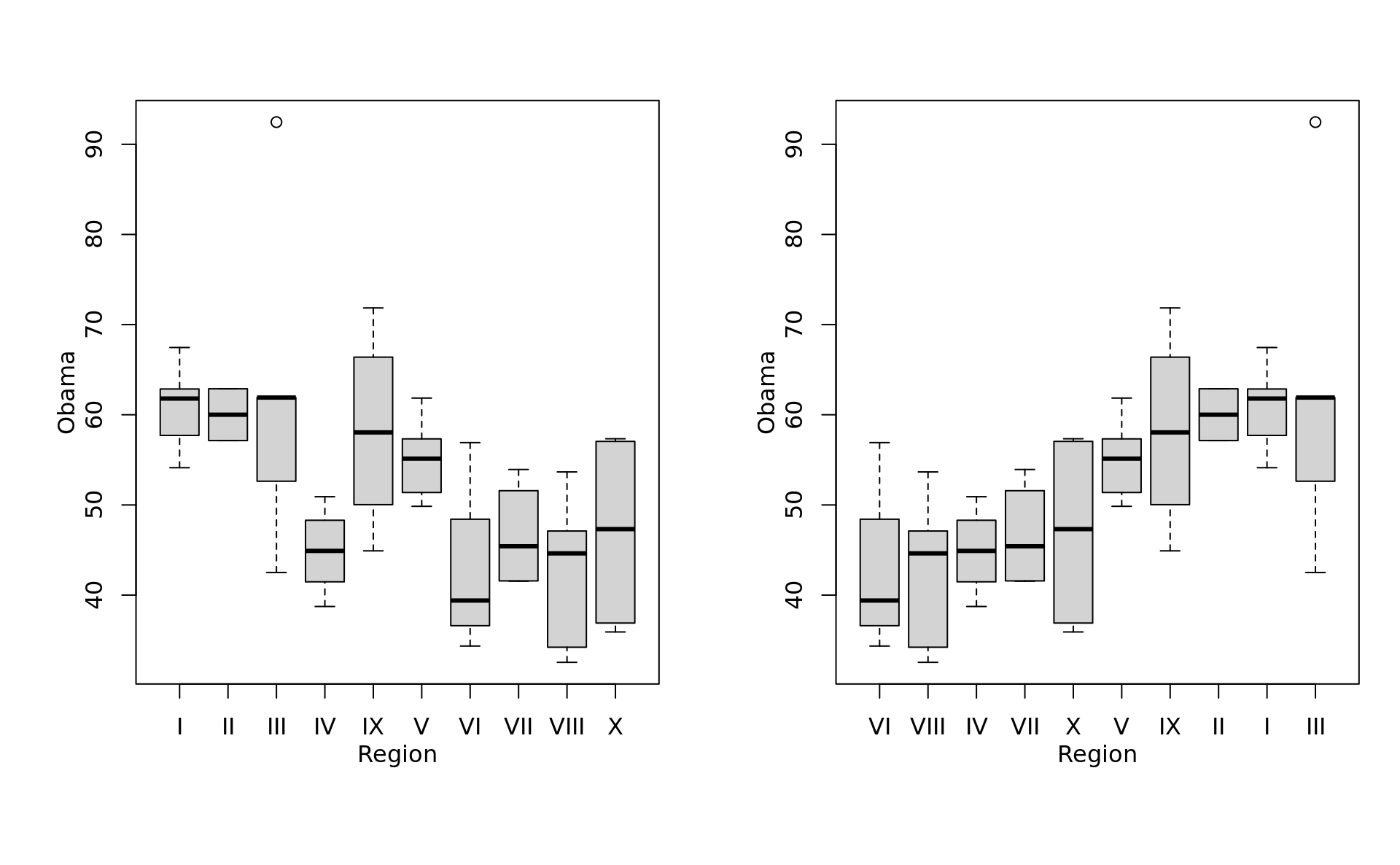
5.5.4 plot categorical data
# conditional density of a set of categories dependent on a numeric value
cdplot(bats ~ AVG, bat.w.names, subset = (bat.w.names$AB > 100))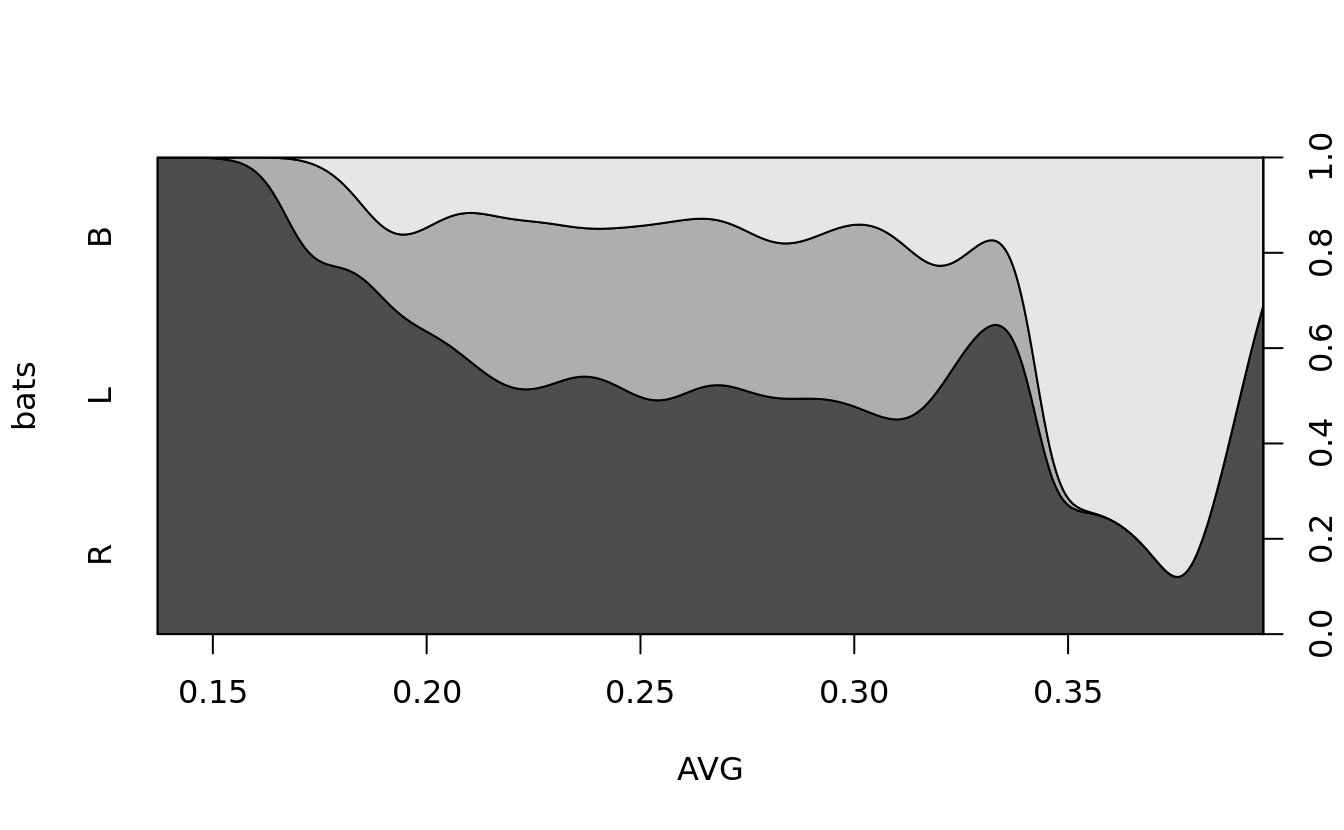
spineplot(bats~throws, bat.w.names)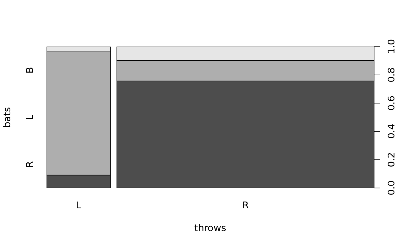
mosaicplot(bats~throws, bat.w.names, color = TRUE)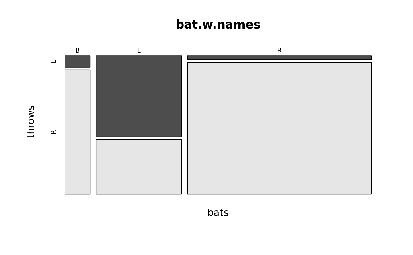
assocplot(table(bat.w.names$bats, bat.w.names$throws), xlab = "Throws", ylab = "Bats")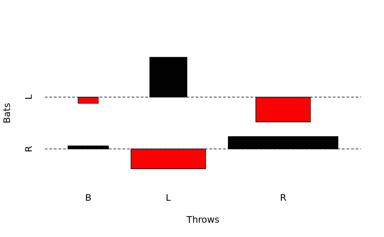
5.6 graphics: trivariate plot
we need to make two transformations:
- In the data file, values move east to west (or left to right) as x indices increase and from north to south (or top to bottom) as y indices increase. Unfortunately, persp plots increasing y coordinates from bottom to top.
- We need to select only a square subset of the elevation points.
To plot the figure, we rotate the image by 225?? (through theta=225), change the viewing angle to 20?? (phi=20), adjuste the light source to be from a 45?? angle (ltheta=45) and set the shading factor to 0.75 (shade=.75) to exaggerate topological features.
row = nrow(yosemite)
col = ncol(yosemite)
halfdome <- yosemite[(row - col + 1):row, col:1]
5.6.1 persp() and headmap()
# three-dimensional surface for a specific perspective.
persp(halfdome, col = grey(.25), border = NA, expand = .15, theta = 225, phi = 20, ltheta = 45, lphi = 20, shade = .75)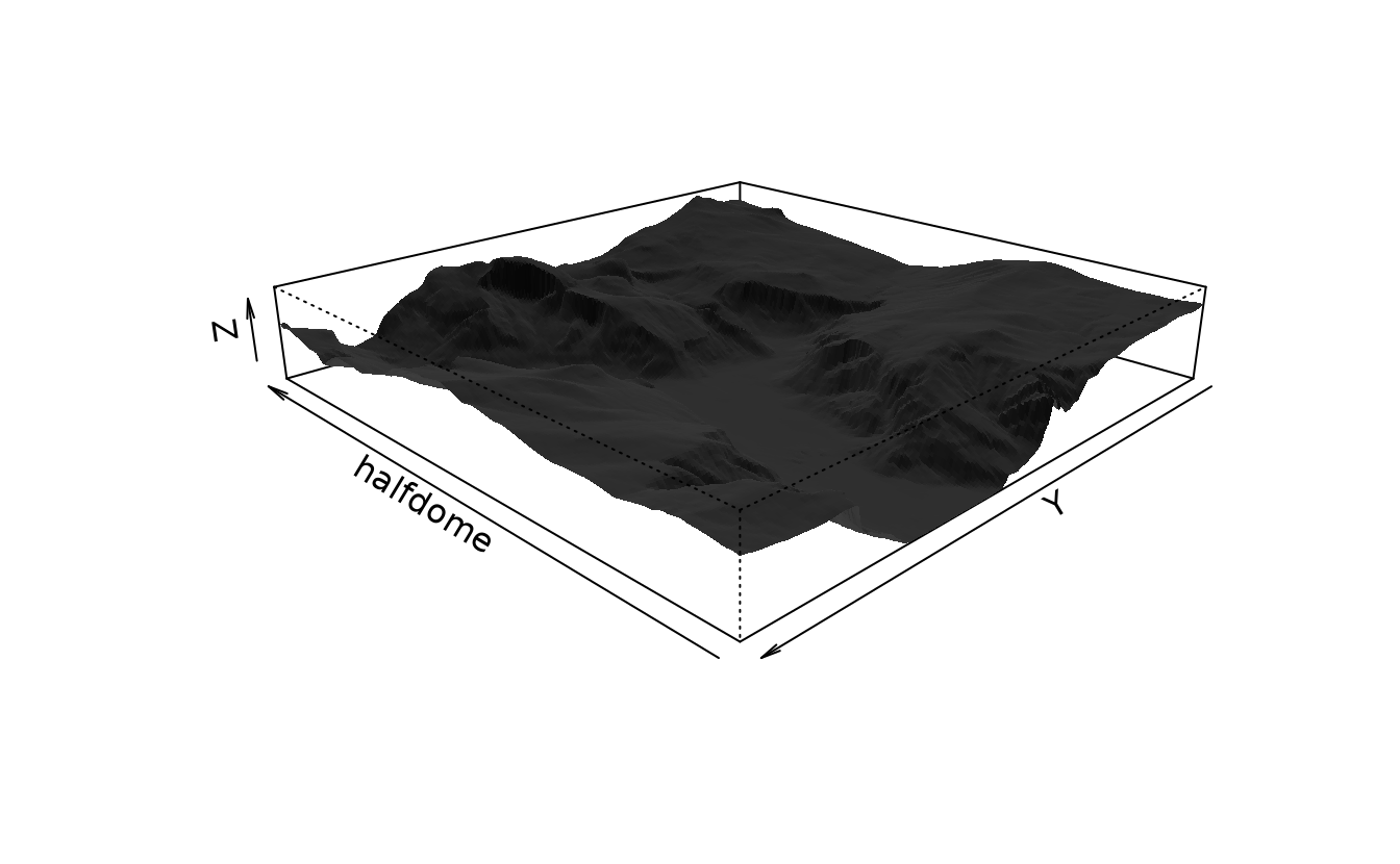
heatmap(yosemite)
5.6.2 image() and contour()
image() plot a matrix of data points as a grid of boxes, color coding the boxes based on the intensity at each location.
aspspecifies an aspect ratio that matches the dimensions of the data;
ylimspecifies that data is plotted from top to bottom
image(yosemite, asp = col/row, col = sapply((0:32)/32, gray))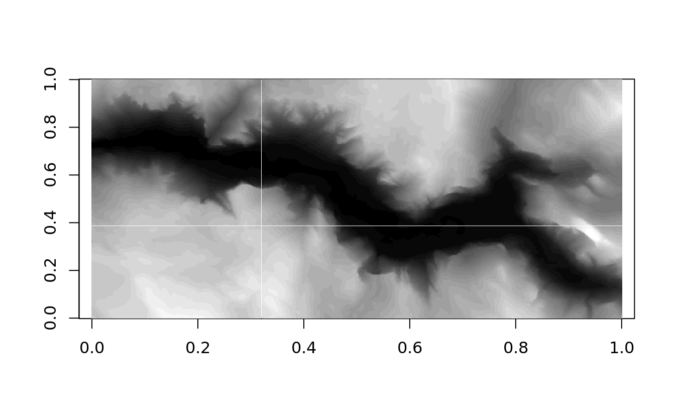
contour(yosemite, asp = col/row, ylim = c(1,0))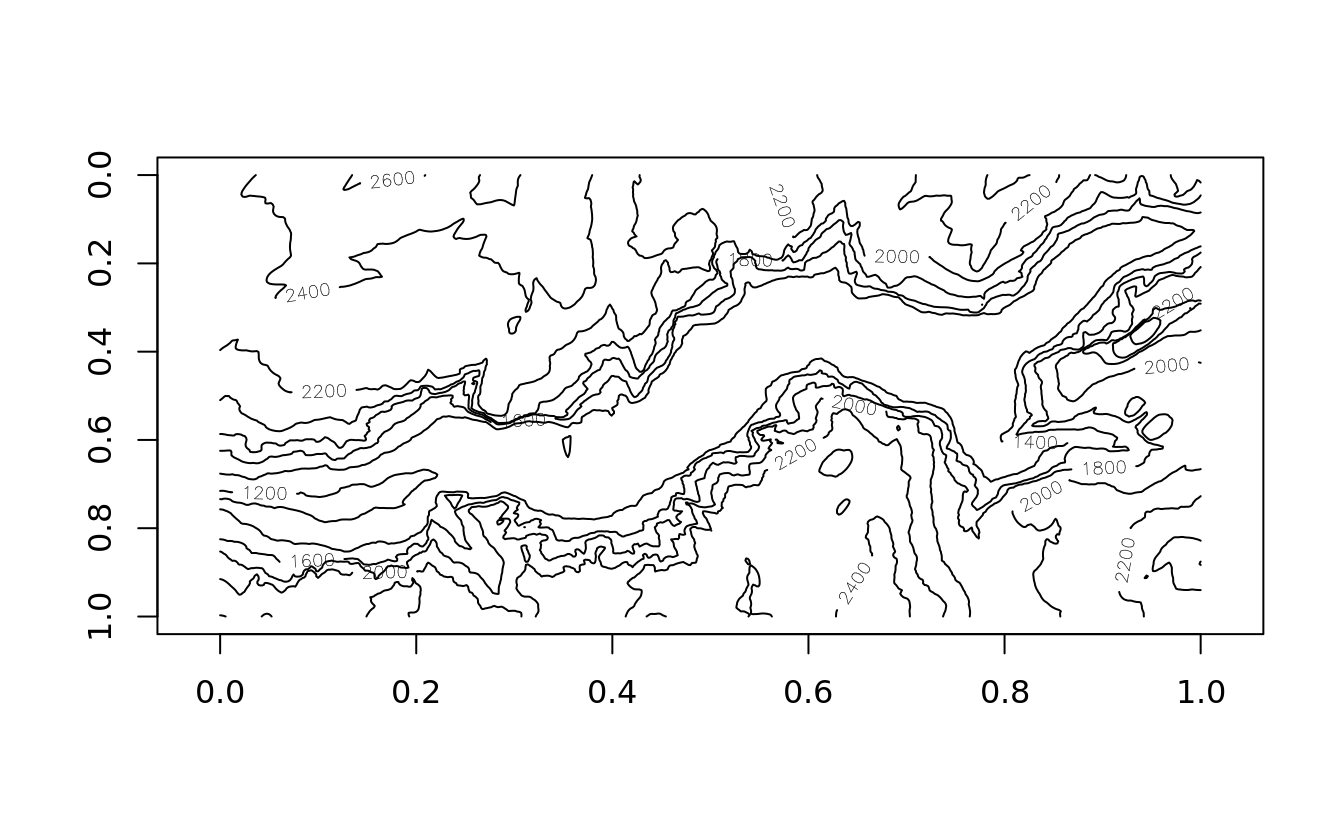
Contours are commonly added to existing image plots:
image(yosemite, asp = col/row, ylim = c(1,0), main = 'image + contour')
contour(yosemite, asp = col/row, ylim = c(1,0), add = T)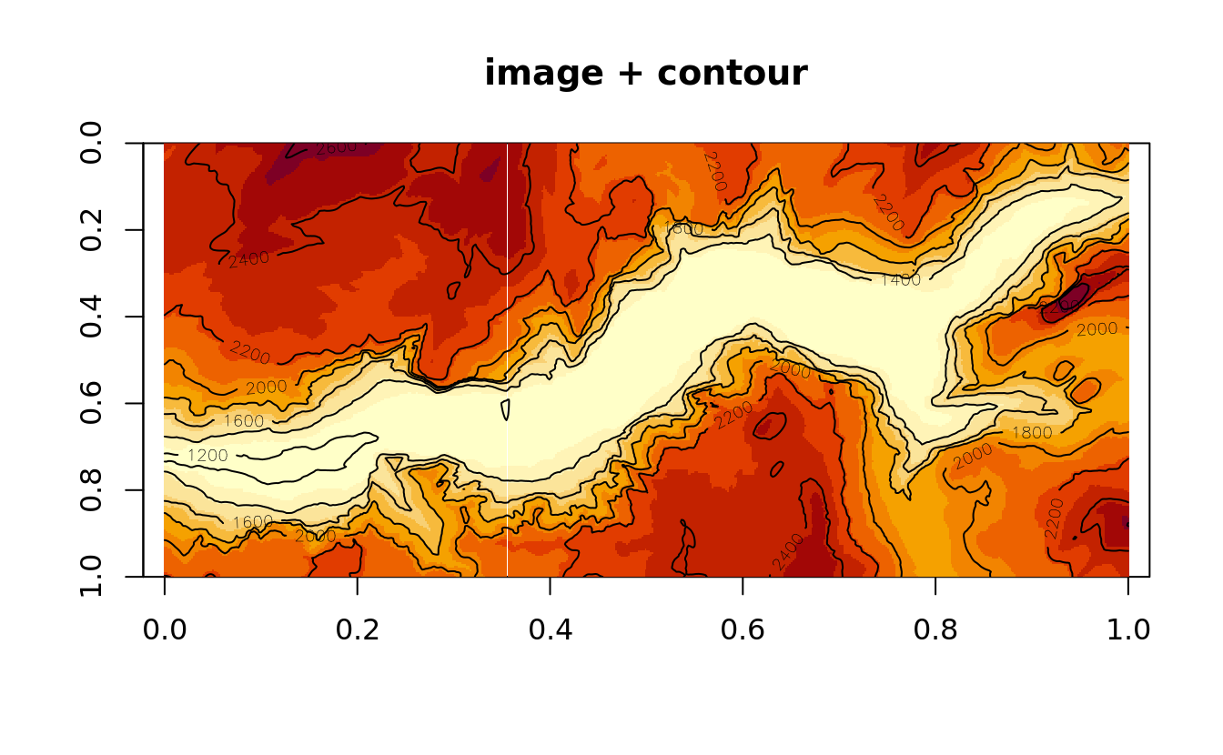
5.7 graphics: customizing charts
5.7.1 graphical parameters
- get
par("bg")
#> [1] "white"
head(par(),3)
#> $xlog
#> [1] FALSE
#>
#> $ylog
#> [1] FALSE
#>
#> $adj
#> [1] 0.5- set
par(bg = "transparent")5.7.2 mutliple plots
par(mfcol = c(2,2))

pie(5:1)
plot(1:400,rnorm(400))
qqnorm(rnorm(100))
hist(rnorm(10000))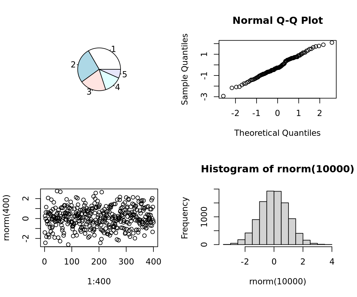
5.7.3 low-level graphics functions
abline()
plot(x = c(0,10),y = c(0,10), main = 'add lines')
abline(h = 4.5, col = 'red')
abline(v = 3.5, col = 'blue')
abline(a = 1, b = 1, col = 'green')
abline(coef  =  c(10,-1))
abline(h = 1:10,v = 1:10, col = 'gray')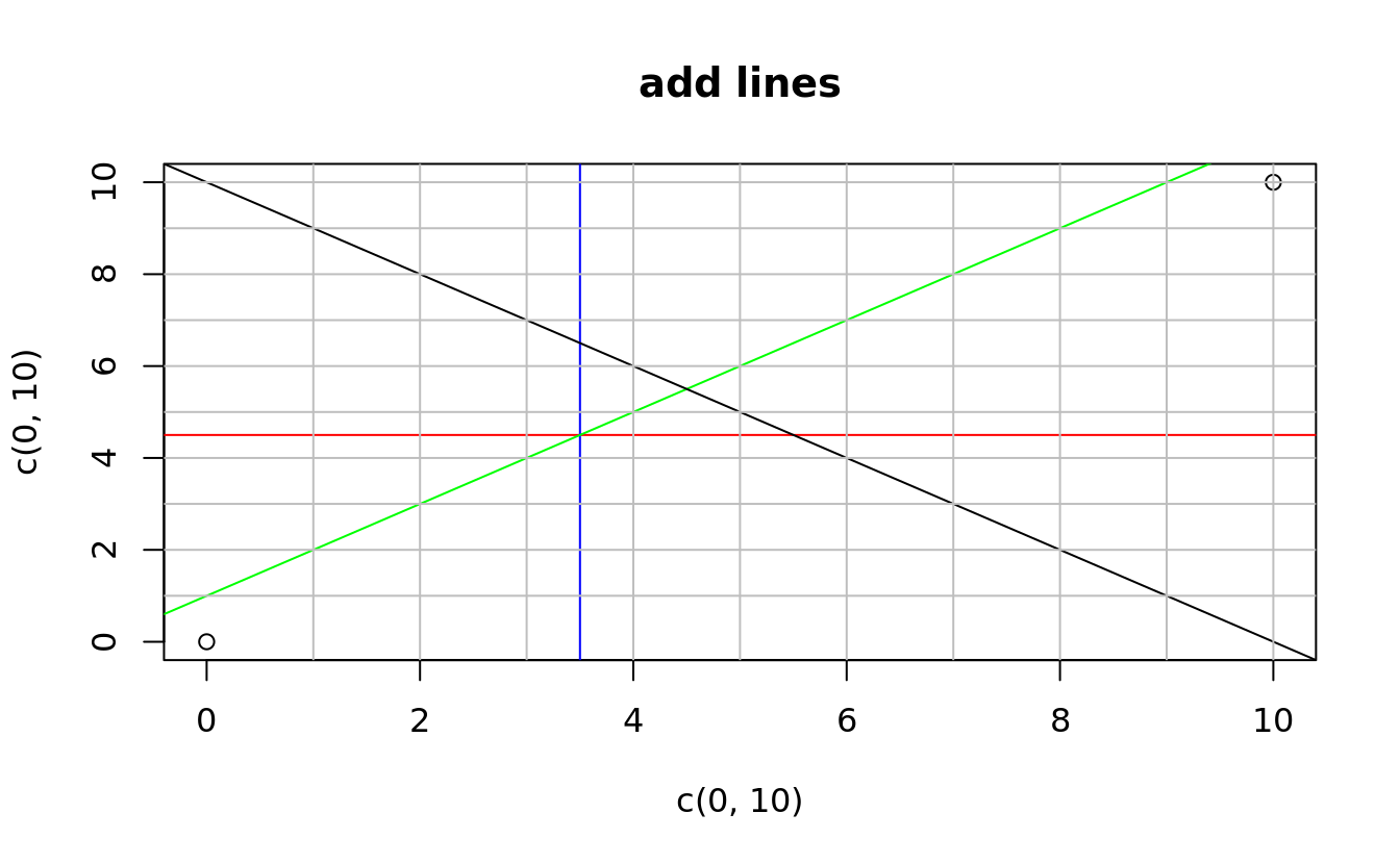
polygon()
plot(x = c(0,10),y = c(0,10), main = 'add polygon')
polygon(x = c(2,2,4,4),y = c(2,4,4,2))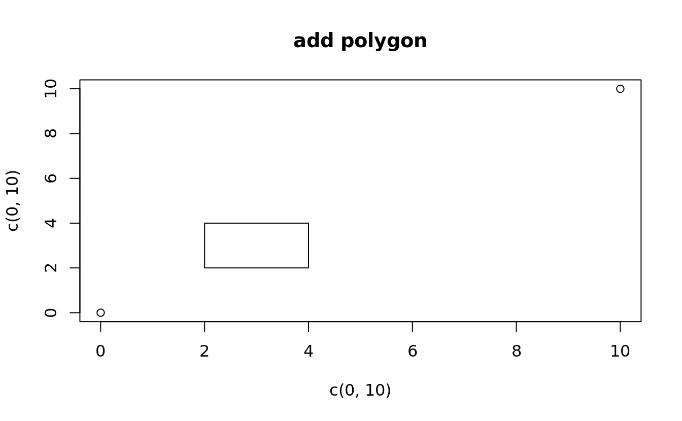
5.8 lattice: introduction
library(lattice)
library(nutshell)
library(learningr)

data(obama_vs_mccain, crab_tag)
data(births2006.smpl, tires.sus, sanfrancisco.home.sales, team.batting.00to08)

births = births2006.smpl
san = sanfrancisco.home.sales
obama_vs_mccain = obama_vs_mccain[!is.na(obama_vs_mccain$Turnout), ]
ovm = within(obama_vs_mccain, Region <- reorder(Region, Obama, median))
ovm2 <- ovm[!(ovm$State %in% c("Alaska", "Hawaii")), ]
5.8.1 how lattice works
- The end user calls a high-level lattice plotting function.
- The lattice function examines the calling arguments and default parameters, assembles a lattice object, and returns the object. (Note that the class of the object is actually trellis.)
- The user calls plot.trellis or plot.trellis with the lattice object as an argument. (This typically happens automatically on the R console.)
- The function plot.trellis sets up the matrix of panels, assigns packets to different panels and then calls the panel function specified in the lattice object to draw the individual panels.
5.8.2 a simple example
(d <- data.frame(x = c(0:9), y = c(1:10), z = c(rep(c("a", "b"), times = 5))))
#>    x  y z
#> 1  0  1 a
#> 2  1  2 b
#> 3  2  3 a
#> 4  3  4 b
#> 5  4  5 a
#> 6  5  6 b
#> 7  6  7 a
#> 8  7  8 b
#> 9  8  9 a
#> 10 9 10 bxyplot(y~x, data = d)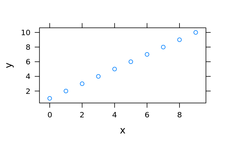
xyplot(y~x, groups = z, data = d)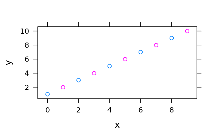
xyplot(y~x | z, data = d)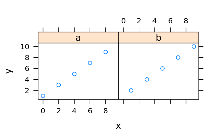
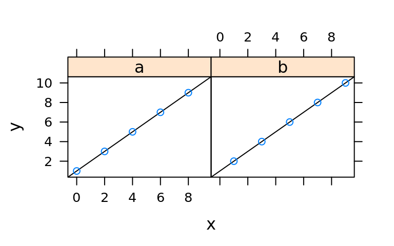
xyplot(
    y~x | z, data = d,
    panel = function(...){
        panel.abline(a = 1,b = 1)
        panel.xyplot(...)
    }
)
5.8.3 store lattice plots and update
(lat1 <- xyplot(Turnout ~ Income | Region,obama_vs_mccain))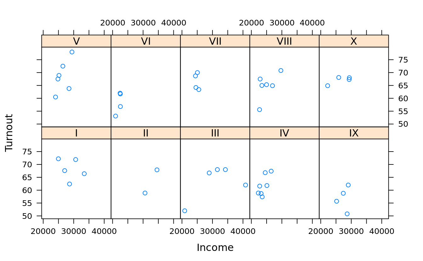
(lat2 <- update(lat1, col = "violet", pch = 20))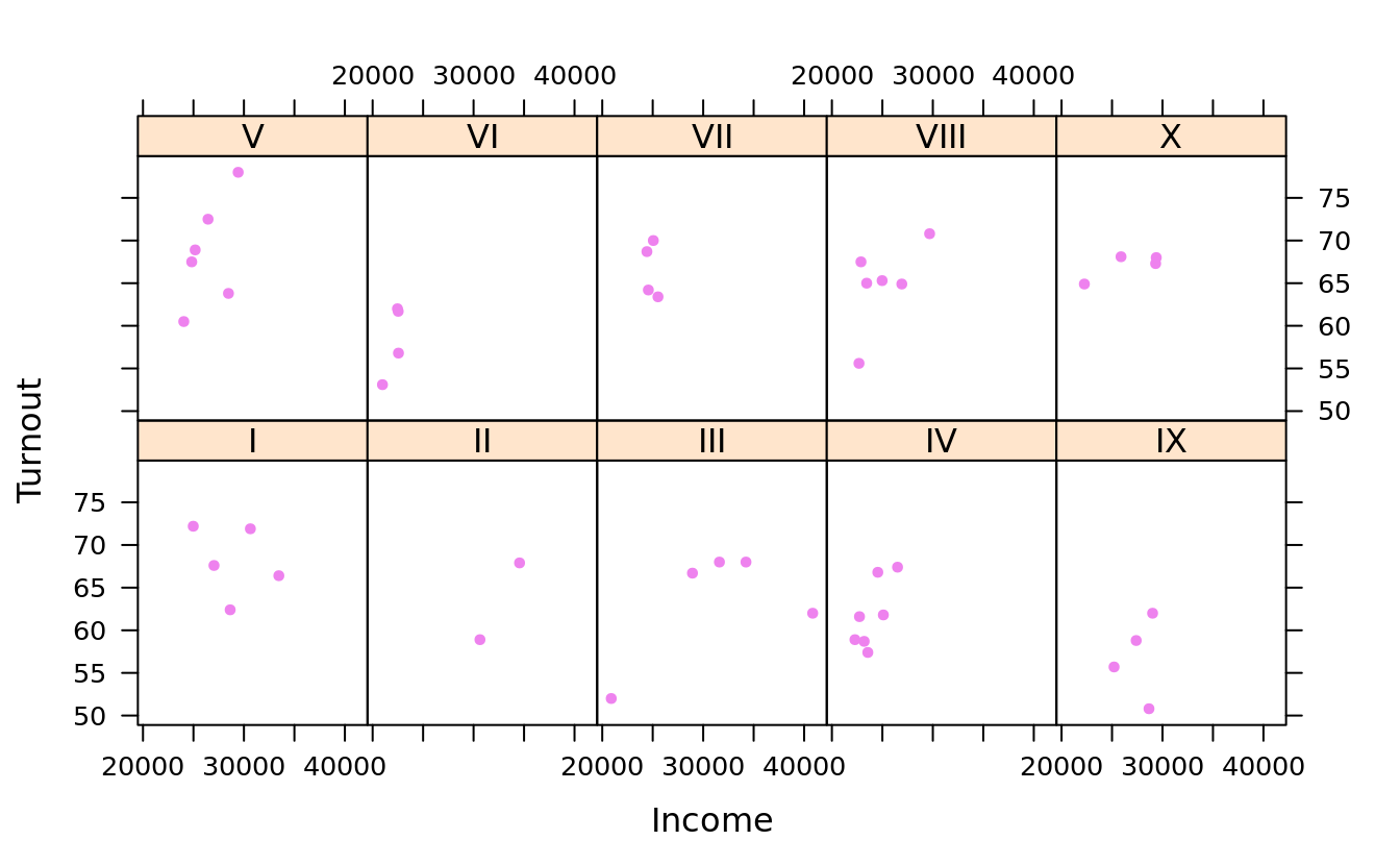
5.9 lattice: univariate plot
5.9.1 bar chart
- one-dimentional table
(births.dow <- table(births$DOB_WK))
#>
#>     1     2     3     4     5     6     7
#> 40274 62757 69775 70290 70164 68380 45683

barchart(births.dow)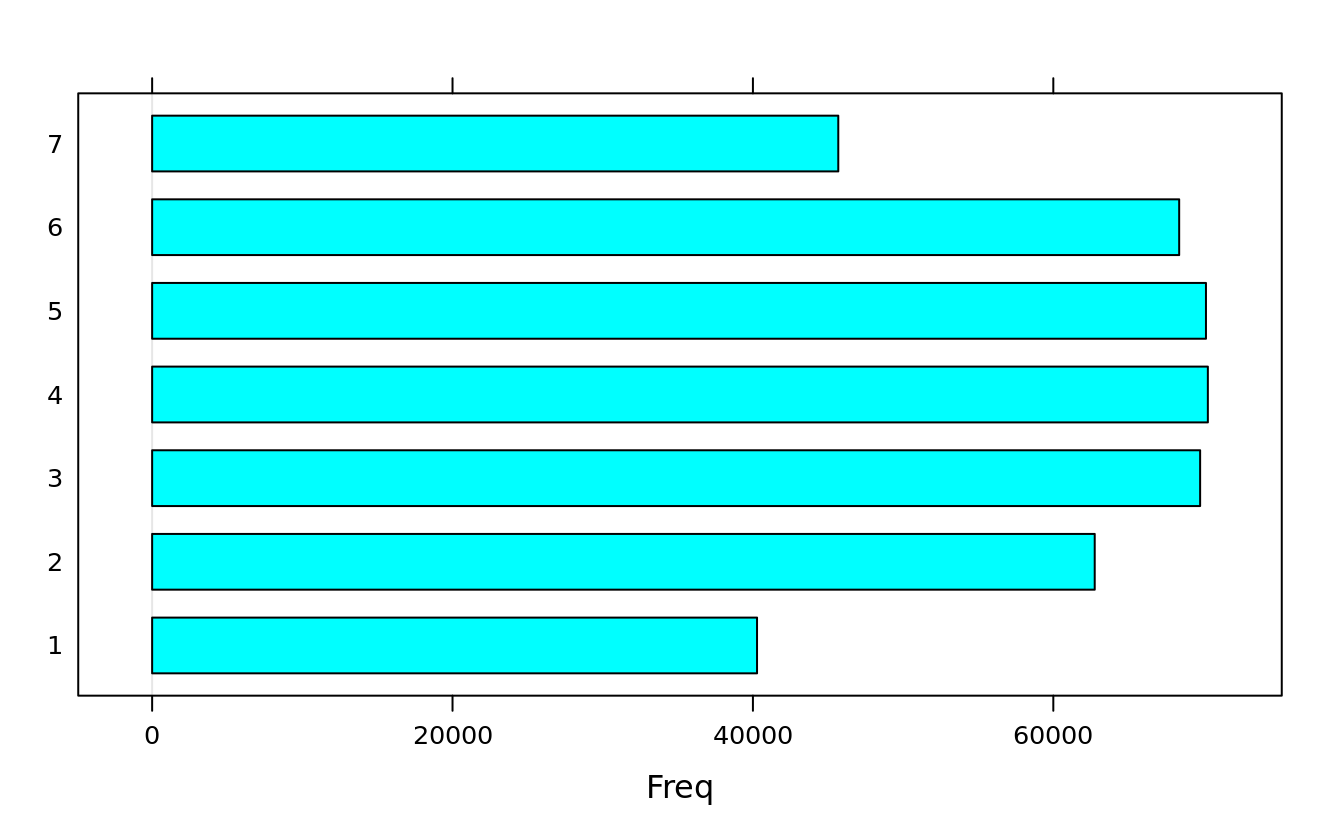
- two-dimensional table
births2006.dm <- plyr::mutate(births[births$DMETH_REC != "Unknown",],
                              DMETH_REC = as.factor(as.character(DMETH_REC)))
(dob.dm.tbl <- with(births2006.dm, table(WK = DOB_WK,MM = DMETH_REC)))
#>    MM
#> WK  C-section Vaginal
#>   1      8836   31348
#>   2     20454   42031
#>   3     22921   46607
#>   4     23103   46935
#>   5     22825   47081
#>   6     23233   44858
#> 7 10696 34878barchart(dob.dm.tbl)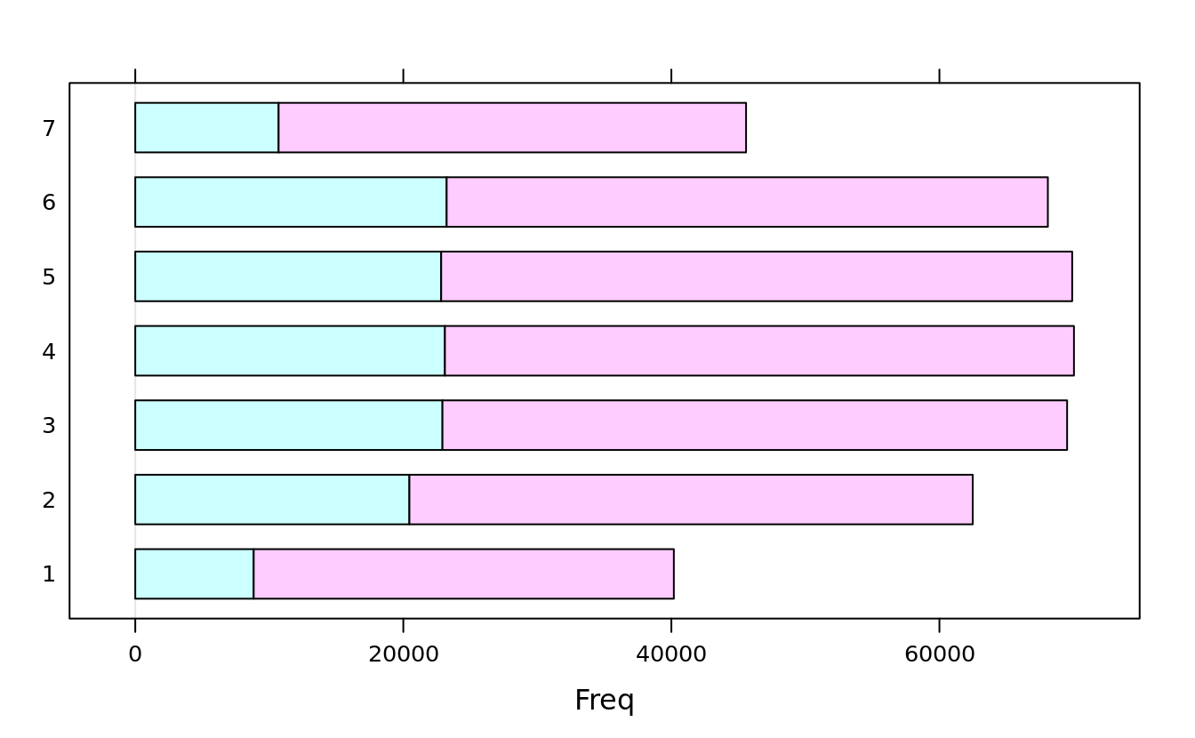
barchart(dob.dm.tbl, stack = F, auto.key = T)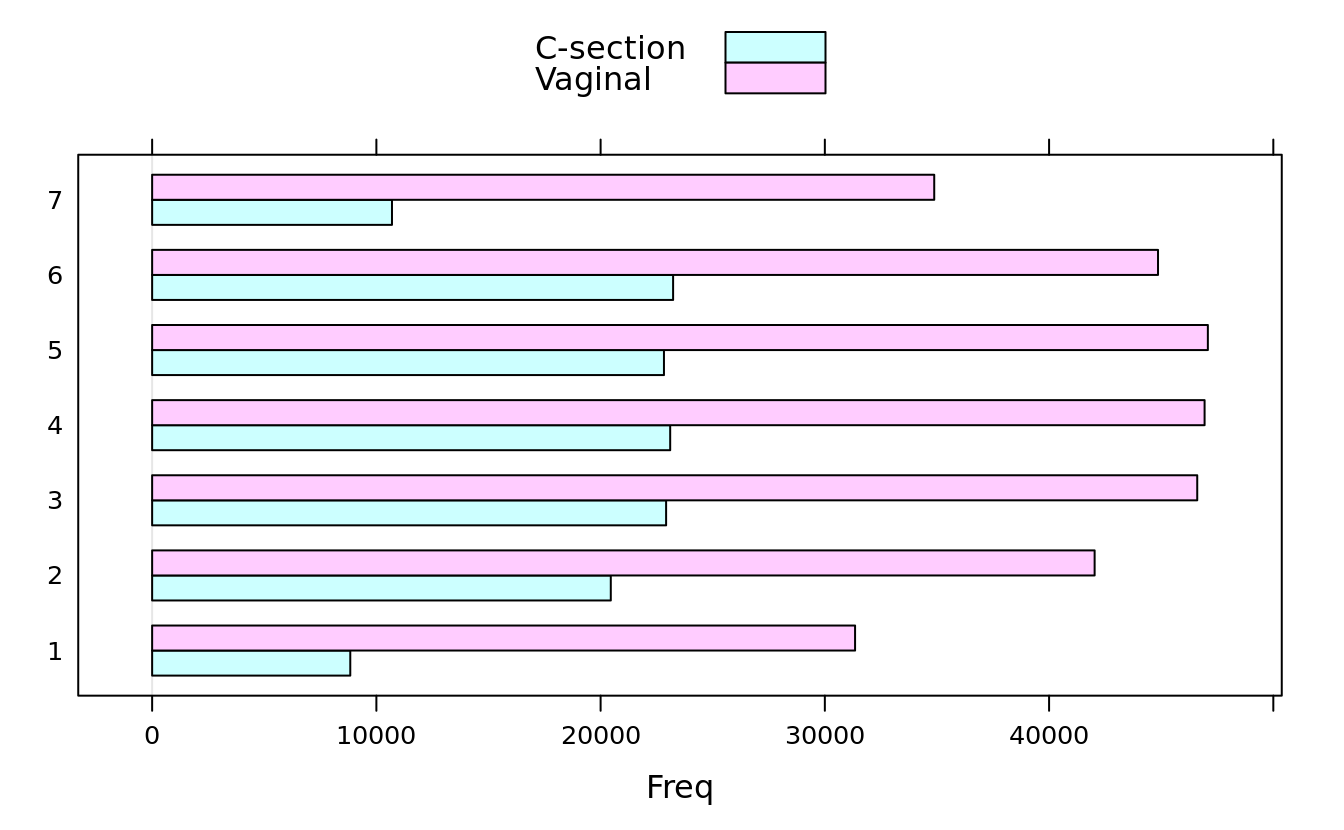
barchart(dob.dm.tbl, horizontal = F, groups = F)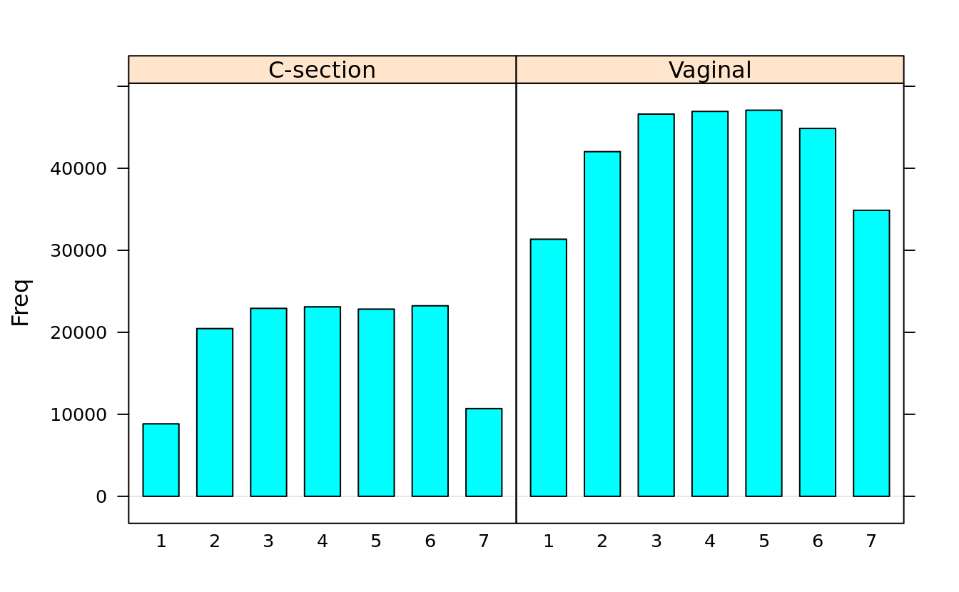
- data frame
ovm2 %>% tibble::as_tibble()
#> # A tibble: 45 x 15
#>    State Region Obama McCain Turnout Unemployment Income Population Catholic
#>    <fct> <fct>  <dbl>  <dbl>   <dbl>        <dbl>  <int>      <int>    <int>
#>  1 Alab… IV      38.7  60.3     61.6          5.9  22732    4802982        6
#>  2 Ariz… IX      44.9  53.4     55.7          7.1  25203    6412700       29
#>  3 Arka… VI      38.9  58.7     53.1          5.8  20977    2926229        8
#>  4 Cali… IX      60.9  36.9     62            8.2  29020   37341989       37
#>  5 Colo… VIII    53.7  44.7     70.8          5.4  29679    5044930       21
#>  6 Dist… III     92.5   6.53    62            7.4  40846     601723       13
#>  7 Dela… III     61.9  36.9     66.7          5.9  28935     900877       26
#>  8 Flor… IV      50.9  48.1     67.4          7.3  26503   18900773       27
#>  9 Geor… IV      46.9  52.1     61.8          7.2  25098    9727566        9
#> 10 Idaho X       35.9  61.2     64.9          5.7  22262    1573499       10
#> # … with 35 more rows, and 6 more variables: Protestant <int>, Other <int>,
#> # Non.religious <int>, Black <dbl>, Latino <dbl>, Urbanization <dbl>barchart(State ~ Catholic, ovm2)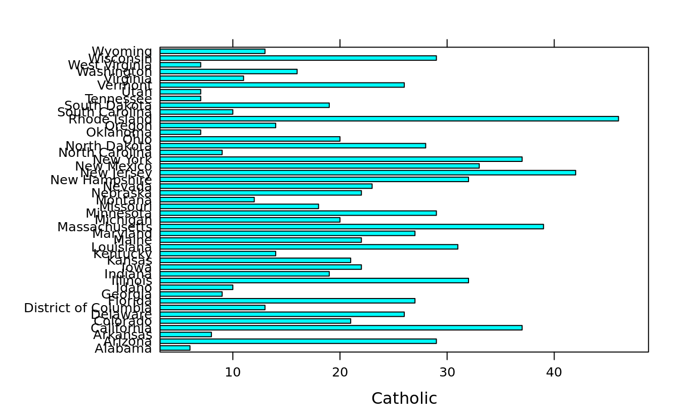
barchart(State ~ Catholic + Protestant + Non.religious + Other, ovm2, stack = T)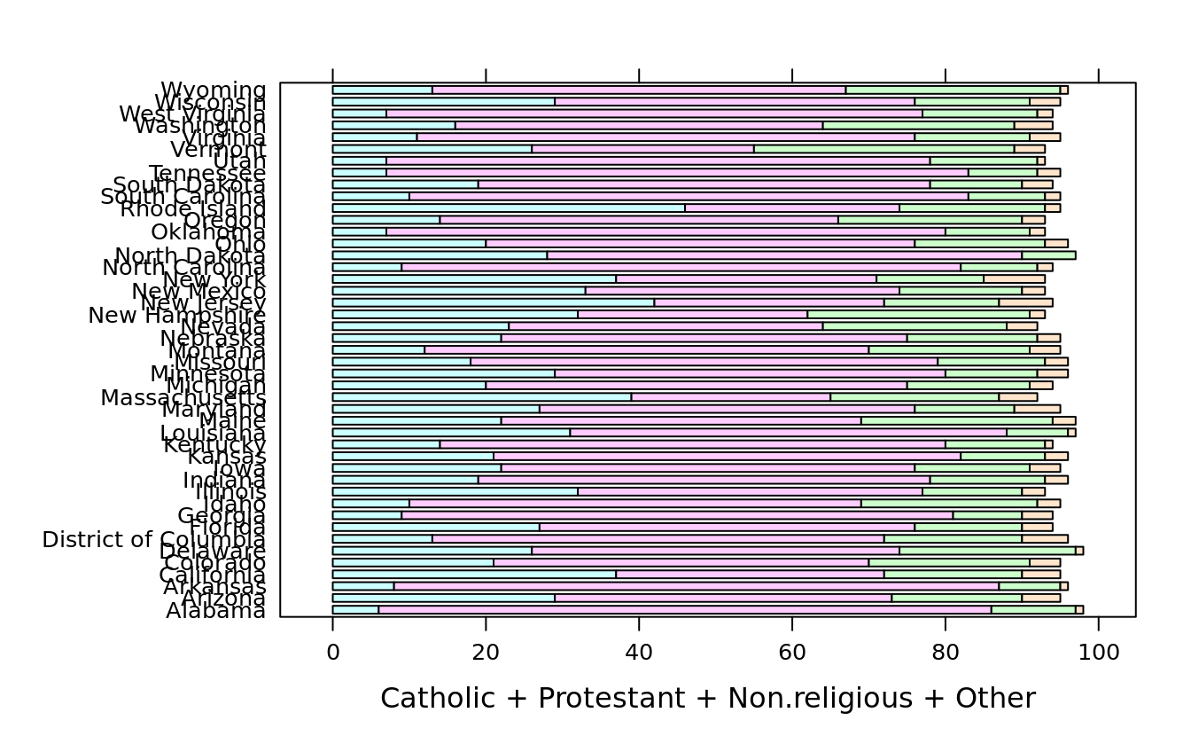
5.9.2 dot plot
- three-dimensional table
(dob.dm.tbl.alt <- with(births2006.dm, table(week = DOB_WK, month = DOB_MM, meths = DMETH_REC)))
#> , , meths = C-section
#>
#>     month
#> week    1    2    3    4    5    6    7    8    9   10   11   12
#>    1  755  630  616  833  653  684  878  696  754  882  652  803
#>    2 1737 1475 1558 1641 1885 1667 2100 1691 1468 2049 1744 1439
#>    3 2044 1792 1686 1769 2090 1654 1589 2389 1936 2308 1844 1820
#>    4 1691 1738 2103 1678 2151 1860 1846 2306 1809 1779 2291 1851
#>    5 1663 1669 2114 1699 1787 2269 1872 2264 1891 1810 1946 1841
#>    6 1571 1767 2156 1678 1726 2292 1985 1825 2394 1821 1722 2296
#>    7  734  784  787  984  774  778 1123  853 1091  893  820 1075
#>
#> , , meths = Vaginal
#>
#>     month
#> week    1    2    3    4    5    6    7    8    9   10   11   12
#>    1 2881 2289 2341 2778 2313 2341 3093 2459 2511 3072 2341 2929
#>    2 3892 3239 3205 3192 3797 3341 4134 3414 3361 4102 3270 3084
#>    3 4196 3490 3546 3509 4355 3513 3542 4807 3847 4563 3750 3489
#>    4 3425 3525 4359 3467 4324 3665 3634 4679 3900 3646 4522 3789
#>    5 3454 3578 4433 3445 3541 4567 3892 4651 3915 3707 4200 3698
#>    6 3236 3517 4152 3337 3231 4298 3756 3684 4598 3422 3328 4299
#>    7 2550 2601 2611 3191 2580 2682 3616 2824 3565 2663 2684 3311

dotplot(dob.dm.tbl.alt, groups = T, auto.key = T, stack = F)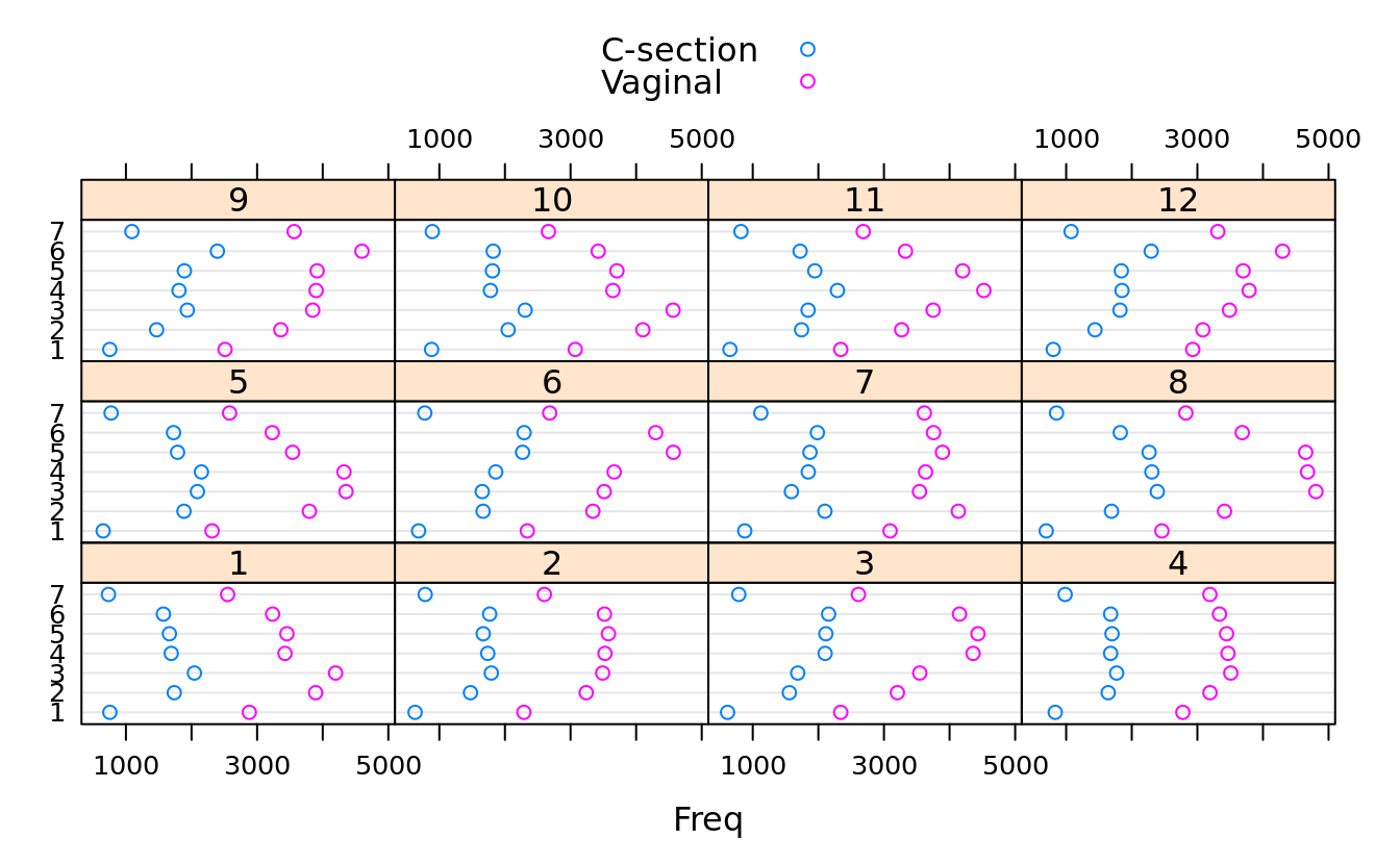
- data frame
tires.sus$Speed_At_Failure_km_h %>% tibble::as_tibble()
#> # A tibble: 66 x 1
#>    value
#>    <int>
#>  1   180
#>  2   180
#>  3   180
#>  4   180
#>  5   180
#>  6   180
#>  7   180
#>  8   180
#>  9   180
#> 10   180
#> # … with 56 more rows

dotplot(as.factor(Speed_At_Failure_km_h) ~ Time_To_Failure | Tire_Type, tires.sus)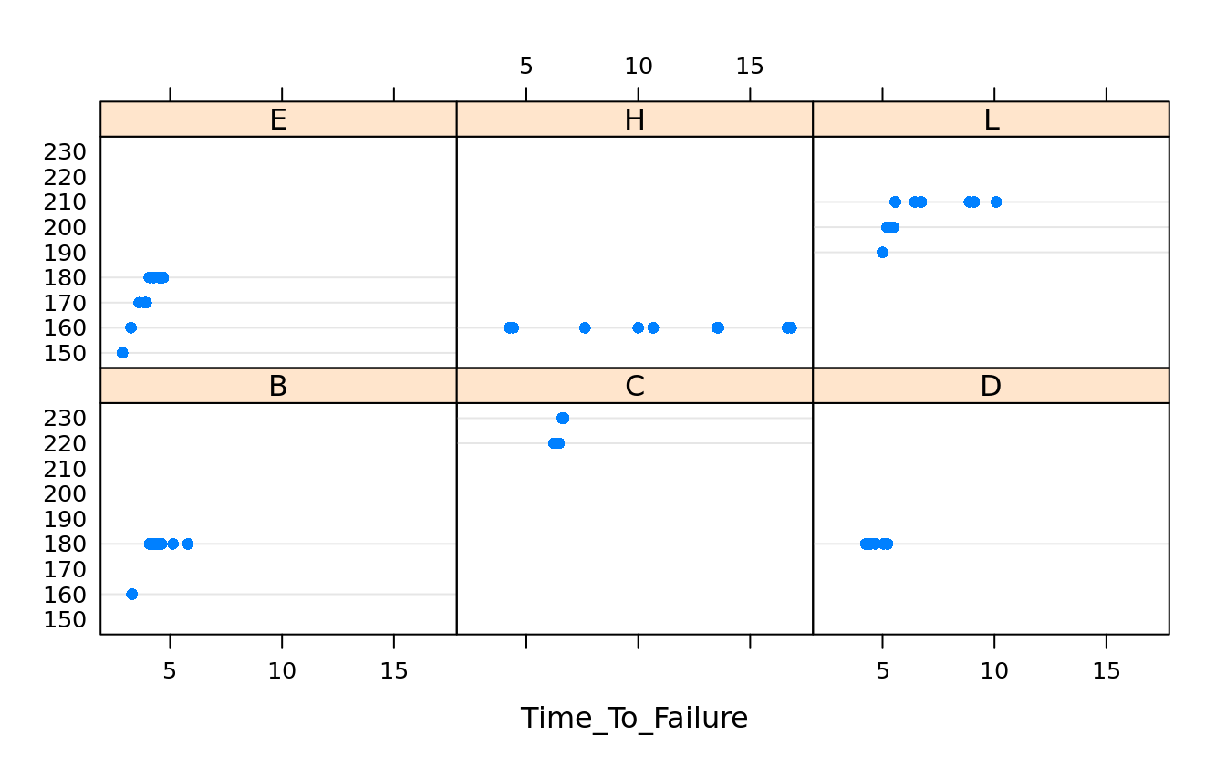
5.9.3 histogram
histogram(~ Obama, obama_vs_mccain) 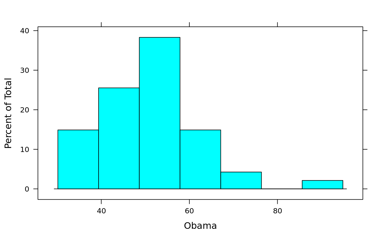
histogram(~ Obama, obama_vs_mccain, breaks = 10)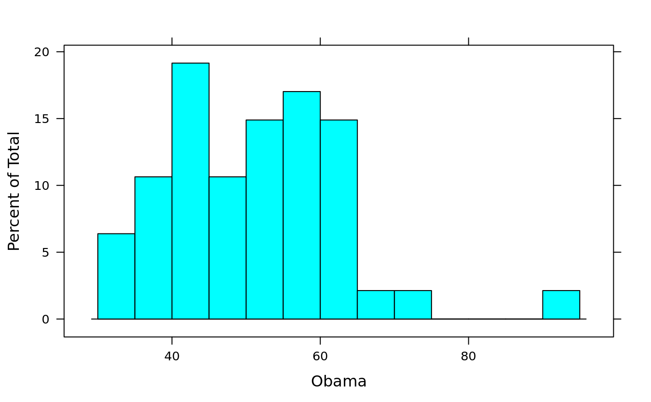
histogram(~ Obama, obama_vs_mccain, type = "percent")
histogram(~ Obama, obama_vs_mccain, type = "count")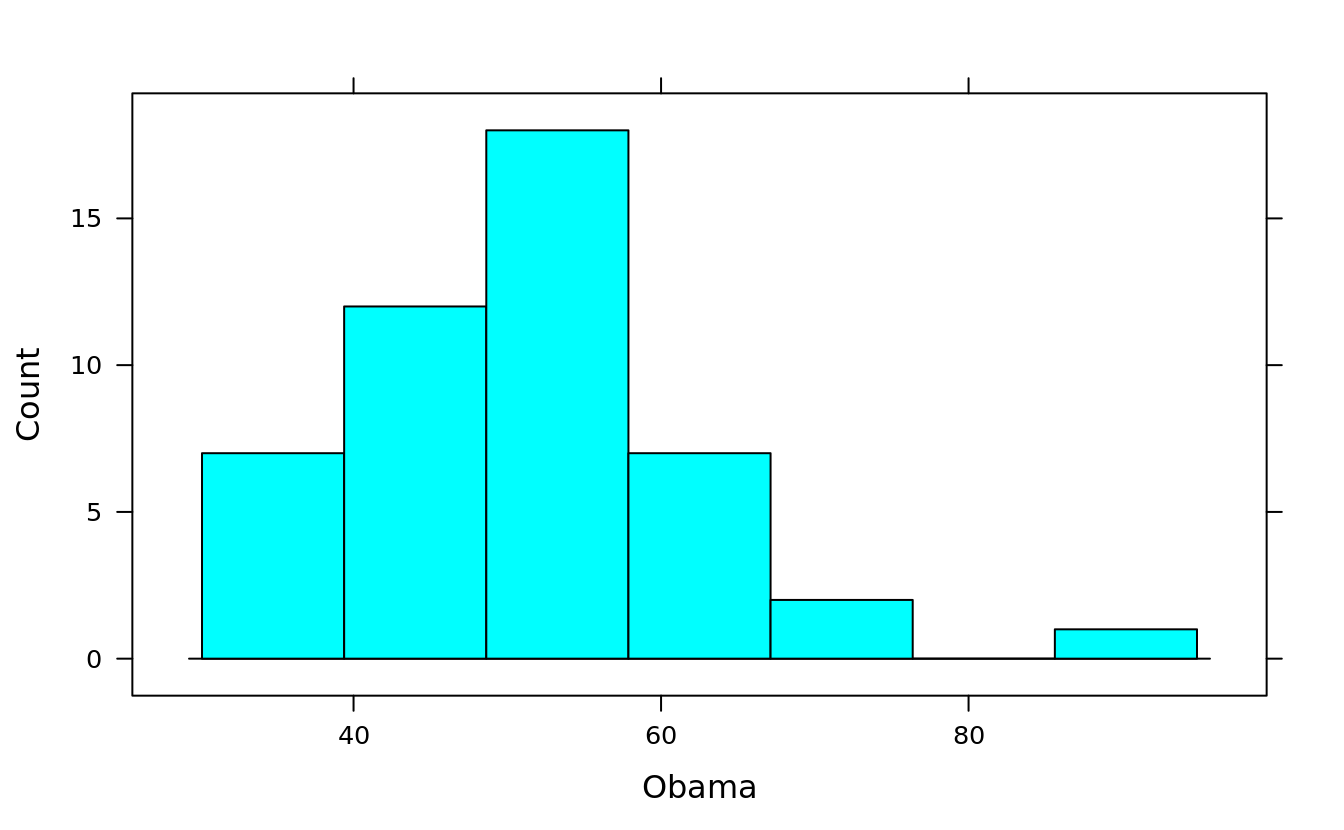
histogram(~ Obama, obama_vs_mccain, type = "density")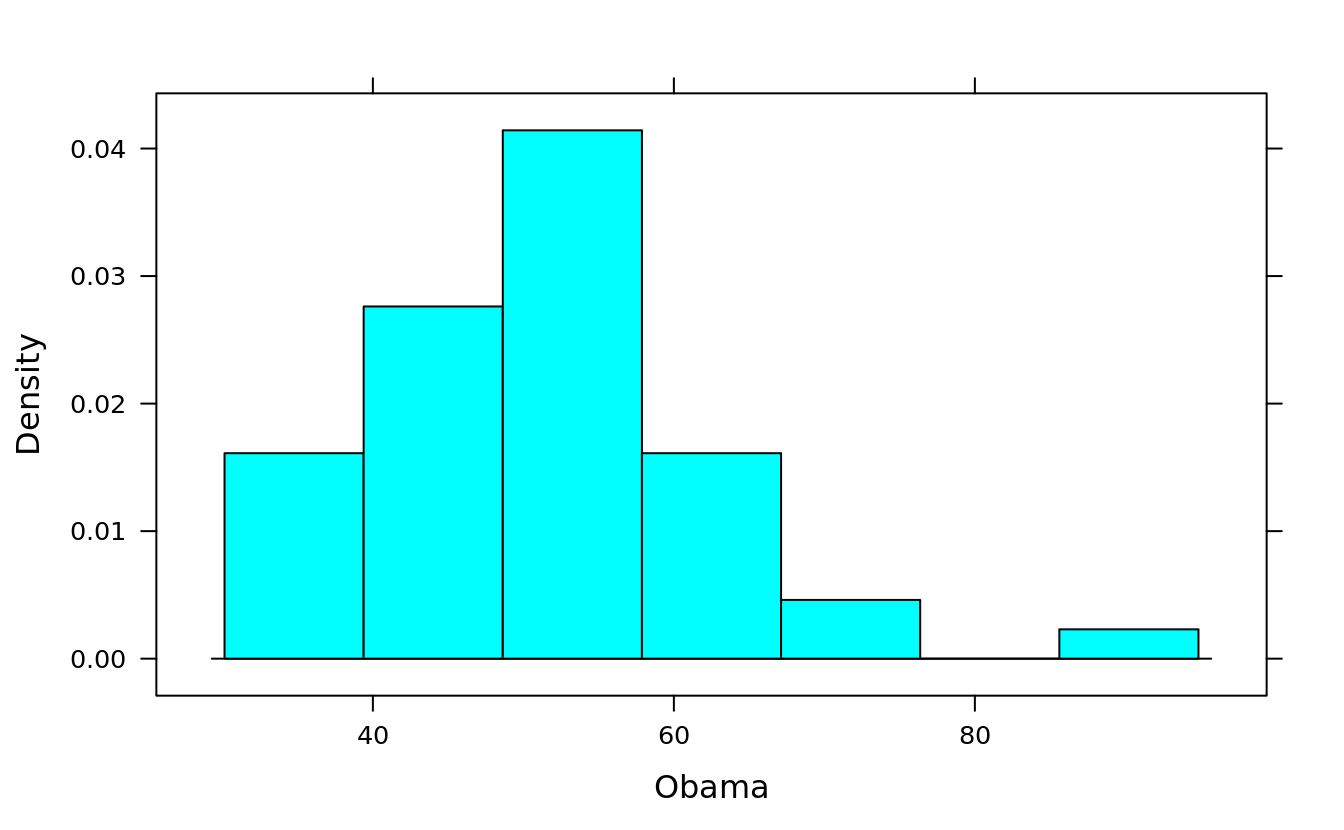
histogram(~DBWT | DPLURAL, births)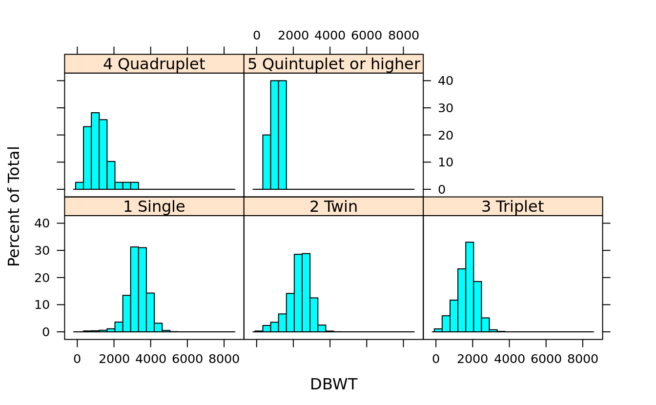
histogram(~DBWT | DPLURAL, births, layout = c(1,5))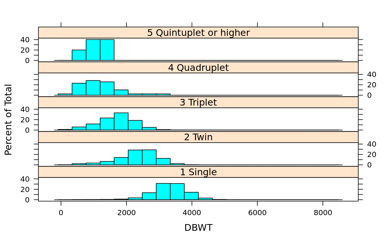
5.9.4 denstity plot
(plur = unique(as.character(births$DPLURAL))[4:5]) #quadruplet or higher
#> [1] "4 Quadruplet"           "5 Quintuplet or higher"
#By default, densityplot will draw a strip chart under each chart:
densityplot(~DBWT | DPLURAL, births, subset = (DPLURAL %in% plur))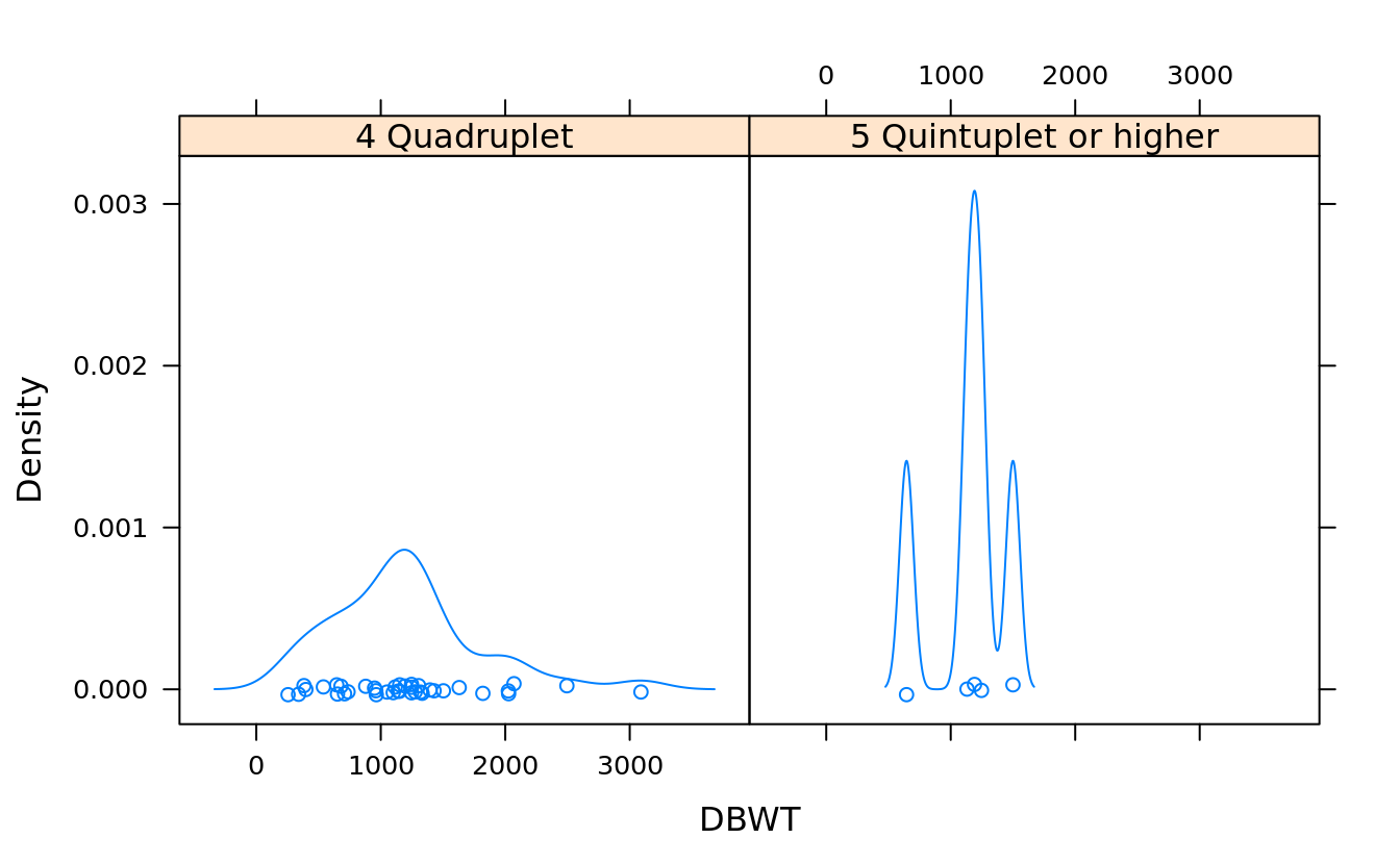
#turn off the strip by plot.points = F because the data set is so big
densityplot(~DBWT | DPLURAL, births, layout = c(1,5), plot.points = F)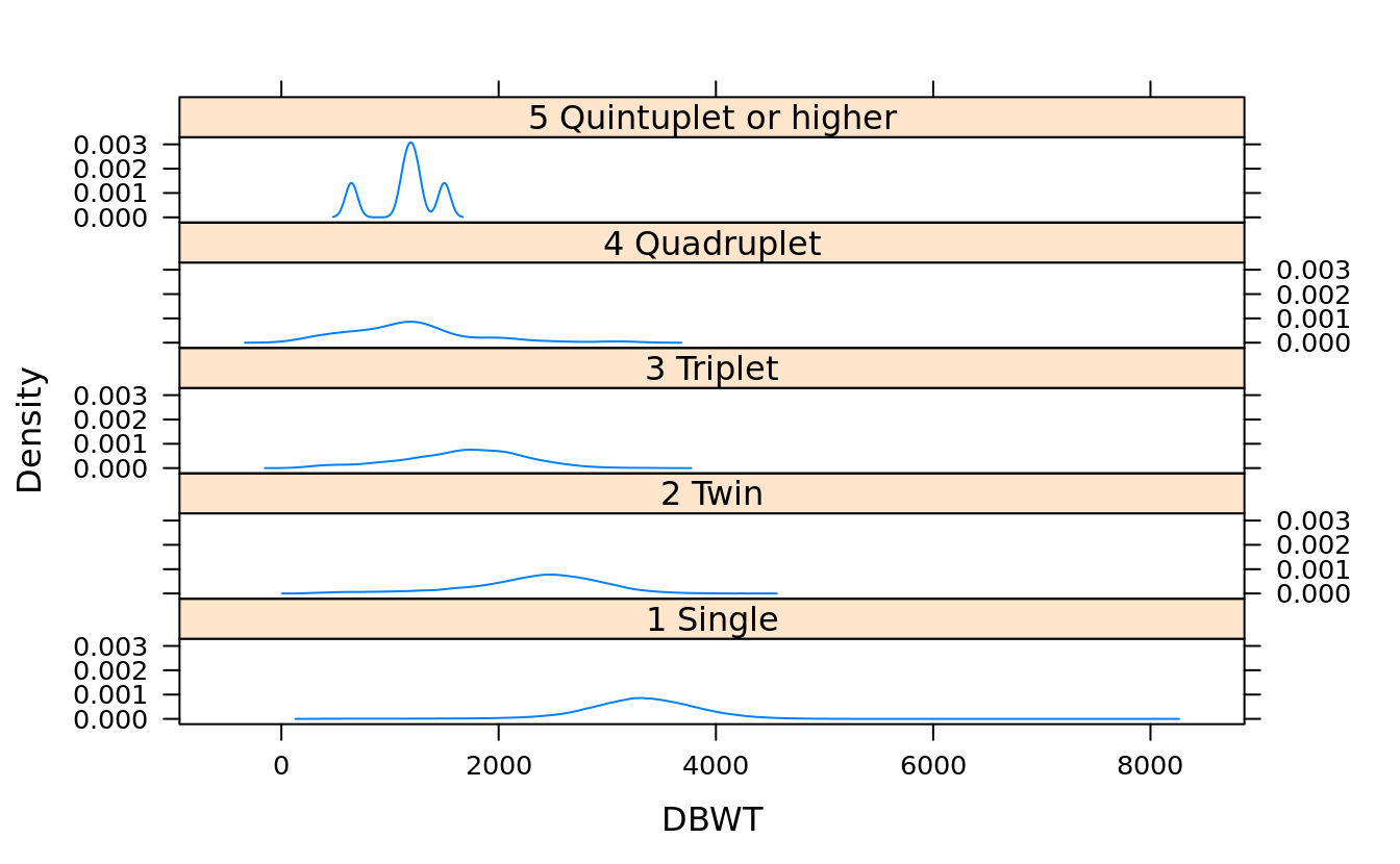
densityplot(~DBWT, groups = DPLURAL, births, plot.points = F, auto.key = T)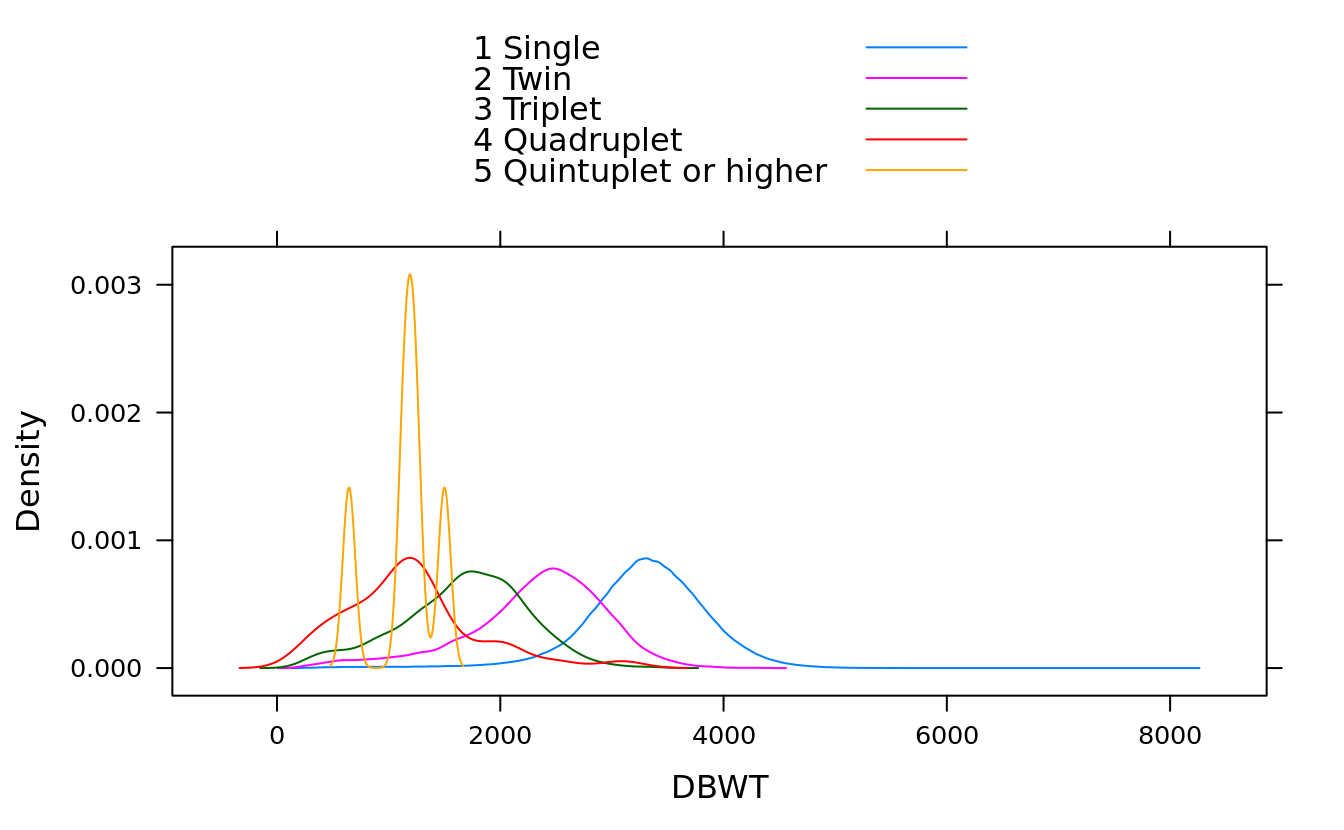
5.9.5 strip plot
You can think of strip plots as one-dimensional scatter plots:
#jitter.data=T adds some random vertical noise to make the points easier to read
stripplot(~DBWT, births, jitter.data = T, subset = (DPLURAL %in% plur))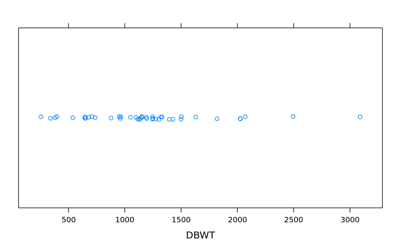
5.9.6 quantile plot
qqmath(rnorm(100000))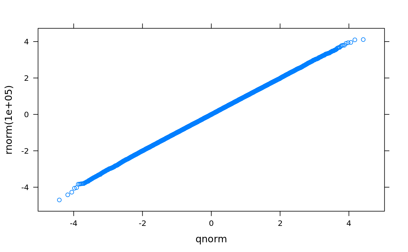
qqmath(~DBWT | DPLURAL, births, pch = 19, cex = .25)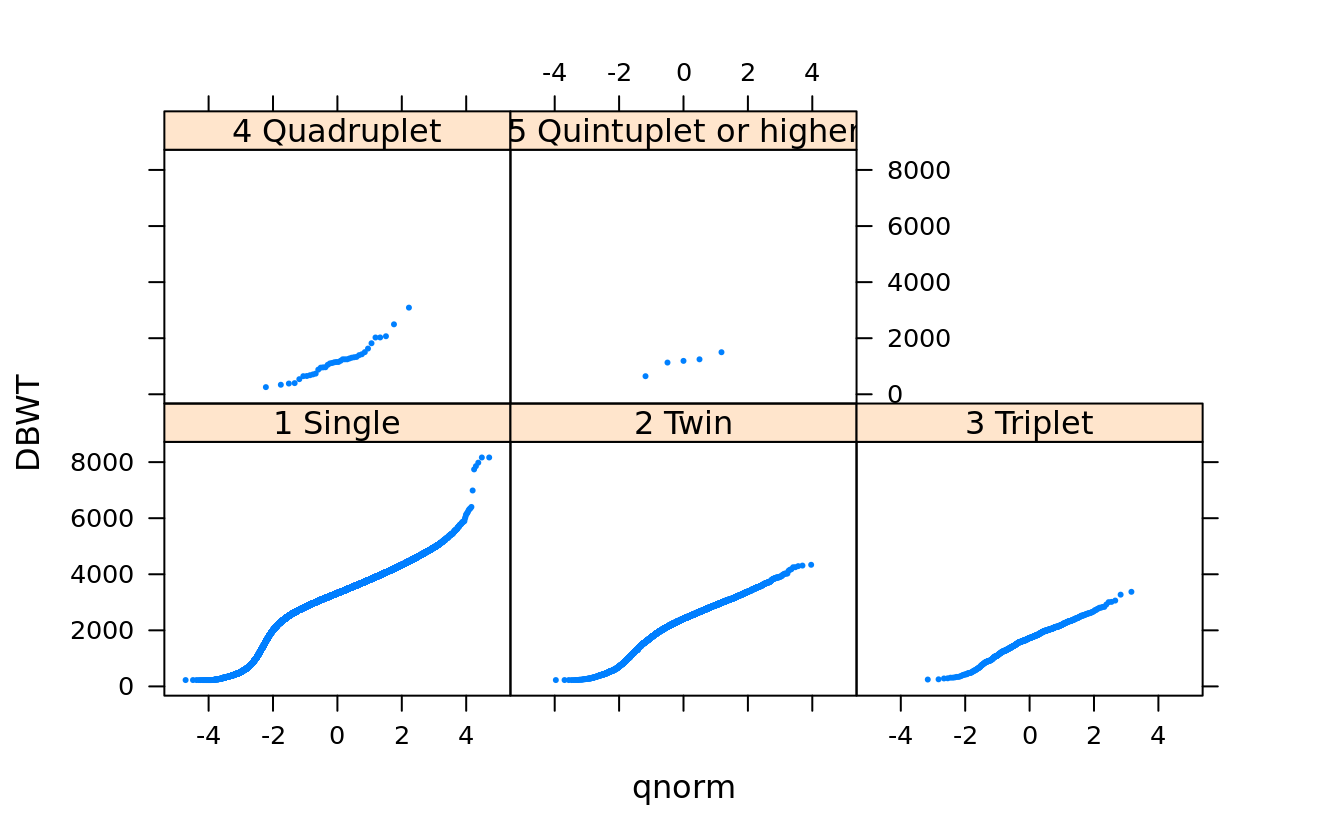
qqmath(~price, san)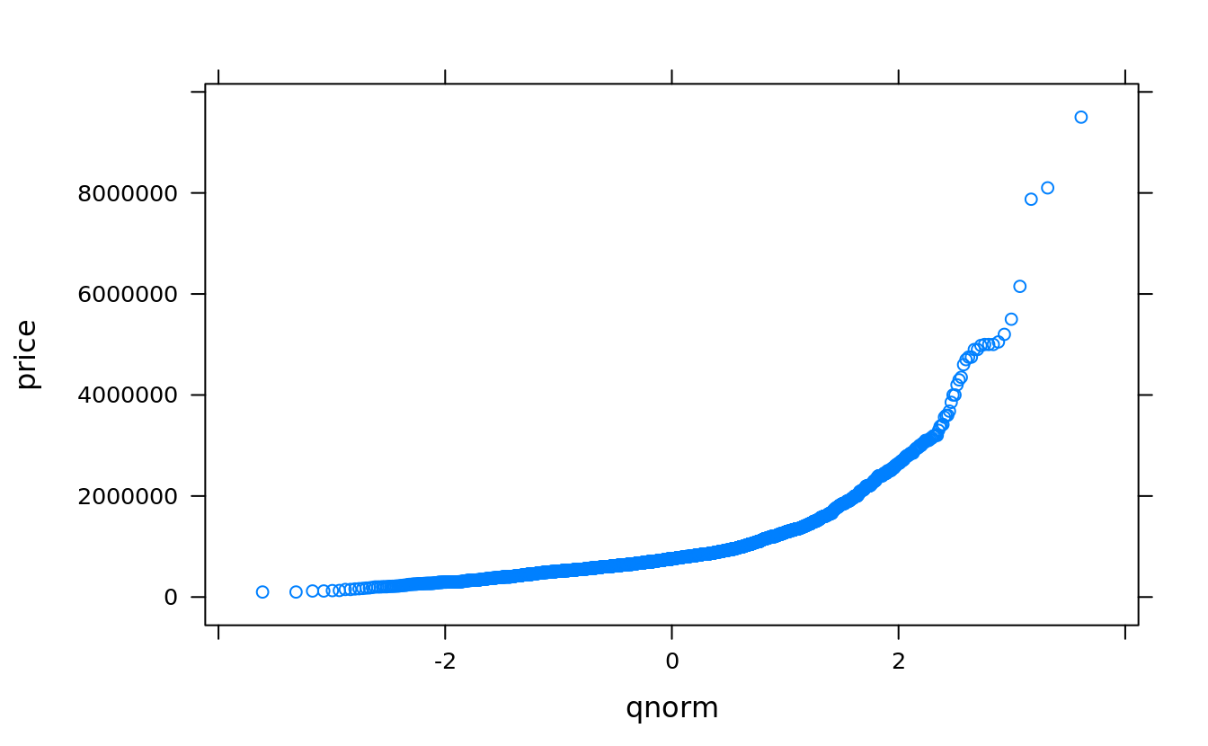
qqmath(~log(price), san)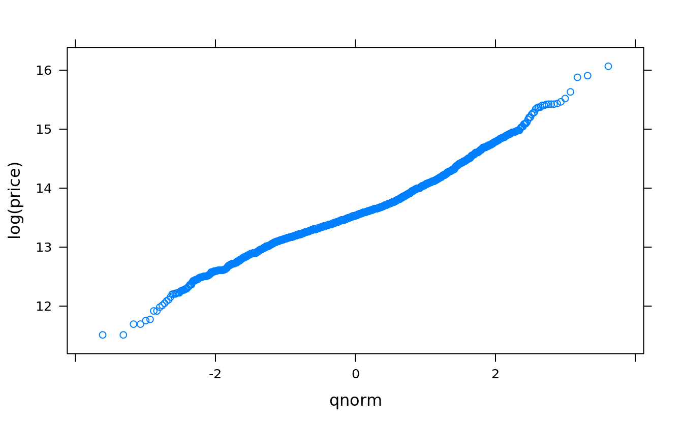
qqmath(~log(price), groups = bedrooms, auto.key = T, type = "smooth",
       subset(san, !is.na(bedrooms) & bedrooms > 0 & bedrooms < 7))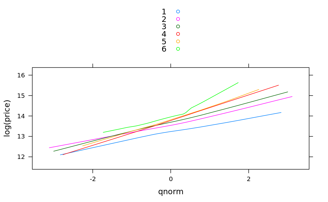
#using subset parameter causes unused factor levels:
qqmath(~log(price), groups = bedrooms, san, auto.key = T, type = "smooth",
       subset = !is.na(bedrooms) & bedrooms > 0 & bedrooms < 7)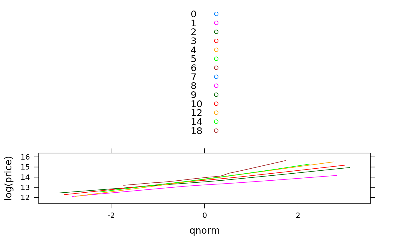
#we use subset parameter because NA is cleaned up:
qqmath(~log(price), groups = Hmisc::cut2(squarefeet, g = 6), san,
       subset = !is.na(squarefeet), type = "smooth", auto.key = T)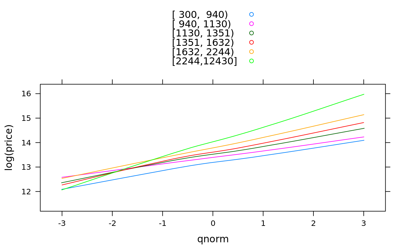
5.10 lattice: bivariate plot
5.10.1 scatter plot
xyplot(Turnout ~ Income, obama_vs_mccain, col = "violet", pch = 20)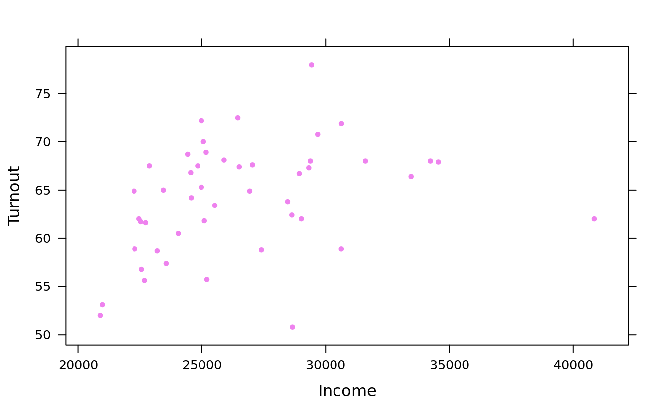
## use `list(log = TRUE)` to log-scale both axes
xyplot(Turnout ~ Income, obama_vs_mccain, scales = list(y = list(log = TRUE))) 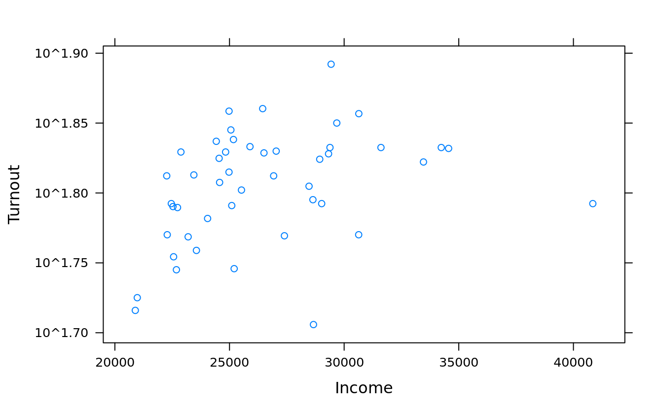
#relation = "same" means that each panel shares the same axes.
#alternating = T(default) means axis ticks for each panel are drawn on alternating sides of the plot, otherwise just the left and bottom
xyplot(Turnout ~ Income | Region, obama_vs_mccain, layout = c(5, 2),
       scales = list(log = T, relation = "same", alternating = F))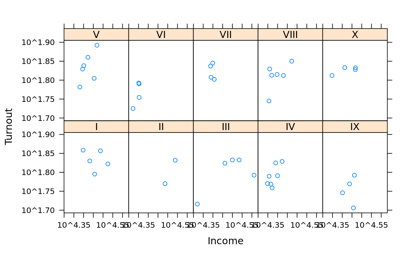
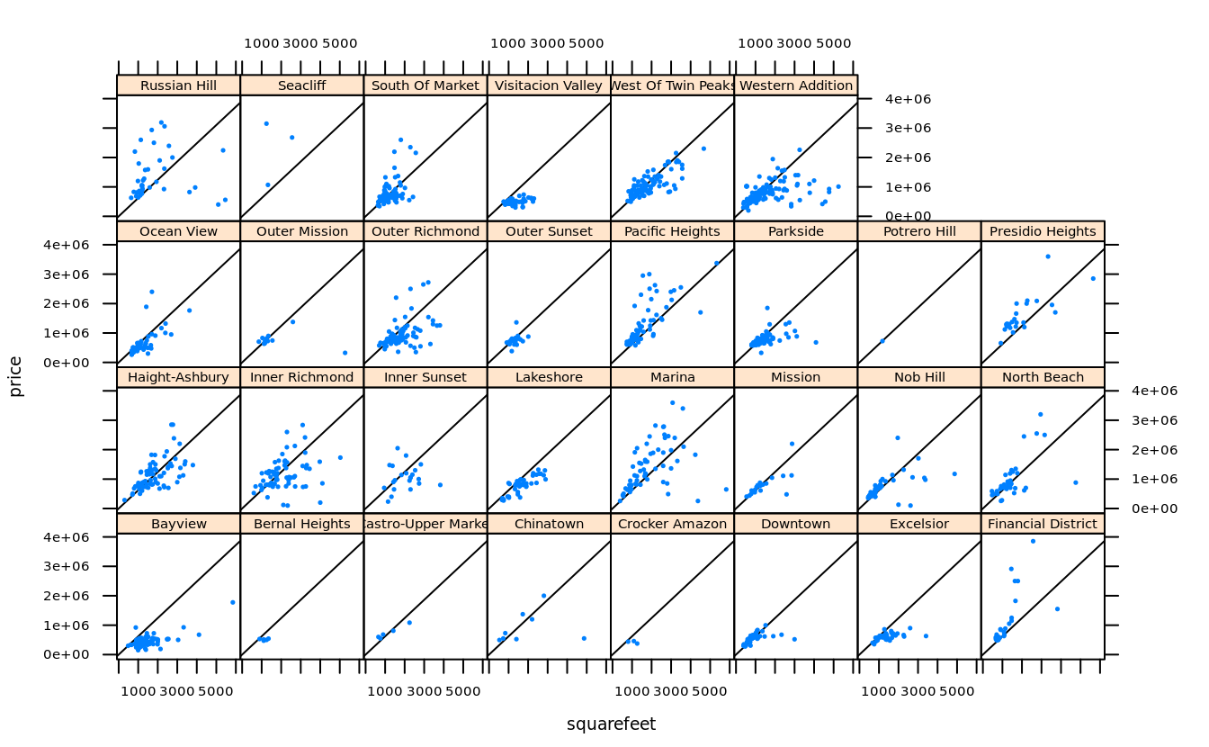
dollars.per.squarefoot <- with(san, mean(price / squarefeet, na.rm = T))
zips = subset(san, !is.na(squarefeet), zip) %>% table() %>% sort() %>% head(4*5) %>% names() %>% as.integer()
san.subset <- subset(san, zip %in% zips & price < 4000000 & squarefeet < 6000)

trellis.par.set(fontsize = list(text = 7))
xyplot(price~squarefeet | neighborhood, san.subset, pch = 19, cex = .2,
       strip = strip.custom(strip.levels = T, horizontal = T,
                            par.strip.text = list(cex = .8)),
       panel = function(...) {
           panel.abline(a = 0, b = dollars.per.squarefoot)
           panel.xyplot(...)
        }
)
5.10.2 line plot
xyplot(-Min.Depth + -Max.Depth ~ Date, crab_tag$daylog, type = "l")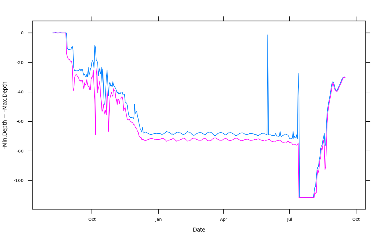
5.10.3 box plot
“bw” is short for “b (box) and w (whisker)”,
table(cut(san$date,"month"))
#>
#> 2008-02-01 2008-03-01 2008-04-01 2008-05-01 2008-06-01 2008-07-01 2008-08-01
#>        139        230        267        253        237        198        253
#> 2008-09-01 2008-10-01 2008-11-01 2008-12-01 2009-01-01 2009-02-01 2009-03-01
#>        223        272        118        181        114        123        142
#> 2009-04-01 2009-05-01 2009-06-01 2009-07-01
#>        116        180        150         85

bwplot(log(price) ~ cut(date,"month"), san, scales = list(x = list(rot = 90)))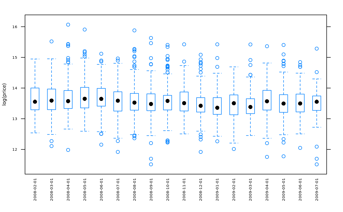
5.11 lattice: others
5.11.1 trivariate plot
levelplot(price~latitude + longitude, san)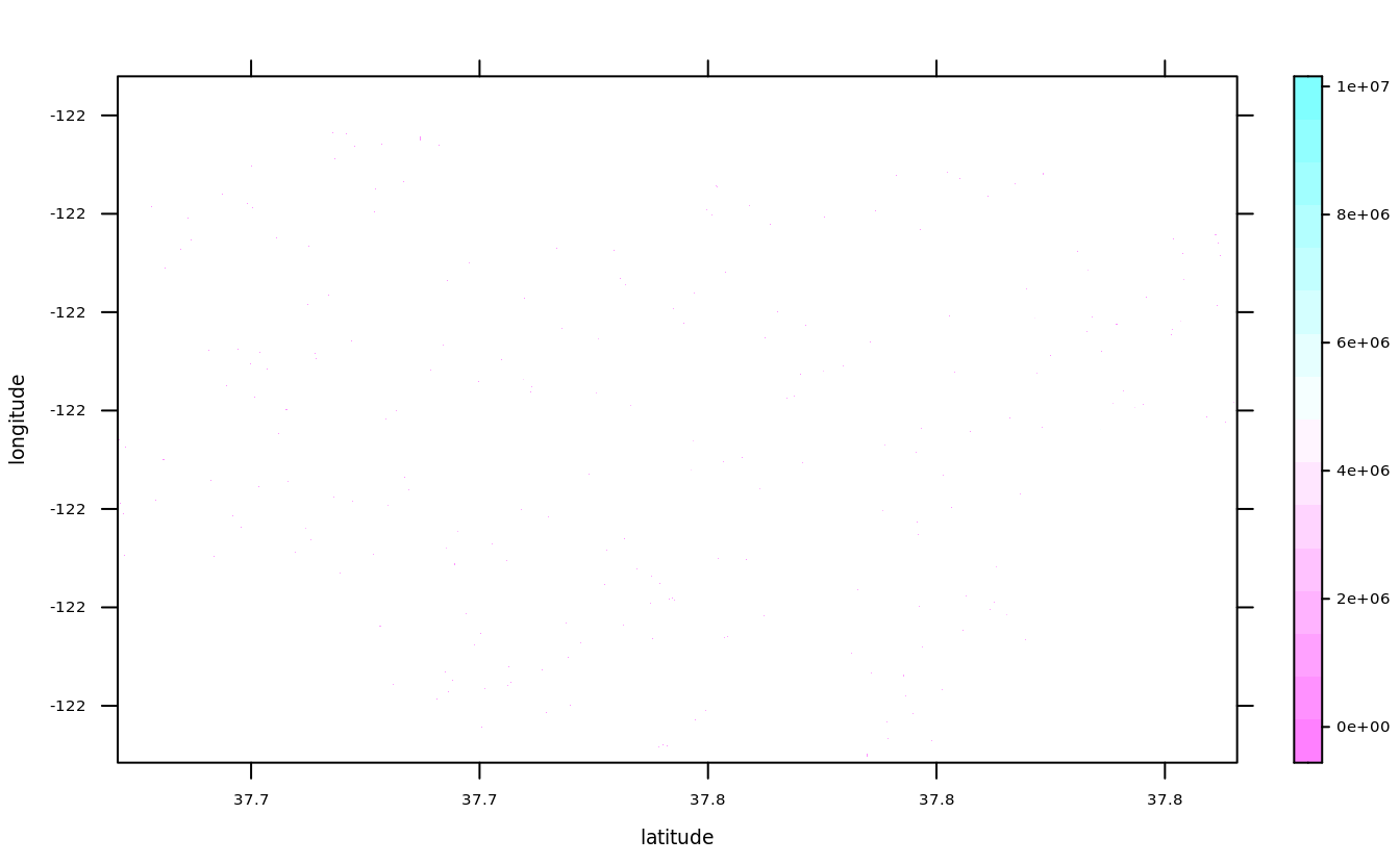
levelplot(with(san, table(cut(longitude,40), cut(latitude,40))),
          scales = list(x = list(rot = 90, cex = .5), y = list(cex = .5)))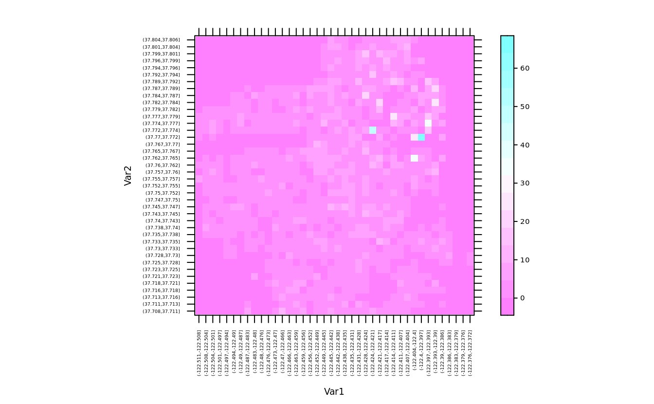
levelplot(
    with(san, tapply(price,list(cut(longitude, 40), cut(latitude, 40)), mean)),
    scales = list(draw = F))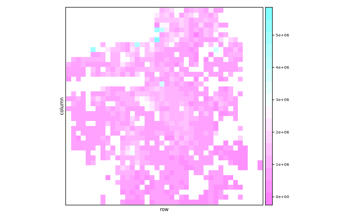
levelplot(with(san, table(cut(longitude, 25),
                          cut(latitude, 25),
                          ifelse(bedrooms < 5, bedrooms, 5))),
          scales = list(draw = F))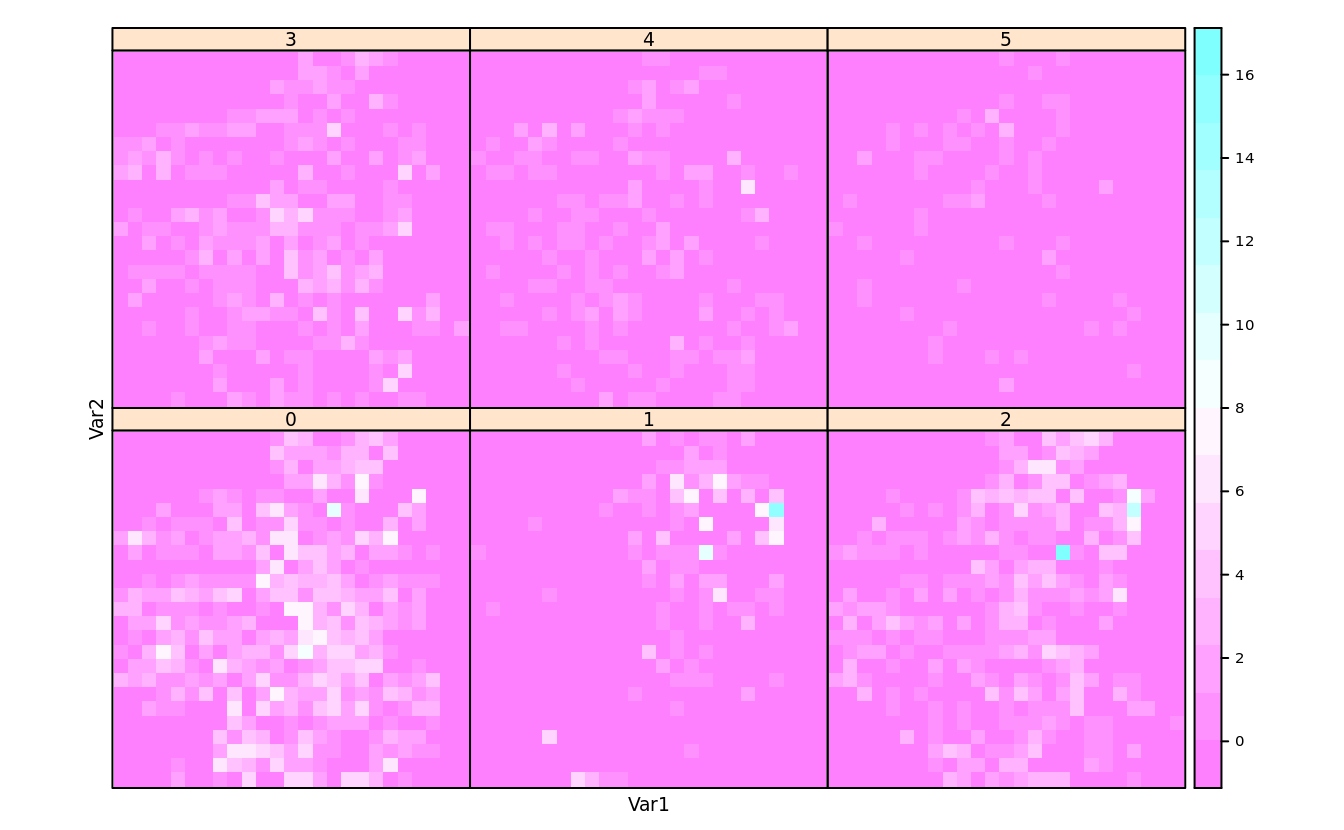
lattice::contourplot()lattice::cloud()lattice::wireframe()
5.11.2 residual and fit-spread (RFS) plot
model = lm(runs~singles + doubles + triples + stolenbases + homeruns + walks
+ hitbypitch + sacrificeflies + caughtstealing, team.batting.00to08)rfs(model)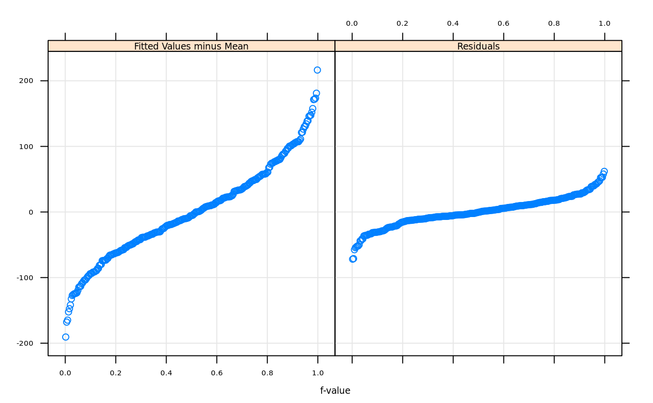
rfs(model,distribution = qnorm)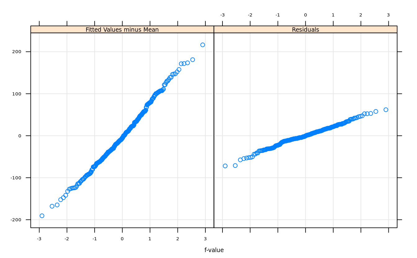
5.11.3 get parameters
trellis.par.get("clip")
#> $panel
#> [1] "on"
#>
#> $strip
#> [1] "on"

head(trellis.par.get(), 3)
#> $grid.pars
#> list()
#>
#> $fontsize
#> $fontsize$text
#> [1] 7
#>
#> $fontsize$points
#> [1] 8
#>
#>
#> $background
#> $background$alpha
#> [1] 1
#>
#> $background$col
#> [1] "transparent"
5.11.4 set parameters
trellis.par.set(list(axis.text = list(cex = .5)))5.11.5 nicer show
show.settings()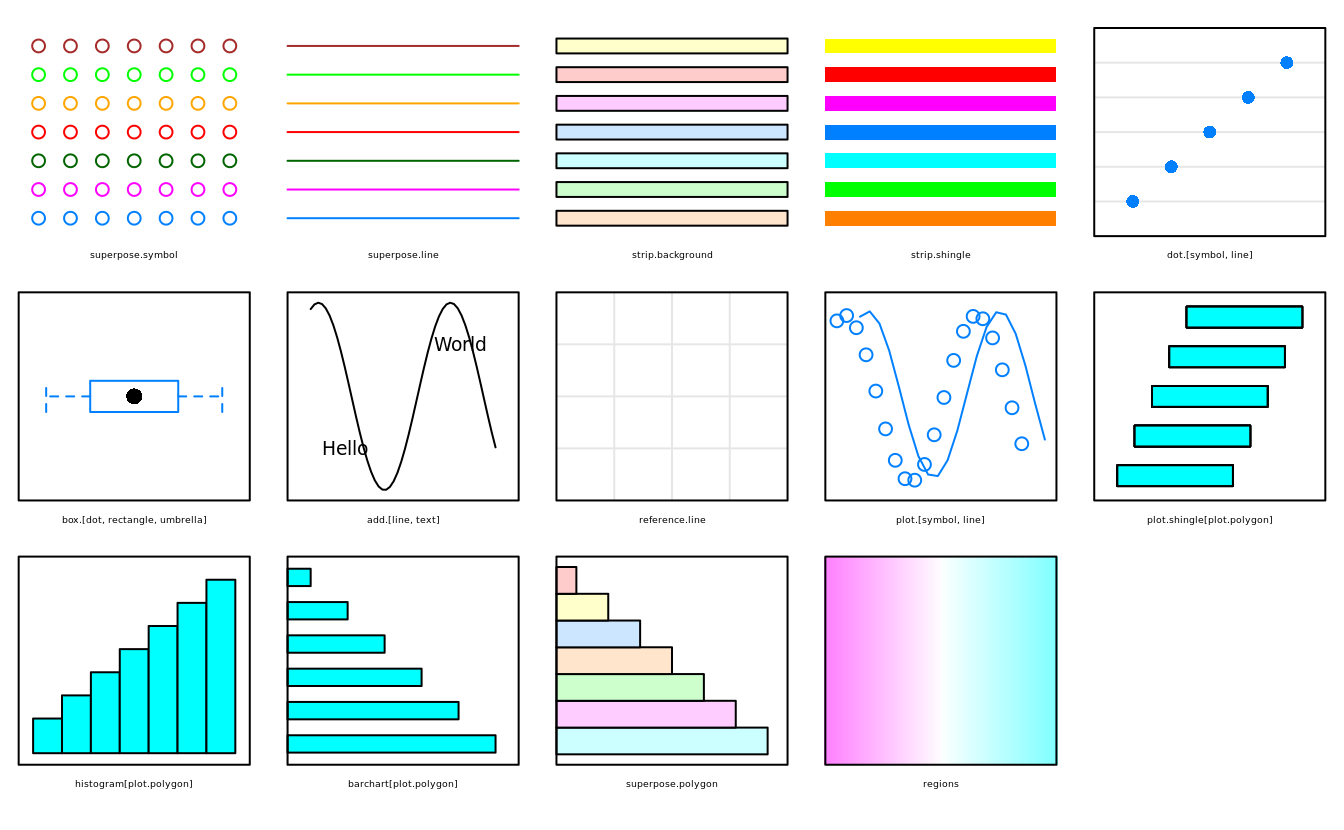
5.11.6 deep diving
There are a total of 378 parameters. However, there are only 46 unique parameters within these groups:
length(unlist(trellis.par.get()))
#> [1] 382

(function() {
    n = names(trellis.par.get())
    p = NA
    for (i in 1:34) p = c(p,names(trellis.par.get(n[i])))
    length(table(p))
})()
#> [1] 48
there are two GitHub repo, the former releases to CRAN↩︎