5.1 Layout
The overall rule about the dashboard layout is that a first-level section generates a page, a second-level section generates a column (or a row), and a third-level section generates a box (that contains one or more dashboard components). Below is a quick example:
---
title: "Get Started"
output: flexdashboard::flex_dashboard
---

```{r setup, include=FALSE}
library(flexdashboard)
```

Column 1
--------------------------------------------------

### Chart A

```{r}
```

Column 2
--------------------------------------------------

### Chart B

```{r}
```

### Chart C

```{r}
```
Note that a series of dashes under a line of text is the alternative Markdown syntax for the second-level section header, i.e.,
Column 1
--------------------------------------------------
is equivalent to
## Column 1We used a series of dashes just to make the second-level sections stand out in the source document. By default, the second-level sections generate columns on a dashboard, and the third level sections will be stacked vertically inside columns. You do not have to have columns on a dashboard: when all you have are the third-level sections in the source document, they will be stacked vertically as one column in the output.
The text of the second-level headers will not be displayed in the output. The second-level headers are for the sole purpose of layout, so the actual content of the headers does not matter at all. By contrast, the first-level and third-level headers will be displayed as titles.
Figure 5.1 shows the output of the above example, in which you can see two columns, with the first column containing “Chart A”, and the second column containing “Chart B” and “Chart C”. We did not really include any R code in the code chunks, so all boxes are empty. In these code chunks, you may write arbitrary R code that generates R plots, HTML widgets, and various other components to be introduced in Section 5.2.
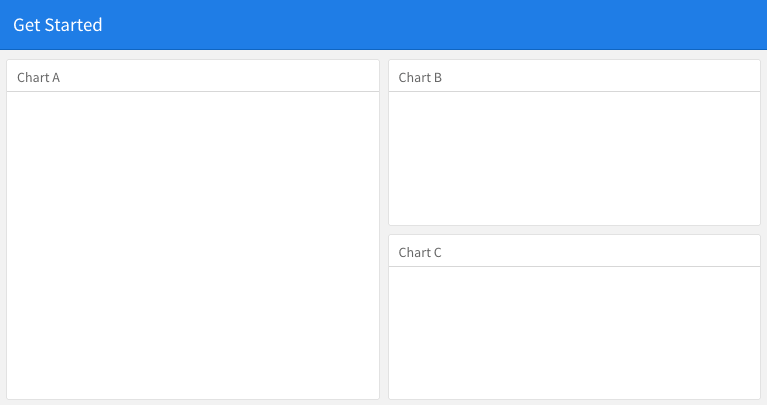
FIGURE 5.1: A quick example of the dashboard layout.
5.1.1 Row-based layouts
You may change the column-oriented layout to the row-oriented layout through the orientation option, e.g.,
output:
  flexdashboard::flex_dashboard:
    orientation: rows
That means the second-level sections will be rows, and the third-level sections will be arranged as columns within rows.
5.1.2 Attributes on sections
The second-level section headers may have attributes on them, e.g., you can set the width of a column to 350:
A narrow column {data-width=350}
--------------------------------
For the row-oriented layout, you can set the data-height attribute for rows. The {.tabset} attribute can be applied on a column so that the third-level sections will be arranged in tabs, e.g.,
Two tabs {.tabset}
------------------

### Tab A

### Tab B
5.1.3 Multiple pages
When you have multiple first-level sections in the document, they will be displayed as separate pages on the dashboard. Below is an example, and Figure 5.2 shows the output. Note that a series of equal signs is the alternative Markdown syntax for the first-level section headers (you can use a single pound sign #, too).
---
title: "Multiple Pages"
output: flexdashboard::flex_dashboard
---

Visualizations {data-icon="fa-signal"}
=====================================

### Chart 1

```{r}
```

### Chart 2

```{r}
```

Tables {data-icon="fa-table"}
=====================================

### Table 1

```{r}
```

### Table 2

```{r}
```
Page titles are displayed as a navigation menu at the top of the dashboard. In this example, we applied icons to page titles through the data-icon attribute. You can find other available icons from https://fontawesome.com.
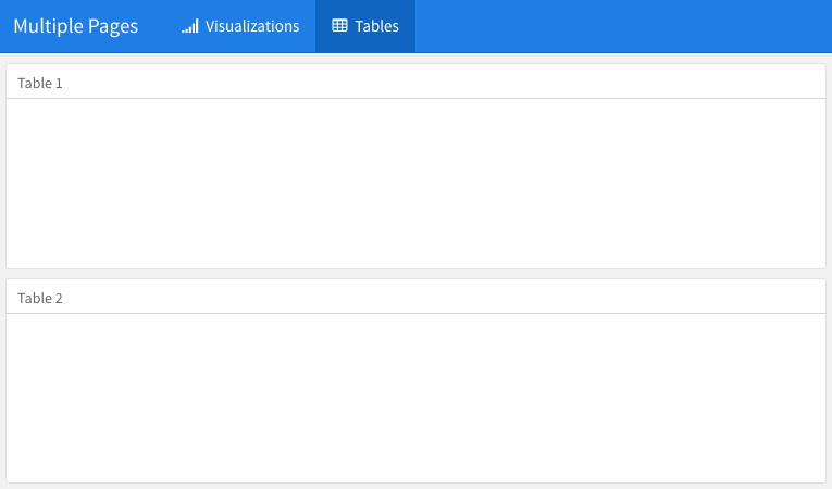
FIGURE 5.2: Multiple pages on a dashboard.
5.1.4 Story boards
Besides the column and row-based layouts, you may present a series of visualizations and related commentary through the “storyboard” layout. To enable this layout, you use the option storyboard. Below is an example, and Figure 5.3 shows the output, in which you can see left/right navigation buttons at the top to help you go through all visualizations and associated commentaries one by one.
---
title: "Storyboard Commentary"
output:
  flexdashboard::flex_dashboard:
    storyboard: true
---

### A nice scatterplot here

```{r}
plot(cars, pch = 20)
grid()
```

---

Some commentary about Frame 1.

### A beautiful histogram on this board

```{r}
hist(faithful$eruptions, col = 'gray', border = 'white', main = '')
```

---

Some commentary about Frame 2.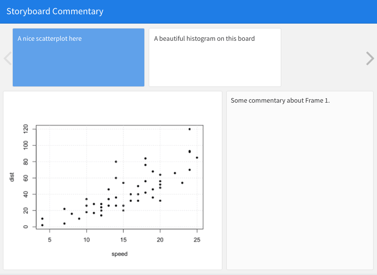
FIGURE 5.3: An example story board.