10.1 A little colour theory
At the physical level, colour is produced by a mixture of wavelengths of light. To characterise a colour completely, we need to know the complete mixture of wavelengths. Fortunately for us the human eye only has three different colour receptors, and so we can summarise the perception of any colour with just three numbers. You may be familiar with the RGB encoding of colour space, which defines a colour by the intensities of red, green and blue light needed to produce it. One problem with this space is that it is not perceptually uniform: the two colours that are one unit apart may look similar or very different depending on where they are in the colour space. This makes it difficult to create a mapping from a continuous variable to a set of colours. There have been many attempts to come up with colours spaces that are more perceptually uniform. We’ll use a modern attempt called the HCL colour space, which has three components of hue, chroma and luminance:
- Hue ranges from 0 to 360 (an angle) and gives the “colour” of the colour (blue, red, orange, etc).
- Chroma is the “purity” of a colour, ranging from 0 (grey) to a maximum that varies with luminance.
- Luminance is the lightness of the colour, ranging from 0 (black) to 1 (white).
The three dimensions have different properties. Hues are arranged around a colour wheel and are not perceived as ordered: e.g. green does not seem “larger” than red, and blue does not seem to be “in between” green or red. In contrast, both chroma and luminance are perceived as ordered: pink is perceived as lying between red and white, and grey is seen to fall between black and white.
The combination of these three components does not produce a simple geometric shape. Figure 10.1 attempts to show the 3d shape of the space. Each slice is a constant luminance (brightness) with hue mapped to angle and chroma to radius. You can see the centre of each slice is grey and the colours get more intense as they get closer to the edge.
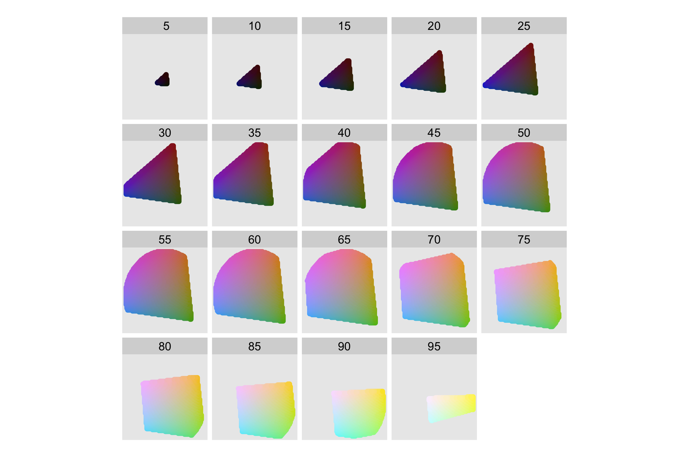
Figure 10.1: The shape of the HCL colour space. Hue is mapped to angle, chroma to radius and each slice shows a different luminance. The HCL space is a pretty odd shape, but you can see that colours near the centre of each slice are grey, and as you move towards the edges they become more intense. Slices for luminance 0 and 100 are omitted because they would, respectively, be a single black point and a single white point.
An additional complication is that many people (~10% of men) do not possess the normal complement of colour receptors and so can distinguish fewer colours than usual. In brief, it’s best to avoid red-green contrasts, and to check your plots with systems that simulate colour blindness. Visicheck is one online solution. Another alternative is the dichromat package34 which provides tools for simulating colour blindness, and a set of colour schemes known to work well for colour-blind people. You can also help people with colour blindness in the same way that you can help people with black-and-white printers: by providing redundant mappings to other aesthetics like size, line type or shape.
Thomas Lumley, Dichromat: Color Schemes for Dichromats, 2007.↩︎