17.4 Theme elements
There are around 40 unique elements that control the appearance of the plot. They can be roughly grouped into five categories: plot, axis, legend, panel and facet. The following sections describe each in turn.
17.4.1 Plot elements
Some elements affect the plot as a whole:
| Element | Setter | Description |
|---|---|---|
| plot.background | element_rect() |
plot background |
| plot.title | element_text() |
plot title |
| plot.margin | margin() |
margins around plot |
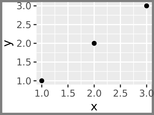
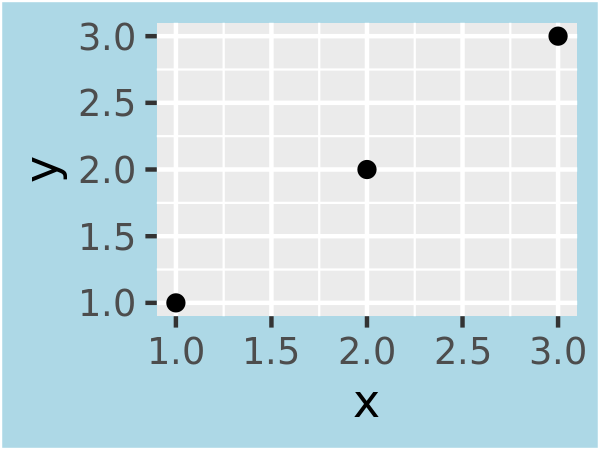
plot.background draws a rectangle that underlies everything else on the plot. By default, ggplot2 uses a white background which ensures that the plot is usable wherever it might end up (e.g. even if you save as a png and put on a slide with a black background). When exporting plots to use in other systems, you might want to make the background transparent with fill = NA. Similarly, if you’re embedding a plot in a system that already has margins you might want to eliminate the built-in margins. Note that a small margin is still necessary if you want to draw a border around the plot.
base + theme(plot.background = element_rect(colour = "grey50", size = 2))
base + theme(
  plot.background = element_rect(colour = "grey50", size = 2),
  plot.margin = margin(2, 2, 2, 2)
)
base + theme(plot.background = element_rect(fill = "lightblue"))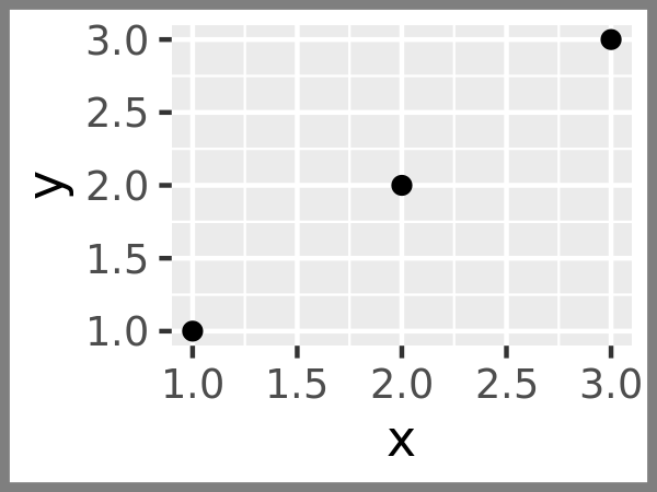
17.4.2 Axis elements
The axis elements control the apperance of the axes:
| Element | Setter | Description |
|---|---|---|
| axis.line | element_line() |
line parallel to axis (hidden in default themes) |
| axis.text | element_text() |
tick labels |
| axis.text.x | element_text() |
x-axis tick labels |
| axis.text.y | element_text() |
y-axis tick labels |
| axis.title | element_text() |
axis titles |
| axis.title.x | element_text() |
x-axis title |
| axis.title.y | element_text() |
y-axis title |
| axis.ticks | element_line() |
axis tick marks |
| axis.ticks.length | unit() |
length of tick marks |
Note that axis.text (and axis.title) comes in three forms: axis.text, axis.text.x, and axis.text.y. Use the first form if you want to modify the properties of both axes at once: any properties that you don’t explicitly set in axis.text.x and axis.text.y will be inherited from axis.text.
df <- data.frame(x = 1:3, y = 1:3)
base <- ggplot(df, aes(x, y)) + geom_point()
# Accentuate the axes
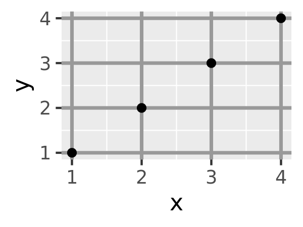
base + theme(axis.line = element_line(colour = "grey50", size = 1))
# Style both x and y axis labels
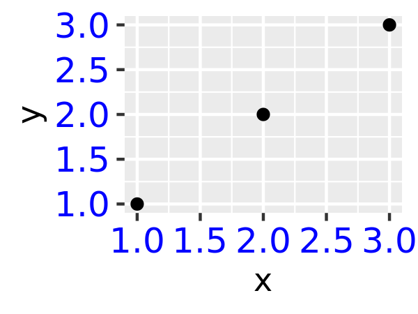
base + theme(axis.text = element_text(color = "blue", size = 12))
# Useful for long labels
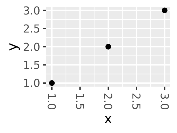
base + theme(axis.text.x = element_text(angle = -90, vjust = 0.5))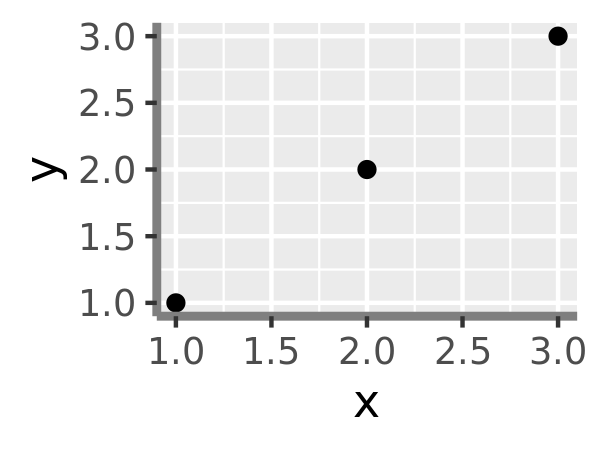
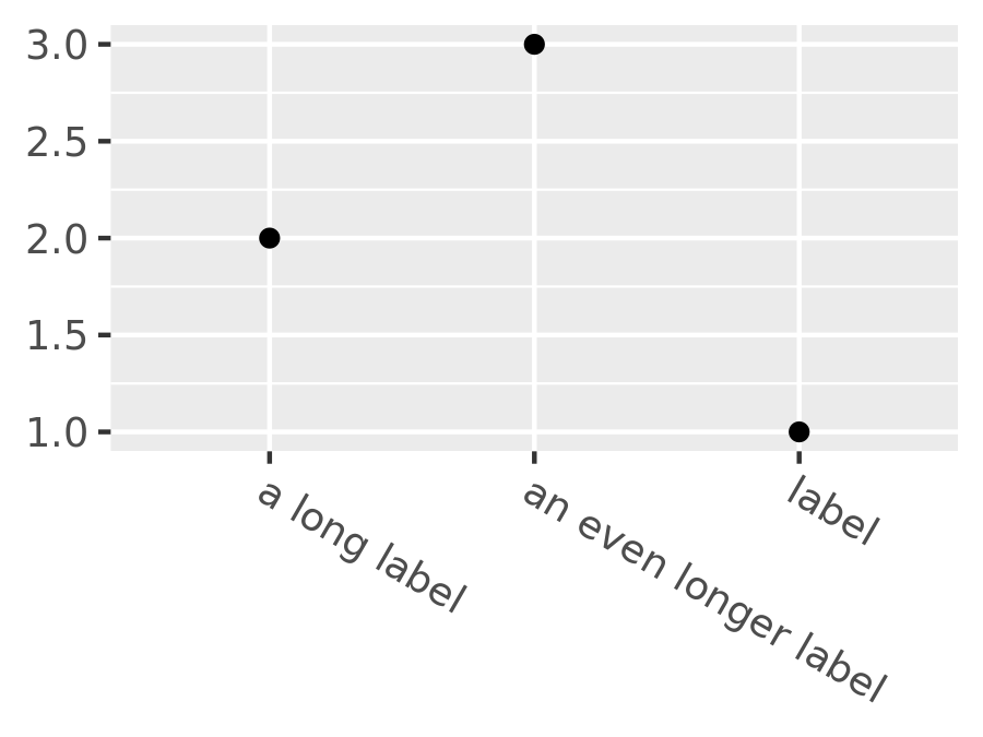
The most common adjustment is to rotate the x-axis labels to avoid long overlapping labels. If you do this, note negative angles tend to look best and you should set hjust = 0 and vjust = 1:
df <- data.frame(
  x = c("label", "a long label", "an even longer label"),
  y = 1:3
)
base <- ggplot(df, aes(x, y)) + geom_point()
base
base +
  theme(axis.text.x = element_text(angle = -30, vjust = 1, hjust = 0)) +
  xlab(NULL) +
  ylab(NULL)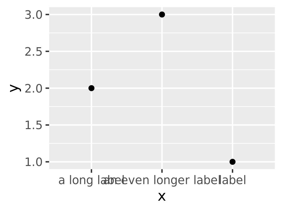
17.4.3 Legend elements
The legend elements control the apperance of all legends. You can also modify the appearance of individual legends by modifying the same elements in guide_legend() or guide_colourbar().
| Element | Setter | Description |
|---|---|---|
| legend.background | element_rect() |
legend background |
| legend.key | element_rect() |
background of legend keys |
| legend.key.size | unit() |
legend key size |
| legend.key.height | unit() |
legend key height |
| legend.key.width | unit() |
legend key width |
| legend.margin | unit() |
legend margin |
| legend.text | element_text() |
legend labels |
| legend.text.align | 0–1 | legend label alignment (0 = right, 1 = left) |
| legend.title | element_text() |
legend name |
| legend.title.align | 0–1 | legend name alignment (0 = right, 1 = left) |
These options are illustrated below:
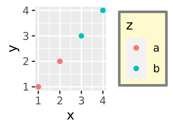
df <- data.frame(x = 1:4, y = 1:4, z = rep(c("a", "b"), each = 2))
base <- ggplot(df, aes(x, y, colour = z)) + geom_point()
base + theme(
legend.background = element_rect(
fill = "lemonchiffon",
colour = "grey50",
size = 1
)
)
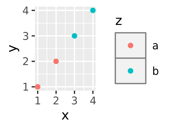
base + theme(
legend.key = element_rect(color = "grey50"),
legend.key.width = unit(0.9, "cm"),
legend.key.height = unit(0.75, "cm")
)
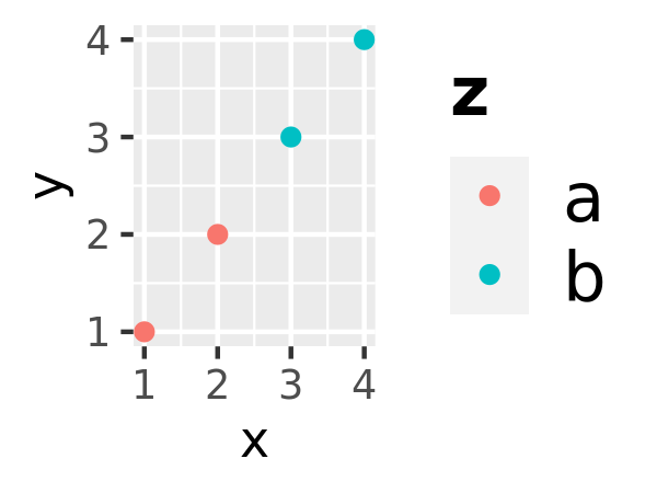
base + theme(
legend.text = element_text(size = 15),
legend.title = element_text(size = 15, face = "bold")
)
There are four other properties that control how legends are laid out in the context of the plot (legend.position, legend.direction, legend.justification, legend.box). They are described in Section 10.6.1.
17.4.4 Panel elements
Panel elements control the appearance of the plotting panels:
| Element | Setter | Description |
|---|---|---|
| panel.background | element_rect() |
panel background (under data) |
| panel.border | element_rect() |
panel border (over data) |
| panel.grid.major | element_line() |
major grid lines |
| panel.grid.major.x | element_line() |
vertical major grid lines |
| panel.grid.major.y | element_line() |
horizontal major grid lines |
| panel.grid.minor | element_line() |
minor grid lines |
| panel.grid.minor.x | element_line() |
vertical minor grid lines |
| panel.grid.minor.y | element_line() |
horizontal minor grid lines |
| aspect.ratio | numeric | plot aspect ratio |
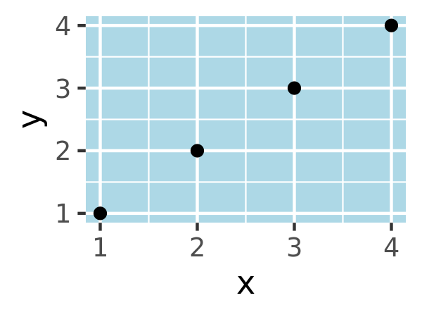
The main difference between panel.background and panel.border is that the background is drawn underneath the data, and the border is drawn on top of it. For that reason, you’ll always need to assign fill = NA when overriding panel.border.
base <- ggplot(df, aes(x, y)) + geom_point()
# Modify background
base + theme(panel.background = element_rect(fill = "lightblue"))

# Tweak major grid lines
base + theme(
  panel.grid.major = element_line(color = "gray60", size = 0.8)
)
# Just in one direction
base + theme(
  panel.grid.major.x = element_line(color = "gray60", size = 0.8)
)
Note that aspect ratio controls the aspect ratio of the panel, not the overall plot:
base2 <- base + theme(plot.background = element_rect(colour = "grey50"))
# Wide screen
base2 + theme(aspect.ratio = 9 / 16)
# Long and skiny
base2 + theme(aspect.ratio = 2 / 1)
# Square
base2 + theme(aspect.ratio = 1)
17.4.5 Faceting elements
The following theme elements are associated with faceted ggplots:
| Element | Setter | Description |
|---|---|---|
| strip.background | element_rect() |
background of panel strips |
| strip.text | element_text() |
strip text |
| strip.text.x | element_text() |
horizontal strip text |
| strip.text.y | element_text() |
vertical strip text |
| panel.margin | unit() |
margin between facets |
| panel.margin.x | unit() |
margin between facets (vertical) |
| panel.margin.y | unit() |
margin between facets (horizontal) |
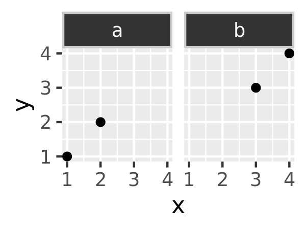
Element strip.text.x affects both facet_wrap() or facet_grid(); strip.text.y only affects facet_grid().
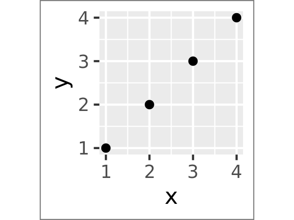
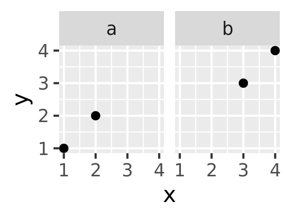
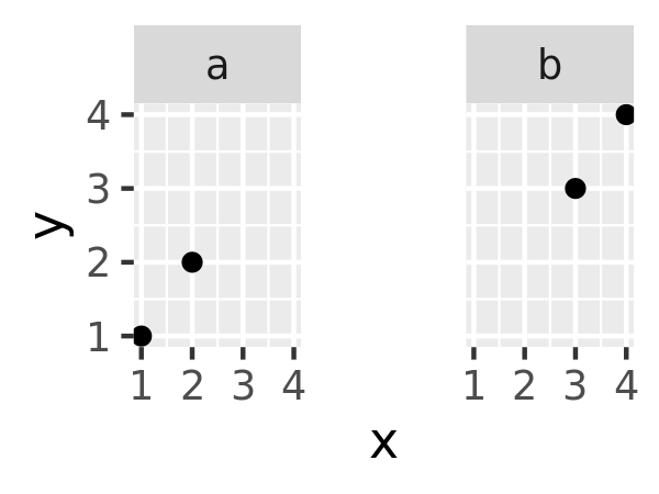
df <- data.frame(x = 1:4, y = 1:4, z = c("a", "a", "b", "b"))
base_f <- ggplot(df, aes(x, y)) + geom_point() + facet_wrap(~z)

base_f
base_f + theme(panel.margin = unit(0.5, "in"))
#> Warning: `panel.margin` is deprecated. Please use `panel.spacing` property
#> instead
base_f + theme(
  strip.background = element_rect(fill = "grey20", color = "grey80", size = 1),
  strip.text = element_text(colour = "white")
)
17.4.6 Exercises
Create the ugliest plot possible! (Contributed by Andrew D. Steen, University of Tennessee - Knoxville)
theme_dark()makes the inside of the plot dark, but not the outside. Change the plot background to black, and then update the text settings so you can still read the labels.Make an elegant theme that uses “linen” as the background colour and a serif font for the text.
Systematically explore the effects of
hjustwhen you have a multiline title. Why doesn’tvjustdo anything?