2.4 Colour, size, shape and other aesthetic attributes
To add additional variables to a plot, we can use other aesthetics like colour, shape, and size (NB: while I use British spelling throughout this book, ggplot2 also accepts American spellings). These work in the same way as the x and y aesthetics, and are added into the call to aes():
aes(displ, hwy, colour = class)aes(displ, hwy, shape = drv)aes(displ, hwy, size = cyl)
ggplot2 takes care of the details of converting data (e.g., ‘f’, ‘r’, ‘4’) into aesthetics (e.g., ‘red’, ‘yellow’, ‘green’) with a scale. There is one scale for each aesthetic mapping in a plot. The scale is also responsible for creating a guide, an axis or legend, that allows you to read the plot, converting aesthetic values back into data values. For now, we’ll stick with the default scales provided by ggplot2. You’ll learn how to override them in Chapter ??.
To learn more about those outlying variables in the previous scatterplot, we could map the class variable to colour:
ggplot(mpg, aes(displ, cty, colour = class)) +
  geom_point()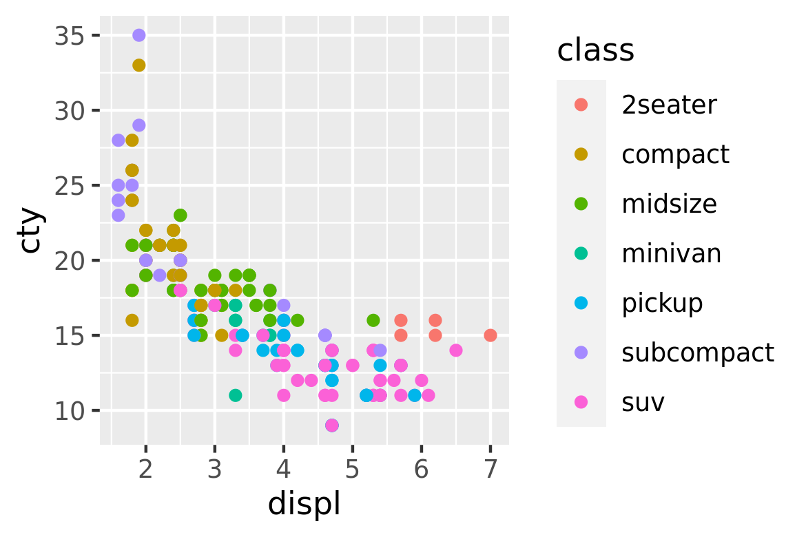
This gives each point a unique colour corresponding to its class. The legend allows us to read data values from the colour, showing us that the group of cars with unusually high fuel economy for their engine size are two seaters: cars with big engines, but lightweight bodies.
If you want to set an aesthetic to a fixed value, without scaling it, do so in the individual layer outside of aes(). Compare the following two plots:
ggplot(mpg, aes(displ, hwy)) + geom_point(aes(colour = "blue"))
ggplot(mpg, aes(displ, hwy)) + geom_point(colour = "blue")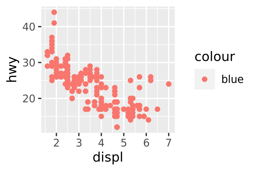
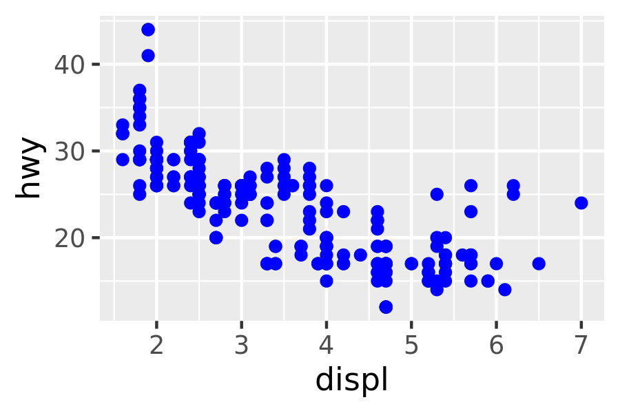
In the first plot, the value “blue” is scaled to a pinkish colour, and a legend is added. In the second plot, the points are given the R colour blue. This is an important technique and you’ll learn more about it in Section 13.4.2. See vignette("ggplot2-specs") for the values needed for colour and other aesthetics.
Different types of aesthetic attributes work better with different types of variables. For example, colour and shape work well with categorical variables, while size works well for continuous variables. The amount of data also makes a difference: if there is a lot of data it can be hard to distinguish different groups. An alternative solution is to use faceting, as described next.
When using aesthetics in a plot, less is usually more. It’s difficult to see the simultaneous relationships among colour and shape and size, so exercise restraint when using aesthetics. Instead of trying to make one very complex plot that shows everything at once, see if you can create a series of simple plots that tell a story, leading the reader from ignorance to knowledge.
2.4.1 Exercises
Experiment with the colour, shape and size aesthetics. What happens when you map them to continuous values? What about categorical values? What happens when you use more than one aesthetic in a plot?
What happens if you map a continuous variable to shape? Why? What happens if you map
transto shape? Why?How is drive train related to fuel economy? How is drive train related to engine size and class?