7.6 Annotation across facets
When used well, annotations can be a powerful tool to help your reader make sense of your data. One example of this is when you want the reader to compare groups across facets. For example, in the plot below it is easy to see the relationship within each facet, but the subtle differences across facets do not pop out:
ggplot(diamonds, aes(log10(carat), log10(price))) +
  geom_bin2d() +
  facet_wrap(vars(cut), nrow = 1)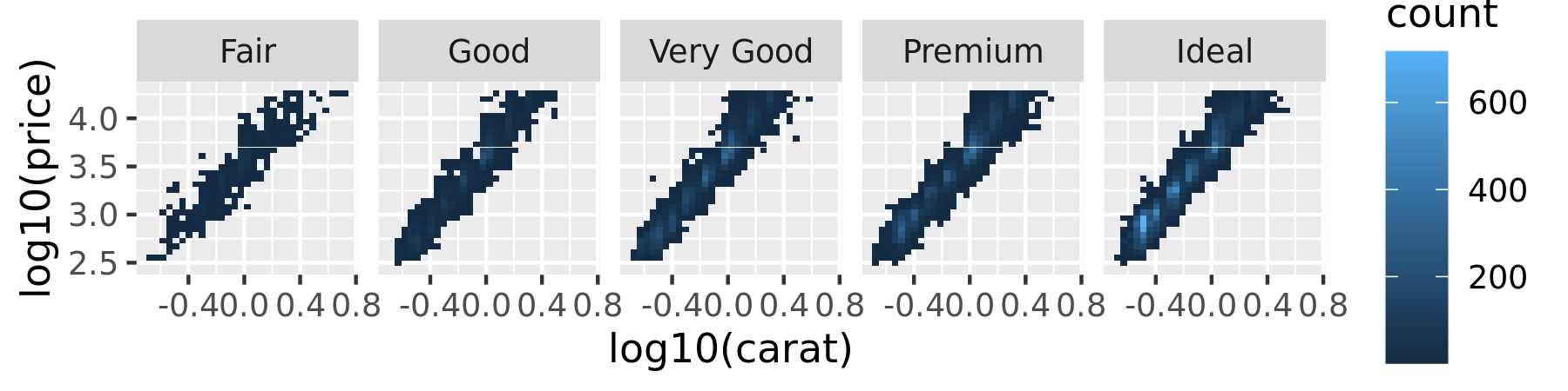
It is much easier to see these subtle differences if we add a reference line:
mod_coef <- coef(lm(log10(price) ~ log10(carat), data = diamonds))
ggplot(diamonds, aes(log10(carat), log10(price))) +
  geom_bin2d() +
  geom_abline(intercept = mod_coef[1], slope = mod_coef[2],
    colour = "white", size = 1) +
  facet_wrap(vars(cut), nrow = 1)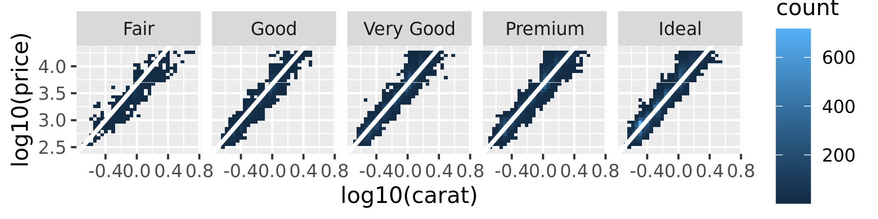
In this plot, each facet displays the data for one category agains the same regression line. This makes it easier to compare the facets to each other because there is shared reference line to assist the visual comparison.
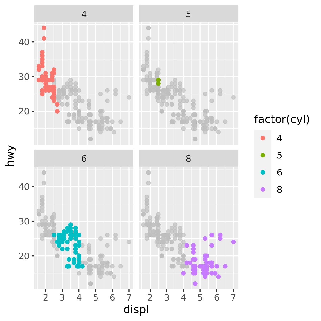
A variation on this theme arises when you want each facet of a plot to display data from a single group, with the complete data set plotted unobtrusively in each panel to aid visual comparison. The gghighlight package is particularly useful in this context:
ggplot(mpg, aes(displ, hwy, colour = factor(cyl))) +
  geom_point() +
  gghighlight::gghighlight() +
  facet_wrap(vars(cyl))