2.3 Key components
Every ggplot2 plot has three key components:
data,
A set of aesthetic mappings between variables in the data and visual properties, and
At least one layer which describes how to render each observation. Layers are usually created with a geom function.
Here’s a simple example:
ggplot(mpg, aes(x = displ, y = hwy)) +
  geom_point()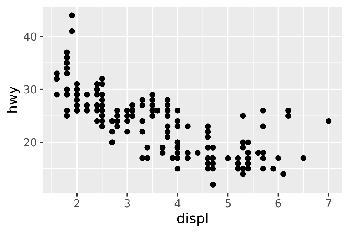
This produces a scatterplot defined by:
- Data:
mpg. - Aesthetic mapping: engine size mapped to x position, fuel economy to y position.
- Layer: points.
Pay attention to the structure of this function call: data and aesthetic mappings are supplied in ggplot(), then layers are added on with +. This is an important pattern, and as you learn more about ggplot2 you’ll construct increasingly sophisticated plots by adding on more types of components.
Almost every plot maps a variable to x and y, so naming these aesthetics is tedious, so the first two unnamed arguments to aes() will be mapped to x and y. This means that the following code is identical to the example above:
ggplot(mpg, aes(displ, hwy)) +
  geom_point()
I’ll stick to that style throughout the book, so don’t forget that the first two arguments to aes() are x and y. Note that I’ve put each command on a new line. I recommend doing this in your own code, so it’s easy to scan a plot specification and see exactly what’s there. In this chapter, I’ll sometimes use just one line per plot, because it makes it easier to see the differences between plot variations.
The plot shows a strong correlation: as the engine size gets bigger, the fuel economy gets worse. There are also some interesting outliers: some cars with large engines get higher fuel economy than average. What sort of cars do you think they are?
2.3.1 Exercises
How would you describe the relationship between
ctyandhwy? Do you have any concerns about drawing conclusions from that plot?What does
ggplot(mpg, aes(model, manufacturer)) + geom_point()show? Is it useful? How could you modify the data to make it more informative?Describe the data, aesthetic mappings and layers used for each of the following plots. You’ll need to guess a little because you haven’t seen all the datasets and functions yet, but use your common sense! See if you can predict what the plot will look like before running the code.
ggplot(mpg, aes(cty, hwy)) + geom_point()ggplot(diamonds, aes(carat, price)) + geom_point()ggplot(economics, aes(date, unemploy)) + geom_line()ggplot(mpg, aes(cty)) + geom_histogram()