10.2 Continuous colour scales
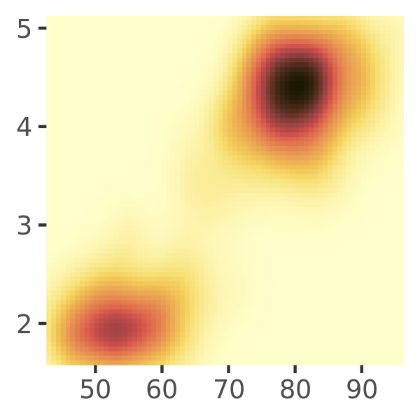
Colour gradients are often used to show the height of a 2d surface. The plots in this section use the surface of a 2d density estimate of the faithful dataset,35 which records the waiting time between eruptions and during each eruption for the Old Faithful geyser in Yellowstone Park. I hide the legends and set expand to 0, to focus on the appearance of the data. Remember: although I use the erupt plot to illustrate concepts using with a fill aesthetic, the same ideas apply to colour scales. Any time I refer to scale_fill_*() in this section there is a corresponding scale_colour_*() for the colour aesthetic (or scale_color_*() if you prefer US spelling).
erupt <- ggplot(faithfuld, aes(waiting, eruptions, fill = density)) +
  geom_raster() +
  scale_x_continuous(NULL, expand = c(0, 0)) +
  scale_y_continuous(NULL, expand = c(0, 0)) +
  theme(legend.position = "none")
10.2.1 Particular palettes
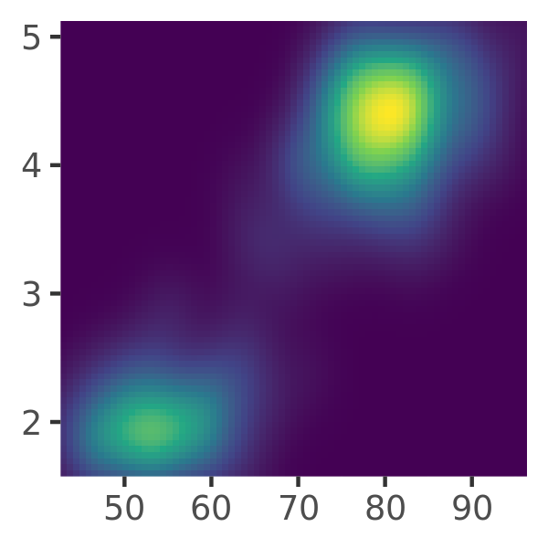
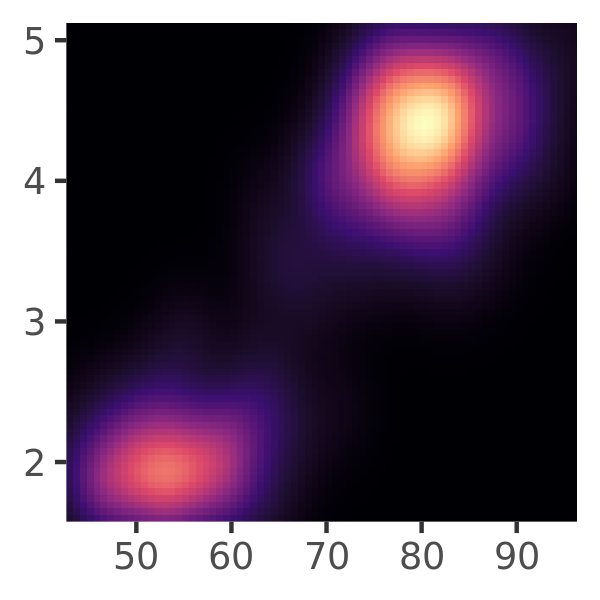
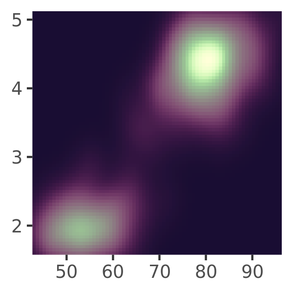
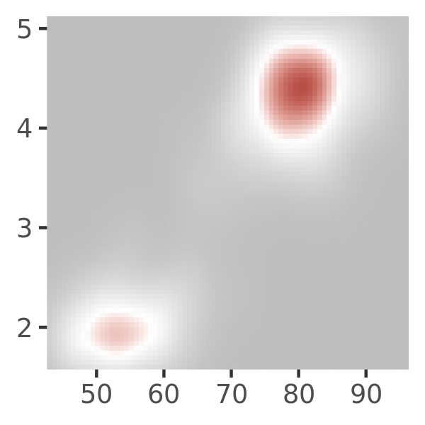
There are multiple ways to specify continuous colour scales. Later I’ll talk about general purpose tools that you can use to construct your own palette, but this is often unnecessary as there are many “hand picked” palettes available. For example, ggplot2 supplies two scale functions that bundle pre-specified palettes, scale_fill_viridis_c() and scale_fill_distiller(). The viridis scales36 are designed to be perceptually uniform in both colour and when reduced to black and white, and to be perceptible to people with various forms of colour blindness.
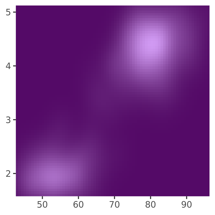
erupt
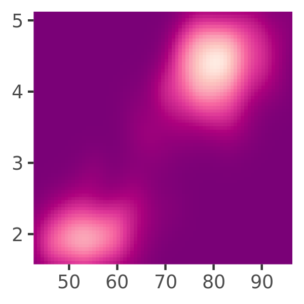
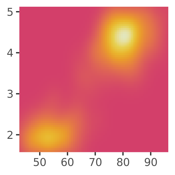
erupt + scale_fill_viridis_c()
erupt + scale_fill_viridis_c(option = "magma")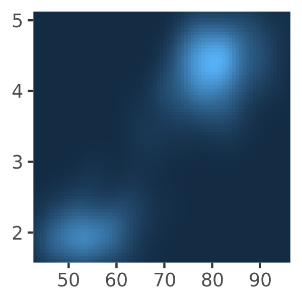
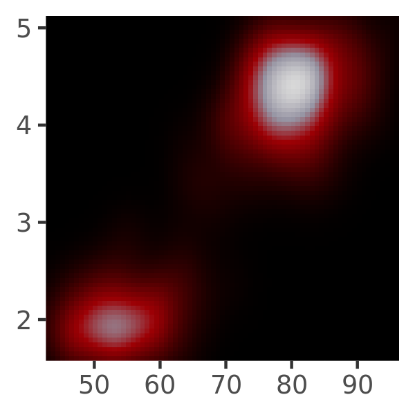
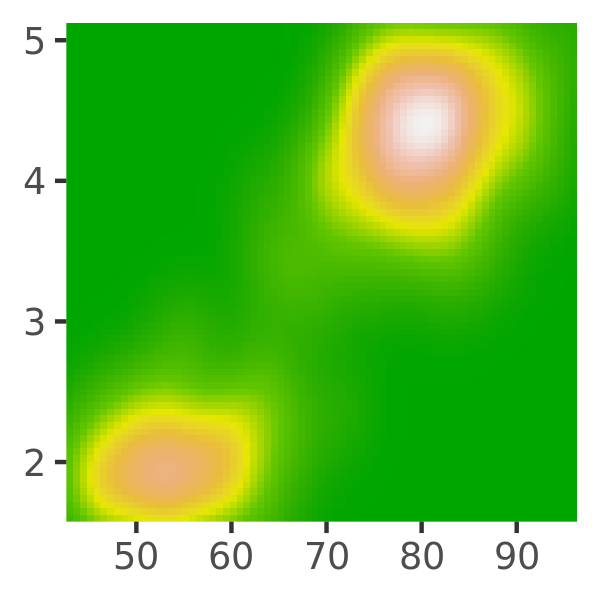
The second group of continuous colour scales built in to ggplot2 are derived from the ColorBrewer scales: scale_fill_brewer() provides these colours as discrete palettes, while scale_fill_distiller() and scale_fill_fermenter() are the continuous and binned analogs. I discuss these scales in Section 10.3), but for illustrative purposes include some examples here:
erupt + scale_fill_distiller()
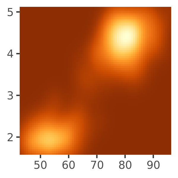
erupt + scale_fill_distiller(palette = "RdPu")
erupt + scale_fill_distiller(palette = "YlOrBr")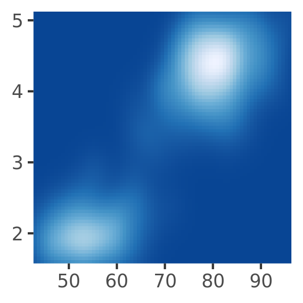
There are many other packages that provide useful colour palettes. For example, scico37 provides more palettes that are perceptually uniform and suitable for scientific visualisation:
erupt + scico::scale_fill_scico(palette = "bilbao") # the default
erupt + scico::scale_fill_scico(palette = "vik")
erupt + scico::scale_fill_scico(palette = "lajolla")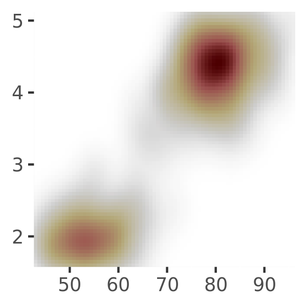
However, as there are a great many palette packages in R, a particularly useful package is paletteer,38 which aims to provide a common interface:
erupt + paletteer::scale_fill_paletteer_c("viridis::plasma")
erupt + paletteer::scale_fill_paletteer_c("scico::tokyo")
erupt + paletteer::scale_fill_paletteer_c("gameofthrones::targaryen")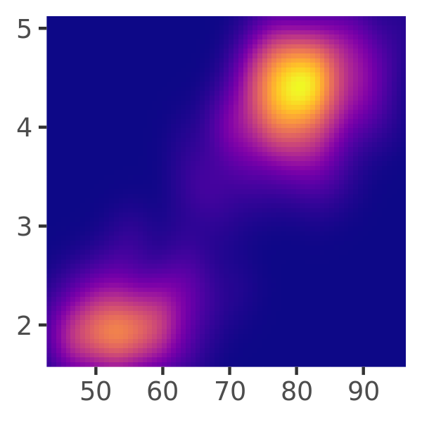
10.2.2 Robust recipes
The default scale for continuous fill scales is scale_fill_continuous() which in turn defaults to scale_fill_gradient(). As a consequence, these three commands produce the same plot using a gradient scale:
erupt
erupt + scale_fill_continuous()
erupt + scale_fill_gradient()


Gradient scales provide a robust method for creating any colour scheme you like. All you need to do is specify two or more reference colours, and ggplot2 will interpolate linearly between them. There are three functions that you can use for this purpose:
scale_fill_gradient()produces a two-colour gradientscale_fill_gradient2()produces a three-colour gradient with specified midpointscale_fill_gradientn()produces an n-colour gradient
The use of gradient scales is illustrated below. The first plot uses a scale that linearly interpolates from grey (hex code: "#bebebe") at the low end of the scale limits to brown ("#a52a2a") at the high end. The second plot has the same endpoints but uses scale_fill_gradient2() to interpolate first from grey to white (#ffffff) and then from white to brown. Note that the mid argument specifies the colour to be shown at the intermediate point, and midpoint is the value in the data at which this colour is used (the default is midpoint = 0). The third method is to use scale_fill_gradientn() which takes a vector of reference colours as its argument, and constructs a scale that linearly interpolates between the specified values. By default, the colours are presumed to be equally spaced along the scale, but if you prefer you can specify a vector of values that correspond to each of the reference colours.
erupt + scale_fill_gradient(low = "grey", high = "brown")
erupt + scale_fill_gradient2(low = "grey", mid = "white", high = "brown", midpoint = .02)
erupt + scale_fill_gradientn(colours = terrain.colors(7))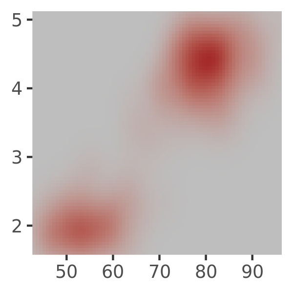
Creating good colour palettes requires some care. Generally, for a two-point gradient scale you want to convey the perceptual impression that the values are sequentially ordered, so you want to keep hue constant, and vary chroma and luminance. The Munsell colour system is useful for this as it provides an easy way of specifying colours based on their hue, chroma and luminance. The munsell package39 provides easy access to the Munsell colours, which can then be used to specify a gradient scale:
munsell::hue_slice("5P") +  # generate a ggplot with hue_slice()
  annotate(                 # add arrows for annotation
    geom = "segment",
    x = c(7, 7),
    y = c(1, 10),
    xend = c(7, 7),
    yend = c(2, 9),
    arrow = arrow(length = unit(2, "mm"))
  )
#> Warning: Removed 31 rows containing missing values (geom_text).

# construct scale
erupt + scale_fill_gradient(
  low = munsell::mnsl("5P 2/12"),
  high = munsell::mnsl("5P 7/12")
)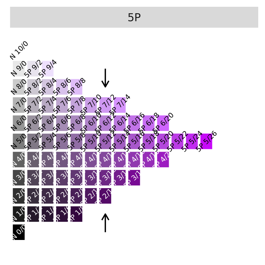
The labels on the left plot are a little difficult to read at this scale, so I have used annotate() to add arrows highlighting the column used to construct the scale on the right. For more information on the munsell package see https://github.com/cwickham/munsell/.
Three-point gradient scales have slightly different design criteria. Typically the goal in such a scale is to convey the perceptual impression that there is a natural midpoint (often a zero value) from which the other values diverge. The left plot below shows how to create a divergent “yellow/blue” scale, though it is a little artificial in this example.
Finally, if you have colours that are meaningful for your data (e.g., black body colours or standard terrain colours), or you’d like to use a palette produced by another package, you may wish to use an n-point gradient. As an illustration, the middle and right plots below use the colorspace package.40 For more information on the colorspace package see https://colorspace.r-forge.r-project.org/.
# munsell example
erupt + scale_fill_gradient2(
low = munsell::mnsl("5B 7/8"),
high = munsell::mnsl("5Y 7/8"),
mid = munsell::mnsl("N 7/0"),
midpoint = .02
)
# colorspace examples
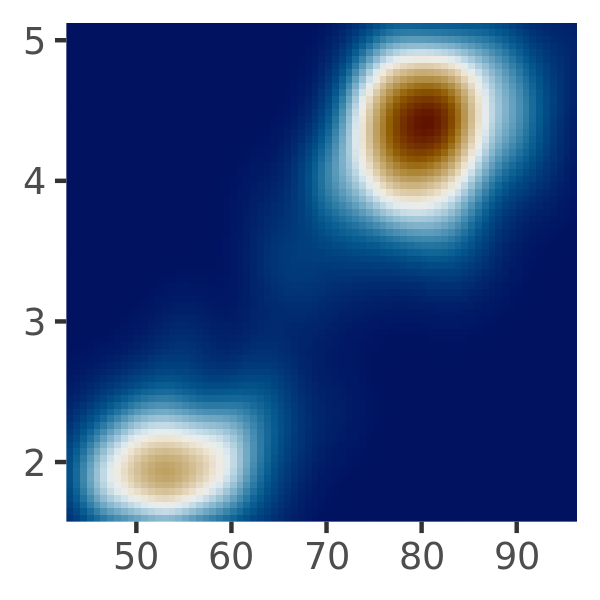
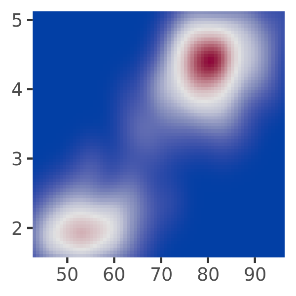
erupt + scale_fill_gradientn(colours = colorspace::heat_hcl(7))
erupt + scale_fill_gradientn(colours = colorspace::diverge_hcl(7))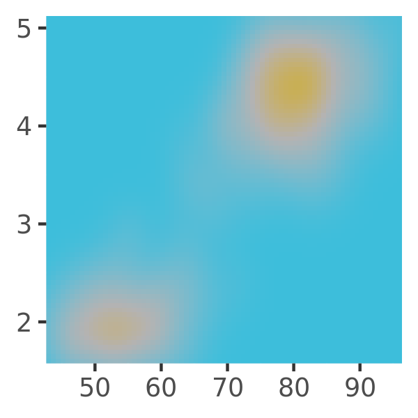
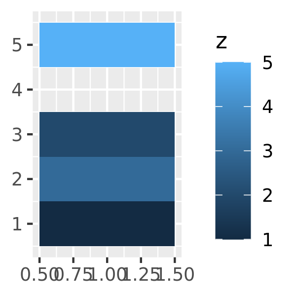
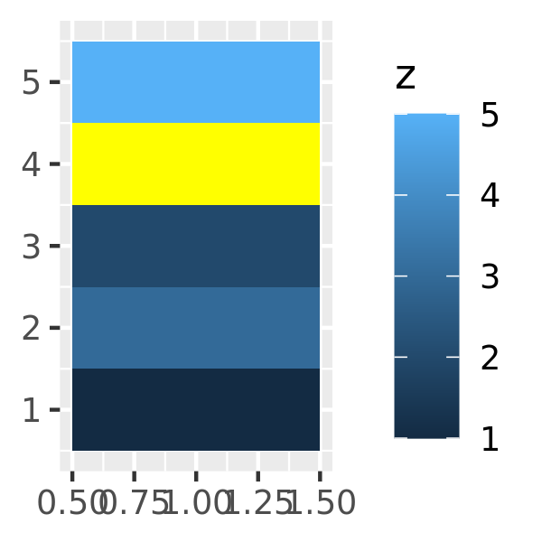
10.2.3 Missing values
All continuous colour scales have an na.value parameter that controls what colour is used for missing values (including values outside the range of the scale limits). By default it is set to grey, which will stand out when you use a colourful scale. If you use a black and white scale, you might want to set it to something else to make it more obvious. You can set na.value = NA to make missing values invisible, or choose a specific colour if you prefer:
df <- data.frame(x = 1, y = 1:5, z = c(1, 3, 2, NA, 5))
base <- ggplot(df, aes(x, y)) +
  geom_tile(aes(fill = z), size = 5) +
  labs(x = NULL, y = NULL)

base
base + scale_fill_gradient(na.value = NA)
base + scale_fill_gradient(na.value = "yellow")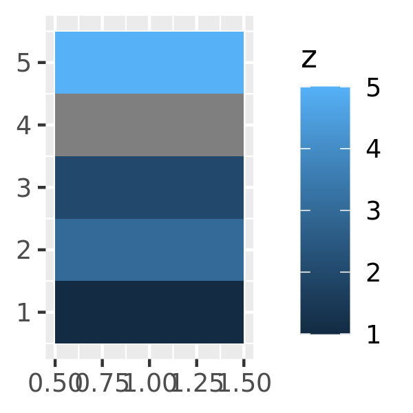
10.2.4 Limits, breaks, and labels
You can suppress the breaks entirely by setting them to NULL. For axes, this removes the tick marks, grid lines, and labels; and for legends this this removes the keys and labels.
toy <- data.frame(
  const = 1,
  up = 1:4,
  txt = letters[1:4],
  big = (1:4)*1000,
  log = c(2, 5, 10, 2000)
)
leg <- ggplot(toy, aes(up, up, fill = big)) +
  geom_tile() +
  labs(x = NULL, y = NULL)
leg + scale_fill_continuous(breaks = NULL)
A. Azzalini and A. W. Bowman, “A Look at Some Data on the Old Faithful Geyser.” Applied Statistics 39 (1990): 357–65.↩︎
Simon Garnier, Viridis: Default Color Maps from ’Matplotlib’, 2018, https://CRAN.R-project.org/package=viridis.↩︎
Thomas Lin Pedersen and Fabio Crameri, Scico: Colour Palettes Based on the Scientific Colour-Maps, 2020, https://CRAN.R-project.org/package=scico.↩︎
Emil Hvitfeldt, Paletteer: Comprehensive Collection of Color Palettes, 2020, https://CRAN.R-project.org/package=paletteer.↩︎
Charlotte Wickham, Munsell: Utilities for Using Munsell Colours, 2018, https://CRAN.R-project.org/package=munsell.↩︎
Achim Zeileis, Kurt Hornik, and Paul Murrell, “Escaping RGBland: Selecting Colors for Statistical Graphics,” Computational Statistics & Data Analysis, 2008, http://statmath.wu-wien.ac.at/~zeileis/papers/Zeileis+Hornik+Murrell-2008.pdf.↩︎