10.3 Discrete colour scales
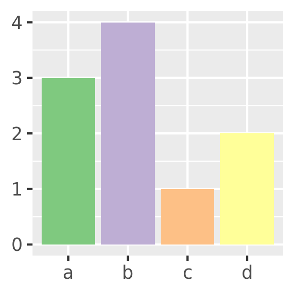
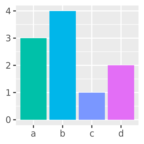
Discrete colour and fill scales occur in many situations. A typical example is a barchart that encodes both position and fill to the same variable. Many concepts from Section 10.2 apply to discrete scales, which I will illustrate using this barchart as the running example:
df <- data.frame(x = c("a", "b", "c", "d"), y = c(3, 4, 1, 2))
bars <- ggplot(df, aes(x, y, fill = x)) +
  geom_bar(stat = "identity") +
  labs(x = NULL, y = NULL) +
  theme(legend.position = "none")
The default scale for discrete colours is scale_fill_discrete() which in turn defaults to scale_fill_hue() so these are identical plots:
bars
bars + scale_fill_discrete()
bars + scale_fill_hue()


This default scale has some limitations (discussed shortly) so I’ll begin by discussing tools for producing nicer discrete palettes.
10.3.1 Brewer scales
scale_colour_brewer() is a discrete colour scale that—along with the continuous analog scale_colour_distiller() and binned analog scale_colour_fermenter()—uses handpicked “ColorBrewer” colours taken from http://colorbrewer2.org/. These colours have been designed to work well in a wide variety of situations, although the focus is on maps and so the colours tend to work better when displayed in large areas. There are many different options:
RColorBrewer::display.brewer.all()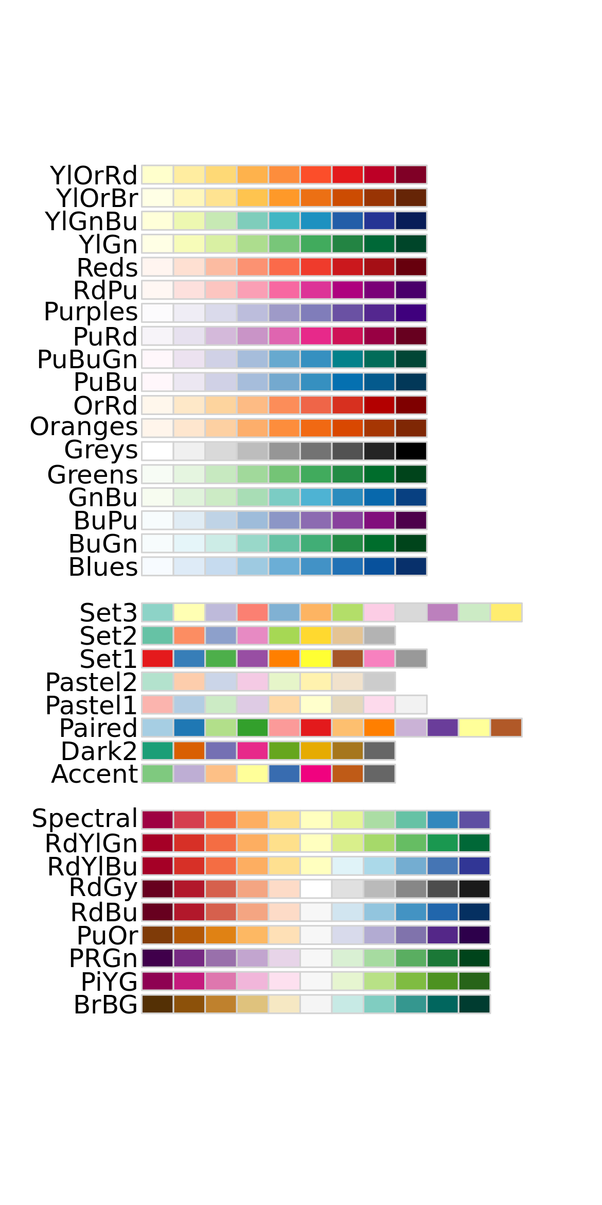
The first group of palettes are sequential scales that are useful when your discrete scale is ordered (e.g., rank data), and are available for continuous data using scale_colour_distiller(). For unordered categorical data, the palettes of most interest are those in the second group. ‘Set1’ and ‘Dark2’ are particularly good for points, and ‘Set2’, ‘Pastel1’, ‘Pastel2’ and ‘Accent’ work well for areas.
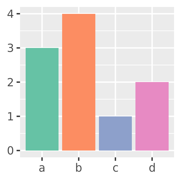
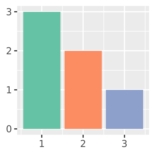
bars + scale_fill_brewer(palette = "Set1")
bars + scale_fill_brewer(palette = "Set2")
bars + scale_fill_brewer(palette = "Accent")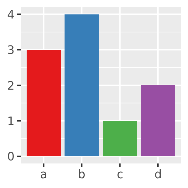
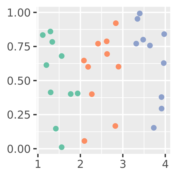
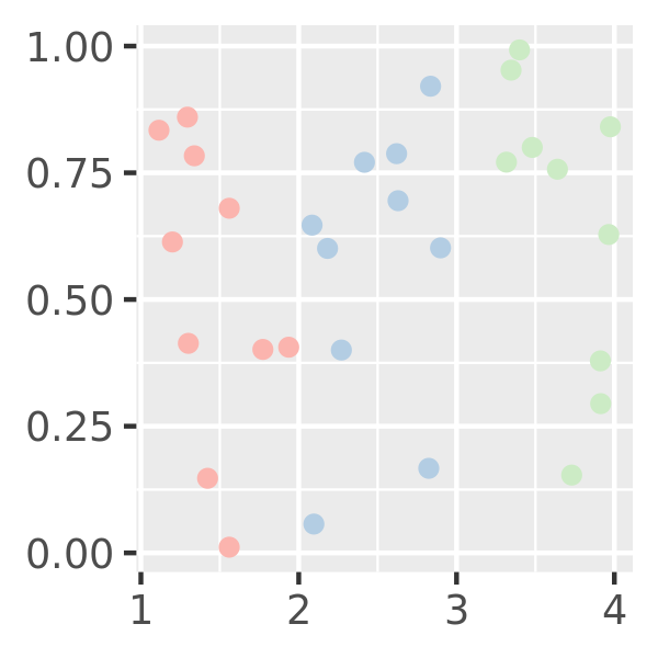
Note that no palette is uniformly good for all purposes. Scatter plots typically use small plot markers, and bright colours tend to work better than subtle ones:
# scatter plot
df <- data.frame(x = 1:3 + runif(30), y = runif(30), z = c("a", "b", "c"))
point <- ggplot(df, aes(x, y)) +
  geom_point(aes(colour = z))  +
  theme(legend.position = "none") +
  labs(x = NULL, y = NULL)

# three palettes
point + scale_colour_brewer(palette = "Set1")
point + scale_colour_brewer(palette = "Set2")
point + scale_colour_brewer(palette = "Pastel1")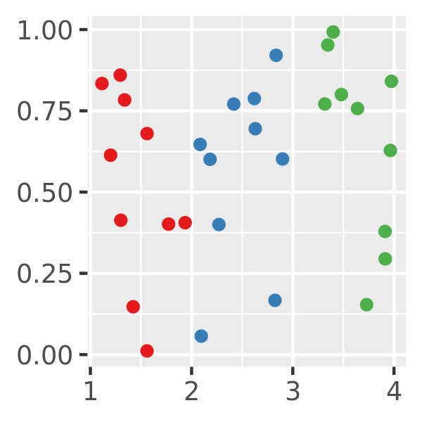
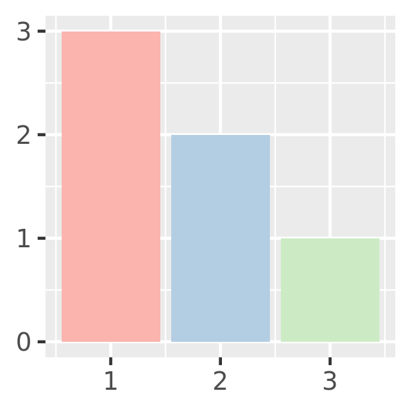
Bar plots usually contain large patches of colour, and bright colours can be overwhelming. Subtle colours tend to work better in this situation:
# bar plot
df <- data.frame(x = 1:3, y = 3:1, z = c("a", "b", "c"))
area <- ggplot(df, aes(x, y)) +
  geom_bar(aes(fill = z), stat = "identity") +
  theme(legend.position = "none") +
  labs(x = NULL, y = NULL)

# three palettes
area + scale_fill_brewer(palette = "Set1")
area + scale_fill_brewer(palette = "Set2")
area + scale_fill_brewer(palette = "Pastel1")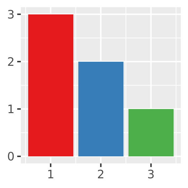
10.3.2 Hue and grey scales
The default colour scheme picks evenly spaced hues around the HCL colour wheel. This works well for up to about eight colours, but after that it becomes hard to tell the different colours apart. You can control the default chroma and luminance, and the range of hues, with the h, c and l arguments:
bars
bars + scale_fill_hue(c = 40)
bars + scale_fill_hue(h = c(180, 300))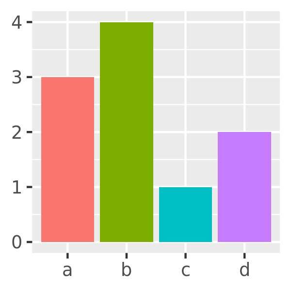

One disadvantage of the default colour scheme is that because the colours all have the same luminance and chroma, when you print them in black and white, they all appear as an identical shade of grey. Noting this, if you are intending a discrete colour scale to be printed in black and white, it is better to use scale_fill_grey() which maps discrete data to grays, from light to dark:
bars + scale_fill_grey()
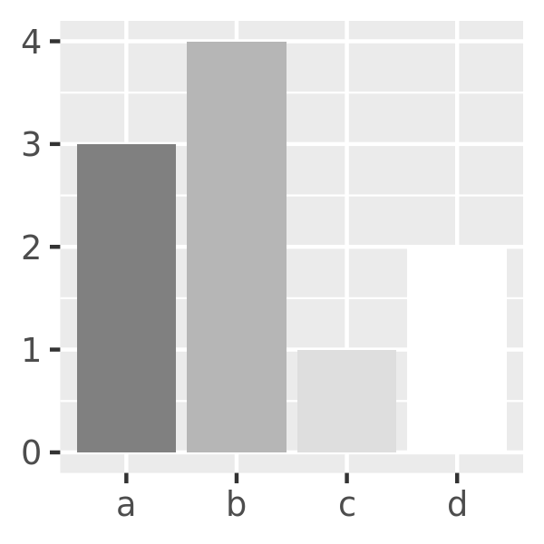
bars + scale_fill_grey(start = 0.5, end = 1)
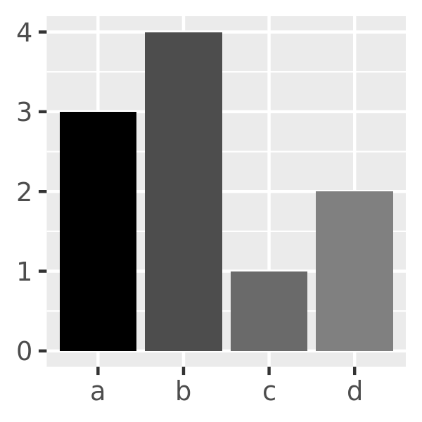
bars + scale_fill_grey(start = 0, end = 0.5)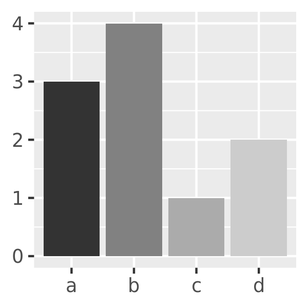
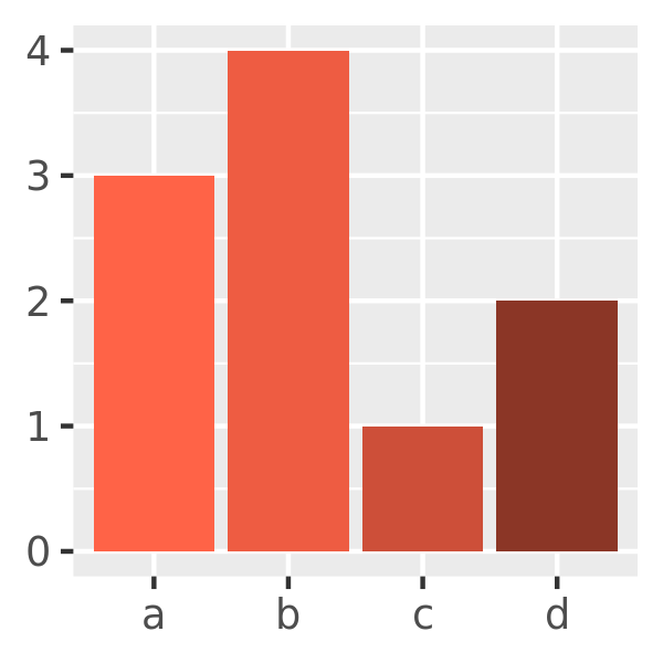
10.3.3 Manual scales
If none of the hand-picked palettes is suitable, or if you have your own preferred colours, you can use scale_fill_manual() to set the colours manually. This can be useful if you wish to choose colours that highlight a secondary grouping structure or draw attention to different comparisons:
bars + scale_fill_manual(values = c("sienna1", "sienna4", "hotpink1", "hotpink4"))
bars + scale_fill_manual(values = c("tomato1", "tomato2", "tomato3", "tomato4"))
bars + scale_fill_manual(values = c("grey", "black", "grey", "grey"))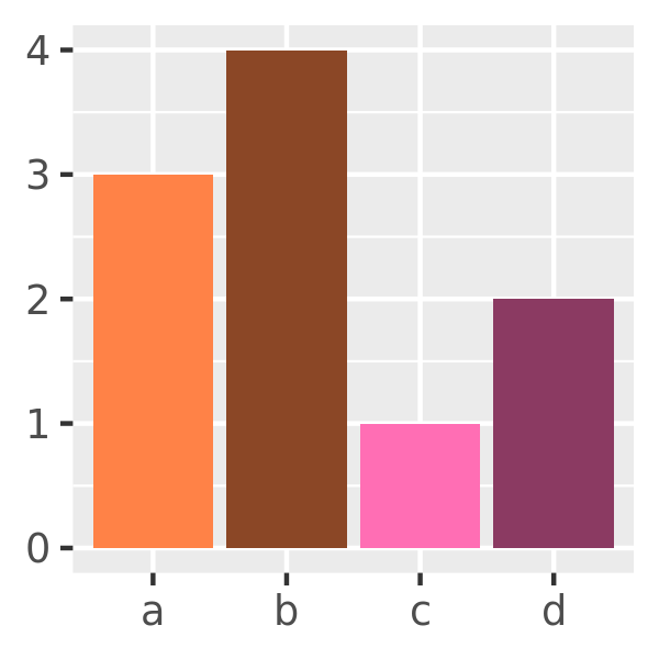
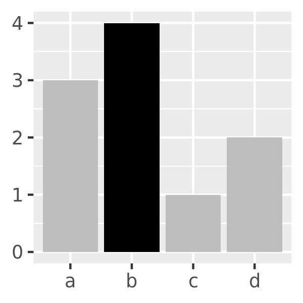
You can also use a named vector to specify colors to be assigned to each level which allows you to specify the levels in any order you like:
bars + scale_fill_manual(values = c(
  "d" = "grey",
  "c" = "grey",
  "b" = "black",
  "a" = "grey"
))
10.3.4 Exercises
Recreate the following plot: