12.3 Adding complexity
With a simple example under our belts, let’s now turn to look at this slightly more complicated example:
ggplot(mpg, aes(displ, hwy)) +
  geom_point() +
  geom_smooth() +
  facet_wrap(~year)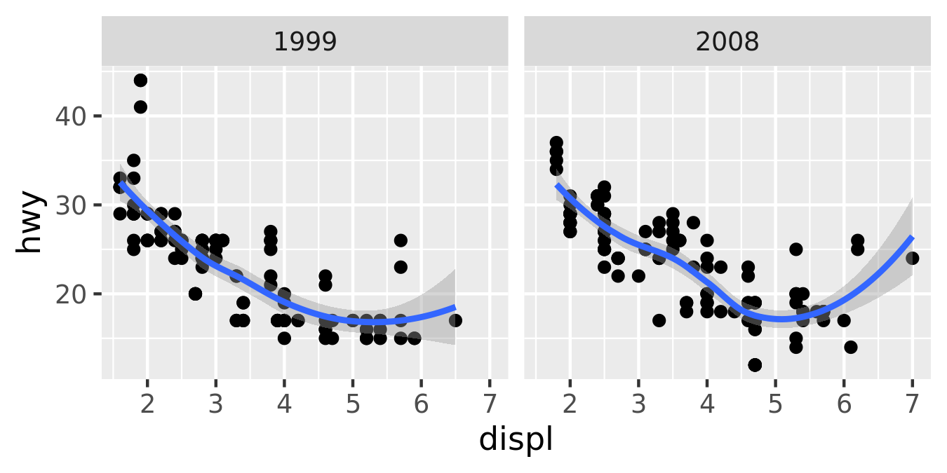
This plot adds three new components to the mix: facets, multiple layers and statistics. The facets and layers expand the data structure described above: each facet panel in each layer has its own dataset. You can think of this as a 3d array: the panels of the facets form a 2d grid, and the layers extend upwards in the 3rd dimension. In this case the data in the layers is the same, but in general we can plot different datasets on different layers.
The smooth layer is different to the point layer because it doesn’t display the raw data, but instead displays a statistical transformation of the data. Specifically, the smooth layer fits a smooth line through the middle of the data. This requires an additional step in the process described above: after mapping the data to aesthetics, the data is passed to a statistical transformation, or stat, which manipulates the data in some useful way. In this example, the stat fits the data to a loess smoother, and then returns predictions from evenly spaced points within the range of the data. Other useful stats include 1 and 2d binning, group means, quantile regression and contouring.
As well as adding an additional step to summarise the data, we also need some extra steps when we get to the scales. This is because we now have multiple datasets (for the different facets and layers) and we need to make sure that the scales are the same across all of them. Scaling actually occurs in three parts: transforming, training and mapping. We haven’t mentioned transformation before, but you have probably seen it before in log-log plots. In a log-log plot, the data values are not linearly mapped to position on the plot, but are first log-transformed.
Scale transformation occurs before statistical transformation so that statistics are computed on the scale-transformed data. This ensures that a plot of \(\log(x)\) vs. \(\log(y)\) on linear scales looks the same as \(x\) vs. \(y\) on log scales. There are many different transformations that can be used, including taking square roots, logarithms and reciprocals. See Section 9 for more details.
After the statistics are computed, each scale is trained on every dataset from all the layers and facets. The training operation combines the ranges of the individual datasets to get the range of the complete data. Without this step, scales could only make sense locally and we wouldn’t be able to overlay different layers because their positions wouldn’t line up. Sometimes we do want to vary position scales across facets (but never across layers), and this is described more fully in Section 16.3.
Finally the scales map the data values into aesthetic values. This is a local operation: the variables in each dataset are mapped to their aesthetic values, producing a new dataset that can then be rendered by the geoms.
Figure 12.2 illustrates the complete process schematically.
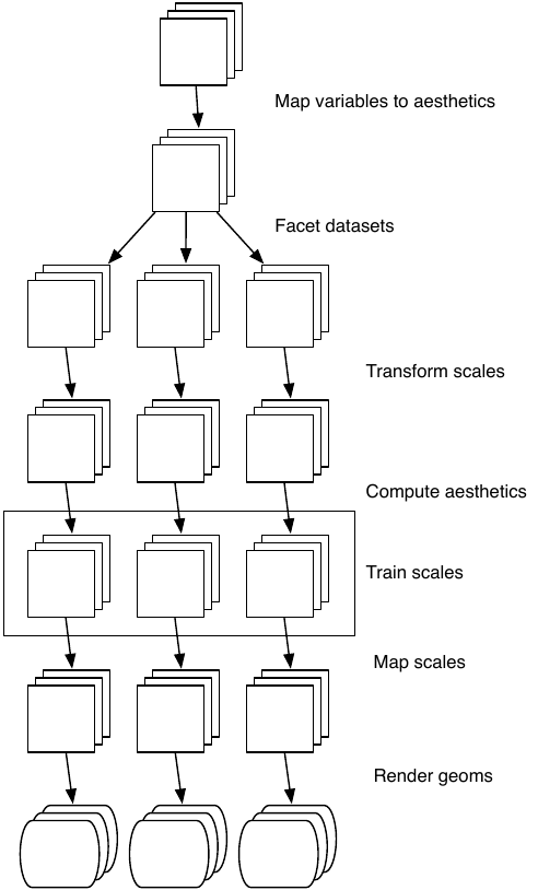
Figure 12.2: Schematic description of the plot generation process. Each square represents a layer, and this schematic represents a plot with three layers and three panels. All steps work by transforming individual data frames except for training scales, which doesn’t affect the data frame and operates across all datasets simultaneously.