12.4 Components of the layered grammar
In the examples above, we have seen some of the components that make up a plot: data and aesthetic mappings, geometric objects (geoms), statistical transformations (stats), scales, and faceting. We have also touched on the coordinate system. One thing we didn’t mention is the position adjustment, which deals with overlapping graphic objects. Together, the data, mappings, stat, geom and position adjustment form a layer. A plot may have multiple layers, as in the example where we overlaid a smoothed line on a scatterplot. All together, the layered grammar defines a plot as the combination of:
A default dataset and set of mappings from variables to aesthetics.
One or more layers, each composed of a geometric object, a statistical transformation, a position adjustment, and optionally, a dataset and aesthetic mappings.
One scale for each aesthetic mapping.
A coordinate system.
The faceting specification.
The following sections describe each of the higher-level components more precisely, and point you to the parts of the book where they are documented.
12.4.1 Layers
Layers are responsible for creating the objects that we perceive on the plot. A layer is composed of five parts:
- Data
- Aesthetic mappings.
- A statistical transformation (stat).
- A geometric object (geom).
- A position adjustment.
The properties of a layer are described in Chapter 13 and their uses for data visualisation in are outlined in Chapters 3 to 7.
12.4.2 Scales
A scale controls the mapping from data to aesthetic attributes, and we need a scale for every aesthetic used on a plot. Each scale operates across all the data in the plot, ensuring a consistent mapping from data to aesthetics. Some examples are shown in Figure .

Figure 12.3: Examples of legends from four different scales. From left to right: continuous variable mapped to size, and to colour, discrete variable mapped to shape, and to colour. The ordering of scales seems upside-down, but this matches the labelling of the \(y\)-axis: small values occur at the bottom.
A scale is a function and its inverse, along with a set of parameters. For example, the colour gradient scale maps a segment of the real line to a path through a colour space. The parameters of the function define whether the path is linear or curved, which colour space to use (e.g., LUV or RGB), and the colours at the start and end.
The inverse function is used to draw a guide so that you can read values from the graph. Guides are either axes (for position scales) or legends (for everything else). Most mappings have a unique inverse (i.e., the mapping function is one-to-one), but many do not. A unique inverse makes it possible to recover the original data, but this is not always desirable if we want to focus attention on a single aspect.
For more details, see Chapter ??.
12.4.3 Coordinate system
A coordinate system, or coord for short, maps the position of objects onto the plane of the plot. Position is often specified by two coordinates \((x, y)\), but potentially could be three or more (although this is not implemented in ggplot2). The Cartesian coordinate system is the most common coordinate system for two dimensions, while polar coordinates and various map projections are used less frequently.
Coordinate systems affect all position variables simultaneously and differ from scales in that they also change the appearance of the geometric objects. For example, in polar coordinates, bar geoms look like segments of a circle. Additionally, scaling is performed before statistical transformation, while coordinate transformations occur afterward. The consequences of this are shown in Section 15.2.
Coordinate systems control how the axes and grid lines are drawn. Figure illustrates three different types of coordinate systems. Very little advice is available for drawing these for non-Cartesian coordinate systems, so a lot of work needs to be done to produce polished output. See Chapter 15 for more details.
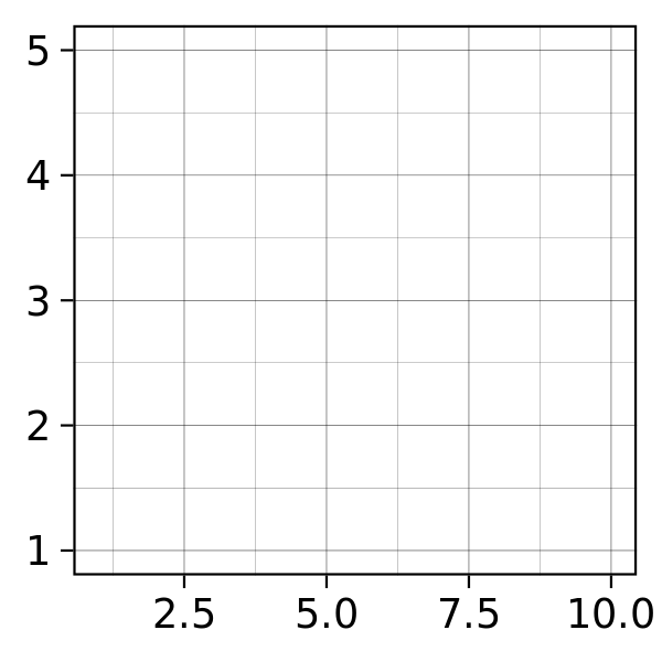
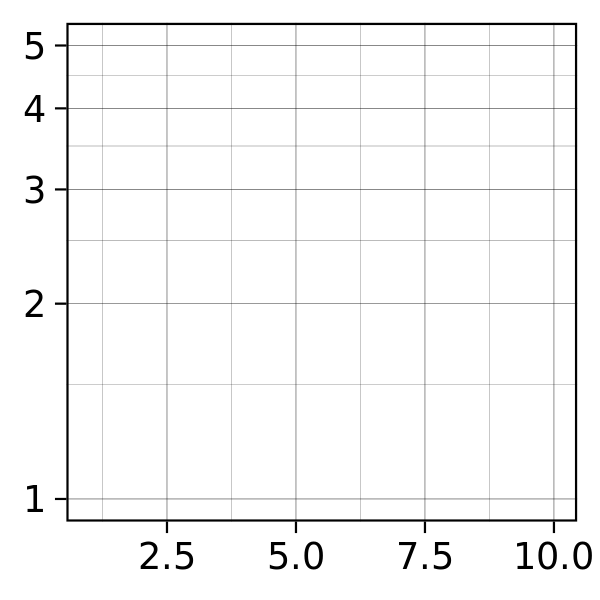
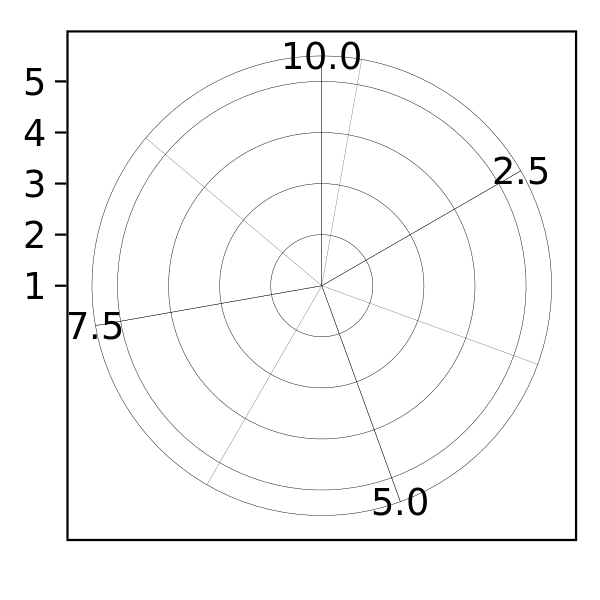
Figure 12.4: Examples of axes and grid lines for three coordinate systems: Cartesian, semi-log and polar. The polar coordinate system illustrates the difficulties associated with non-Cartesian coordinates: it is hard to draw the axes well.
12.4.4 Faceting
There is also another thing that turns out to be sufficiently useful that we should include it in our general framework: faceting, a general case of conditioned or trellised plots. This makes it easy to create small multiples, each showing a different subset of the whole dataset. This is a powerful tool when investigating whether patterns hold across all conditions. The faceting specification describes which variables should be used to split up the data, and whether position scales should be free or constrained. Faceting is described in Section 13.7.