15.2 Non-linear coordinate systems
Unlike linear coordinates, non-linear coordinates can change the shape of geoms. For example, in polar coordinates a rectangle becomes an arc; in a map projection, the shortest path between two points is not necessarily a straight line. The code below shows how a line and a rectangle are rendered in a few different coordinate systems.
rect <- data.frame(x = 50, y = 50)
line <- data.frame(x = c(1, 200), y = c(100, 1))
base <- ggplot(mapping = aes(x, y)) +
geom_tile(data = rect, aes(width = 50, height = 50)) +
geom_line(data = line) +
xlab(NULL) + ylab(NULL)
base
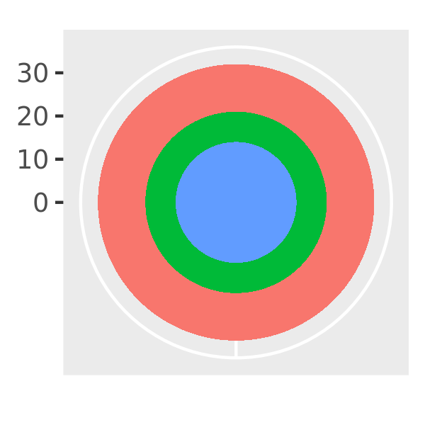
base + coord_polar("x")
base + coord_polar("y")![]()
![]()
![]()
base + coord_flip()
base + coord_trans(y = "log10")
base + coord_fixed()![]()
![]()
![]()
The transformation takes part in two steps. Firstly, the parameterisation of each geom is changed to be purely location-based, rather than location- and dimension-based. For example, a bar can be represented as an x position (a location), a height and a width (two dimensions). Interpreting height and width in a non-Cartesian coordinate system is hard because a rectangle may no longer have constant height and width, so we convert to a purely location-based representation, a polygon defined by the four corners. This effectively converts all geoms to a combination of points, lines and polygons.
Once all geoms have a location-based representation, the next step is to transform each location into the new coordinate system. It is easy to transform points, because a point is still a point no matter what coordinate system you are in. Lines and polygons are harder, because a straight line may no longer be straight in the new coordinate system. To make the problem tractable we assume that all coordinate transformations are smooth, in the sense that all very short lines will still be very short straight lines in the new coordinate system. With this assumption in hand, we can transform lines and polygons by breaking them up into many small line segments and transforming each segment. This process is called munching and is illustrated below:
We start with a line parameterised by its two endpoints:
df <- data.frame(r = c(0, 1), theta = c(0, 3 / 2 * pi))
ggplot(df, aes(r, theta)) +
  geom_line() +
  geom_point(size = 2, colour = "red")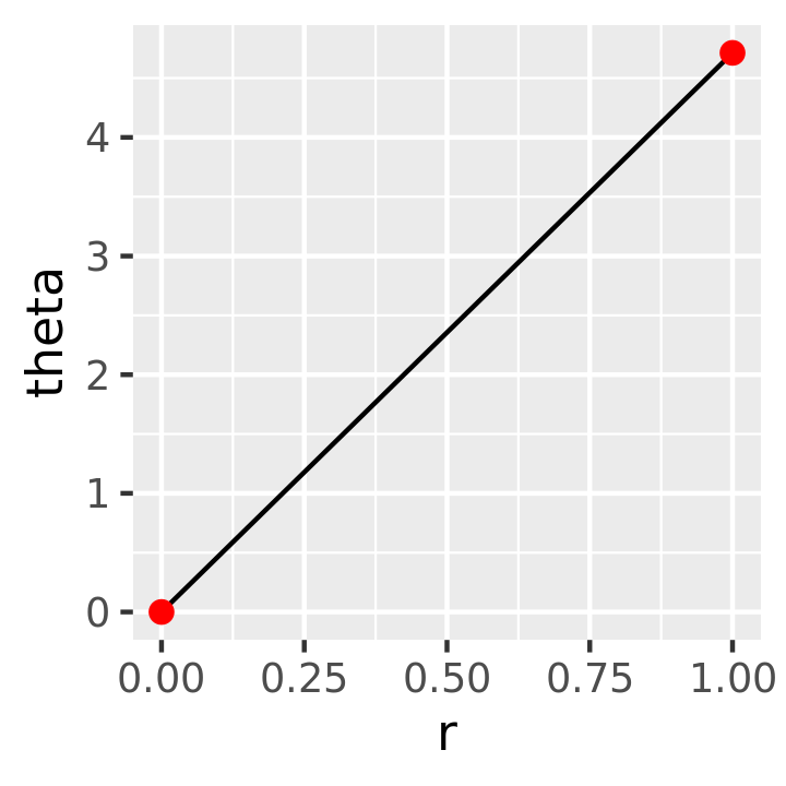
We break it into multiple line segments, each with two endpoints.
interp <- function(rng, n) {
  seq(rng[1], rng[2], length = n)
}
munched <- data.frame(
  r = interp(df$r, 15),
  theta = interp(df$theta, 15)
)

ggplot(munched, aes(r, theta)) +
  geom_line() +
  geom_point(size = 2, colour = "red")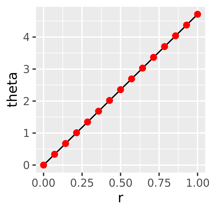
We transform the locations of each piece:
transformed <- transform(munched,
  x = r * sin(theta),
  y = r * cos(theta)
)

ggplot(transformed, aes(x, y)) +
  geom_path() +
  geom_point(size = 2, colour = "red") +
  coord_fixed()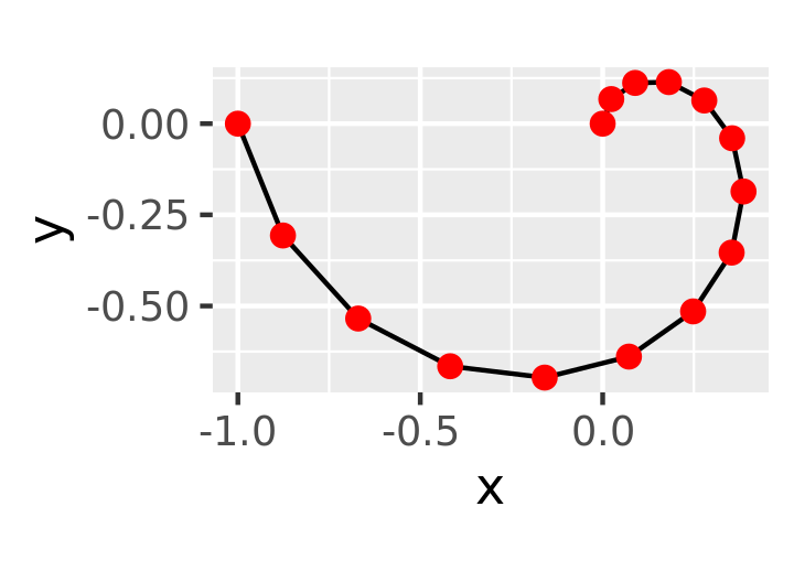
Internally ggplot2 uses many more segments so that the result looks smooth.
15.2.1 Transformations with coord_trans()
Like limits, we can also transform the data in two places: at the scale level or at the coordinate system level. coord_trans() has arguments x and y which should be strings naming the transformer or transformer objects (see Section 9). Transforming at the scale level occurs before statistics are computed and does not change the shape of the geom. Transforming at the coordinate system level occurs after the statistics have been computed, and does affect the shape of the geom. Using both together allows us to model the data on a transformed scale and then backtransform it for interpretation: a common pattern in analysis.
# Linear model on original scale is poor fit
base <- ggplot(diamonds, aes(carat, price)) +
  stat_bin2d() +
  geom_smooth(method = "lm") +
  xlab(NULL) +
  ylab(NULL) +
  theme(legend.position = "none")
base
#> `geom_smooth()` using formula 'y ~ x'

# Better fit on log scale, but harder to interpret
base +
  scale_x_log10() +
  scale_y_log10()
#> `geom_smooth()` using formula 'y ~ x'

# Fit on log scale, then backtransform to original.
# Highlights lack of expensive diamonds with large carats
pow10 <- scales::exp_trans(10)
base +
  scale_x_log10() +
  scale_y_log10() +
  coord_trans(x = pow10, y = pow10)
#> `geom_smooth()` using formula 'y ~ x'![]()
![]()
![]()
15.2.2 Polar coordinates with coord_polar()
Using polar coordinates gives rise to pie charts and wind roses (from bar geoms), and radar charts (from line geoms). Polar coordinates are often used for circular data, particularly time or direction, but the perceptual properties are not good because the angle is harder to perceive for small radii than it is for large radii. The theta argument determines which position variable is mapped to angle (by default, x) and which to radius.
The code below shows how we can turn a bar into a pie chart or a bullseye chart by changing the coordinate system. The documentation includes other examples.
base <- ggplot(mtcars, aes(factor(1), fill = factor(cyl))) +
geom_bar(width = 1) +
theme(legend.position = "none") +
scale_x_discrete(NULL, expand = c(0, 0)) +
scale_y_continuous(NULL, expand = c(0, 0))
# Stacked barchart
base
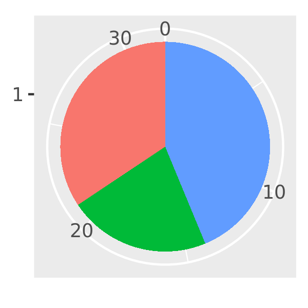
# Pie chart
base + coord_polar(theta = "y")
# The bullseye chart
base + coord_polar()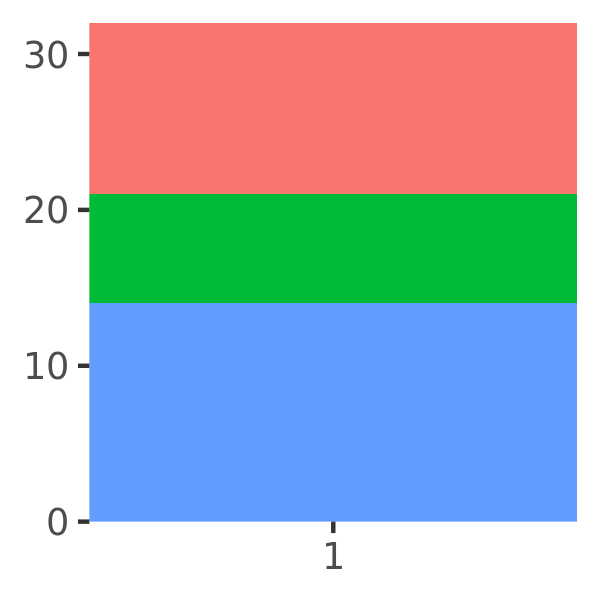
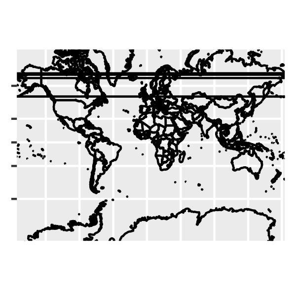
15.2.3 Map projections with coord_map()
Maps are intrinsically displays of spherical data. Simply plotting raw longitudes and latitudes is misleading, so we must project the data. There are two ways to do this with ggplot2:
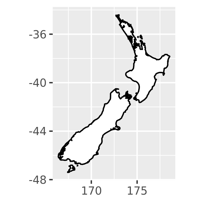
coord_quickmap()is a quick and dirty approximation that sets the aspect ratio to ensure that 1m of latitude and 1m of longitude are the same distance in the middle of the plot. This is a reasonable place to start for smaller regions, and is very fast.# Prepare a map of NZ nzmap <- ggplot(map_data("nz"), aes(long, lat, group = group)) + geom_polygon(fill = "white", colour = "black") + xlab(NULL) + ylab(NULL) # Plot it in cartesian coordinates nzmap # With the aspect ratio approximation nzmap + coord_quickmap()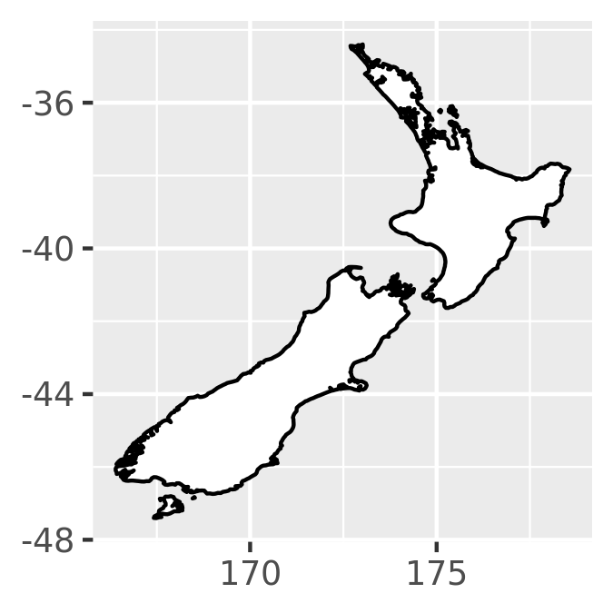
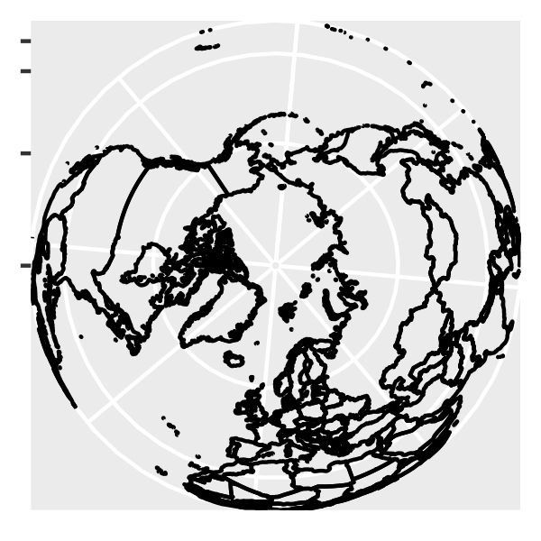
coord_map()uses the mapproj package, https://cran.r-project.org/package=mapproj to do a formal map projection. It takes the same arguments asmapproj::mapproject()for controlling the projection. It is much slower thancoord_quickmap()because it must munch the data and transform each piece.world <- map_data("world") worldmap <- ggplot(world, aes(long, lat, group = group)) + geom_path() + scale_y_continuous(NULL, breaks = (-2:3) * 30, labels = NULL) + scale_x_continuous(NULL, breaks = (-4:4) * 45, labels = NULL) worldmap + coord_map() # Some crazier projections worldmap + coord_map("ortho") worldmap + coord_map("stereographic")