13.3 Data
Every layer must have some data associated with it, and that data must be in a tidy data frame. Tidy data frames are described in more detail in R for Data Science (https://r4ds.had.co.nz), but for now, all you need to know is that a tidy data frame has variables in the columns and observations in the rows. This is a strong restriction, but there are good reasons for it:
Your data is very important, so it’s best to be explicit about it.
A single data frame is also easier to save than a multitude of vectors, which means it’s easier to reproduce your results or send your data to someone else.
It enforces a clean separation of concerns: ggplot2 turns data frames into visualisations. Other packages can make data frames in the right format.
The data on each layer doesn’t need to be the same, and it’s often useful to combine multiple datasets in a single plot. To illustrate that idea I’m going to generate two new datasets related to the mpg dataset. First I’ll fit a loess model and generate predictions from it. (This is what geom_smooth() does behind the scenes)
mod <- loess(hwy ~ displ, data = mpg)
grid <- data_frame(displ = seq(min(mpg$displ), max(mpg$displ), length = 50))
#> Warning: `data_frame()` is deprecated as of tibble 1.1.0.
#> Please use `tibble()` instead.
#> This warning is displayed once every 8 hours.
#> Call `lifecycle::last_warnings()` to see where this warning was generated.
grid$hwy <- predict(mod, newdata = grid)

grid
#> # A tibble: 50 x 2
#>   displ   hwy
#>   <dbl> <dbl>
#> 1  1.6   33.1
#> 2  1.71  32.2
#> 3  1.82  31.3
#> 4  1.93  30.4
#> 5  2.04  29.6
#> 6  2.15  28.8
#> # … with 44 more rows
Next, I’ll isolate observations that are particularly far away from their predicted values:
std_resid <- resid(mod) / mod$s
outlier <- filter(mpg, abs(std_resid) > 2)
outlier
#> # A tibble: 6 x 11
#>   manufacturer model   displ  year   cyl trans   drv     cty   hwy fl    class
#>   <chr>        <chr>   <dbl> <int> <int> <chr>   <chr> <int> <int> <chr> <chr>
#> 1 chevrolet    corvet…   5.7  1999     8 manual… r        16    26 p     2seater
#> 2 pontiac      grand …   3.8  2008     6 auto(l… f        18    28 r     midsize
#> 3 pontiac      grand …   5.3  2008     8 auto(s… f        16    25 p     midsize
#> 4 volkswagen   jetta     1.9  1999     4 manual… f        33    44 d     compact
#> 5 volkswagen   new be…   1.9  1999     4 manual… f        35    44 d     subcom…
#> 6 volkswagen   new be…   1.9  1999     4 auto(l… f        29    41 d     subcom…
I’ve generated these datasets because it’s common to enhance the display of raw data with a statistical summary and some annotations. With these new datasets, I can improve our initial scatterplot by overlaying a smoothed line, and labelling the outlying points:
ggplot(mpg, aes(displ, hwy)) +
  geom_point() +
  geom_line(data = grid, colour = "blue", size = 1.5) +
  geom_text(data = outlier, aes(label = model))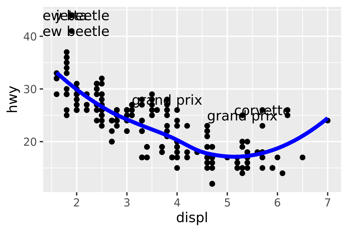
(The labels aren’t particularly easy to read, but you can fix that with some manual tweaking.)
Note that you need the explicit data = in the layers, but not in the call to ggplot(). That’s because the argument order is different. This is a little inconsistent, but it reduces typing for the common case where you specify the data once in ggplot() and modify aesthetics in each layer.
In this example, every layer uses a different dataset. We could define the same plot in another way, omitting the default dataset, and specifying a dataset for each layer:
ggplot(mapping = aes(displ, hwy)) +
  geom_point(data = mpg) +
  geom_line(data = grid) +
  geom_text(data = outlier, aes(label = model))
I don’t particularly like this style in this example because it makes it less clear what the primary dataset is (and because of the way that the arguments to ggplot() are ordered, it actually requires more keystrokes). However, you may prefer it in cases where there isn’t a clear primary dataset, or where the aesthetics also vary from layer to layer.
13.3.1 Exercises
The first two arguments to ggplot are
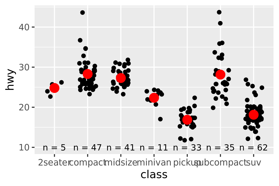
dataandmapping. The first two arguments to all layer functions aremappinganddata. Why does the order of the arguments differ? (Hint: think about what you set most commonly.)The following code uses dplyr to generate some summary statistics about each class of car.
library(dplyr)
class <- mpg %>%
  group_by(class) %>%
  summarise(n = n(), hwy = mean(hwy))
#> `summarise()` ungrouping output (override with `.groups` argument)
Use the data to recreate this plot: