5.4 Displaying distributions
There are a number of geoms that can be used to display distributions, depending on the dimensionality of the distribution, whether it is continuous or discrete, and whether you are interested in the conditional or joint distribution.
For 1d continuous distributions the most important geom is the histogram, geom_histogram():
ggplot(diamonds, aes(depth)) +
  geom_histogram()
#> `stat_bin()` using `bins = 30`. Pick better value with `binwidth`.
ggplot(diamonds, aes(depth)) +
  geom_histogram(binwidth = 0.1) +
  xlim(55, 70)
#> Warning: Removed 45 rows containing non-finite values (stat_bin).
#> Warning: Removed 2 rows containing missing values (geom_bar).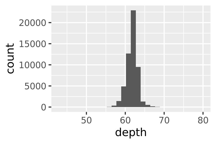
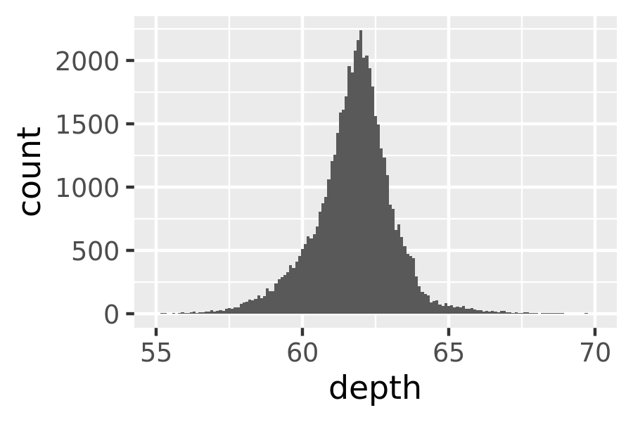
It is important to experiment with binning to find a revealing view. You can change the binwidth, specify the number of bins, or specify the exact location of the breaks. Never rely on the default parameters to get a revealing view of the distribution. Zooming in on the x axis, xlim(55, 70), and selecting a smaller bin width, binwidth = 0.1, reveals far more detail.
When publishing figures, don’t forget to include information about important parameters (like bin width) in the caption.
If you want to compare the distribution between groups, you have a few options:
- Show small multiples of the histogram,
facet_wrap(~ var). - Use colour and a frequency polygon,
geom_freqpoly(). - Use a “conditional density plot”,
geom_histogram(position = "fill").
The frequency polygon and conditional density plots are shown below. The conditional density plot uses position_fill() to stack each bin, scaling it to the same height. This plot is perceptually challenging because you need to compare bar heights, not positions, but you can see the strongest patterns.
ggplot(diamonds, aes(depth)) +
  geom_freqpoly(aes(colour = cut), binwidth = 0.1, na.rm = TRUE) +
  xlim(58, 68) +
  theme(legend.position = "none")
ggplot(diamonds, aes(depth)) +
  geom_histogram(aes(fill = cut), binwidth = 0.1, position = "fill",
    na.rm = TRUE) +
  xlim(58, 68) +
  theme(legend.position = "none")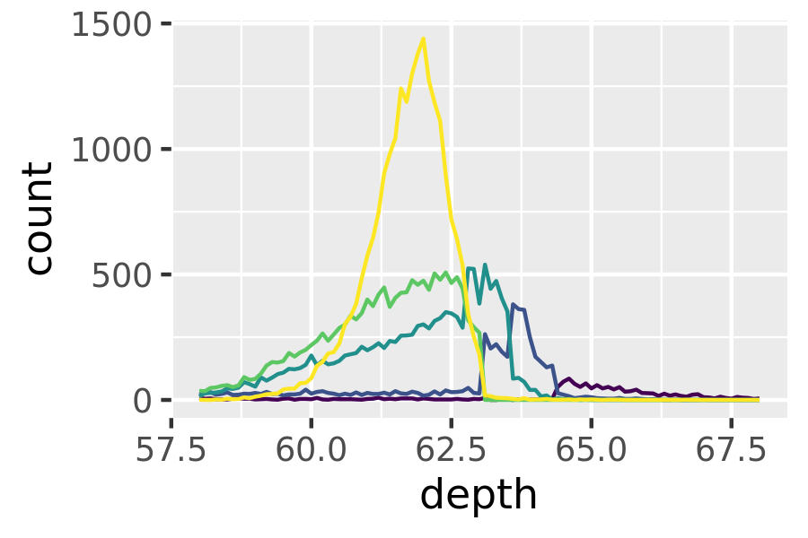
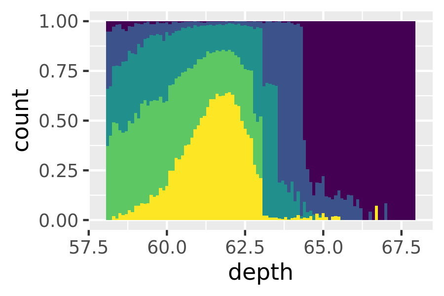
(I’ve suppressed the legends to focus on the display of the data.)
Both the histogram and frequency polygon geom use the same underlying statistical transformation: stat = "bin". This statistic produces two output variables: count and density. By default, count is mapped to y-position, because it’s most interpretable. The density is the count divided by the total count multiplied by the bin width, and is useful when you want to compare the shape of the distributions, not the overall size.
An alternative to a bin-based visualisation is a density estimate. geom_density() places a little normal distribution at each data point and sums up all the curves. It has desirable theoretical properties, but is more difficult to relate back to the data. Use a density plot when you know that the underlying density is smooth, continuous and unbounded. You can use the adjust parameter to make the density more or less smooth.
ggplot(diamonds, aes(depth)) +
  geom_density(na.rm = TRUE) +
  xlim(58, 68) +
  theme(legend.position = "none")
ggplot(diamonds, aes(depth, fill = cut, colour = cut)) +
  geom_density(alpha = 0.2, na.rm = TRUE) +
  xlim(58, 68) +
  theme(legend.position = "none")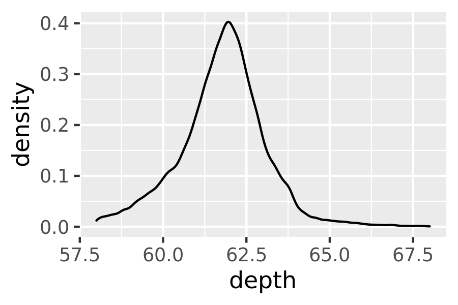
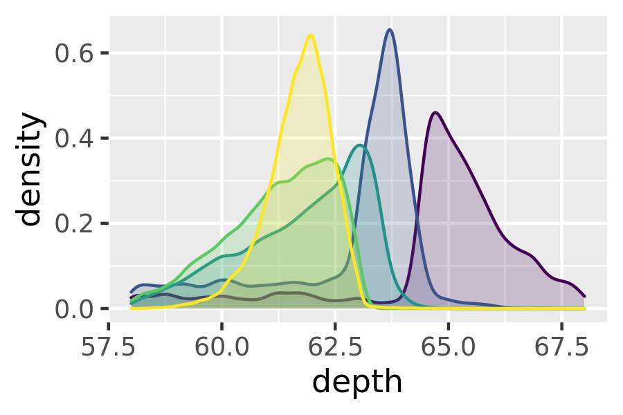
Note that the area of each density estimate is standardised to one so that you lose information about the relative size of each group.
The histogram, frequency polygon and density display a detailed view of the distribution. However, sometimes you want to compare many distributions, and it’s useful to have alternative options that sacrifice quality for quantity. Here are three options:
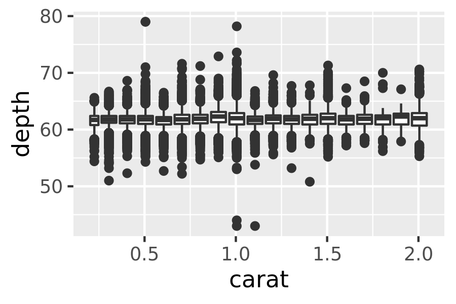
geom_boxplot(): the box-and-whisker plot shows five summary statistics along with individual “outliers”. It displays far less information than a histogram, but also takes up much less space.You can use boxplot with both categorical and continuous x. For continuous x, you’ll also need to set the group aesthetic to define how the x variable is broken up into bins. A useful helper function is
cut_width():ggplot(diamonds, aes(clarity, depth)) + geom_boxplot() ggplot(diamonds, aes(carat, depth)) + geom_boxplot(aes(group = cut_width(carat, 0.1))) + xlim(NA, 2.05) #> Warning: Removed 997 rows containing missing values (stat_boxplot).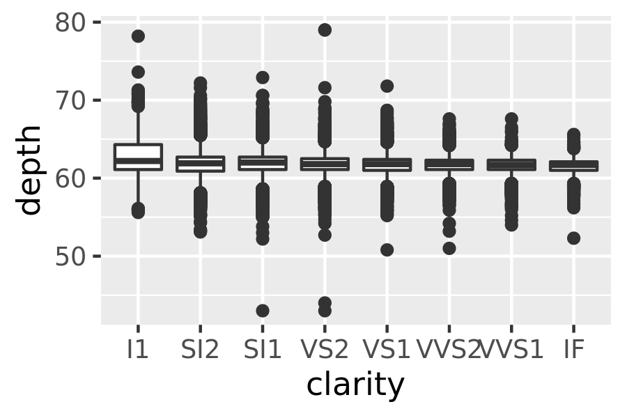
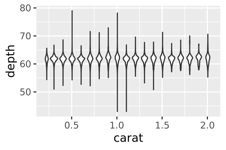
geom_violin(): the violin plot is a compact version of the density plot. The underlying computation is the same, but the results are displayed in a similar fashion to the boxplot:ggplot(diamonds, aes(clarity, depth)) + geom_violin() ggplot(diamonds, aes(carat, depth)) + geom_violin(aes(group = cut_width(carat, 0.1))) + xlim(NA, 2.05) #> Warning: Removed 997 rows containing non-finite values (stat_ydensity).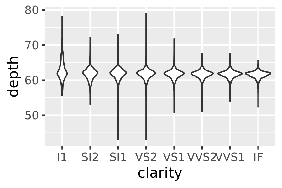
geom_dotplot(): draws one point for each observation, carefully adjusted in space to avoid overlaps and show the distribution. It is useful for smaller datasets.
5.4.1 Exercises
What binwidth tells you the most interesting story about the distribution of
carat?Draw a histogram of
price. What interesting patterns do you see?How does the distribution of
pricevary withclarity?Overlay a frequency polygon and density plot of
depth. What computed variable do you need to map toyto make the two plots comparable? (You can either modifygeom_freqpoly()orgeom_density().)