17.1 Introduction
In this chapter you will learn how to use the ggplot2 theme system, which allows you to exercise fine control over the non-data elements of your plot. The theme system does not affect how the data is rendered by geoms, or how it is transformed by scales. Themes don’t change the perceptual properties of the plot, but they do help you make the plot aesthetically pleasing or match an existing style guide. Themes give you control over things like fonts, ticks, panel strips, and backgrounds.
This separation of control into data and non-data parts is quite different from base and lattice graphics. In base and lattice graphics, most functions take a large number of arguments that specify both data and non-data appearance, which makes the functions complicated and harder to learn. ggplot2 takes a different approach: when creating the plot you determine how the data is displayed, then after it has been created you can edit every detail of the rendering, using the theming system.
The theming system is composed of four main components:
Theme elements specify the non-data elements that you can control. For example, the
plot.titleelement controls the appearance of the plot title;axis.ticks.x, the ticks on the x axis;legend.key.height, the height of the keys in the legend.Each element is associated with an element function, which describes the visual properties of the element. For example,
element_text()sets the font size, colour and face of text elements likeplot.title.The
theme()function which allows you to override the default theme elements by calling element functions, liketheme(plot.title = element_text(colour = "red")).Complete themes, like
theme_grey()set all of the theme elements to values designed to work together harmoniously.
For example, imagine you’ve made the following plot of your data.
base <- ggplot(mpg, aes(cty, hwy, color = factor(cyl))) +
  geom_jitter() +
  geom_abline(colour = "grey50", size = 2)
base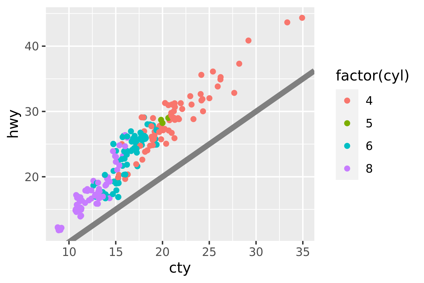
It’s served its purpose for you: you’ve learned that cty and hwy are highly correlated, both are tightly coupled with cyl, and that hwy is always greater than cty (and the difference increases as cty increases). Now you want to share the plot with others, perhaps by publishing it in a paper. That requires some changes. First, you need to make sure the plot can stand alone by:
- Improving the axes and legend labels.
- Adding a title for the plot.
- Tweaking the colour scale.
Fortunately you know how to do that already because you’ve read Chapter ??:
labelled <- base +
  labs(
    x = "City mileage/gallon",
    y = "Highway mileage/gallon",
    colour = "Cylinders",
    title = "Highway and city mileage are highly correlated"
  ) +
  scale_colour_brewer(type = "seq", palette = "Spectral")
labelled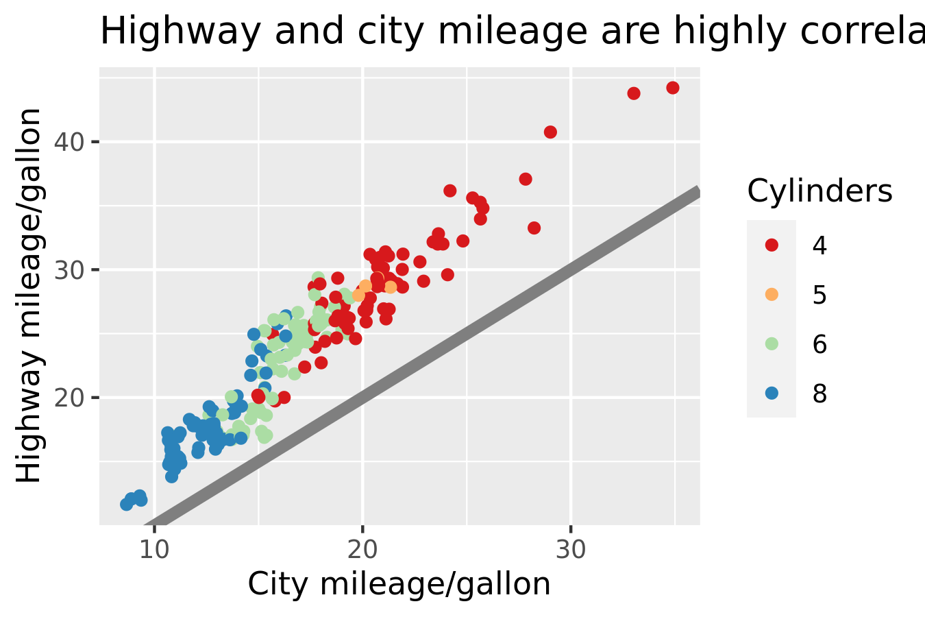
Next, you need to make sure the plot matches the style guidelines of your journal:
- The background should be white, not pale grey.
- The legend should be placed inside the plot if there’s room.
- Major gridlines should be a pale grey and minor gridlines should be removed.
- The plot title should be 12pt bold text.
In this chapter, you’ll learn how to use the theming system to make those changes, as shown below:
styled <- labelled +
  theme_bw() +
  theme(
    plot.title = element_text(face = "bold", size = 12),
    legend.background = element_rect(fill = "white", size = 4, colour = "white"),
    legend.justification = c(0, 1),
    legend.position = c(0, 1),
    axis.ticks = element_line(colour = "grey70", size = 0.2),
    panel.grid.major = element_line(colour = "grey70", size = 0.2),
    panel.grid.minor = element_blank()
  )
styled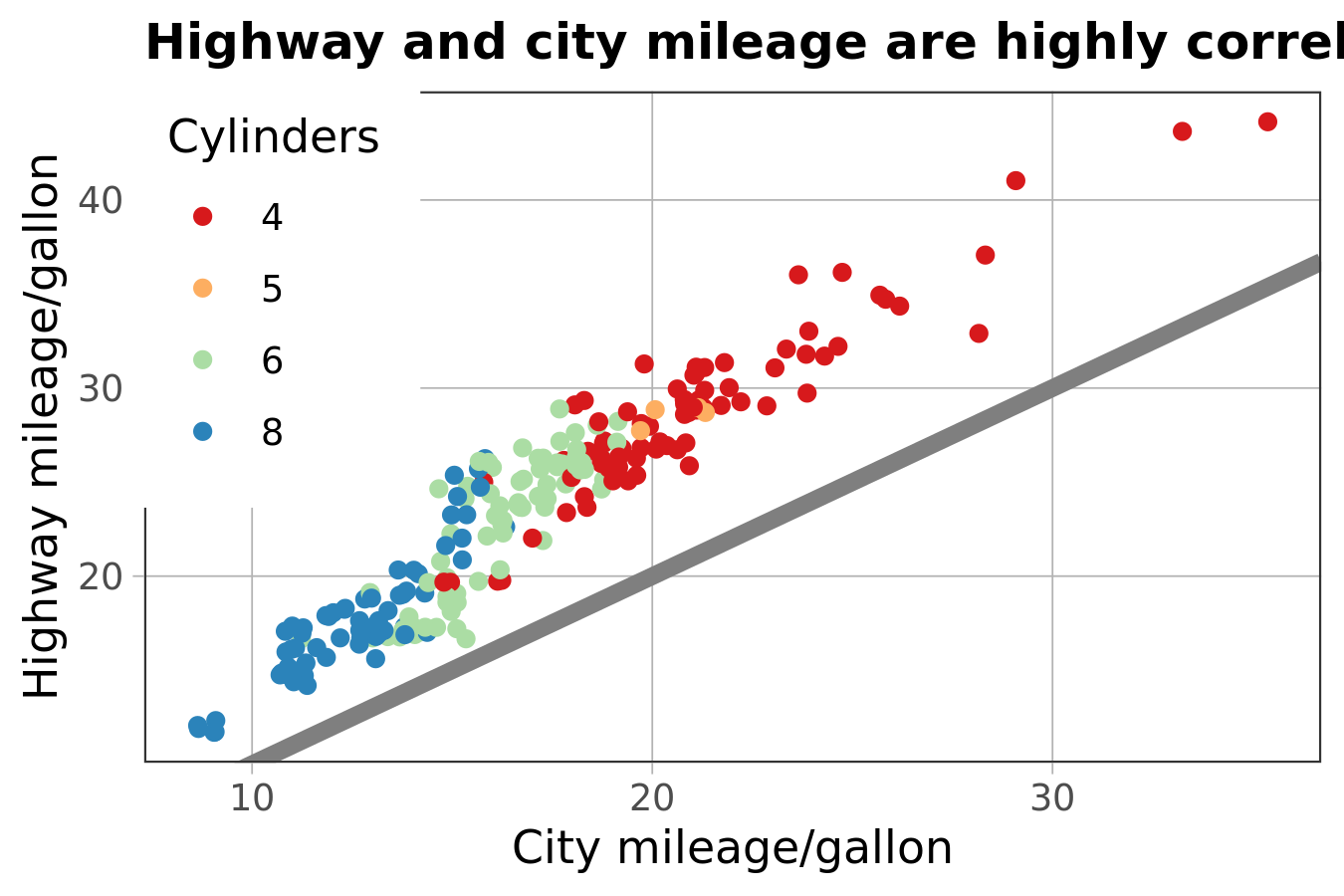
Finally, the journal wants the figure as a 600 dpi TIFF file. You’ll learn the fine details of ggsave() in Section 17.5.