10.7 Legend key glyphs
In most cases the default glyphs shown in the legend key will be appropriate to the layer and the aesthetic. Line plots of different colours will show up as lines of different colours in the legend, boxplots will appear as small boxplots in the legend, and so on. Should you need to override this behaviour, the key_glyph argument can be used to associate a particular layer with a different kind of glyph. For example:
base <- ggplot(economics, aes(date, psavert, color = "savings"))

base + geom_line()
base + geom_line(key_glyph = "timeseries")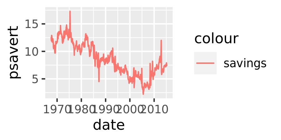

More precisely, each geom is associated with a function such as draw_key_path(), draw_key_boxplot() or draw_key_path() which is responsible for drawing the key when the legend is created. You can pass the desired key drawing function directly: for example, base + geom_line(key_glyph = draw_key_timeseries) would also produce the plot shown above right.
10.7.1 guide_legend()
The legend guide displays individual keys in a table. The most useful options are:
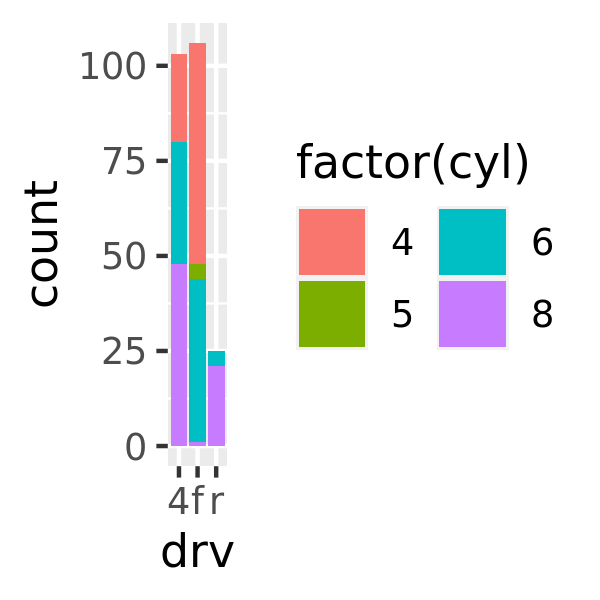
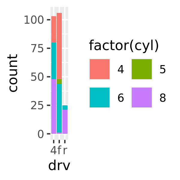
nroworncolwhich specify the dimensions of the table.byrowcontrols how the table is filled:FALSEfills it by column (the default),TRUEfills it by row.base <- ggplot(mpg, aes(drv, fill = factor(cyl))) + geom_bar() base base + guides(fill = guide_legend(ncol = 2)) base + guides(fill = guide_legend(ncol = 2, byrow = TRUE))
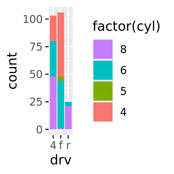
reversereverses the order of the keys:base base + guides(fill = guide_legend(reverse = TRUE))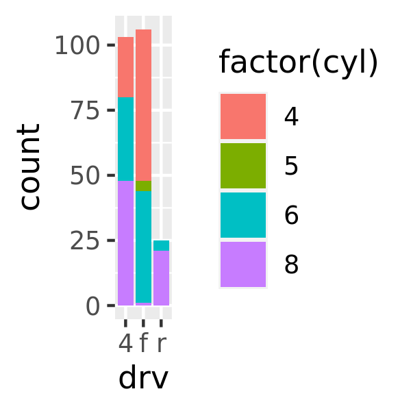
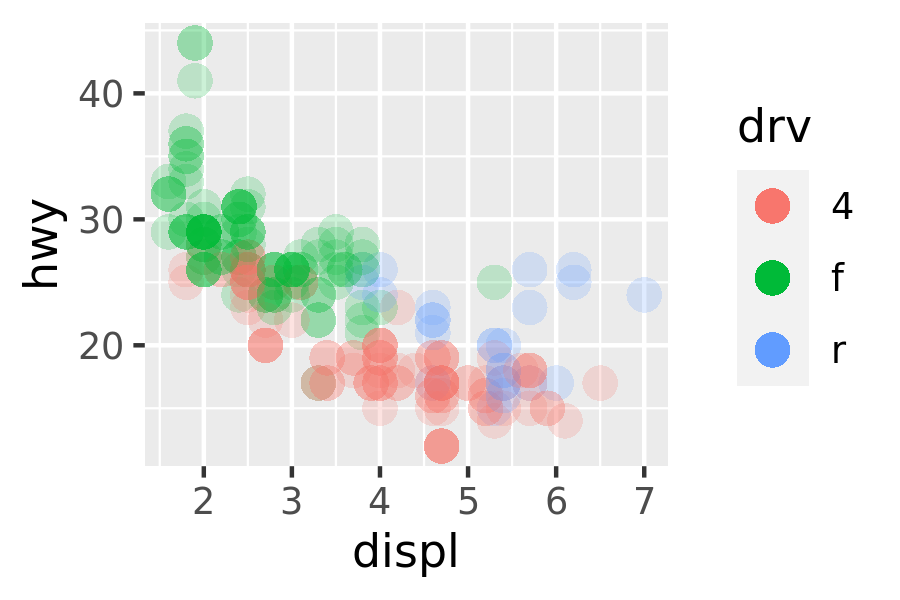
override.aesis useful when you want the elements in the legend display differently to the geoms in the plot. This is often required when you’ve used transparency or size to deal with moderate overplotting and also used colour in the plot.base <- ggplot(mpg, aes(displ, hwy, colour = drv)) + geom_point(size = 4, alpha = .2, stroke = 0) base + guides(colour = guide_legend()) base + guides(colour = guide_legend(override.aes = list(alpha = 1)))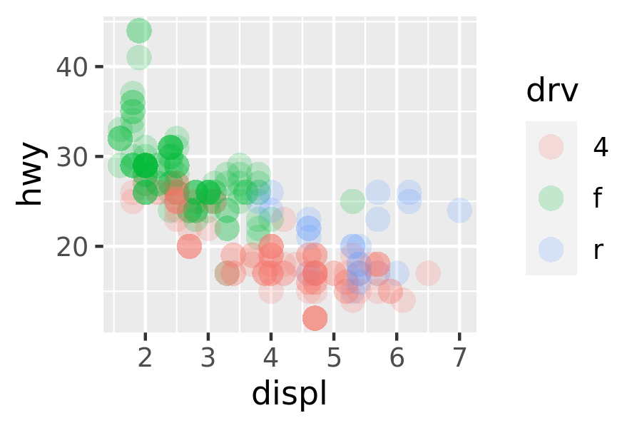
keywidthandkeyheight(along withdefault.unit) allow you to specify the size of the keys. These are grid units, e.g.unit(1, "cm").
10.7.2 guide_bins()
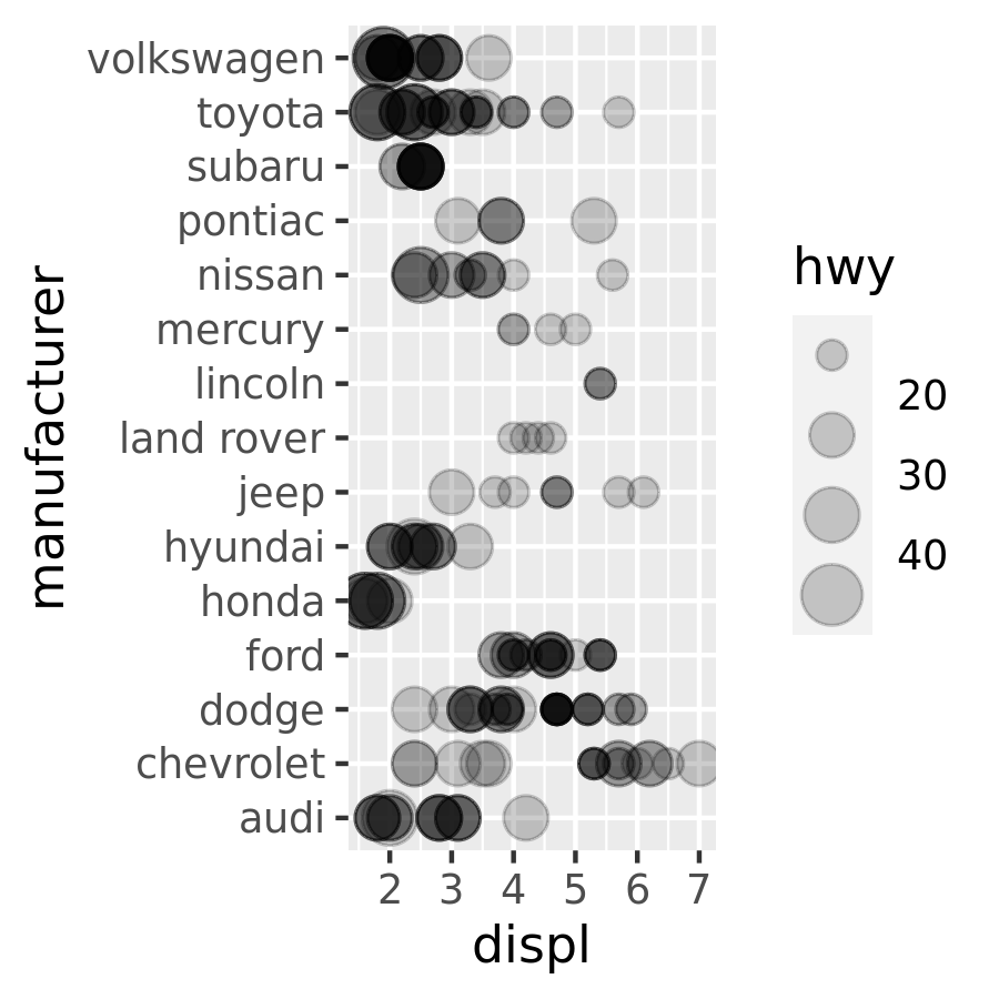
guide_bins() is suited to the situation when a continuous variable is binned and then mapped to an aesthetic that produces a legend, such as size, colour and fill. For instance, in the mpg data we could use scale_size_binned() to create a binned version of the continuous variable hwy.
base <- ggplot(mpg, aes(displ, manufacturer, size = hwy)) +
geom_point(alpha = .2) +
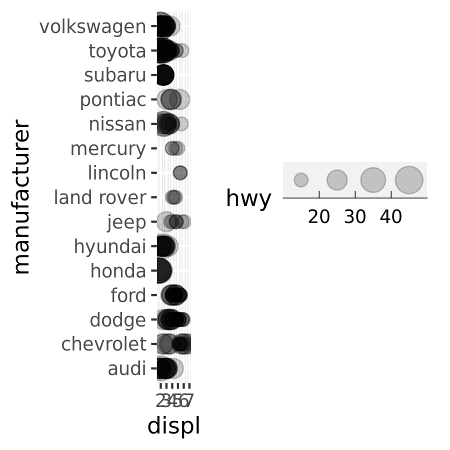
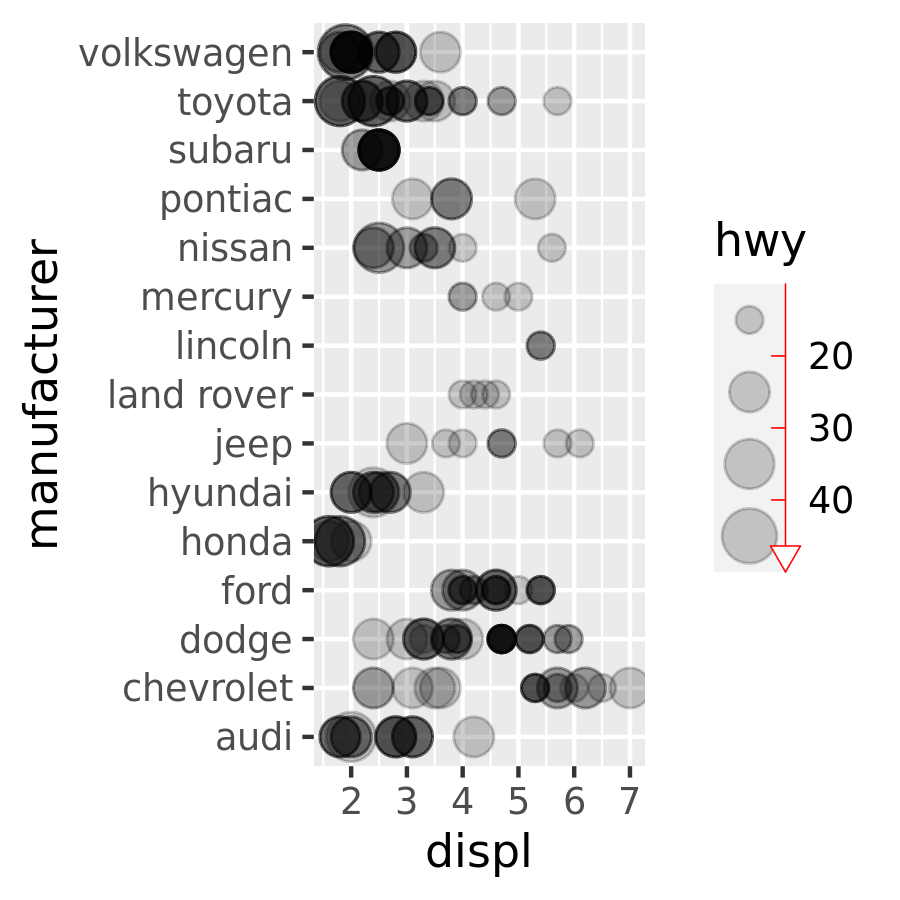
scale_size_binned()Unlike guide_legend(), the guide created for a binned scale by guide_bins() does not organise the individual keys into a table. Instead they are arranged in a column (or row) along a single vertical (or horizontal) axis, which by default is displayed with its own axis. The important arguments to guide_bins() are listed below:
axisindicates whether the axis should be drawn (default isTRUE).base base + guides(size = guide_bins(axis = FALSE))
directionis a character string specifying the direction of the guide:base + guides(size = guide_bins(direction = "vertical")) base + guides(size = guide_bins(direction = "horizontal"))
show.limitsspecifies whether tick marks are shown at the ends of the guide axisaxis.colour,axis.linewidthandaxis.arroware used to control the guide axis that is displayed alongside the legend keysbase + guides(size = guide_bins(show.limits = TRUE)) base + guides( size = guide_bins( axis.colour = "red", axis.arrow = arrow( length = unit(.1, "inches"), ends = "first", type = "closed" ) ) )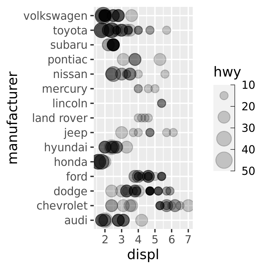
keywidth,keyheight,reverseandoverride.aeshave the same behaviour asguide_legend()
10.7.3 guide_colourbar() / guide_colorbar()
The colour bar guide is designed for continuous ranges of colors—as its name implies, it outputs a rectangle over which the color gradient varies. The most important arguments are:
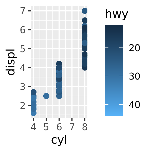
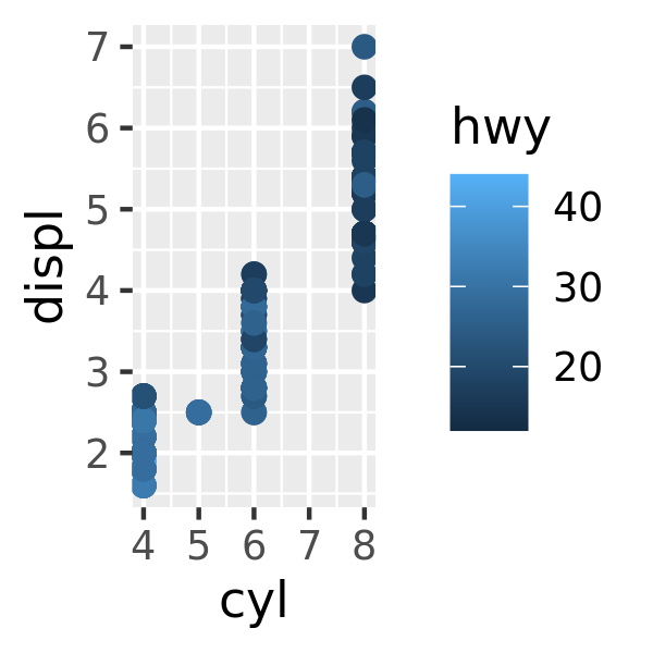
barwidthandbarheightallow you to specify the size of the bar. These are grid units, e.g.unit(1, "cm").nbincontrols the number of slices. You may want to increase this from the default value of 20 if you draw a very long bar.reverseflips the colour bar to put the lowest values at the top.
These options are illustrated below:
base <- ggplot(mpg, aes(cyl, displ, colour = hwy)) +
  geom_point(size = 2)

base
base + guides(colour = guide_colourbar(reverse = TRUE))
base + guides(colour = guide_colourbar(barheight = unit(2, "cm")))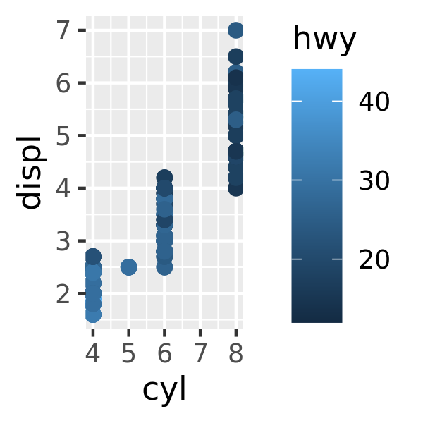
10.7.4 guide_coloursteps() / guide_colorsteps()
This “colour steps” guide is a version of guide_colourbar() appropriate for binned colour and fill scales. It shows the area between breaks as a single constant colour, rather than displaying a colour gradient that varies smoothly along the bar. Arguments mostly mirror those for guide_colourbar(). The additional arguments are as follows:
show.limitsindicates whether values should be shown at the ends of the stepped colour bar (analogous to the corresponding argument inguide_bins())base <- ggplot(mpg, aes(displ, hwy, colour = cyl)) + geom_point() + scale_color_binned() base + guides(colour = guide_coloursteps(show.limits = TRUE)) base + guides(colour = guide_coloursteps(show.limits = FALSE))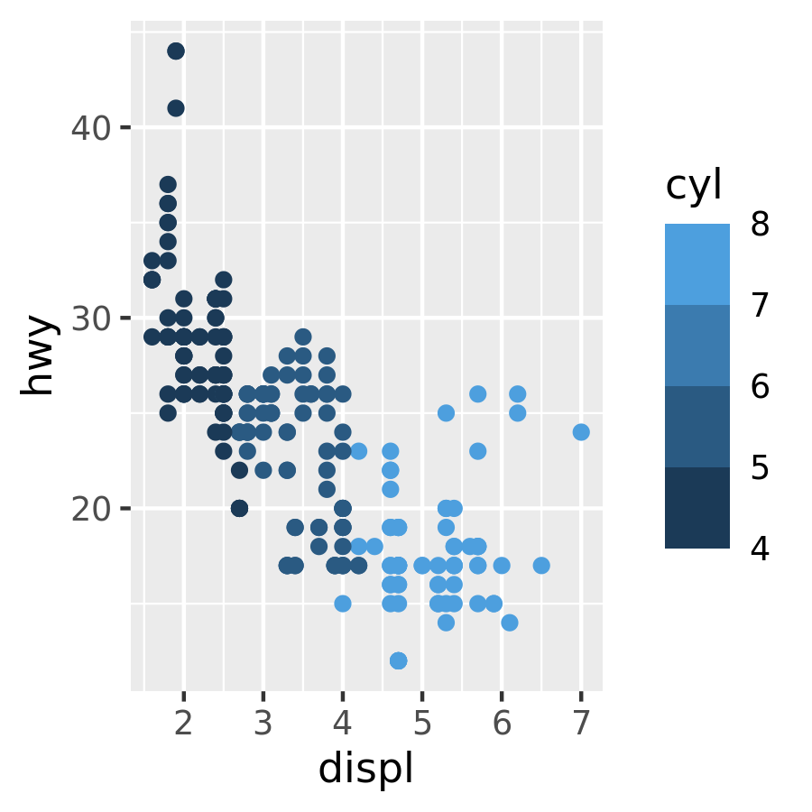

ticksis a logical variable indicating whether tick marks should be displayed adjacent to the legend labels (default isNULL, in which case the value is inherited from the scale)even.stepsis a logical variable indicating whether bins should be evenly spaced (default isTRUE) or proportional in size to their frequency in the data
10.7.5 Exercises
How do you make legends appear to the left of the plot?
What’s gone wrong with this plot? How could you fix it?
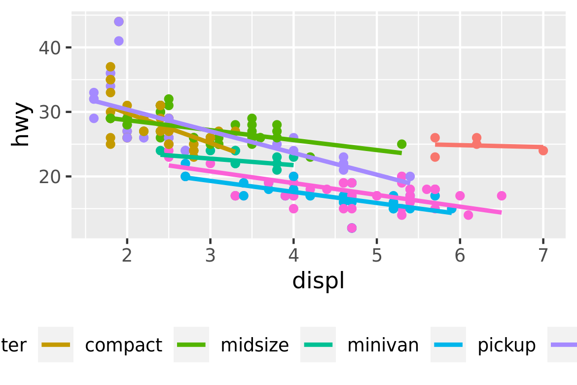
ggplot(mpg, aes(displ, hwy)) +
  geom_point(aes(colour = drv, shape = drv)) +
  scale_colour_discrete("Drive train")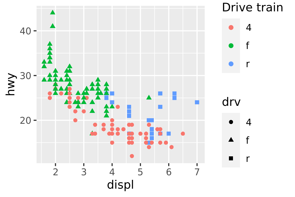
Can you recreate the code for this plot?
#> `geom_smooth()` using formula 'y ~ x'