18.3 Multiple components
It’s not always possible to achieve your goals with a single component. Fortunately, ggplot2 has a convenient way of adding multiple components to a plot in one step with a list. The following function adds two layers: one to show the mean, and one to show its standard error:
geom_mean <- function() {
list(
stat_summary(fun = "mean", geom = "bar", fill = "grey70"),
stat_summary(fun.data = "mean_cl_normal", geom = "errorbar", width = 0.4)
)
}
ggplot(mpg, aes(class, cty)) + geom_mean()
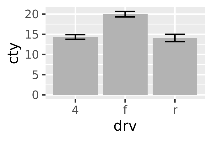
ggplot(mpg, aes(drv, cty)) + geom_mean()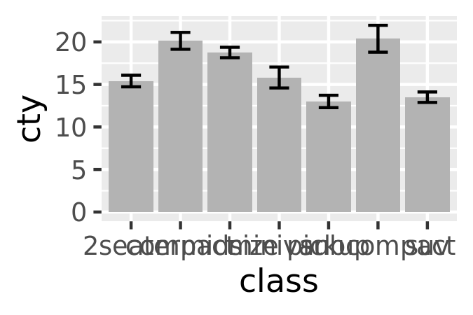
If the list contains any NULL elements, they’re ignored. This makes it easy to conditionally add components:
geom_mean <- function(se = TRUE) {
list(
stat_summary(fun = "mean", geom = "bar", fill = "grey70"),
if (se)
stat_summary(fun.data = "mean_cl_normal", geom = "errorbar", width = 0.4)
)
}
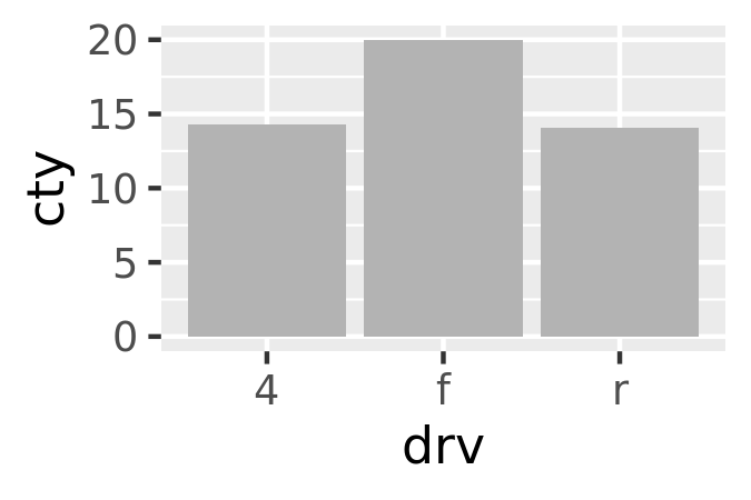
ggplot(mpg, aes(drv, cty)) + geom_mean()
ggplot(mpg, aes(drv, cty)) + geom_mean(se = FALSE)
18.3.1 Plot components
You’re not just limited to adding layers in this way. You can also include any of the following object types in the list:
A data.frame, which will override the default dataset associated with the plot. (If you add a data frame by itself, you’ll need to use
%+%, but this is not necessary if the data frame is in a list.)An
aes()object, which will be combined with the existing default aesthetic mapping.Scales, which override existing scales, with a warning if they’ve already been set by the user.
Coordinate systems and faceting specification, which override the existing settings.
Theme components, which override the specified components.
18.3.2 Annotation
It’s often useful to add standard annotations to a plot. In this case, your function will also set the data in the layer function, rather than inheriting it from the plot. There are two other options that you should set when you do this. These ensure that the layer is self-contained:
inherit.aes = FALSEprevents the layer from inheriting aesthetics from the parent plot. This ensures your annotation works regardless of what else is on the plot.show.legend = FALSEensures that your annotation won’t appear in the legend.
One example of this technique is the borders() function built into ggplot2. It’s designed to add map borders from one of the datasets in the maps package:
borders <- function(database = "world", regions = ".", fill = NA,
                    colour = "grey50", ...) {
  df <- map_data(database, regions)
  geom_polygon(
    aes_(~lat, ~long, group = ~group),
    data = df, fill = fill, colour = colour, ...,
    inherit.aes = FALSE, show.legend = FALSE
  )
}
18.3.3 Additional arguments
If you want to pass additional arguments to the components in your function, ... is no good: there’s no way to direct different arguments to different components. Instead, you’ll need to think about how you want your function to work, balancing the benefits of having one function that does it all vs. the cost of having a complex function that’s harder to understand.
To get you started, here’s one approach using modifyList() and do.call():
geom_mean <- function(..., bar.params = list(), errorbar.params = list()) {
params <- list(...)
bar.params <- modifyList(params, bar.params)
errorbar.params <- modifyList(params, errorbar.params)
bar <- do.call("stat_summary", modifyList(
list(fun = "mean", geom = "bar", fill = "grey70"),
bar.params)
)
errorbar <- do.call("stat_summary", modifyList(
list(fun.data = "mean_cl_normal", geom = "errorbar", width = 0.4),
errorbar.params)
)
list(bar, errorbar)
}
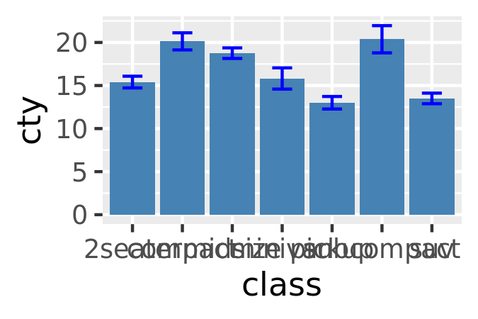
ggplot(mpg, aes(class, cty)) +
geom_mean(
colour = "steelblue",
errorbar.params = list(width = 0.5, size = 1)
)
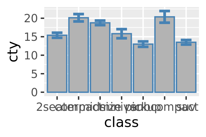
ggplot(mpg, aes(class, cty)) +
geom_mean(
bar.params = list(fill = "steelblue"),
errorbar.params = list(colour = "blue")
)
If you need more complex behaviour, it might be easier to create a custom geom or stat. You can learn about that in the extending ggplot2 vignette included with the package. Read it by running vignette("extending-ggplot2").
18.3.4 Exercises
To make the best use of space, many examples in this book hide the axes labels and legend. I’ve just copied-and-pasted the same code into multiple places, but it would make more sense to create a reusable function. What would that function look like?
Extend the
borders()function to also addcoord_quickmap()to the plot.Look through your own code. What combinations of geoms or scales do you use all the time? How could you extract the pattern into a reusable function?