5.5 Dealing with overplotting
The scatterplot is a very important tool for assessing the relationship between two continuous variables. However, when the data is large, points will be often plotted on top of each other, obscuring the true relationship. In extreme cases, you will only be able to see the extent of the data, and any conclusions drawn from the graphic will be suspect. This problem is called overplotting.
There are a number of ways to deal with it depending on the size of the data and severity of the overplotting. The first set of techniques involves tweaking aesthetic properties. These tend to be most effective for smaller datasets:
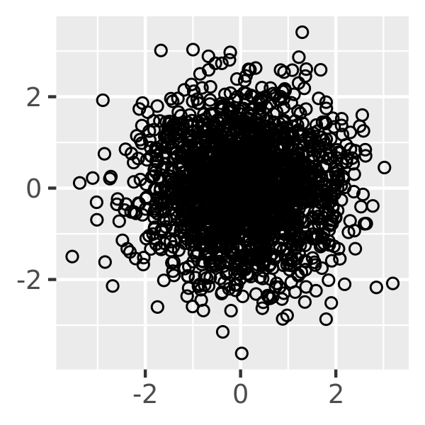
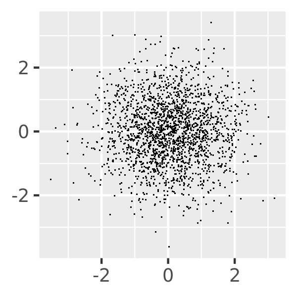
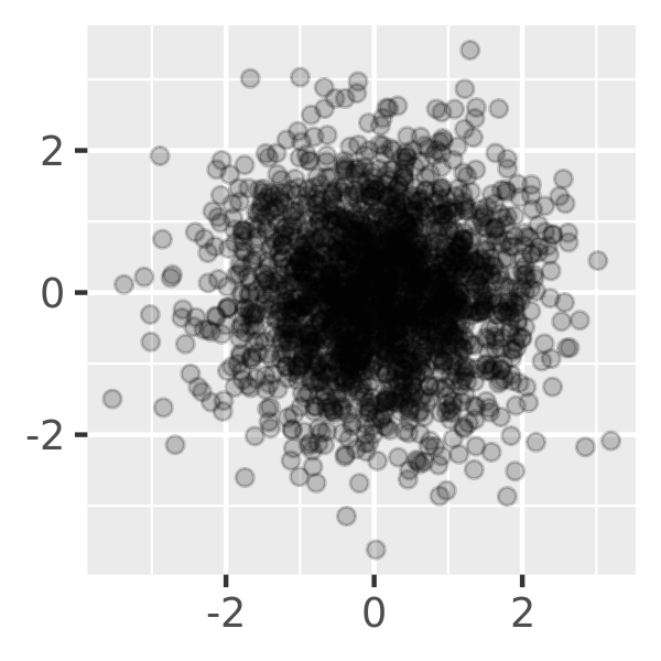
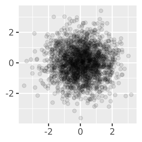
Very small amounts of overplotting can sometimes be alleviated by making the points smaller, or using hollow glyphs. The following code shows some options for 2000 points sampled from a bivariate normal distribution.
df <- data.frame(x = rnorm(2000), y = rnorm(2000))
norm <- ggplot(df, aes(x, y)) + xlab(NULL) + ylab(NULL)
norm + geom_point()
norm + geom_point(shape = 1) # Hollow circles
norm + geom_point(shape = ".") # Pixel sized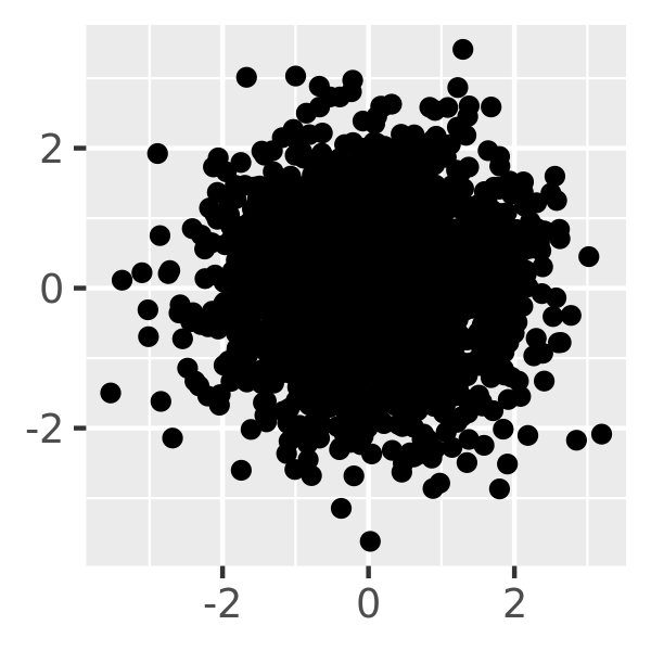
For larger datasets with more overplotting, you can use alpha blending (transparency) to make the points transparent. If you specify
alphaas a ratio, the denominator gives the number of points that must be overplotted to give a solid colour. Values smaller than ~\(1/500\) are rounded down to zero, giving completely transparent points.norm + geom_point(alpha = 1 / 3) norm + geom_point(alpha = 1 / 5) norm + geom_point(alpha = 1 / 10)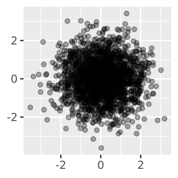
If there is some discreteness in the data, you can randomly jitter the points to alleviate some overlaps with
geom_jitter(). This can be particularly useful in conjunction with transparency. By default, the amount of jitter added is 40% of the resolution of the data, which leaves a small gap between adjacent regions. You can override the default withwidthandheightarguments.
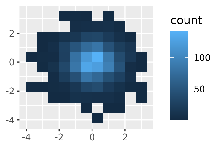
Alternatively, we can think of overplotting as a 2d density estimation problem, which gives rise to two more approaches:
Bin the points and count the number in each bin, then visualise that count (the 2d generalisation of the histogram),
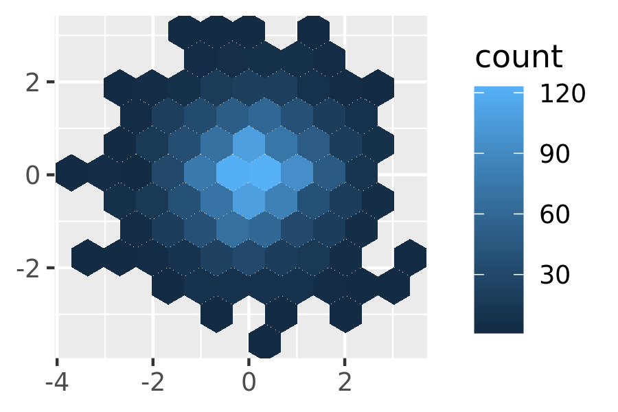
geom_bin2d(). Breaking the plot into many small squares can produce distracting visual artefacts.17 suggests using hexagons instead, and this is implemented ingeom_hex(), using the hexbin package.18The code below compares square and hexagonal bins, using parameters
binsandbinwidthto control the number and size of the bins.norm + geom_bin2d() norm + geom_bin2d(bins = 10)
norm + geom_hex()
norm + geom_hex(bins = 10)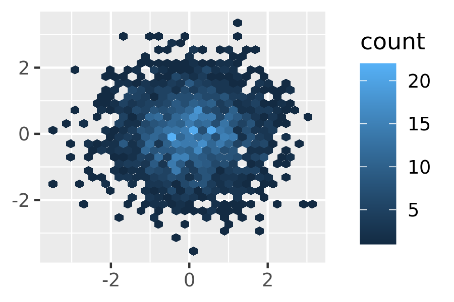
Estimate the 2d density with
stat_density2d(), and then display using one of the techniques for showing 3d surfaces in Section 5.7.If you are interested in the conditional distribution of y given x, then the techniques of Section 2.6.3 will also be useful.
Another approach to dealing with overplotting is to add data summaries to help guide the eye to the true shape of the pattern within the data. For example, you could add a smooth line showing the centre of the data with geom_smooth() or use one of the summaries below.