2.6 Plot geoms
You might guess that by substituting geom_point() for a different geom function, you’d get a different type of plot. That’s a great guess! In the following sections, you’ll learn about some of the other important geoms provided in ggplot2. This isn’t an exhaustive list, but should cover the most commonly used plot types. You’ll learn more in Chapters 3 and 4.
geom_smooth()fits a smoother to the data and displays the smooth and its standard error.geom_boxplot()produces a box-and-whisker plot to summarise the distribution of a set of points.geom_histogram()andgeom_freqpoly()show the distribution of continuous variables.geom_bar()shows the distribution of categorical variables.geom_path()andgeom_line()draw lines between the data points. A line plot is constrained to produce lines that travel from left to right, while paths can go in any direction. Lines are typically used to explore how things change over time.
2.6.1 Adding a smoother to a plot
If you have a scatterplot with a lot of noise, it can be hard to see the dominant pattern. In this case it’s useful to add a smoothed line to the plot with geom_smooth():
ggplot(mpg, aes(displ, hwy)) +
  geom_point() +
  geom_smooth()
#> `geom_smooth()` using method = 'loess' and formula 'y ~ x'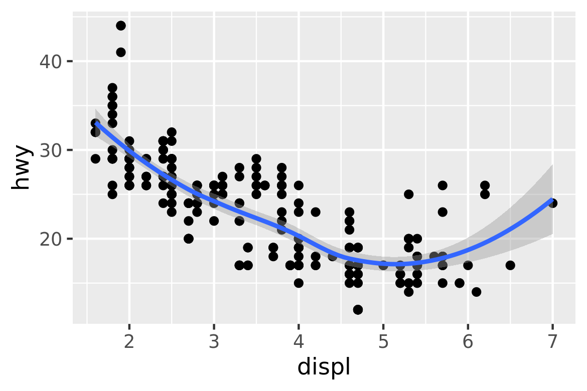
This overlays the scatterplot with a smooth curve, including an assessment of uncertainty in the form of point-wise confidence intervals shown in grey. If you’re not interested in the confidence interval, turn it off with geom_smooth(se = FALSE).
An important argument to geom_smooth() is the method, which allows you to choose which type of model is used to fit the smooth curve:
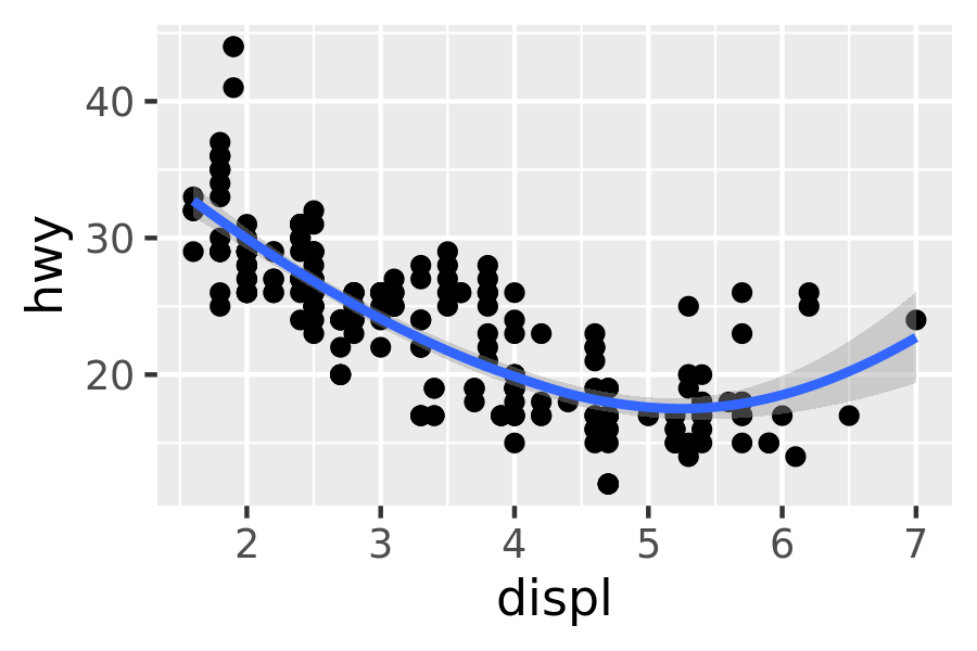
method = "loess", the default for small n, uses a smooth local regression (as described in?loess). The wiggliness of the line is controlled by thespanparameter, which ranges from 0 (exceedingly wiggly) to 1 (not so wiggly).ggplot(mpg, aes(displ, hwy)) + geom_point() + geom_smooth(span = 0.2) #> `geom_smooth()` using method = 'loess' and formula 'y ~ x' ggplot(mpg, aes(displ, hwy)) + geom_point() + geom_smooth(span = 1) #> `geom_smooth()` using method = 'loess' and formula 'y ~ x'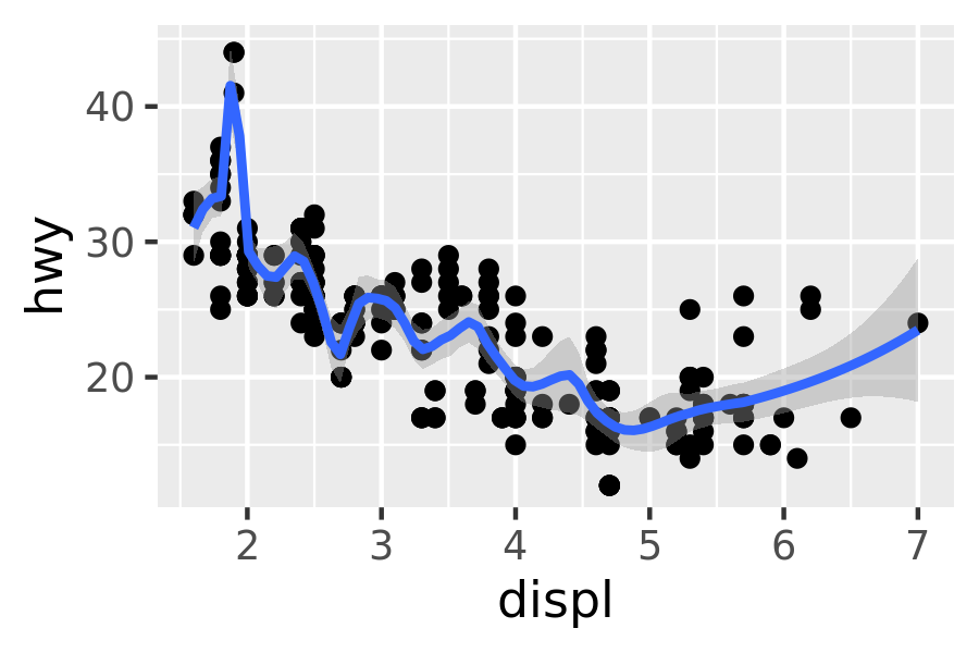
Loess does not work well for large datasets (it’s \(O(n^2)\) in memory), so an alternative smoothing algorithm is used when \(n\) is greater than 1,000.
method = "gam"fits a generalised additive model provided by the mgcv package. You need to first load mgcv, then use a formula likeformula = y ~ s(x)ory ~ s(x, bs = "cs")(for large data). This is what ggplot2 uses when there are more than 1,000 points.library(mgcv) ggplot(mpg, aes(displ, hwy)) + geom_point() + geom_smooth(method = "gam", formula = y ~ s(x))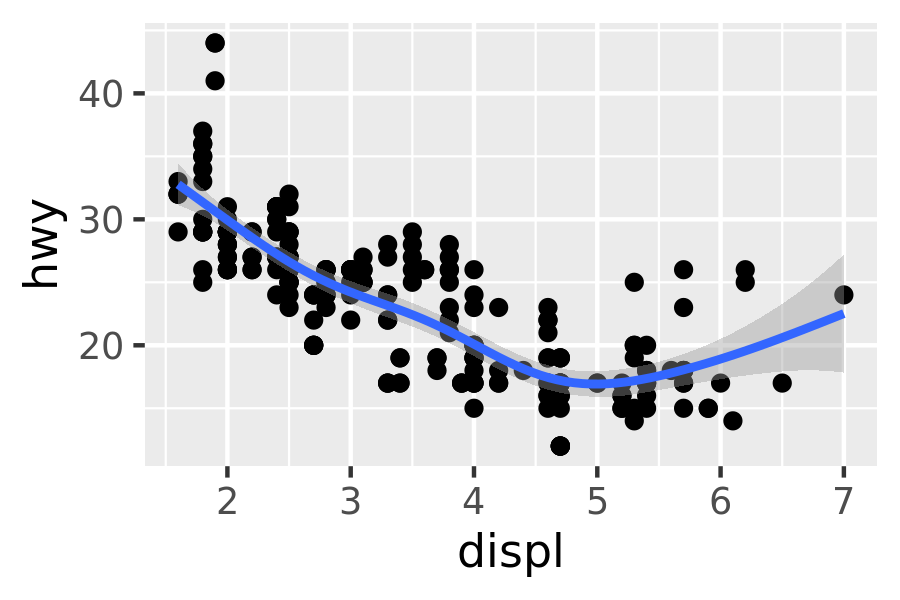
method = "lm"fits a linear model, giving the line of best fit.ggplot(mpg, aes(displ, hwy)) + geom_point() + geom_smooth(method = "lm") #> `geom_smooth()` using formula 'y ~ x'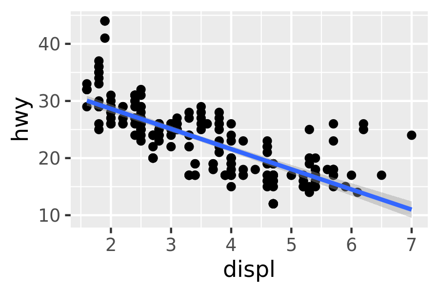
method = "rlm"works likelm(), but uses a robust fitting algorithm so that outliers don’t affect the fit as much. It’s part of the MASS package, so remember to load that first.
2.6.2 Boxplots and jittered points
When a set of data includes a categorical variable and one or more continuous variables, you will probably be interested to know how the values of the continuous variables vary with the levels of the categorical variable. Say we’re interested in seeing how fuel economy varies within cars that have the same kind of drivetrain. We might start with a scatterplot like this:
ggplot(mpg, aes(drv, hwy)) +
  geom_point()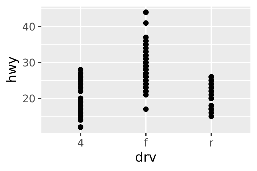
Because there are few unique values of both drv and hwy, there is a lot of overplotting. Many points are plotted in the same location, and it’s difficult to see the distribution. There are three useful techniques that help alleviate the problem:
Jittering,
geom_jitter(), adds a little random noise to the data which can help avoid overplotting.Boxplots,
geom_boxplot(), summarise the shape of the distribution with a handful of summary statistics.Violin plots,
geom_violin(), show a compact representation of the “density” of the distribution, highlighting the areas where more points are found.
These are illustrated below:
ggplot(mpg, aes(drv, hwy)) + geom_jitter()
ggplot(mpg, aes(drv, hwy)) + geom_boxplot()
ggplot(mpg, aes(drv, hwy)) + geom_violin()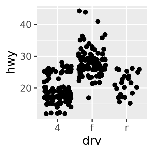
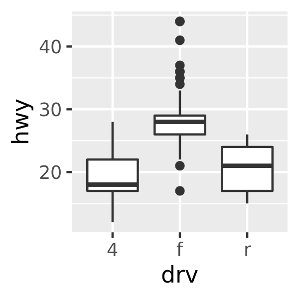
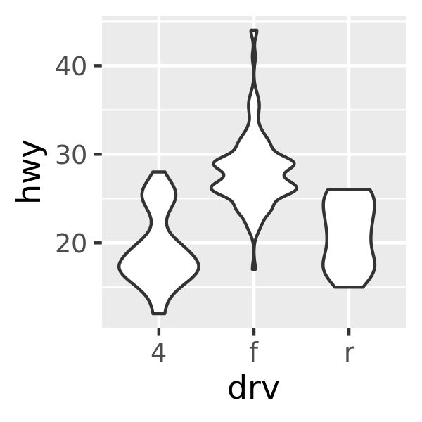
Each method has its strengths and weaknesses. Boxplots summarise the bulk of the distribution with only five numbers, while jittered plots show every point but only work with relatively small datasets. Violin plots give the richest display, but rely on the calculation of a density estimate, which can be hard to interpret.
For jittered points, geom_jitter() offers the same control over aesthetics as geom_point(): size, colour, and shape. For geom_boxplot() and geom_violin(), you can control the outline colour or the internal fill colour.
2.6.3 Histograms and frequency polygons
Histograms and frequency polygons show the distribution of a single numeric variable. They provide more information about the distribution of a single group than boxplots do, at the expense of needing more space.
ggplot(mpg, aes(hwy)) + geom_histogram()
#> `stat_bin()` using `bins = 30`. Pick better value with `binwidth`.
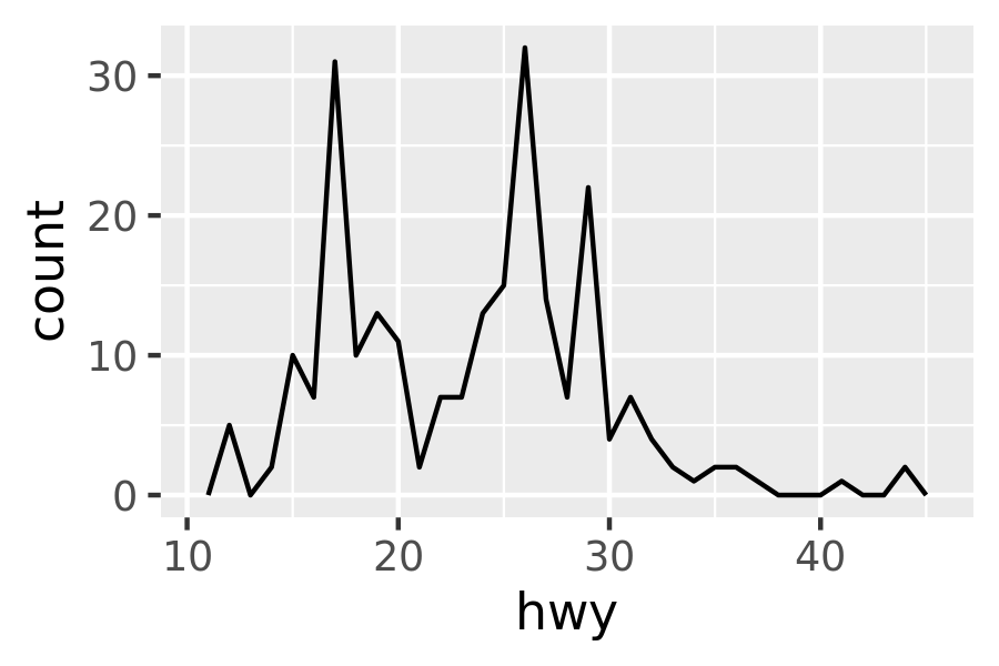
ggplot(mpg, aes(hwy)) + geom_freqpoly()
#> `stat_bin()` using `bins = 30`. Pick better value with `binwidth`.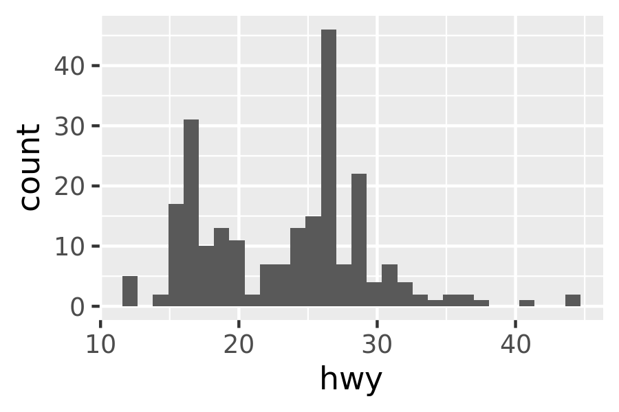
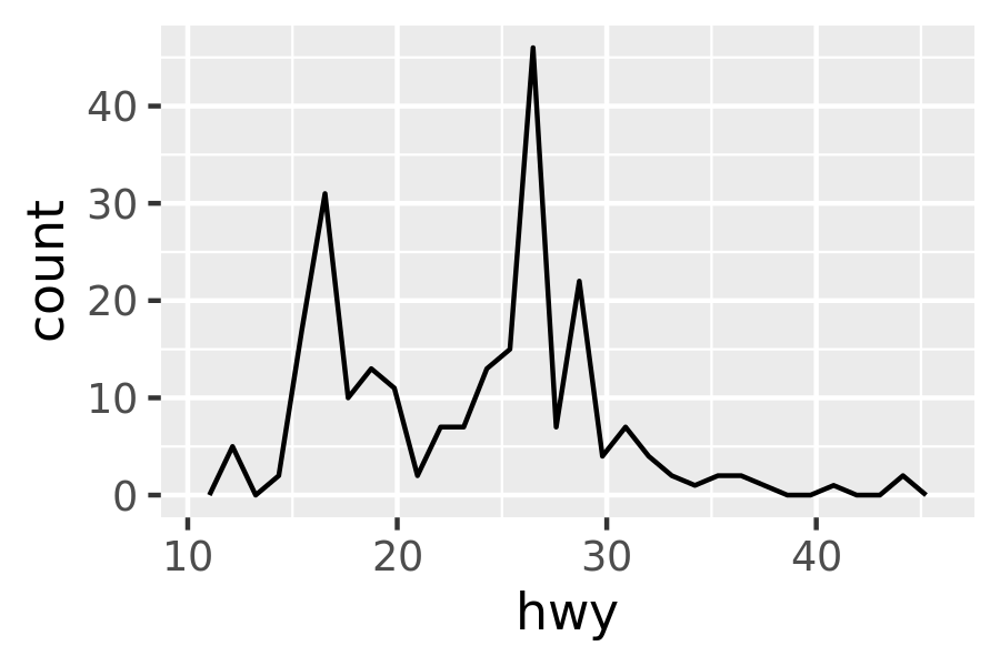
Both histograms and frequency polygons work in the same way: they bin the data, then count the number of observations in each bin. The only difference is the display: histograms use bars and frequency polygons use lines.
You can control the width of the bins with the binwidth argument (if you don’t want evenly spaced bins you can use the breaks argument). It is very important to experiment with the bin width. The default just splits your data into 30 bins, which is unlikely to be the best choice. You should always try many bin widths, and you may find you need multiple bin widths to tell the full story of your data.
ggplot(mpg, aes(hwy)) +
  geom_freqpoly(binwidth = 2.5)
ggplot(mpg, aes(hwy)) +
  geom_freqpoly(binwidth = 1)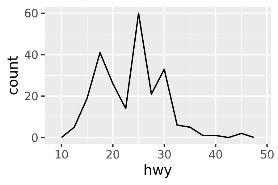
An alternative to the frequency polygon is the density plot, geom_density(). I’m not a fan of density plots because they are harder to interpret since the underlying computations are more complex. They also make assumptions that are not true for all data, namely that the underlying distribution is continuous, unbounded, and smooth.
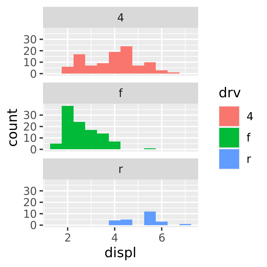
To compare the distributions of different subgroups, you can map a categorical variable to either fill (for geom_histogram()) or colour (for geom_freqpoly()). It’s easier to compare distributions using the frequency polygon because the underlying perceptual task is easier. You can also use faceting: this makes comparisons a little harder, but it’s easier to see the distribution of each group.
ggplot(mpg, aes(displ, colour = drv)) +
  geom_freqpoly(binwidth = 0.5)
ggplot(mpg, aes(displ, fill = drv)) +
  geom_histogram(binwidth = 0.5) +
  facet_wrap(~drv, ncol = 1)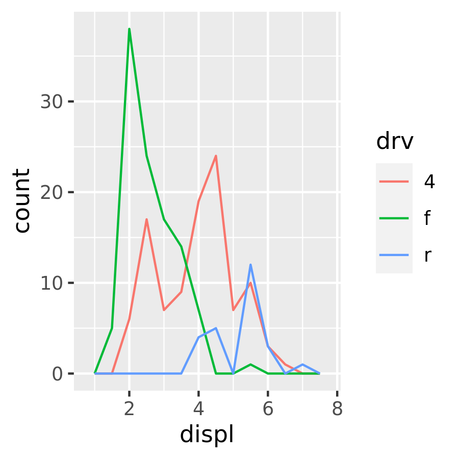
2.6.4 Bar charts
The discrete analogue of the histogram is the bar chart, geom_bar(). It’s easy to use:
ggplot(mpg, aes(manufacturer)) +
  geom_bar()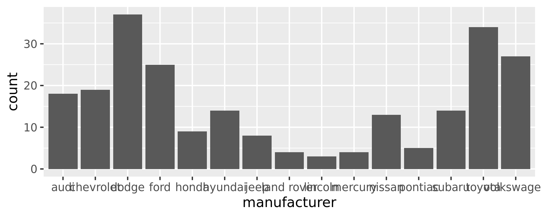
(You’ll learn how to fix the labels in Section 17.4.2).
Bar charts can be confusing because there are two rather different plots that are both commonly called bar charts. The above form expects you to have unsummarised data, and each observation contributes one unit to the height of each bar. The other form of bar chart is used for presummarised data. For example, you might have three drugs with their average effect:
drugs <- data.frame(
drug = c("a", "b", "c"),
effect = c(4.2, 9.7, 6.1)
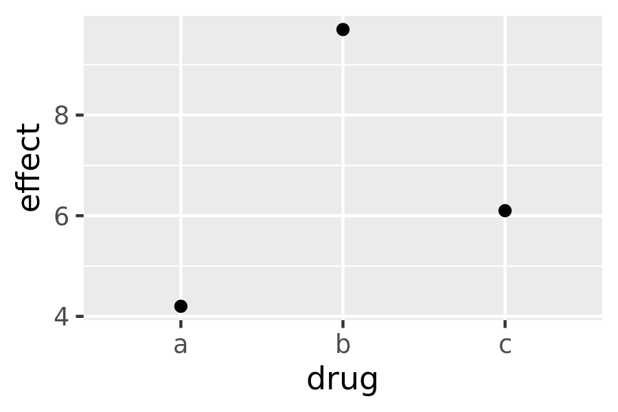
)To display this sort of data, you need to tell geom_bar() to not run the default stat which bins and counts the data. However, I think it’s even better to use geom_point() because points take up less space than bars, and don’t require that the y axis includes 0.
ggplot(drugs, aes(drug, effect)) + geom_bar(stat = "identity")
ggplot(drugs, aes(drug, effect)) + geom_point()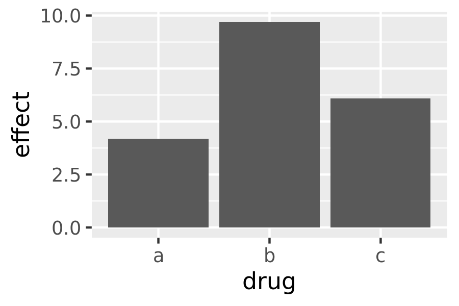
2.6.5 Time series with line and path plots
Line and path plots are typically used for time series data. Line plots join the points from left to right, while path plots join them in the order that they appear in the dataset (in other words, a line plot is a path plot of the data sorted by x value). Line plots usually have time on the x-axis, showing how a single variable has changed over time. Path plots show how two variables have simultaneously changed over time, with time encoded in the way that observations are connected.
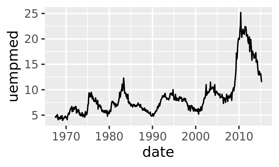
Because the year variable in the mpg dataset only has two values, we’ll show some time series plots using the economics dataset, which contains economic data on the US measured over the last 40 years. The figure below shows two plots of unemployment over time, both produced using geom_line(). The first shows the unemployment rate while the second shows the median number of weeks unemployed. We can already see some differences in these two variables, particularly in the last peak, where the unemployment percentage is lower than it was in the preceding peaks, but the length of unemployment is high.
ggplot(economics, aes(date, unemploy / pop)) +
  geom_line()
ggplot(economics, aes(date, uempmed)) +
  geom_line()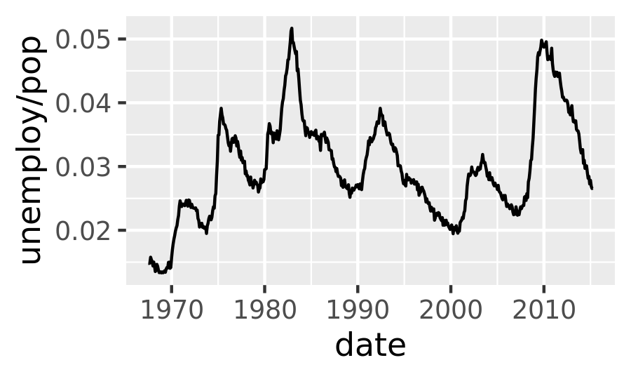
To examine this relationship in greater detail, we would like to draw both time series on the same plot. We could draw a scatterplot of unemployment rate vs. length of unemployment, but then we could no longer see the evolution over time. The solution is to join points adjacent in time with line segments, forming a path plot.
Below we plot unemployment rate vs. length of unemployment and join the individual observations with a path. Because of the many line crossings, the direction in which time flows isn’t easy to see in the first plot. In the second plot, we colour the points to make it easier to see the direction of time.
ggplot(economics, aes(unemploy / pop, uempmed)) +
  geom_path() +
  geom_point()

year <- function(x) as.POSIXlt(x)$year + 1900
ggplot(economics, aes(unemploy / pop, uempmed)) +
  geom_path(colour = "grey50") +
  geom_point(aes(colour = year(date)))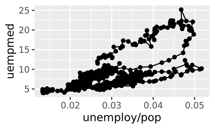
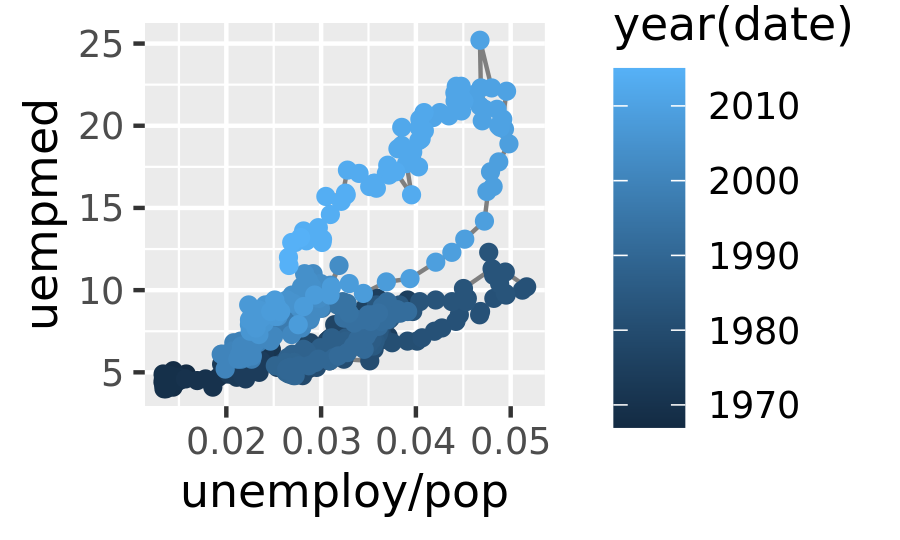
We can see that unemployment rate and length of unemployment are highly correlated, but in recent years the length of unemployment has been increasing relative to the unemployment rate.
With longitudinal data, you often want to display multiple time series on each plot, each series representing one individual. To do this you need to map the group aesthetic to a variable encoding the group membership of each observation. This is explained in more depth in Chapter 4.
2.6.6 Exercises
What’s the problem with the plot created by
ggplot(mpg, aes(cty, hwy)) + geom_point()? Which of the geoms described above is most effective at remedying the problem?One challenge with
ggplot(mpg, aes(class, hwy)) + geom_boxplot()is that the ordering ofclassis alphabetical, which is not terribly useful. How could you change the factor levels to be more informative?Rather than reordering the factor by hand, you can do it automatically based on the data:
ggplot(mpg, aes(reorder(class, hwy), hwy)) + geom_boxplot(). What doesreorder()do? Read the documentation.Explore the distribution of the carat variable in the
diamondsdataset. What binwidth reveals the most interesting patterns?Explore the distribution of the price variable in the
diamondsdata. How does the distribution vary by cut?You now know (at least) three ways to compare the distributions of subgroups:
geom_violin(),geom_freqpoly()and the colour aesthetic, orgeom_histogram()and faceting. What are the strengths and weaknesses of each approach? What other approaches could you try?Read the documentation for
geom_bar(). What does theweightaesthetic do?Using the techniques already discussed in this chapter, come up with three ways to visualise a 2d categorical distribution. Try them out by visualising the distribution of
modelandmanufacturer,transandclass, andcylandtrans.