6.5 Raster maps
A second way to supply geospatial information for mapping is to rely on raster data. Unlike the simple features format, in which geographical entities are specified in terms of a set of lines, points and polygons, rasters take the form of images. In the simplest case raster data might be nothing more than a bitmap file, but there are many different image formats out there. In the geospatial context specifically, there are image formats that include metadata (e.g., geodetic datum, coordinate reference system) that can be used to map the image information to the surface of the Earth. For example, one common format is GeoTIFF, which is a regular TIFF file with additional metadata supplied. Happily, most formats can be easily read into R with the assistance of GDAL (the Geospatial Data Abstraction Library, https://gdal.org/). For example the sf package contains a function sf::gdal_read() that provides access to the GDAL raster drivers from R. However, you rarely need to call this function directly, as there are other high level functions that take care of this for you.
As an illustration, suppose we wish to plot satellite images made publicly available by the Australian Bureau of Meterorology (BOM) on their FTP server. The bomrang package24 provides a convenient interface to the server, including a get_available_imagery() function that returns a vector of filenames and a get_satellite_imagery() function that downloads a file and imports it directly into R. For expository purposes, however, I’ll use a more flexible method that could be adapted to any FTP server, and use the download.file() function:
# list of all file names with time stamp 2020-01-07 21:00 GMT
# (BOM images are retained for 24 hours, so this will return an
# empty vector if you run this code without editing the time stamp)
files <- bomrang::get_available_imagery() %>%
  stringr::str_subset("202001072100")

# use curl_download() to obtain a single file, and purrr to
# vectorise this operation
purrr::walk2(
  .x = paste0("ftp://ftp.bom.gov.au/anon/gen/gms/", files),
  .y = file.path("raster", files),
  .f = ~ download.file(url = .x, destfile = .y)
)
After caching the files locally (which is generally a good idea) we can inspect the list of files we have downloaded:
dir("raster")
#> [1] "IDE00421.202001072100.tif" "IDE00422.202001072100.tif"
All 14 files are constructed from images taken by the Himawari-8 geostationary satellite operated by the Japan Meteorological Agency and takes images across 13 distinct bands. The images released by the Australian BOM include data on the visible spectrum (channel 3) and the infrared spectrum (channel 13):
img_vis  <- file.path("raster", "IDE00422.202001072100.tif")
img_inf <- file.path("raster", "IDE00421.202001072100.tif")
To import the data in the img_visible file into R, I’ll use the stars package25 to import the data as stars objects:
library(stars)
#> Loading required package: abind
sat_vis <- read_stars(img_vis, RasterIO = list(nBufXSize = 600, nBufYSize = 600))
sat_inf <- read_stars(img_inf, RasterIO = list(nBufXSize = 600, nBufYSize = 600))
In the code above, the first argument specifies the path to the raster file, and the RasterIO argument is used to pass a list of low-level parameters to GDAL. In this case, I have used nBufXSize and nBufYSize to ensure that R reads the data at low resolution (as a 600x600 pixel image). To see what information R has imported, we can inspect the sat_vis object:
sat_vis
#> stars object with 3 dimensions and 1 attribute
#> attribute(s), summary of first 1e+05 cells:
#>  IDE00422.202001072100.tif
#>  Min.   :  0.0
#>  1st Qu.:  0.0
#>  Median :  0.0
#>  Mean   : 18.1
#>  3rd Qu.:  0.0
#>  Max.   :255.0
#> dimension(s):
#>      from  to   offset    delta                  refsys point values
#> x       1 600 -5500000  18333.3 Geostationary_Satellite FALSE   NULL [x]
#> y       1 600  5500000 -18333.3 Geostationary_Satellite FALSE   NULL [y]
#> band    1   3       NA       NA                      NA    NA   NULL
This output tells us something about the structure of a stars object. For the sat_vis object the underlying data is stored as a three dimensional array, with x and y dimensions specifying the spatial data. The band dimension in this case corresponds to the colour channel (RGB) but is redundant for this image as the data are greyscale. In other data sets there might be bands corresponding to different sensors, and possibly a time dimension as well. Note that the spatial data is also associated with a coordinate reference system (referred to as “refsys” in the output).
To plot the sat_vis data in ggplot2, we can use the geom_stars() function provided by the stars package. A minimal plot might look like this:
ggplot() +
  geom_stars(data = sat_vis) +
  coord_equal()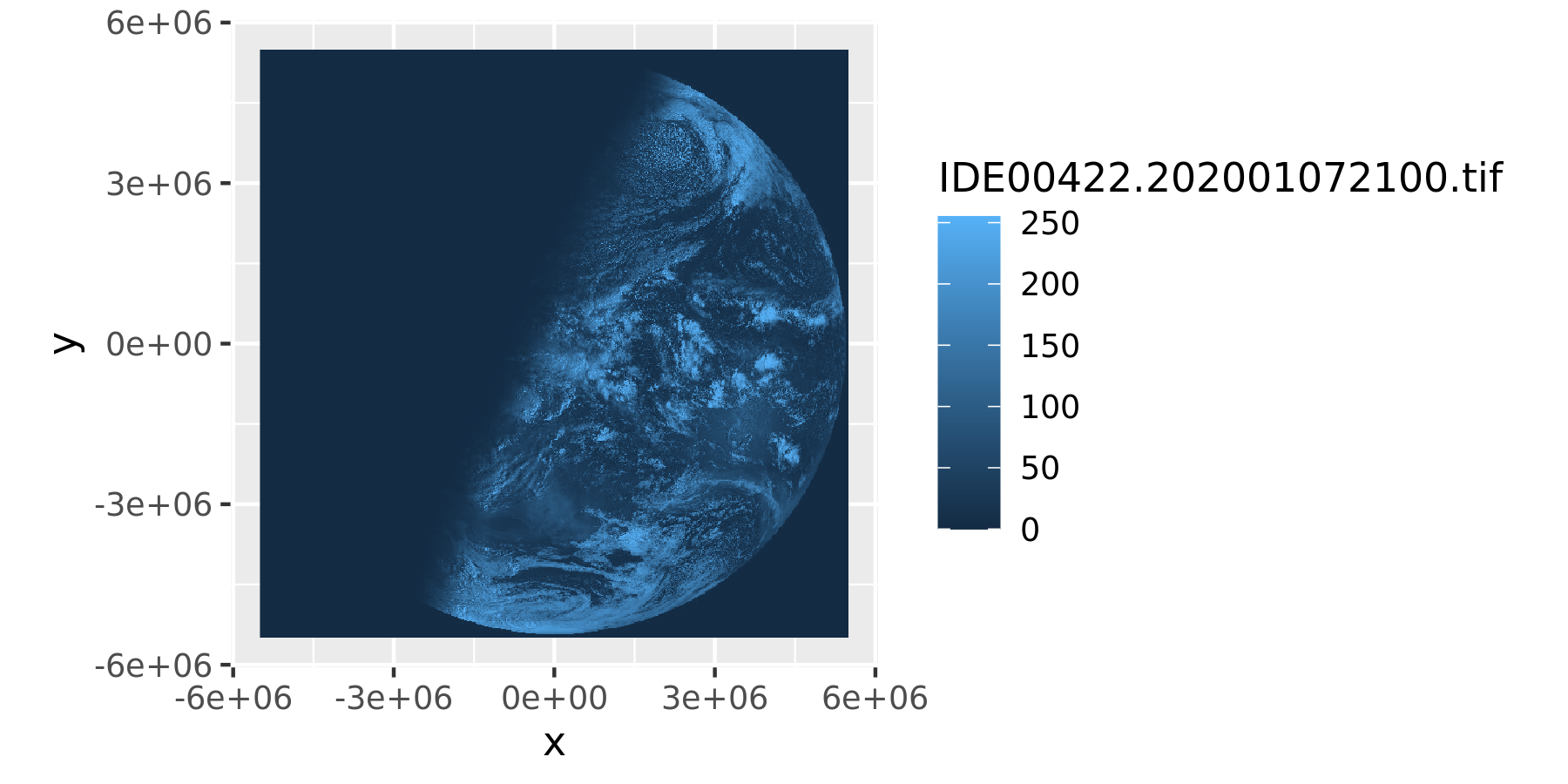
The geom_stars() function requires the data argument to be a stars object, and maps the raster data to the fill aesthetic. Accordingly, the blue shading in the satellite image above is determined by the ggplot2 scale, not the image itself. That is, although sat_vis contains three bands, the plot above only displays the first one, and the raw data values (which range from 0 to 255) are mapped onto the default blue palette that ggplot2 uses for continuous data. To see what the image file “really” looks like we can separate the bands using facet_wrap():
ggplot() +
  geom_stars(data = sat_vis, show.legend = FALSE) +
  facet_wrap(vars(band)) +
  coord_equal() +
  scale_fill_gradient(low = "black", high = "white")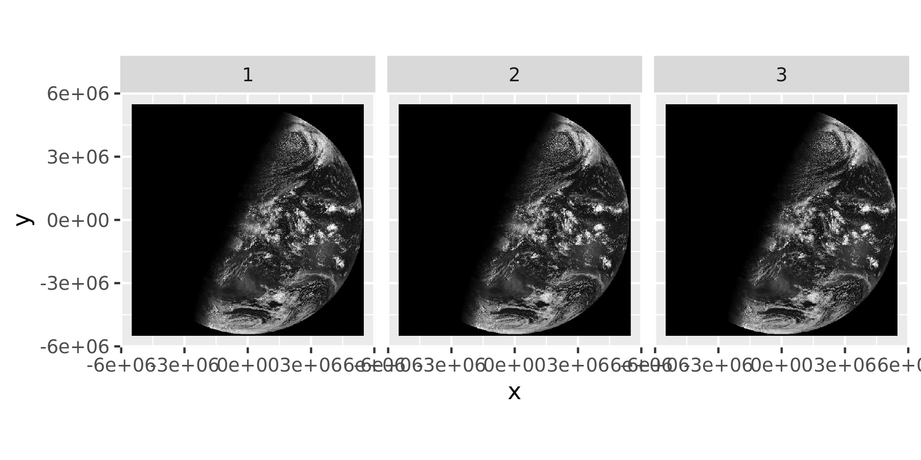
One limitation to displaying only the raw image is that it is not easy to work out where the relevant landmasses are, and we may wish to overlay the satellite data with the oz_states vector map to show the outlines of Australian political entities. However, some care is required in doing so because the two data sources are associated with different coordinate reference systems. To project the oz_states data correctly, the data should be transformed using the st_transform() function from the sf package. In the code below, I extract the CRS from the sat_vis raster object, and transform the oz_states data to use the same system.
oz_states <- st_transform(oz_states, crs = st_crs(sat_vis))Having done so, I can now draw the vector map over the top of the raster image to make the image more interpretable to the reader. It is now clear from inspection that the satellite image was taken during the Australian sunrise:
ggplot() +
  geom_stars(data = sat_vis, show.legend = FALSE) +
  geom_sf(data = oz_states, fill = NA, color = "white") +
  coord_sf() +
  theme_void() +
  scale_fill_gradient(low = "black", high = "white")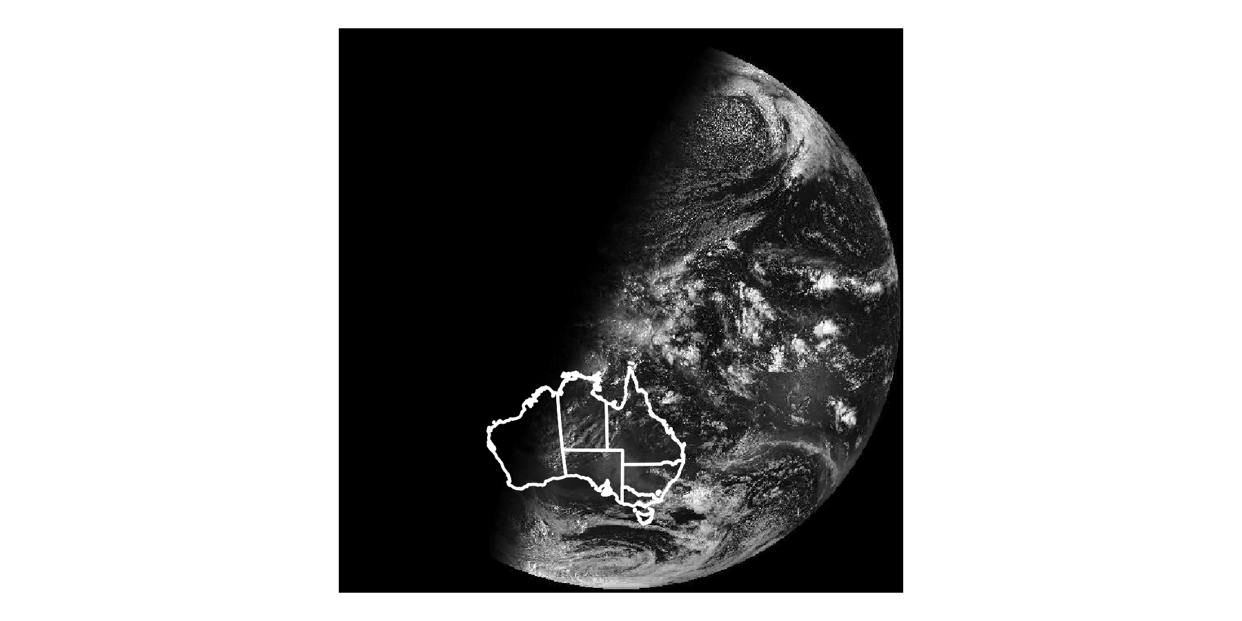
What if we wanted to plot more conventional data over the top? A simple example of this would be to plot the locations of the Australian capital cities per the oz_capitals data frame that contains latitude and longitude data. However, because these data are not associated with a CRS and are not on the same scale as the raster data in sat_vis, these will also need to be transformed. This can be slightly finicky because the oz_capitals data are not sf objects and not currently associated with any CRS.
# create matrix of longitude and latitude values
latlon <- oz_capitals %>%
  select(lon, lat) %>%
  as.matrix()

# convert to a simple features column
geometry <- latlon %>%
  st_multipoint() %>%
  st_sfc() %>%
  st_cast("POINT")
# append the city names and attach the "longlat" geometry
# in which the coordinates were originally defined
cities <- st_sf(city = oz_capitals$city, geometry)
st_crs(cities) <- st_crs("+proj=longlat +datum=WGS84")
What we have done here is transform the original oz_capitals data, which took the form of a standard data frame (or tibble), into a properly specified simple features object that has its own CRS. The choice of projection is determined by the fact that oz_capitals specifying longitude and latitude data, and I’ve chosen the same WGS84 datum that I used previously as the map is global in scope. Having done so we can now transform the co-ordinates from the latitude-longitude geometry to the match the geometry of our sat_vis data:
cities <- st_transform(cities, st_crs(sat_vis))The transformed data can now be overlaid using geom_sf():
ggplot() +
  geom_stars(data = sat_vis, show.legend = FALSE) +
  geom_sf(data = oz_states, fill = NA, color = "white") +
  geom_sf(data = cities, color = "red") +
  coord_sf() +
  theme_void() +
  scale_fill_gradient(low = "black", high = "white")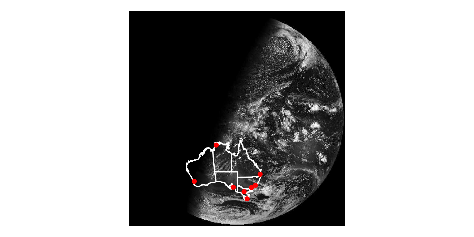
This version of the image makes clearer that the satellite image was taken at approximately sunrise in Darwin: the sun had risen for all the eastern cities but not in Perth. This could be made clearer in the data visualisation using the geom_sf_text() function to add labels to each city. For instance we could add another layer to the plot using code like this,
geom_sf_text(data = cities, mapping = aes(label = city)) though some care would be required to ensure the text is positioned nicely (see Chapter 7).
Adam H Sparks et al., “bomrang: Fetch Australian Government Bureau of Meteorology Weather Data,” The Journal of Open Source Software 2, no. 17 (September 2017), https://doi.org/10.21105/joss.00411.↩︎
Edzer Pebesma, Stars: Spatiotemporal Arrays, Raster and Vector Data Cubes, 2020.↩︎