14.2 Scale transformation
When working with continuous data, the default is to map linearly from the data space onto the aesthetic space. It is possible to override this default using transformations. Every continuous scale takes a trans argument, allowing the use of a variety of transformations:
# convert from fuel economy to fuel consumption
ggplot(mpg, aes(displ, hwy)) +
geom_point() +
scale_y_continuous(trans = "reciprocal")
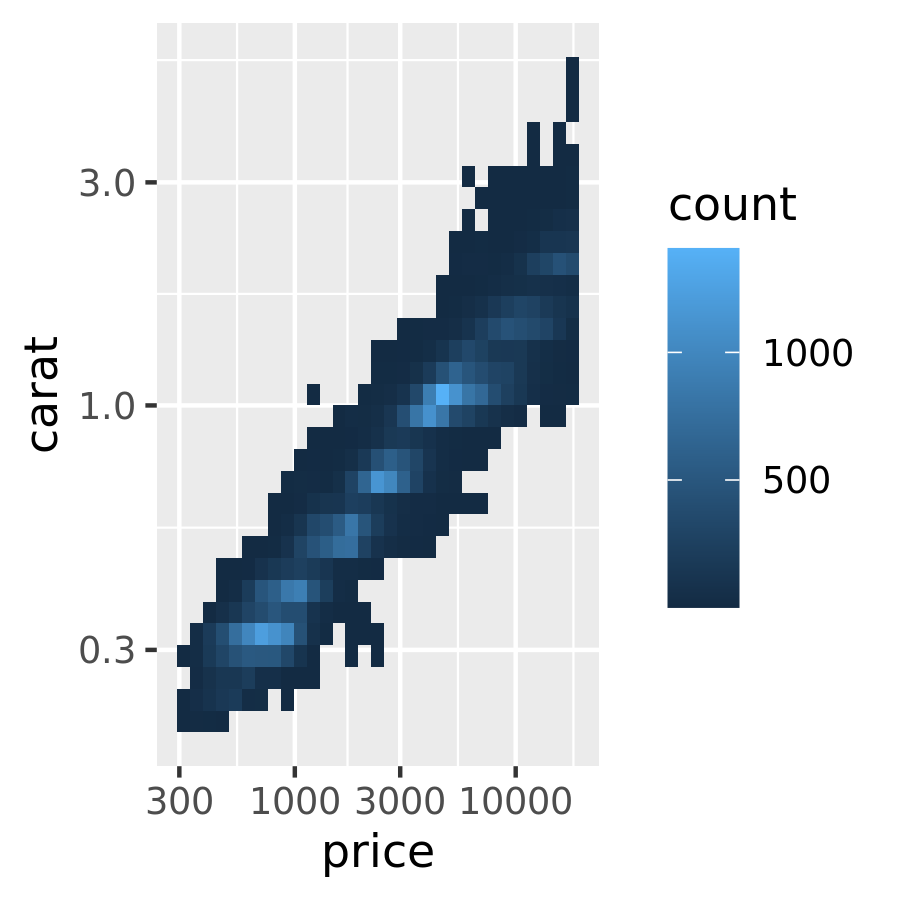
# log transform x and y axes
ggplot(diamonds, aes(price, carat)) +
geom_bin2d() +
scale_x_continuous(trans = "log10") +
scale_y_continuous(trans = "log10")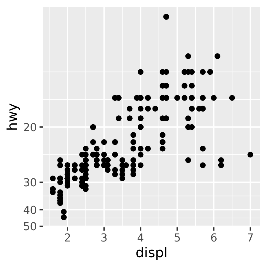
The transformation is carried out by a “transformer”, which describes the transformation, its inverse, and how to draw the labels. You can construct your own transformer using scales::trans_new(), but, as the plots above illustrate, ggplot2 understands many common transformations supplied by the scales package. The following table lists the most common variants:
| Name | Function \(f(x)\) | Inverse \(f^{-1}(y)\) |
|---|---|---|
| asn | \(\tanh^{-1}(x)\) | \(\tanh(y)\) |
| exp | \(e ^ x\) | \(\log(y)\) |
| identity | \(x\) | \(y\) |
| log | \(\log(x)\) | \(e ^ y\) |
| log10 | \(\log_{10}(x)\) | \(10 ^ y\) |
| log2 | \(\log_2(x)\) | \(2 ^ y\) |
| logit | \(\log(\frac{x}{1 - x})\) | \(\frac{1}{1 + e(y)}\) |
| pow10 | \(10^x\) | \(\log_{10}(y)\) |
| probit | \(\Phi(x)\) | \(\Phi^{-1}(y)\) |
| reciprocal | \(x^{-1}\) | \(y^{-1}\) |
| reverse | \(-x\) | \(-y\) |
| sqrt | \(x^{1/2}\) | \(y ^ 2\) |
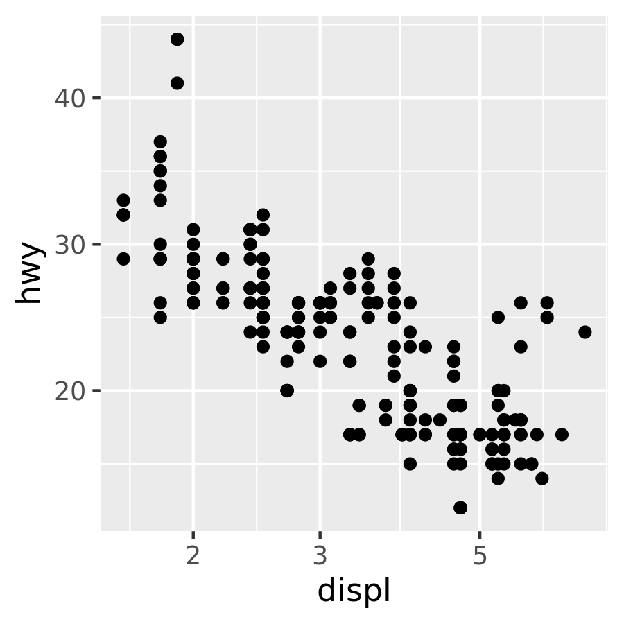
To simplify matters, ggplot2 provides convenience functions for the most common transformations: scale_x_log10(), scale_x_sqrt() and scale_x_reverse() provide the relevant transformation on the x axis, with similar functions provided for the y axis. Thus, the code below produces the same two plots shown in the previous example:
ggplot(mpg, aes(displ, hwy)) +
  geom_point() +
  scale_y_reverse()

ggplot(diamonds, aes(price, carat)) +
  geom_bin2d() +
  scale_x_log10() +
  scale_y_log10()
Note that there is nothing preventing you from performing these transformations manually. For example, instead of using scale_x_log10() to transform the scale, you could transform the data instead and plot log10(x). The appearance of the geom will be the same, but the tick labels will be different. Specifically, if you use a transformed scale, the axes will be labelled in the original data space; if you transform the data, the axes will be labelled in the transformed space.
# manual transformation
ggplot(mpg, aes(log10(displ), hwy)) +
  geom_point()

# transform using scales
ggplot(mpg, aes(displ, hwy)) +
  geom_point() +
  scale_x_log10()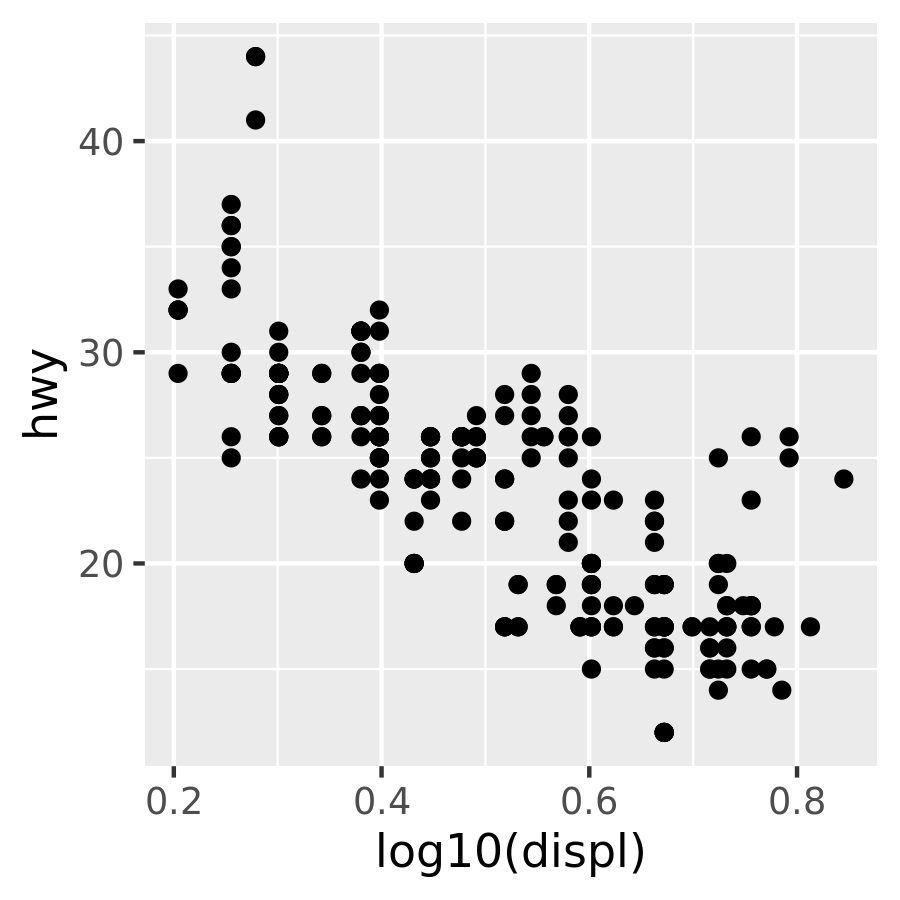
Regardless of which method you use, the transformation occurs before any statistical summaries. To transform after statistical computation use coord_trans(). See Section 15.1 for more details.
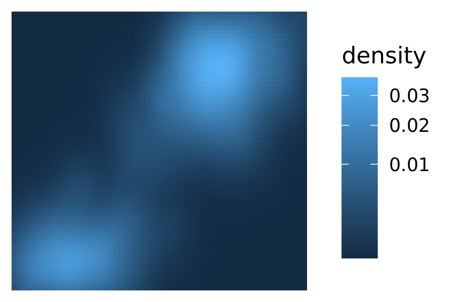
Although the most common use for transformations is to adjust position scales, they can sometimes be helpful to when applied to other aesthetics. Often this is purely a matter of visual emphasis. An example of this for the Old Faithful density plot is shown below. The linearly mapped scale on the left makes it easy to see the peaks of the distribution, whereas the transformed representation on the right makes it easier to see the regions of non-negligible density around those peaks:
base <- ggplot(faithfuld, aes(waiting, eruptions)) +
  geom_raster(aes(fill = density)) +
  scale_x_continuous(NULL, NULL, expand = c(0, 0)) +
  scale_y_continuous(NULL, NULL, expand = c(0, 0))

base
base + scale_fill_continuous(trans = "sqrt")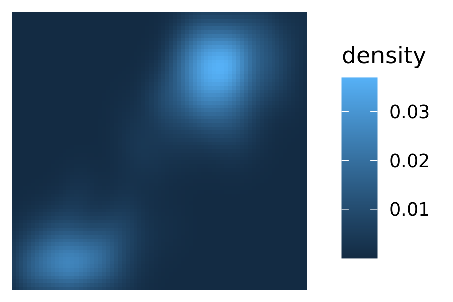
Transforming size aesthetics is also possible:
df <- data.frame(x = runif(20), y = runif(20), z = sample(20))
base <- ggplot(df, aes(x, y, size = z)) + geom_point()

base
base + scale_size(trans = "reverse")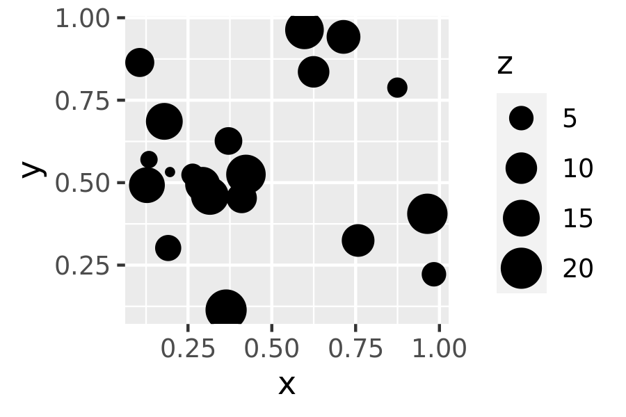
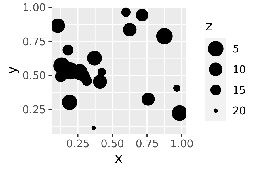
In the plot on the left, the z value is naturally interpreted as a “weight”: if each dot corresponds to a group, the z value might be the size of the group. In the plot on the right, the size scale is reversed, and z is more naturally interpreted as a “distance” measure: distant entities are scaled to appear smaller in the plot.