6.2 Simple features maps
There are a few limitations to the approach outlined above, not least of which is the fact that the simple “longitude-latitude” data format is not typically used in real world mapping. Vector data for maps are typically encoded using the “simple features” standard produced by the Open Geospatial Consortium. The sf package19 developed by Edzer Pebesma https://github.com/r-spatial/sf provides an excellent toolset for working with such data, and the geom_sf() and coord_sf() functions in ggplot2 are designed to work together with the sf package.
To introduce these functions, we rely on the ozmaps package by Michael Sumner https://github.com/mdsumner/ozmaps/ which provides maps for Australian state boundaries, local government areas, electoral boundaries, and so on.20 To illustrate what an sf data set looks like, we import a data set depicting the borders of Australian states and territories:
library(ozmaps)
library(sf)
#> Linking to GEOS 3.8.0, GDAL 3.0.4, PROJ 6.3.1

oz_states <- ozmaps::ozmap_states
oz_states
#> Simple feature collection with 9 features and 1 field
#> geometry type:  MULTIPOLYGON
#> dimension:      XY
#> bbox:           xmin: 106 ymin: -43.6 xmax: 168 ymax: -9.23
#> geographic CRS: GDA94
#> # A tibble: 9 x 2
#>   NAME                                                                  geometry
#>   <chr>                                                       <MULTIPOLYGON [°]>
#> 1 New South Wal… (((151 -35.1, 151 -35.1, 151 -35.1, 151 -35.1, 151 -35.2, 151 …
#> 2 Victoria       (((147 -38.7, 147 -38.7, 147 -38.7, 147 -38.7, 147 -38.7)), ((…
#> 3 Queensland     (((149 -20.3, 149 -20.4, 149 -20.4, 149 -20.3)), ((149 -20.9, …
#> 4 South Austral… (((137 -34.5, 137 -34.5, 137 -34.5, 137 -34.5, 137 -34.5, 137 …
#> 5 Western Austr… (((126 -14, 126 -14, 126 -14, 126 -14, 126 -14)), ((124 -16.1,…
#> 6 Tasmania       (((148 -40.3, 148 -40.3, 148 -40.3, 148 -40.3)), ((147 -39.5, …
#> # … with 3 more rows
This output shows some of the metadata associated with the data (discussed momentarily), and tells us that the data is essentially a tibble with 11 rows and 4 columns. One advantage to sf data is immediately apparent, we can easily see the overall structure of the data: Australia is comprised of six states, four territories and Macquarie Island, which is politically part of Tasmania. There are 11 distinct geographical units, so there are 11 rows in this tibble (cf. mi_counties data where there is one row per polygon vertex).
The most important column is geometry, which specifies the spatial geometry for each of the states and territories. Each element in the geometry column is a multipolygon object which, as the name suggests, contains data specifying the vertices of one or more polygons that demark the border of a region. Given data in this format, we can use geom_sf() and coord_sf() to draw a serviceable map without specifying any parameters or even explicitly declaring any aesthetics:
ggplot(oz_states) +
  geom_sf() +
  coord_sf()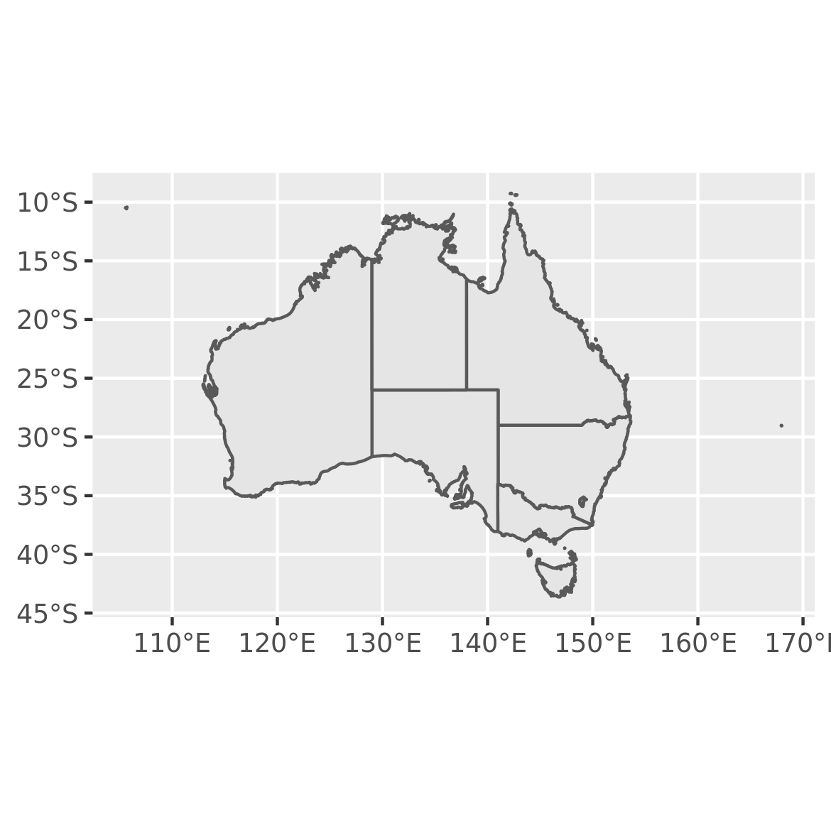
To understand why this works, note that geom_sf() relies on a geometry aesthetic that is not used elsewhere in ggplot2. This aesthetic can be specified in one of three ways:
In the simplest case (illustrated above) when the user does nothing,
geom_sf()will attempt to map it to a column namedgeometry.If the
dataargument is an sf object thengeom_sf()can automatically detect a geometry column, even if it’s not calledgeometry.You can specify the mapping manually in the usual way with
aes(geometry = my_column). This is useful if you have multiple geometry columns.
The coord_sf() function governs the map projection, discussed in Section 6.3.
6.2.1 Layered maps
In some instances you may want to overlay one map on top of another. The ggplot2 package supports this by allowing you to add multiple geom_sf() layers to a plot. As an example, I’ll use the oz_states data to draw the Australian states in different colours, and will overlay this plot with the boundaries of Australian electoral regions. To do this, there are two preprocessing steps to perform. First, I’ll use dplyr::filter() to remove the “Other Territories” from the state boundaries.
The code below draws a plot with two map layers: the first uses oz_states to fill the states in different colours, and the second uses oz_votes to draw the electoral boundaries. Second, I’ll extract the electoral boundaries in a simplified form using the ms_simplify() function from the rmapshaper package.21 This is generally a good idea if the original data set (in this case ozmaps::abs_ced) is stored at a higher resolution than your plot requires, in order to reduce the time taken to render the plot.
oz_states <- ozmaps::ozmap_states %>% filter(NAME != "Other Territories")
oz_votes <- rmapshaper::ms_simplify(ozmaps::abs_ced)
#> Registered S3 method overwritten by 'geojsonlint':
#>   method         from
#>   print.location dplyr
Now that I have data sets oz_states and oz_votes to represent the state borders and electoral borders respectively, the desired plot can be constructed by adding two geom_sf() layers to the plot:
ggplot() +
  geom_sf(data = oz_states, mapping = aes(fill = NAME), show.legend = FALSE) +
  geom_sf(data = oz_votes, fill = NA) +
  coord_sf()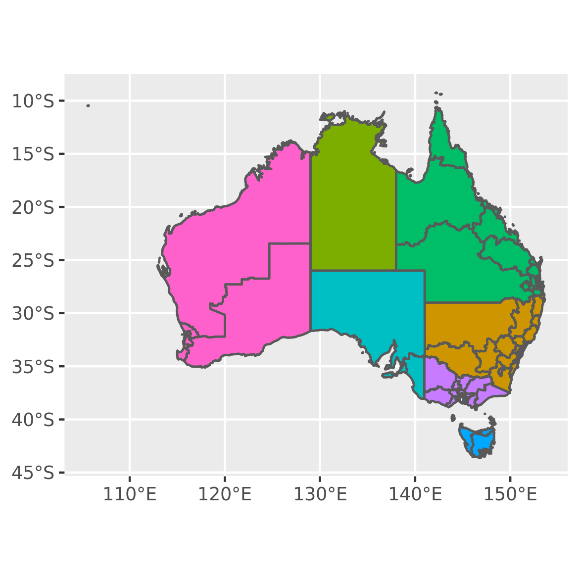
It is worth noting that the first layer to this plot maps the fill aesthetic in onto a variable in the data. In this instance the NAME variable is a categorical variable and does not convey any additional information, but the same approach can be used to visualise other kinds of area metadata. For example, if oz_states had an additional column specifying the unemployment level in each state, we could map the fill aesthetic to that variable.
6.2.2 Labelled maps
Adding labels to maps is an example of annotating plots (Chapter 7) and is supported by geom_sf_label() and geom_sf_text(). For example, while an Australian audience might be reasonably expected to know the names of the Australian states (and are left unlabelled in the plot above) few Australians would know the names of different electorates in the Sydney metropolitan region. In order to draw an electoral map of Sydney, then, we would first need to extract the
map data for the relevant elextorates, and then add the label. The plot below zooms in on the Sydney region by specifying xlim and ylim in coord_sf() and then uses geom_sf_label() to overlay each electorate with a label:
# filter electorates in the Sydney metropolitan region
sydney_map <- ozmaps::abs_ced %>% filter(NAME %in% c(
  "Sydney", "Wentworth", "Warringah", "Kingsford Smith", "Grayndler", "Lowe",
  "North Sydney", "Barton", "Bradfield", "Banks", "Blaxland", "Reid",
  "Watson", "Fowler", "Werriwa", "Prospect", "Parramatta", "Bennelong",
  "Mackellar", "Greenway", "Mitchell", "Chifley", "McMahon"
))

# draw the electoral map of Sydney
ggplot(sydney_map) +
  geom_sf(aes(fill = NAME), show.legend = FALSE) +
  coord_sf(xlim = c(150.97, 151.3), ylim = c(-33.98, -33.79)) +
  geom_sf_label(aes(label = NAME), label.padding = unit(1, "mm"))
#> Warning in st_point_on_surface.sfc(sf::st_zm(x)): st_point_on_surface may not
#> give correct results for longitude/latitude data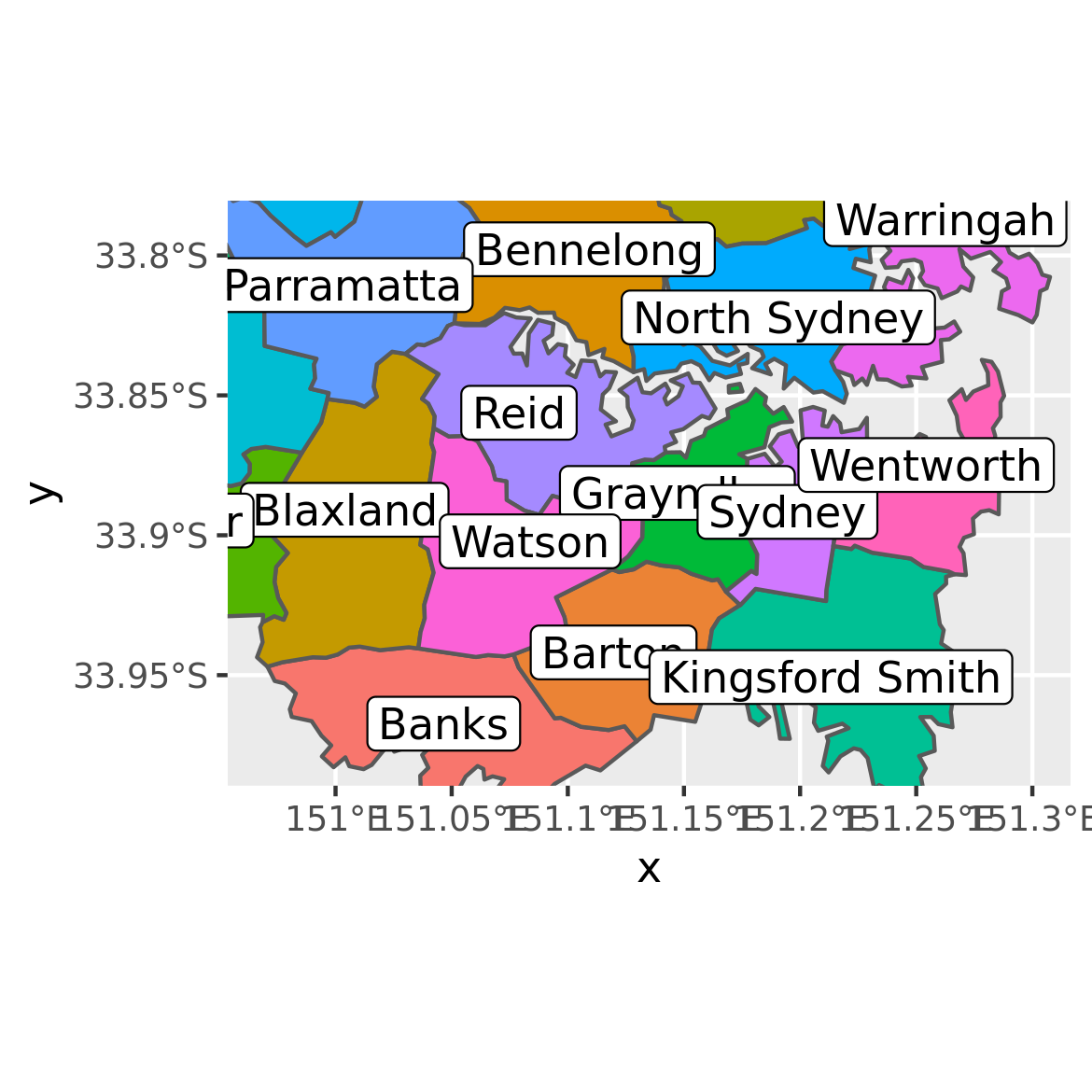
The warning message is worth noting. Internally geom_sf_label() uses the function
st_point_on_surface() from the sf package to place labels, and the warning message
occurs because most algorithms used by sf to compute geometric quantities (e.g., centroids,
interior points) are based on an assumption that the points lie in on a flat two dimensional
surface and parameterised with Cartesian co-ordinates. This assumption is not strictly
warranted, and in some cases (e.g., regions near the poles) calculations that treat
longitude and latitude in this way will give erroneous answers. For this reason, the sf
package produces warning messages when it relies on this approximation.
6.2.3 Adding other geoms
Though geom_sf() is special in some ways, it nevertheless behaves in much the same fashion as any other geom, allowing additional data to be plotted on a map with standard geoms. For example, we may wish to plot the locations of the Australian capital cities on the map using geom_point(). The code below illustrates how this is done:
oz_capitals <- tibble::tribble(
  ~city,           ~lat,     ~lon,
  "Sydney",    -33.8688, 151.2093,
  "Melbourne", -37.8136, 144.9631,
  "Brisbane",  -27.4698, 153.0251,
  "Adelaide",  -34.9285, 138.6007,
  "Perth",     -31.9505, 115.8605,
  "Hobart",    -42.8821, 147.3272,
  "Canberra",  -35.2809, 149.1300,
  "Darwin",    -12.4634, 130.8456,
)

ggplot() +
  geom_sf(data = oz_votes) +
  geom_sf(data = oz_states, colour = "black", fill = NA) +
  geom_point(data = oz_capitals, mapping = aes(x = lon, y = lat), colour = "red") +
  coord_sf()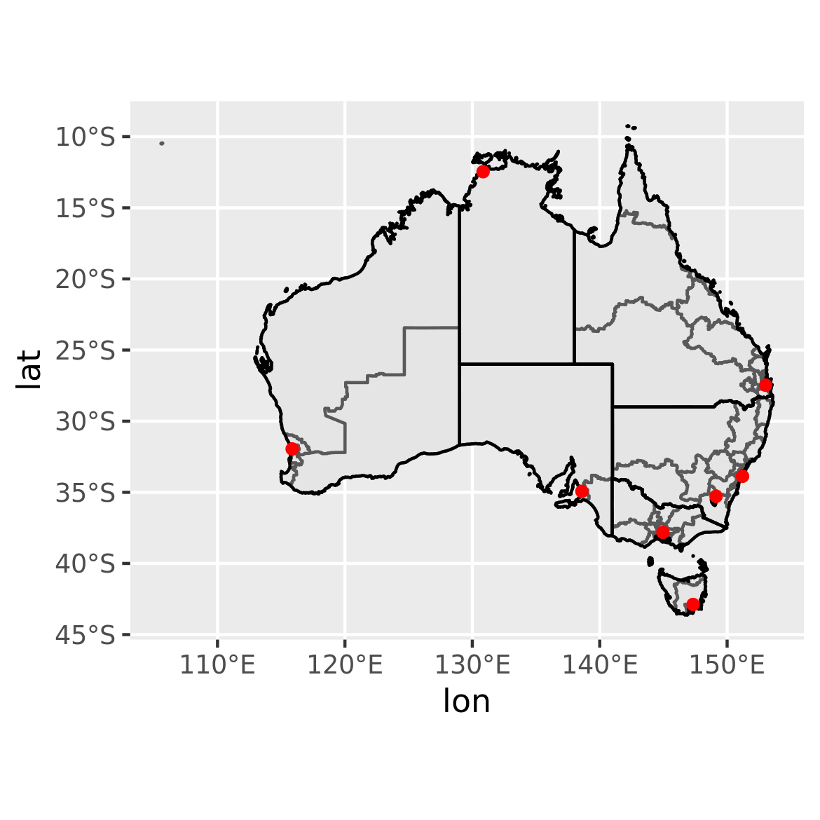
In this example geom_point is used only to specify the locations of the capital cities, but the basic idea can be extended to handle point metadata more generally. For example if the oz_capitals data were to include an additional variable specifying the number of electorates within each metropolitan area, we could encode that data using the size aesthetic.
Edzer Pebesma, “Simple Features for R: Standardized Support for Spatial Vector Data,” The R Journal 10, no. 1 (2018): 439–46, https://doi.org/10.32614/RJ-2018-009.↩︎
Michael Sumner, Ozmaps: Australia Maps, 2019, https://CRAN.R-project.org/package=ozmaps.↩︎
Andy Teucher and Kenton Russell, Rmapshaper: Client for ’Mapshaper’ for ’Geospatial’ Operations, 2018, https://CRAN.R-project.org/package=rmapshaper.↩︎