12.2 Building a scatterplot
How are engine size and fuel economy related? We might create a scatterplot of engine displacement and highway mpg with points coloured by number of cylinders:
ggplot(mpg, aes(displ, hwy, colour = factor(cyl))) +
  geom_point()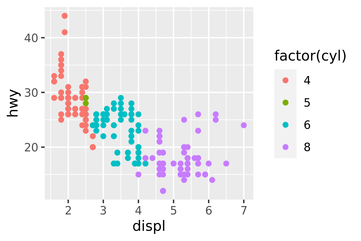
You can create plots like this easily, but what is going on underneath the surface? How does ggplot2 draw this plot?
12.2.1 Mapping aesthetics to data
What precisely is a scatterplot? You have seen many before and have probably even drawn some by hand. A scatterplot represents each observation as a point, positioned according to the value of two variables. As well as a horizontal and vertical position, each point also has a size, a colour and a shape. These attributes are called aesthetics, and are the properties that can be perceived on the graphic. Each aesthetic can be mapped to a variable, or set to a constant value. In the previous graphic, displ is mapped to horizontal position, hwy to vertical position and cyl to colour. Size and shape are not mapped to variables, but remain at their (constant) default values.
Once we have these mappings we can create a new dataset that records this information:
| x | y | colour |
|---|---|---|
| 1.8 | 29 | 4 |
| 1.8 | 29 | 4 |
| 2.0 | 31 | 4 |
| 2.0 | 30 | 4 |
| 2.8 | 26 | 6 |
| 2.8 | 26 | 6 |
| 3.1 | 27 | 6 |
| 1.8 | 26 | 4 |
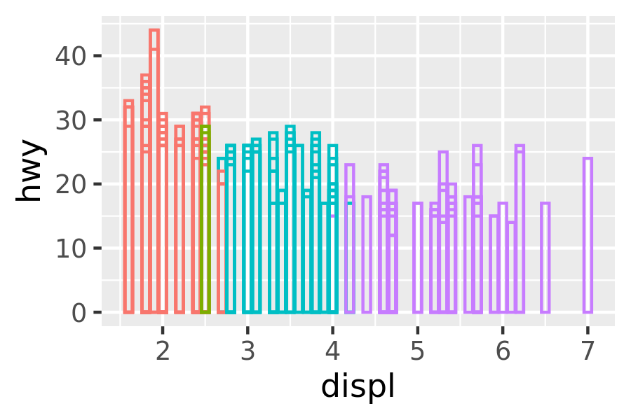
This new dataset is a result of applying the aesthetic mappings to the original data. We can create many different types of plots using this data. The scatterplot uses points, but were we instead to draw lines we would get a line plot. If we used bars, we’d get a bar plot. Neither of those examples makes sense for this data, but we could still draw them (I’ve omitted the legends to save space):
ggplot(mpg, aes(displ, hwy, colour = factor(cyl))) +
  geom_line() +
  theme(legend.position = "none")
ggplot(mpg, aes(displ, hwy, colour = factor(cyl))) +
  geom_bar(stat = "identity", position = "identity", fill = NA) +
  theme(legend.position = "none")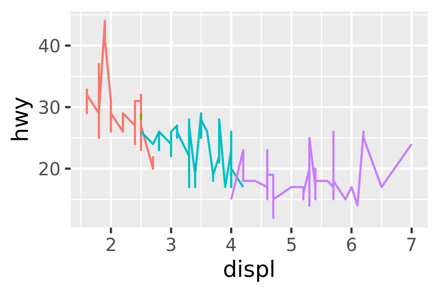
In ggplot, we can produce many plots that don’t make sense, yet are grammatically valid. This is no different than English, where we can create senseless but grammatical sentences like the angry rock barked like a comma.
Points, lines and bars are all examples of geometric objects, or geoms. Geoms determine the ``type’’ of the plot. Plots that use a single geom are often given a special name:
| Named plot | Geom | Other features |
|---|---|---|
| scatterplot | point | |
| bubblechart | point | size mapped to a variable |
| barchart | bar | |
| box-and-whisker plot | boxplot | |
| line chart | line |
More complex plots with combinations of multiple geoms don’t have a special name, and we have to describe them by hand. For example, this plot overlays a per group regression line on top of a scatterplot:
ggplot(mpg, aes(displ, hwy, colour = factor(cyl))) +
  geom_point() +
  geom_smooth(method = "lm")
#> `geom_smooth()` using formula 'y ~ x'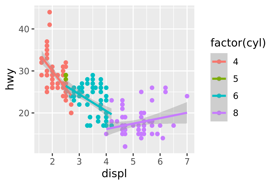
What would you call this plot? Once you’ve mastered the grammar, you’ll find that many of the plots that you produce are uniquely tailored to your problems and will no longer have special names.
12.2.2 Scaling
The values in the previous table have no meaning to the computer. We need to convert them from data units (e.g., litres, miles per gallon and number of cylinders) to graphical units (e.g., pixels and colours) that the computer can display. This conversion process is called scaling and performed by scales. Now that these values are meaningful to the computer, they may not be meaningful to us: colours are represented by a six-letter hexadecimal string, sizes by a number and shapes by an integer. These aesthetic specifications that are meaningful to R are described in vignette("ggplot2-specs").
In this example, we have three aesthetics that need to be scaled: horizontal position (x), vertical position (y) and colour. Scaling position is easy in this example because we are using the default linear scales. We need only a linear mapping from the range of the data to \([0, 1]\). We use \([0, 1]\) instead of exact pixels because the drawing system that ggplot2 uses, grid, takes care of that final conversion for us. A final step determines how the two positions (x and y) are combined to form the final location on the plot. This is done by the coordinate system, or coord. In most cases this will be Cartesian coordinates, but it might be polar coordinates, or a spherical projection used for a map.
The process for mapping the colour is a little more complicated, as we have a non-numeric result: colours. However, colours can be thought of as having three components, corresponding to the three types of colour-detecting cells in the human eye. These three cell types give rise to a three-dimensional colour space. Scaling then involves mapping the data values to points in this space. There are many ways to do this, but here since cyl is a categorical variable we map values to evenly spaced hues on the colour wheel, as shown in Figure 12.1. A different mapping is used when the variable is continuous.
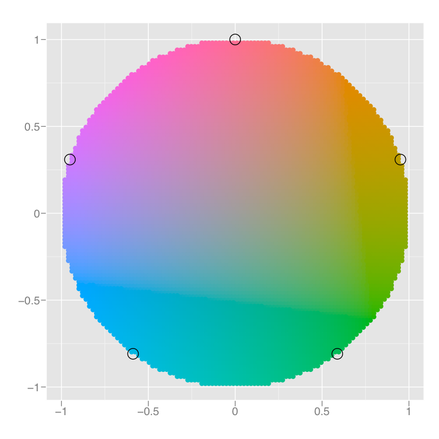
Figure 12.1: A colour wheel illustrating the choice of five equally spaced colours. This is the default scale for discrete variables.
The result of these conversions is below. As well as aesthetics that have been mapped to variable, we also include aesthetics that are constant. We need these so that the aesthetics for each point are completely specified and R can draw the plot. The points will be filled circles (shape 19 in R) with a 1-mm diameter:
| x | y | colour | size | shape |
|---|---|---|---|---|
| 0.037 | 0.531 | #F8766D | 1 | 19 |
| 0.037 | 0.531 | #F8766D | 1 | 19 |
| 0.074 | 0.594 | #F8766D | 1 | 19 |
| 0.074 | 0.562 | #F8766D | 1 | 19 |
| 0.222 | 0.438 | #00BFC4 | 1 | 19 |
| 0.222 | 0.438 | #00BFC4 | 1 | 19 |
| 0.278 | 0.469 | #00BFC4 | 1 | 19 |
| 0.037 | 0.438 | #F8766D | 1 | 19 |
Finally, we need to render this data to create the graphical objects that are displayed on the screen. To create a complete plot we need to combine graphical objects from three sources: the data, represented by the point geom; the scales and coordinate system, which generate axes and legends so that we can read values from the graph; and plot annotations, such as the background and plot title.