13.6 Stats
A statistical transformation, or stat, transforms the data, typically by summarising it in some manner. For example, a useful stat is the smoother, which calculates the smoothed mean of y, conditional on x. You’ve already used many of ggplot2’s stats because they’re used behind the scenes to generate many important geoms:
stat_bin():geom_bar(),geom_freqpoly(),geom_histogram()stat_bin2d():geom_bin2d()stat_bindot():geom_dotplot()stat_binhex():geom_hex()stat_boxplot():geom_boxplot()stat_contour():geom_contour()stat_quantile():geom_quantile()stat_smooth():geom_smooth()stat_sum():geom_count()
You’ll rarely call these functions directly, but they are useful to know about because their documentation often provides more detail about the corresponding statistical transformation.
Other stats can’t be created with a geom_ function:
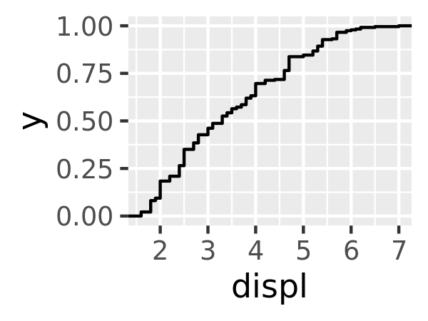
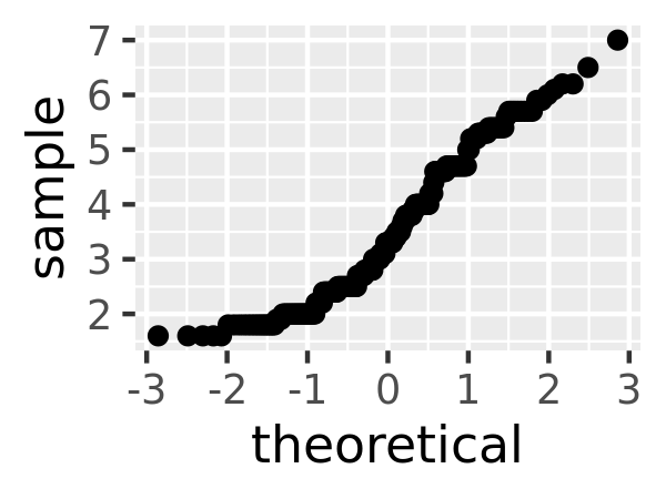
stat_ecdf(): compute a empirical cumulative distribution plot.stat_function(): compute y values from a function of x values.stat_summary(): summarise y values at distinct x values.stat_summary2d(),stat_summary_hex(): summarise binned values.stat_qq(): perform calculations for a quantile-quantile plot.stat_spoke(): convert angle and radius to position.stat_unique(): remove duplicated rows.
There are two ways to use these functions. You can either add a stat_() function and override the default geom, or add a geom_() function and override the default stat:
ggplot(mpg, aes(trans, cty)) +
  geom_point() +
  stat_summary(geom = "point", fun = "mean", colour = "red", size = 4)

ggplot(mpg, aes(trans, cty)) +
  geom_point() +
  geom_point(stat = "summary", fun = "mean", colour = "red", size = 4)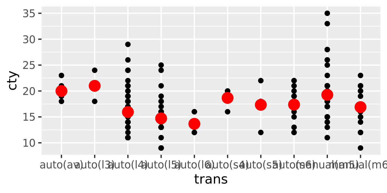
I think it’s best to use the second form because it makes it more clear that you’re displaying a summary, not the raw data.
13.6.1 Generated variables
Internally, a stat takes a data frame as input and returns a data frame as output, and so a stat can add new variables to the original dataset. It is possible to map aesthetics to these new variables. For example, stat_bin, the statistic used to make histograms, produces the following variables:
count, the number of observations in each bindensity, the density of observations in each bin (percentage of total / bar width)x, the centre of the bin
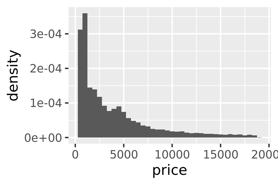
These generated variables can be used instead of the variables present in the original dataset. For example, the default histogram geom assigns the height of the bars to the number of observations (count), but if you’d prefer a more traditional histogram, you can use the density (density). To refer to a generated variable like density, “after_stat()” must wrap the name. This prevents confusion in case the original dataset includes a variable with the same name as a generated variable, and it makes it clear to any later reader of the code that this variable was generated by a stat. Each statistic lists the variables that it creates in its documentation. Compare the y-axes on these two plots:
ggplot(diamonds, aes(price)) +
  geom_histogram(binwidth = 500)
ggplot(diamonds, aes(price)) +
  geom_histogram(aes(y = after_stat(density)), binwidth = 500)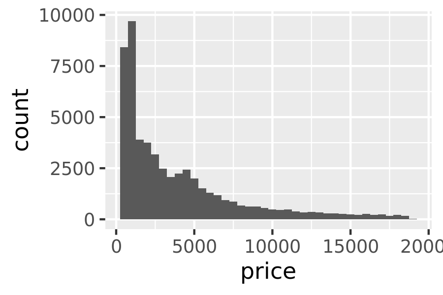
This technique is particularly useful when you want to compare the distribution of multiple groups that have very different sizes. For example, it’s hard to compare the distribution of price within cut because some groups are quite small. It’s easier to compare if we standardise each group to take up the same area:
ggplot(diamonds, aes(price, colour = cut)) +
  geom_freqpoly(binwidth = 500) +
  theme(legend.position = "none")

ggplot(diamonds, aes(price, colour = cut)) +
  geom_freqpoly(aes(y = after_stat(density)), binwidth = 500) +
  theme(legend.position = "none")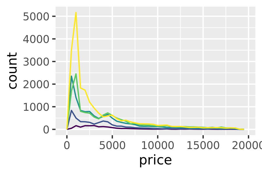
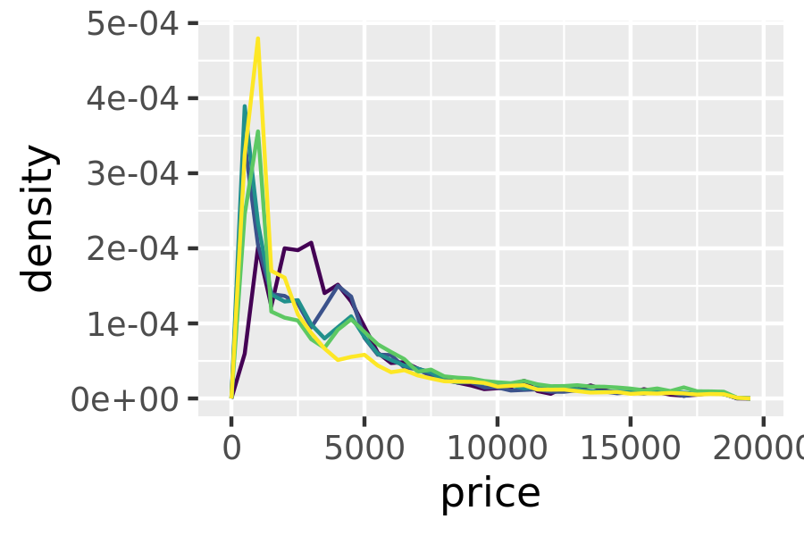
The result of this plot is rather surprising: low quality diamonds seem to be more expensive on average.
13.6.2 Exercises
The code below creates a similar dataset to
stat_smooth(). Use the appropriate geoms to mimic the defaultgeom_smooth()display.mod <- loess(hwy ~ displ, data = mpg) smoothed <- data.frame(displ = seq(1.6, 7, length = 50)) pred <- predict(mod, newdata = smoothed, se = TRUE) smoothed$hwy <- pred$fit smoothed$hwy_lwr <- pred$fit - 1.96 * pred$se.fit smoothed$hwy_upr <- pred$fit + 1.96 * pred$se.fitWhat stats were used to create the following plots?
Read the help for
stat_sum()then usegeom_count()to create a plot that shows the proportion of cars that have each combination ofdrvandtrans.