7.3 Text labels
Adding text to a plot is one of the most common forms of annotation. Most plots
will not benefit from adding text to every single observation on the plot,
but labelling outliers and other important points is very useful. However, text
annotation can be tricky due to the way that R handles fonts. The ggplot2 package doesn’t have all the answers, but it does provide some tools to make your life a little easier. The main tool for labelling plots is geom_text(), which adds label text at the specified x and y positions. geom_text() has the most aesthetics of any geom, because there are so many ways to control the appearance of a text:
The
familyaesthetic provides the name of a font. This aesthetic does allow you to use the name of a system font, but some care is required. There are only three fonts that are guaranteed to work everywhere: “sans” (the default), “serif”, or “mono”. To illustrate these:df <- data.frame(x = 1, y = 3:1, family = c("sans", "serif", "mono")) ggplot(df, aes(x, y)) + geom_text(aes(label = family, family = family))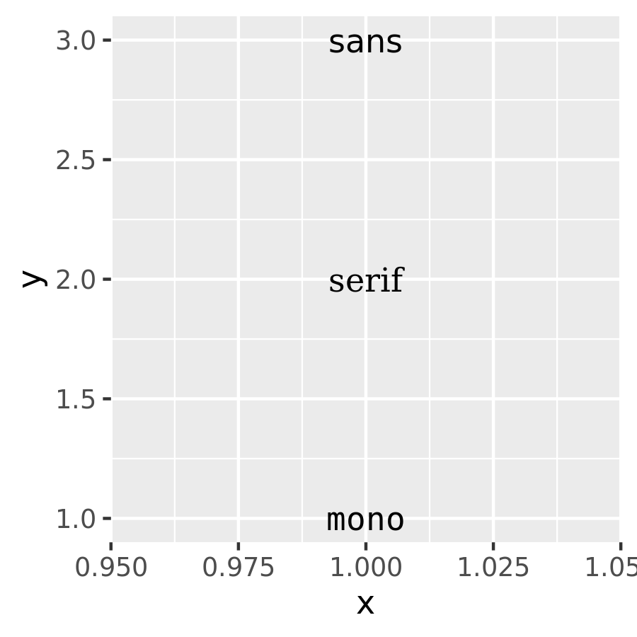
The reason that it can be tricky to use system fonts in a plot is that text drawing is handled differently by each graphics device (GD). There are two groups of GDs: screen devices such as
windows()(for Windows),quartz()(for Macs),x11()(mostly for Linux) andRStudioGD()(within RStudio) draw the plot to the screen, whereas file devices such aspng()andpdf()write the plot to a file. Unfortunately, the devices do not specify fonts in the same way so if you want a font to work everywhere you need to configure the devices in different ways. Two packages simplify the quandary a bit:showtext, https://github.com/yixuan/showtext, by Yixuan Qiu, makes GD-independent plots by rendering all text as polygons.
extrafont, https://github.com/wch/extrafont, by Winston Chang, converts fonts to a standard format that all devices can use.
Both approaches have pros and cons, so you will to need to try both of them and see which works best for your needs.
The
fontfaceaesthetic specifies the face, and can take three values: “plain” (the default), “bold” or “italic”. For example:df <- data.frame(x = 1, y = 3:1, face = c("plain", "bold", "italic")) ggplot(df, aes(x, y)) + geom_text(aes(label = face, fontface = face))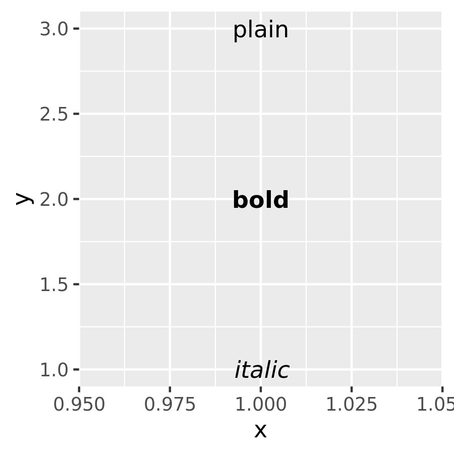
You can adjust the alignment of the text with the
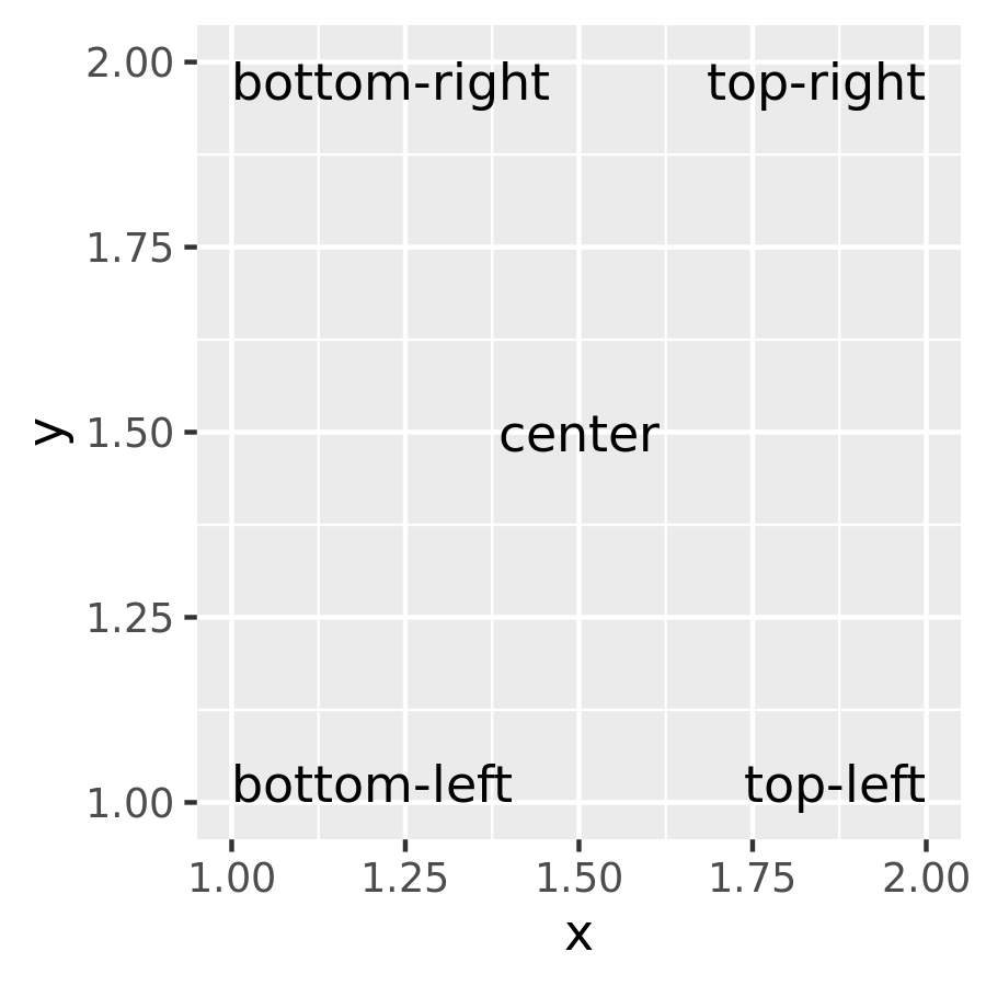
hjust(“left”, “center”, “right”, “inward”, “outward”) andvjust(“bottom”, “middle”, “top”, “inward”, “outward”) aesthetics. By default the aligment is centered, but there are often good reasons to override this. One of the most useful alignments is “inward”. It aligns text towards the middle of the plot, which ensures that labels remain within the plot limits:df <- data.frame( x = c(1, 1, 2, 2, 1.5), y = c(1, 2, 1, 2, 1.5), text = c( "bottom-left", "bottom-right", "top-left", "top-right", "center" ) ) ggplot(df, aes(x, y)) + geom_text(aes(label = text)) ggplot(df, aes(x, y)) + geom_text(aes(label = text), vjust = "inward", hjust = "inward")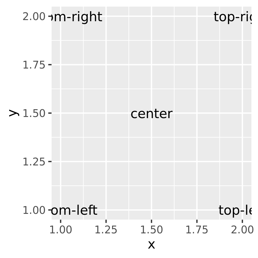
The font size is controlled by the
sizeaesthetic. Unlike most tools, ggplot2 specifies the size in millimeters (mm), rather than the usual points (pts). The reason for this choice is that it makes it the units for font sizes consistent with how other sizes are specified in ggplot2. (There are 72.27 pts in a inch, so to convert from points to mm, just multiply by 72.27 / 25.4).anglespecifies the rotation of the text in degrees.
The ggplot2 package does allow you to map data values to the aesthetics used by geom_text(), but you should use restraint: it is hard to perceive the relationship between variables mapped to these aesthetics, and rarely useful to do so.
In addition to the various aesthetics, geom_text() has three parameters that you can specify. Unlike the aesthetics these only take single values, so they must be the same for all labels:
Often you want to label existing points on the plot, but you don’t want the text to overlap with the points (or bars etc). In this situation it’s useful to offset the text a little, which you can do with the
nudge_xandnudge_yparameters:df <- data.frame(trt = c("a", "b", "c"), resp = c(1.2, 3.4, 2.5)) ggplot(df, aes(resp, trt)) + geom_point() + geom_text(aes(label = paste0("(", resp, ")")), nudge_y = -0.25) + xlim(1, 3.6)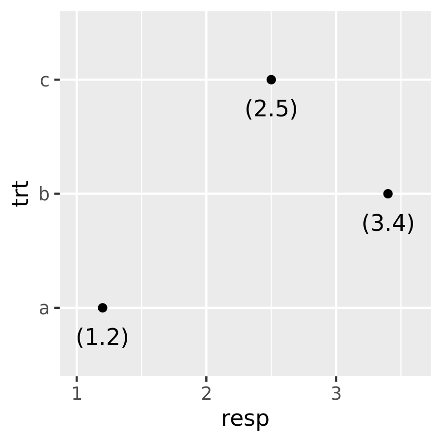
(Note that I manually tweaked the x-axis limits to make sure all the text fit on the plot.)
The third parameter is
check_overlap. Ifcheck_overlap = TRUE, overlapping labels will be automatically removed from the plot. The algorithm is simple: labels are plotted in the order they appear in the data frame; if a label would overlap with an existing point, it’s omitted.ggplot(mpg, aes(displ, hwy)) + geom_text(aes(label = model)) + xlim(1, 8) ggplot(mpg, aes(displ, hwy)) + geom_text(aes(label = model), check_overlap = TRUE) + xlim(1, 8)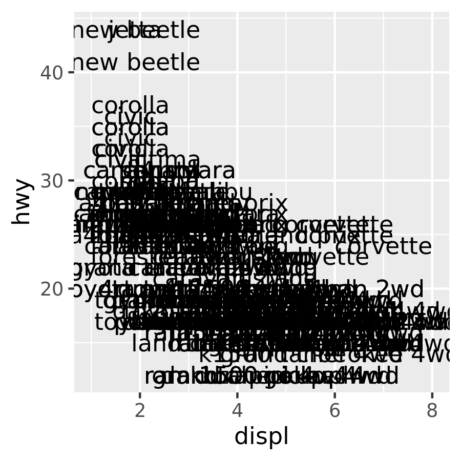
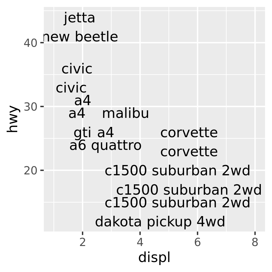
At first glance this feature does not appear very useful, but the simplicity of the algorithm comes in handy. If you sort the input data in order of priority the result is a plot with labels that emphasise important data points.
A variation on geom_text() is geom_label(): it draws a rounded rectangle behind the text. This makes it useful for adding labels to plots with busy backgrounds:
label <- data.frame(
  waiting = c(55, 80),
  eruptions = c(2, 4.3),
  label = c("peak one", "peak two")
)

ggplot(faithfuld, aes(waiting, eruptions)) +
  geom_tile(aes(fill = density)) +
  geom_label(data = label, aes(label = label))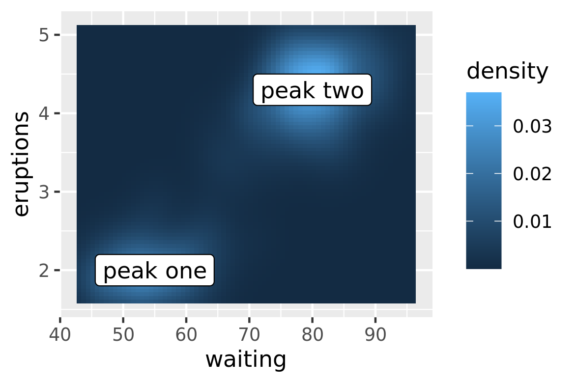
Labelling data well poses some challenges:
Text does not affect the limits of the plot. Unfortunately there’s no way to make this work since a label has an absolute size (e.g. 3 cm), regardless of the size of the plot. This means that the limits of a plot would need to be different depending on the size of the plot — there’s just no way to make that happen with ggplot2. Instead, you’ll need to tweak
xlim()andylim()based on your data and plot size.If you want to label many points, it is difficult to avoid overlaps.
check_overlap = TRUEis useful, but offers little control over which labels are removed. A popular technique for addressing this is to use the ggrepel package https://github.com/slowkow/ggrepel by Kamil Slowikowski. The package suppliesgeom_text_repel(), which optimizes the label positioning to avoid overlap. It works quite well so long as the number of labels is not excessive:mini_mpg <- mpg[sample(nrow(mpg), 20),] ggplot(mpg, aes(displ, hwy)) + geom_point(colour = "red") + ggrepel::geom_text_repel(data = mini_mpg, aes(label = class))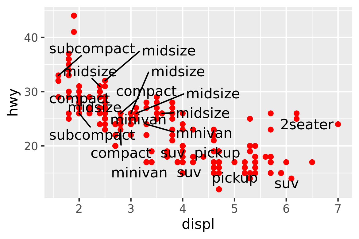
It can sometimes be difficult to ensure that text labels fit within the space that you want. The ggfittext package https://github.com/wilkox/ggfittext by Claus Wilke contains useful tools that can assist with this, including functions that allow you to place text labels inside the columns in a bar chart.