17.2 Complete themes
ggplot2 comes with a number of built in themes. The most important is theme_grey(), the signature ggplot2 theme with a light grey background and white gridlines. The theme is designed to put the data forward while supporting comparisons, following the advice of.44 We can still see the gridlines to aid in the judgement of position,45 but they have little visual impact and we can easily ‘tune’ them out. The grey background gives the plot a similar typographic colour to the text, ensuring that the graphics fit in with the flow of a
document without jumping out with a bright white background. Finally, the grey background creates a continuous field of colour which ensures that the plot is perceived as a single visual entity.
There are seven other themes built in to ggplot2 1.1.0:
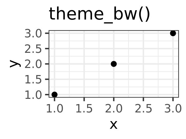
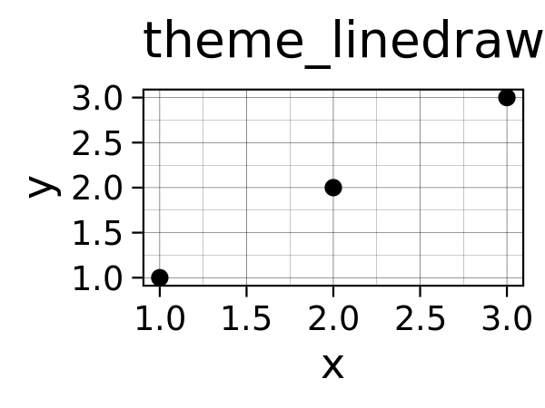
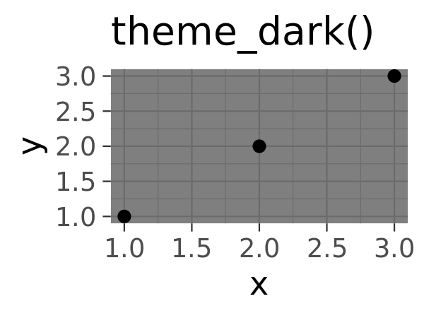
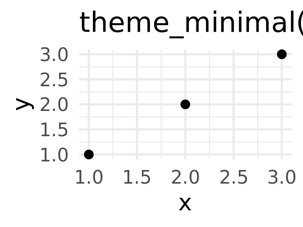
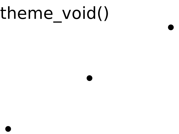
theme_bw(): a variation ontheme_grey()that uses a white background and thin grey grid lines.theme_linedraw(): A theme with only black lines of various widths on white backgrounds, reminiscent of a line drawing.theme_light(): similar totheme_linedraw()but with light grey lines and axes, to direct more attention towards the data.theme_dark(): the dark cousin oftheme_light(), with similar line sizes but a dark background. Useful to make thin coloured lines pop out.theme_minimal(): A minimalistic theme with no background annotations.theme_classic(): A classic-looking theme, with x and y axis lines and no gridlines.theme_void(): A completely empty theme.
df <- data.frame(x = 1:3, y = 1:3)
base <- ggplot(df, aes(x, y)) + geom_point()
base + theme_grey() + ggtitle("theme_grey()")
base + theme_bw() + ggtitle("theme_bw()")
base + theme_linedraw() + ggtitle("theme_linedraw()")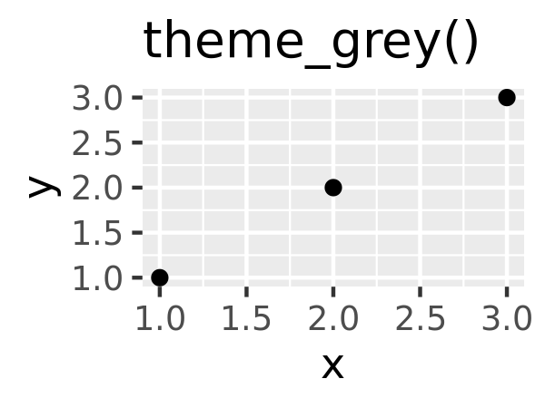
base + theme_light() + ggtitle("theme_light()")
base + theme_dark() + ggtitle("theme_dark()")
base + theme_minimal()  + ggtitle("theme_minimal()")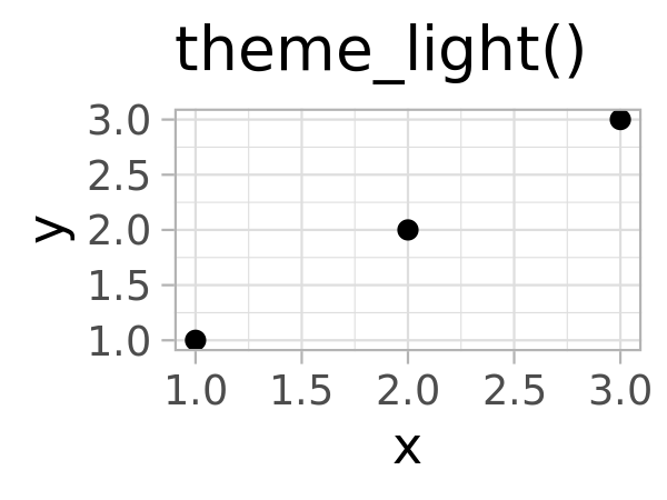
base + theme_classic() + ggtitle("theme_classic()")
base + theme_void() + ggtitle("theme_void()")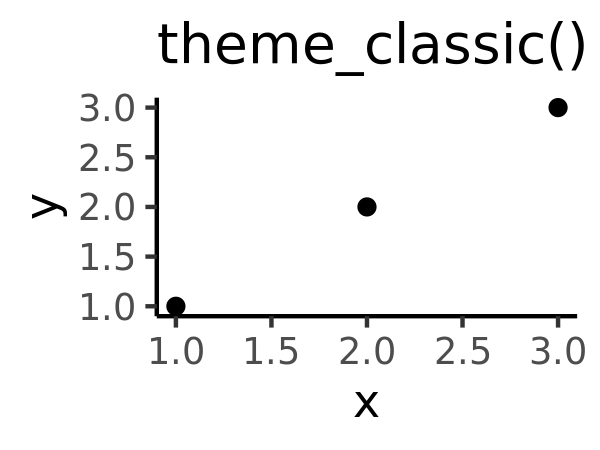
All themes have a base_size parameter which controls the base font size. The base font size is the size that the axis titles use: the plot title is usually bigger (1.2x), and the tick and strip labels are smaller (0.8x). If you want to control these sizes separately, you’ll need to modify the individual elements as described below.
As well as applying themes a plot at a time, you can change the default theme with theme_set(). For example, if you really hate the default grey background, run theme_set(theme_bw()) to use a white background for all plots.
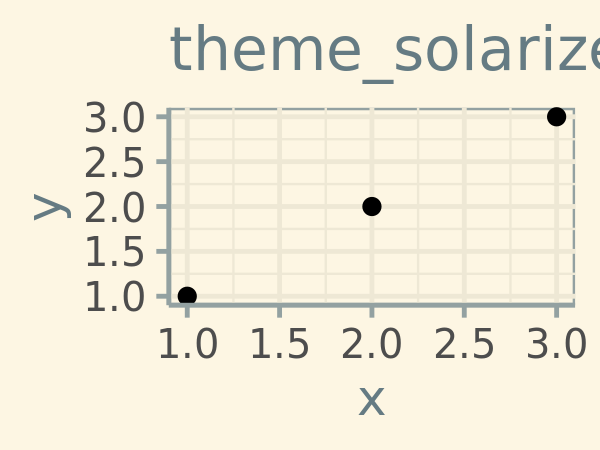
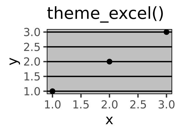
You’re not limited to the themes built-in to ggplot2. Other packages, like ggthemes by Jeffrey Arnold, add even more. Here’s a few of my favourites from ggthemes:
library(ggthemes)
base + theme_tufte() + ggtitle("theme_tufte()")
base + theme_solarized() + ggtitle("theme_solarized()")
base + theme_excel() + ggtitle("theme_excel()") # ;)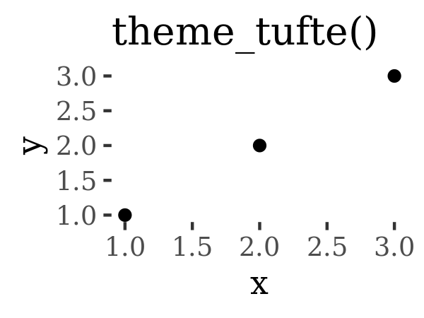
The complete themes are a great place to start but don’t give you a lot of control. To modify individual elements, you need to use theme() to override the default setting for an element with an element function.
17.2.1 Exercises
Try out all the themes in ggthemes. Which do you like the best?
What aspects of the default theme do you like? What don’t you like?
What would you change?Look at the plots in your favourite scientific journal. What theme do they most resemble? What are the main differences?
Edward R. Tufte, Beautiful Evidence (Graphics Press, 2006); Cynthia A. Brewer, “Color Use Guidelines for Mapping and Visualization,” in Visualization in Modern Cartography, ed. A. M. MacEachren and D. R. F. Taylor (Elsevier Science, 1994), 123–47; Dan Carr, “Graphical Displays,” in Encyclopedia of Environmetrics, ed. Abdel H. El-Shaarawi and Walter W. Piegorsch, vol. 2 (John Wiley & Sons, 2002), 933–60, http://www.galaxy.gmu.edu/~dcarr/lib/EnvironmentalGraphics.pdf; Dan Carr, “Using Gray in Plots,” ASA Statistical Computing and Graphics Newsletter 2, no. 5 (1994): 11–14, http://www.galaxy.gmu.edu/~dcarr/lib/v5n2.pdf; Dan Carr and Ru Sun, “Using Layering and Perceptual Grouping in Statistical Graphics,” ASA Statistical Computing and Graphics Newsletter 10, no. 1 (1999): 25–31.↩︎
William Cleveland, “A Model for Studying Display Methods of Statistical Graphics,” Journal of Computational and Graphical Statistics 2 (1993): 323–64, http://stat.bell-labs.com/doc/93.4.ps.↩︎