5.2 Weighted data
When you have aggregated data where each row in the dataset represents multiple observations, you need some way to take into account the weighting variable. We will use some data collected on Midwest states in the 2000 US census in the built-in midwest data frame. The data consists mainly of percentages (e.g., percent white, percent below poverty line, percent with college degree) and some information for each county (area, total population, population density).
There are a few different things we might want to weight by:
- Nothing, to look at numbers of counties.
- Total population, to work with absolute numbers.
- Area, to investigate geographic effects. (This isn’t useful for
midwest, but would be if we had variables like percentage of farmland.)
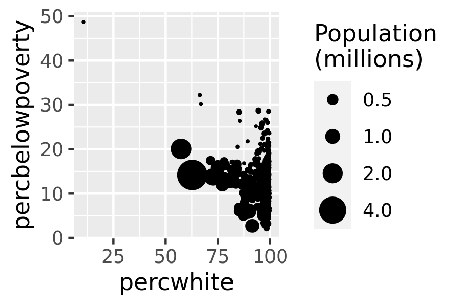
The choice of a weighting variable profoundly affects what we are looking at in the plot and the conclusions that we will draw. There are two aesthetic attributes that can be used to adjust for weights. Firstly, for simple geoms like lines and points, use the size aesthetic:
# Unweighted
ggplot(midwest, aes(percwhite, percbelowpoverty)) +
  geom_point()

# Weight by population
ggplot(midwest, aes(percwhite, percbelowpoverty)) +
  geom_point(aes(size = poptotal / 1e6)) +
  scale_size_area("Population\n(millions)", breaks = c(0.5, 1, 2, 4))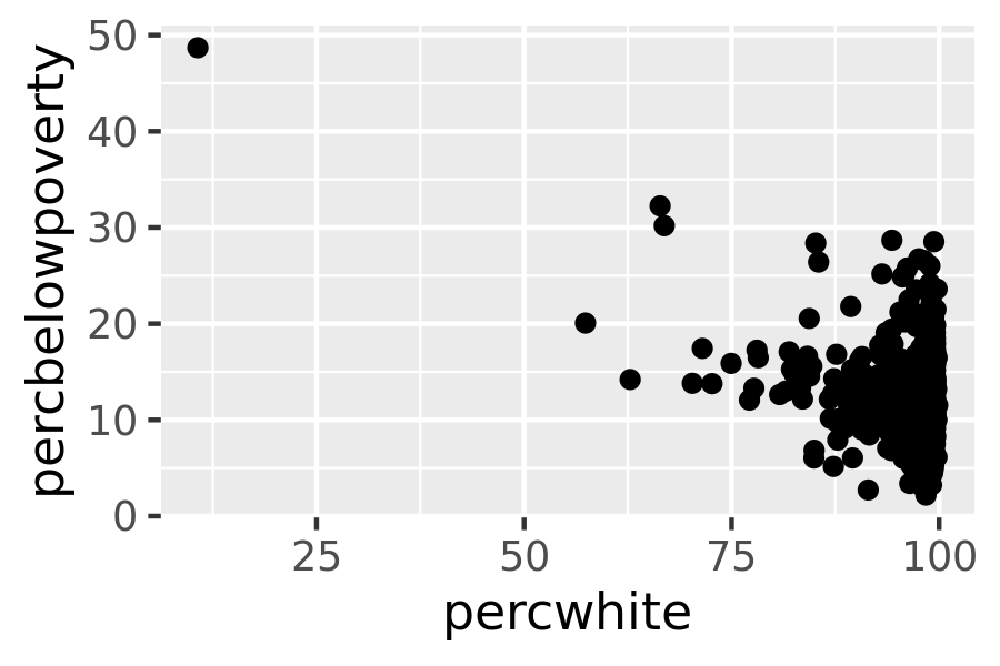
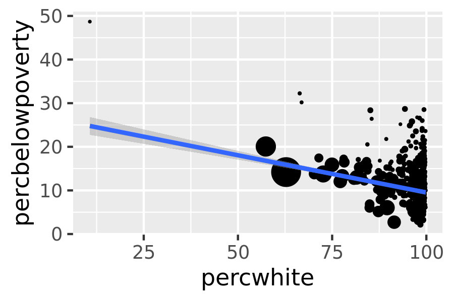
For more complicated grobs which involve some statistical transformation, we specify weights with the weight aesthetic. These weights will be passed on to the statistical summary function. Weights are supported for every case where it makes sense: smoothers, quantile regressions, boxplots, histograms, and density plots. You can’t see this weighting variable directly, and it doesn’t produce a legend, but it will change the results of the statistical summary. The following code shows how weighting by population density affects the relationship between percent white and percent below the poverty line.
# Unweighted
ggplot(midwest, aes(percwhite, percbelowpoverty)) +
  geom_point() +
  geom_smooth(method = lm, size = 1)
#> `geom_smooth()` using formula 'y ~ x'

# Weighted by population
ggplot(midwest, aes(percwhite, percbelowpoverty)) +
  geom_point(aes(size = poptotal / 1e6)) +
  geom_smooth(aes(weight = poptotal), method = lm, size = 1) +
  scale_size_area(guide = "none")
#> `geom_smooth()` using formula 'y ~ x'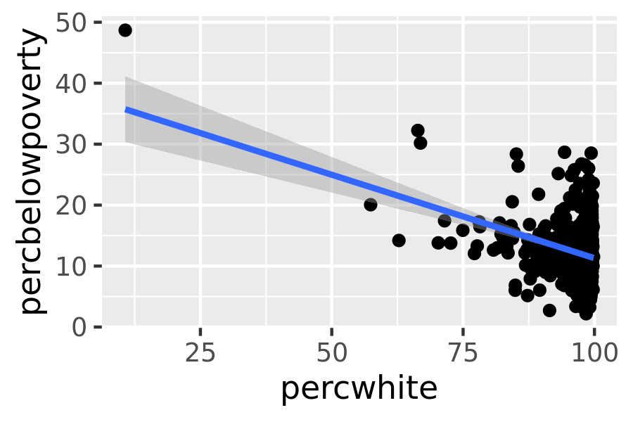
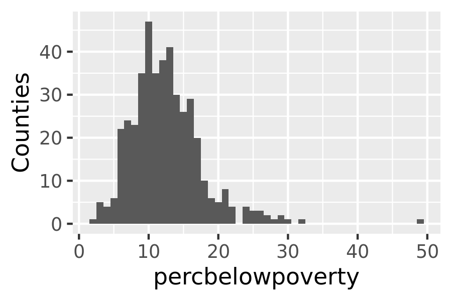
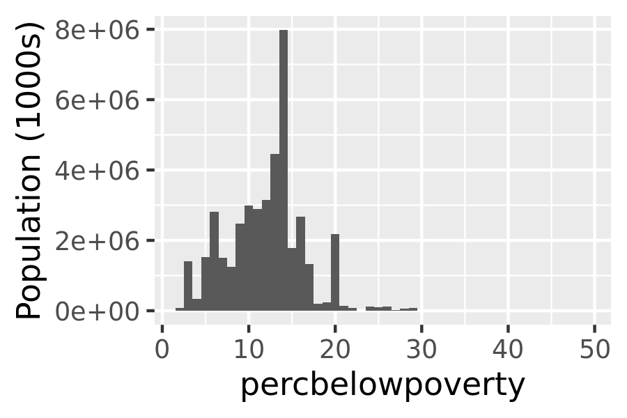
When we weight a histogram or density plot by total population, we change from looking at the distribution of the number of counties, to the distribution of the number of people. The following code shows the difference this makes for a histogram of the percentage below the poverty line:
ggplot(midwest, aes(percbelowpoverty)) +
  geom_histogram(binwidth = 1) +
  ylab("Counties")

ggplot(midwest, aes(percbelowpoverty)) +
  geom_histogram(aes(weight = poptotal), binwidth = 1) +
  ylab("Population (1000s)")